
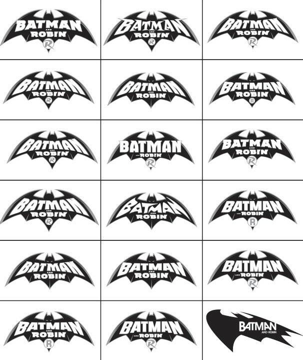
Via The Source a study of the Great Rian Hughes’s various logos for Batman and Robin. All so similar in the strong shape (derived from the 60-year-old original) and yet differing in tiny details in the readability of the lettering and even Batman’s eyes.
BONUS: Process on the covers in another post. The collection of BATMAN & ROBIN Volume 2 goes on sale this week.


I’ve also written about this logo in my Batman Logo Study Part 5:
http://kleinletters.com/Blog/?p=288