


This is the third season in a column that judges a book by its cover. Catch up on the current season, or view the complete archive. Spelling corrections are welcome.
A new 30 Days Of Night collection came out this week and reminded me of the time I not only judged a book by it’s cover — I special ordered it!
Back in 2002 I was buying Preview every month. While browsing the indie section in the back, a cover jumped out at me that looked so different any other comic I’d seen. I mean, nowadays it’s no longer uncommon to see people experimenting with cover design, but this one was really unusual. Even at thumbnail size it grabbed my attention. I had to have it.
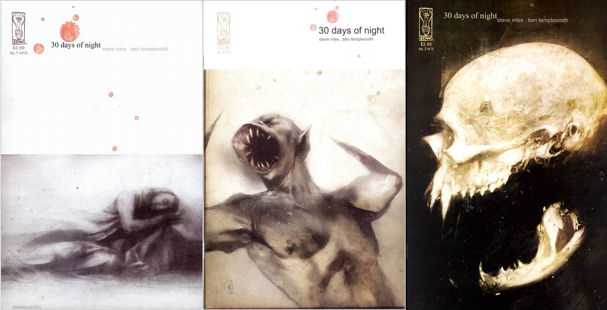
The thumbnail I was looking at was for 30 Days Of Night #1. IDW was this new indie company no one had ever heard of, and my LCS definitely wasn’t going to order a copy for the shelf. Also, it cost $3.99 at a time when the average comic was $2.25. But I guess I’m just that crazy about comic cover design.
As luck would have it, sometime between the release of #1 and #3, it was announced the movie rights had been optioned by Sam Raimi. Suddenly everyone wanted this under-ordered first issue from this new indie publisher. In college, just before the movie came out, I sold the set of three for $150, which is a pretty good profit. I mean, it doesn’t seem as much to me now that I’m making student loan payments, but it seemed worth it at the time.
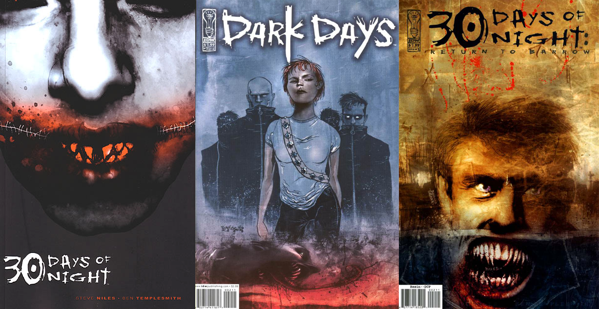
I love how the three covers worked in sequence, the white box shrinking and disappearing, almost like a curtain being raised. I’m a little mystified why the title spontaneously became Arial on #2, but other than that it’s a great sequence.
The covers that came after it were disappointing in comparison. The TPB collection (at left) was okay, except there was spot varnish applied only to the face, which mean the black area below it looked like a dark gray when it probably should have blended evenly. Or maybe it was done on purpose as a weird experiment, who knows? If so, it didn’t work…it looks like a mistake.
The minis that followed (center and left) all gave in and adopted the traditional comic cover layout. Sigh.
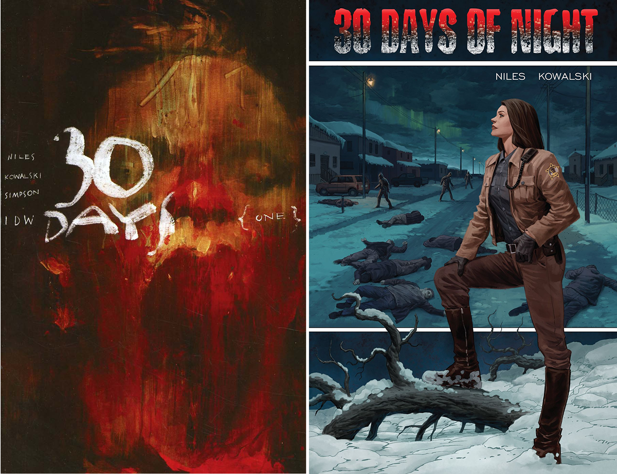
The latest mini also adopted a pretty standard layout, but there were a few fun ones. Ashley Wood’s variant at left is a nice mix of Apocalypse Now and Se7en. The TPB collection on the right got rid of the company logo in the corner and centered the title (unless the design changes when it goes to print). I like how this Piotr Kowalski illustration combines a quiet setting and a horrific setting in a designed way. The logo could be stronger, though.
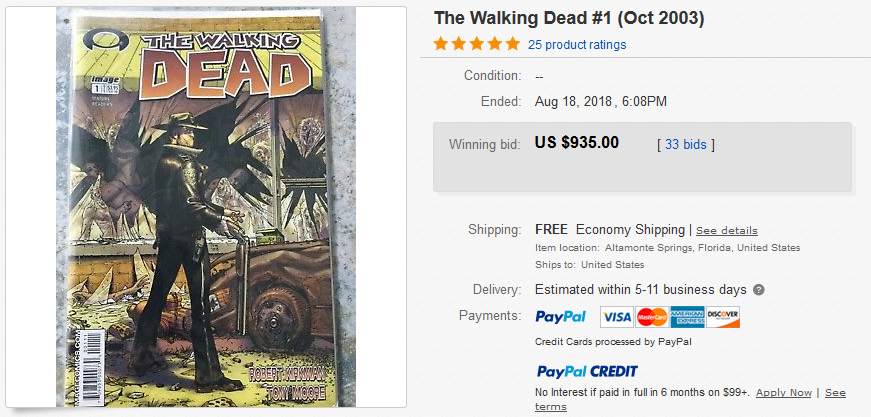
I might’ve gotten lucky with 30 Days Of Night mini, but my eye for comic covers isn’t always a great indicator of hits-to-be. I’m pretty sure I saw the first issue of The Walking Dead and thought it looked pretty bland. Of course I’m kicking myself now.
This Week’s Covers
Every week I pick a handful of covers that I consider particularly well-designed, not just well-illustrated. My personal criteria for a well-designed cover is that the illustration and design elements complement each other rather than fight each other, and that the resulting image stands out from the crowd.
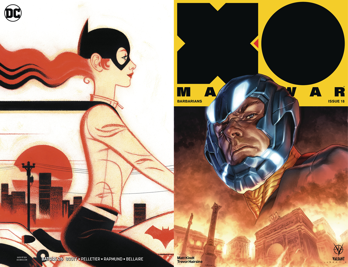
BATGIRL #26 by Joshua Middleton / X-O MANOWAR #18 by Lewis LaRosa
Apparently this Batgirl cover is by Joshua Middleton, which is wild! Very different from what he usually does, but I love it. There’s such much rhythm in the shapes, and great use of a limited color palette.
I’ve loved X-O Manowar‘s chunky trade dress ever since it was introduced, but the illustrations paired with it don’t always compliment each other well. This illustration is great because its big and bold and readable from a distance, and overlaps the logo area just enough to look really killer.
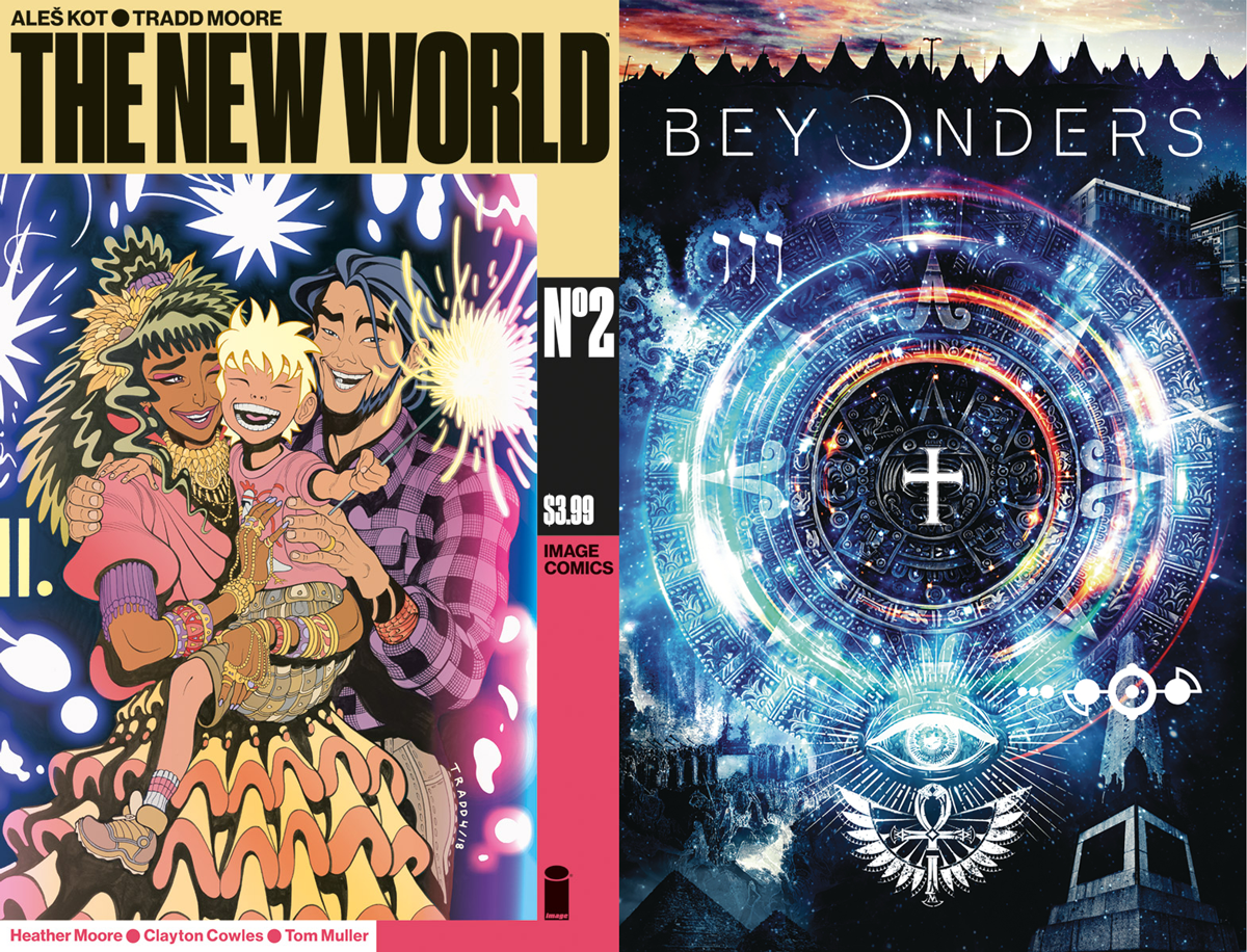
THE NEW WORLD #2 by Tradd Moore & Tom Muller / BEYONDERS #1 by Andi Ewington
Tom Muller’s trade dress for The New World is interesting, the way it puts a lot of the info into a bar on the side and frames the illustrations. It looks particularly nice when several of the issues are viewed side by side. Maybe I’ll do that in a future column.
Andi Ewington’s cover is a great example of an image that looks nothing like any other covers currently on the stand. The central design is super trippy, but my favorite part is actually the small strip of sky at the top that breaks the darkness of the cover and helps to put focus on the logo.


