
by Alex Dueben
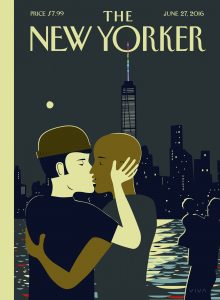 Adults probably know Frank Viva for a series of great covers at The New Yorker magazine–including the cover of the recent June 27th issue titled “Love.” Viva is also the director of the Toronto-based branding and design firm Viva & Company, where he handles brands including everyone’s favorite French cookware company La Creuset. However, most kids likely know him for his books. Since 2011, Viva has written and illustrated six picture books including Sea Change, which was just released by TOON Books.
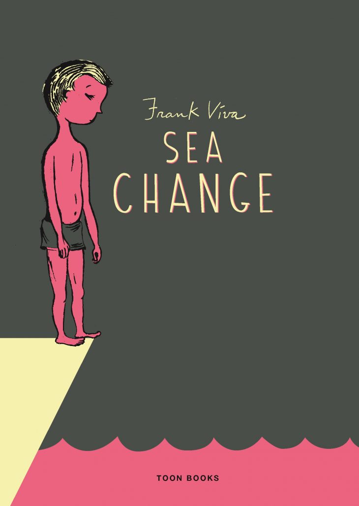
Sea Change is aimed at an older audience and isn’t technically comics, though an argument can be made that it is a graphic novel. Sea Change is a book where the illustrations are integrated with the text, words are spelled out in the artwork, and typography is important. Sea Change tells the story of a young boy named Eliot who is sent to spend the summer with relatives in a small oceanside community.
Frank Viva will be appearing at the Museum of the City of New York on July 12 at 6:30 pm. He’ll be in conversation with Francoise Mouly, his editor at The New Yorker and at TOON Books. To give you a taste of what you’ll hear at his talk, The Comics Beat recently sat down with Viva to discuss his career.
Alex Dueben: People might recognize your work from your picture books or from the covers that you do for The New Yorker. You run a design firm, Viva & Company– is most of your work design?
Frank Viva: I have switched back and forth between graphic design and illustration pretty much all my career. In the early days after college I did a lot of magazine illustration, mostly here in Toronto but in New York as well. I did a few years of graphic design and switched back and now mainly overlap. I work where I can when the two things meet. That is why I got very interested in doing books because for all the books I’ve done so far I’ve been able to design them and get into the typography as well as illustrate and write and bring all those threads together when it comes to books.
Dueben: Your first book was Along a Long Road. Since then, you’ve been coming out with books pretty regularly.
I’ve slowed down a bit recently because I did three that overlapped and I found it a little too much, but I’ve got three on deck again so I spoke too soon. I’ll probably be right back in it again. [laughs] I have taken a few months to collect myself.
Dueben: This is the second book you did at TOON Books. How did you start working with them?
Viva: My recollection is that I was working on a book about aliens. By that time we had worked together at The New Yorker and I knew about TOON Books. We had lunch and her daughter Nadja was there and I talked about a trip to Antarctica. What I’ve heard from Francoise and Nadja since then is that I talked about it as such a great moment in my life that shortly afterwards they said, that’s your book. Let’s do a book about Antarctica. And so that’s what set us off on that course.
Dueben: Sea Change is aimed at older readers than your other books, it’s a longer narrative; it’s a different kind of project for you.
Viva: At the studio here I do a lot of writing for our clients. One of our clients is La Creuset that French cookware company. I do a lot of the writing for that account and others and so in one way or another over the past 35 years I’ve been illustrating, designing and writing. As I hinted at before, I’ve tried to find ways to intimately combine those things. That was the thinking for Sea Change. I enjoy writing, I enjoy illustrating and I enjoy designing–how can I find a way to have those three things connect intimately somehow? That was the problem I was trying to solve with Sea Change.
Dueben: The book is set in this remote town, Point Aconi, Nova Scotia, and you mentioned in the end that you spent summers then when you were a kid. Did the book come from your experiences there?
Viva: I did. The place is not fictional, but the story and the characters are fictional. I guess there’s a little bit of Eliot in me. I didn’t have as much dread about it as Eliot does, but a little, I guess. He’s a little grumpier and feistier than me, I think. Other than that, the arc of the plot is completely made up. There are aspects of some of the kids I met, I’m sure, but nothing like what happens in the book ever happened to me. It was pretty lighthearted the summers I spent.
Dueben: Did you have a sense of the shape of the story when you started? Did you know that this would be a longer book?
Viva: I wasn’t sure how long. I was just trying to put myself in the head of my twelve year old self and write from that perspective. That way I thought I’d avoid the trap of pandering to the audience or underestimating them. I wasn’t thinking about the way bookstores and publishers divide things up between young adult and middle grade and things like that. I thought it would end up being aimed at the age of the protagonist.
Dueben: Because this is longer and different from your previous books, did you know right away how it would look, or did that come later?
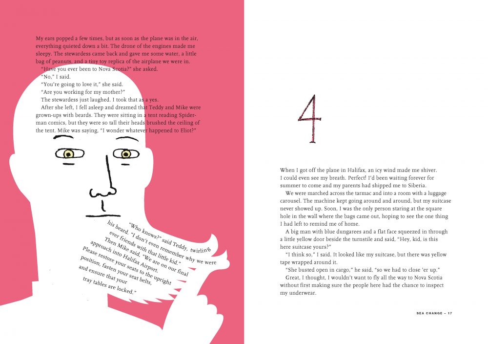
Viva: An important part of design is typography so I wondered if there was a lot of words whether I could integrate the typography into the illustrations at the stage where it was being designed. There’s this quite intimate connection between the illustrations and the typography in a way that potentially could help a reader. I wasn’t the best reader in the world when I was a kid, and I wanted to use the illustrations and the design in a way it could help punctuate the meaning of the words that are in the book. Use the type in a way that helped with that process. But also just integrating everything–pictures, words and typography. That’s what I set out to do.
Dueben: You made a previous book with TOON, A Trip to the Bottom of the World with Mouse. At what stage did you start working with them on Sea Change?
Viva: I did show it to one of the other publishers I worked with, but it was heading in a direction that didn’t feel right and so I stopped that. I had written maybe a chapter or two and some sample illustrations showing how the illustrations could connect with the typography. Francoise was in town for TCAF and came by the studio and I showed it to her. My recollection of it was her saying, “let’s do this.” However, I think she probably had reservations because I think that while it fits into the TOON lineup pretty well, it’s also a little different.
Dueben: I can see her going, this looks fun, let’s do it, and we’ll figure out all those details later.
Viva: [laughs] She’s said to me on several occasions that she doesn’t really want to be doing what other book publishers are doing. Why should I? There’s lots of them out there doing that. Let’s try some new stuff. That is her attitude. She loves experimentation.
Dueben: I asked when you brought the book to them because it does require the publisher to know what’s involved and be interested in thinking about the book in those terms from the start.
Viva: Yeah, it wasn’t the easiest thing, even with a few samples, to describe, but Francoise is pretty rare in my experience and I think she really got it. The picture she had in her head and the picture I had in my head were in perfect alignment on that meeting during TCAF. That was my sense. I think she knew exactly what I was talking about without a lot of evidence. We were setting off on the same path together with some of the same ideas.
She really helped shape the story. Again this was my first attempt, not at writing, but doing a fictional story and she was very helpful in a lot of ways at all stages. Helping to shape the thing and fussing over pacing and all the things that an editor would bring to the table. It’s all wrapped up together with Francoise; she’s editing text and thinking about the top level things but also fussing about design and illustration. We both overlap in those areas, I think.
Dueben: She’s rare in that she can think about narrative in a way that a lot of art editors can’t and can think about art and design in a way a lot of editors can’t.
Viva: I think she’s one of the best in the world at understanding how words and pictures can share in the narrative. That’s how I think of comics and children’s picture books. I don’t want the illustrations to simply be repeating what the text is saying. I want both of them to work at telling the story. I want to let an illustration to do what words can’t and let the words do what an illustration can’t. That was at the heart of Sea Change as well.
Dueben: You mentioned earlier that you had trouble describing the book. How do you describe it? Have you found a way?
Viva: In terms of the storyline?
Dueben: I think the storyline is pretty straight forward, but describing the experience of the book.
Viva: I have heard what all the reviewers have said and there have been a lot of ways of attempting to describe what it is. People have used phrases like concrete poetry. One reviewer said it was a graphic novel in the truest sense. I know that a lot of people who do graphic novels hate that term, but I think it’s an appropriate term for Sea Change. The bones that it’s built on, the design and typography, are from the traditional novel, but the graphics are integrated into the novel. I described it once to Francoise as if comics hadn’t been invented or maybe if somebody tried to integrate words and illustration in an intimate way, this might have been a first attempt. It’s like a fake artifact almost, if that makes any sense.
Dueben: We don’t see many books like this because comics have their own language, but every now and again an illustrated book that owes something to picture books comes out. I can’t help but think that if you did this in a picture book, I don’t think people would be shocked the way that they are for a longer story like this.
Viva: I suppose so. I think with a forty page kids book there might be some parents out there who might be dismayed at the amount of text. They would expect far less text in a picture book, but that’s a great idea. I might do that. I got this very lovely picture in my head as you described that. [laughs]
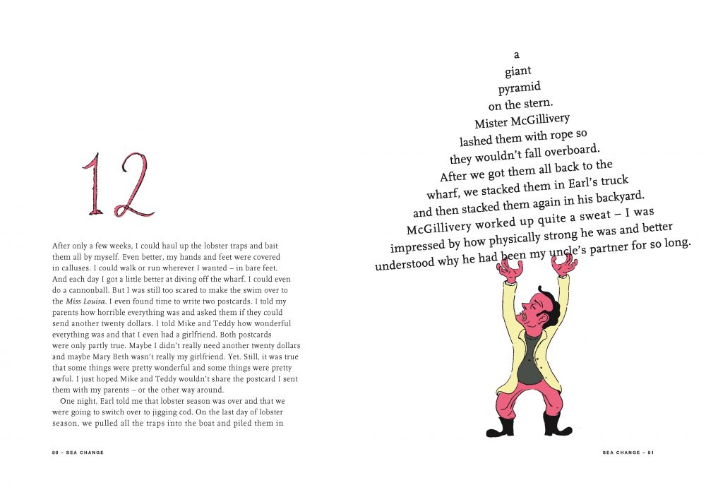
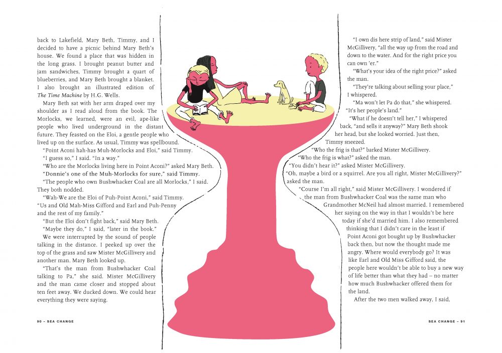
Dueben: You really try to integrate the illustrations in many different ways. There’s a two page spread where a line of fishes goes from the bottom of the left page to the top of the right and of course one reads the left page and our eye follows the text on the line to the top of the next, but the scene those pages depict is on the ship while they’re fishing so it literally is the background of the scene.
Viva: I try to. I was trying to be very conscious of legibility, but also thinking it would fun for a 12 year old to engage in a little bit of Where’s Waldo with the words. There’s one page in the book where two kids are looking up at the night sky and the words and the letters are the stars. That’s a little bit more difficult to read than I would normally do, but I thought, no this is fun. It’s almost a little bit of a puzzle within the book.
Dueben: And there are some interesting typographical moments like Mabel’s curly hair forms letters. The scene where Mary Beth kisses Eliot.
Viva: A few people have mentioned that one.
Dueben: How did you decide on the color scheme for the book?
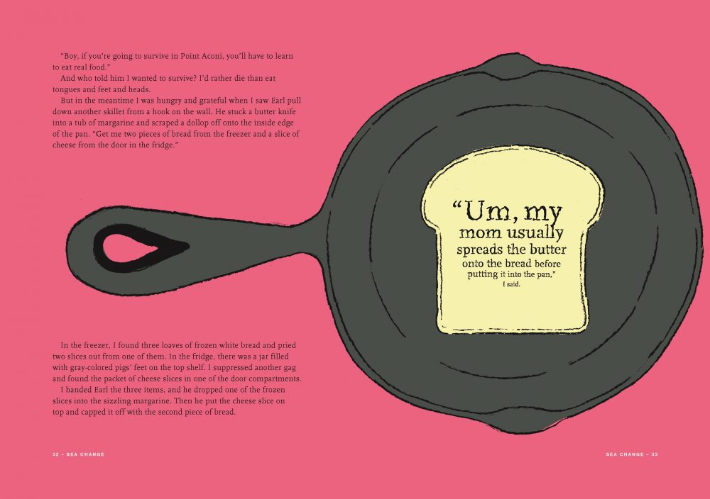
Viva: I tried a few different things and just ended up there. There’s only three colors plus black. There were technically issues like I needed a darker color and a lighter color and a medium color because every illustration in the book could only partake of those colors. I just sort of fell upon this particular color palate. It felt modern but the dark green reminded me a little bit of Nova Scotia and the trim on the houses out there. I thought it was kind of unique.
Dueben: The colors feels natural, but also a little off, which helps with Eliot’s sense of displacement.
Viva: Yeah, there’s a slightly sickening thing going on with the pink. The other interesting thing about the way this book is produced and that all the kids books I’ve done have been produced this way is that it’s using special colors to print with. If you looked through a loup you wouldn’t see any dots because the inks are physically mixed like ink and then applied so there’s a richness to the color that you don’t get with a CMYK separated dot reproduction. Nobody has picked up on that. It’s pretty technical. [laughs]
Dueben: You mentioned that you’re in the midst of three different books right now?
Viva: Well, starting up three books. I’m attempting to do an adult fiction novel at the moment. I’ve got another children’s picture book underway for a New York publisher about Keith Haring. I’m doing a book for the Museum of Modern Art. It’s a followup to a book that I did for them a couple years back called Young Frank Architect. They’re holding a large retrospective of Frank Lloyd Wright’s work and so the book will come out the same time that that happens.


Interview for series of great covers new york magazines.Its a nice article for all.So thanks mostly share for this content…….
Comments are closed.