
This week the Wednesday Comics Reviews team tackles a light week that is headlined by the Alan Moore riff, Whatever Happen to Crimson Justice? #1. We also look ahead at new titles eligible for pre-order, including Benjamin #1, and Star Trek: Red Shirts #1. Plus, as always, The Prog Report!
 Whatever Happened to Crimson Justice? #1
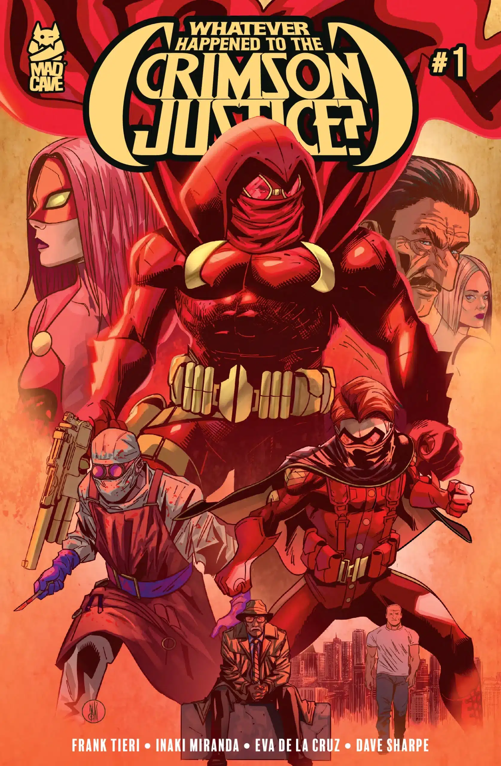
Writer: Frank Tieri
Art: Inaki Miranda
Colors: Eva de la Cruz
Letters: Dave Sharpe
Publisher: Mad Cave Studios
Review by Clyde Hall
If you’ve ever read the seminal Alan Moore two-issue wrap to Superman’s Silver Age era, 1986’s “Whatever Happened to the Man of Tomorrow?”, and wondered how Batman might fare given a similar treatment, wonder no more.
In a manner mirroring how Moore took even the most Comics Code-approved themes of that Superman period, examined them through a more mature, finite lens, and carefully placed them aside as new iterations of the Man of Steel began, writer Frank Tieri attempts a similar Dark Knight analog with the first issue of this 5-issue miniseries.
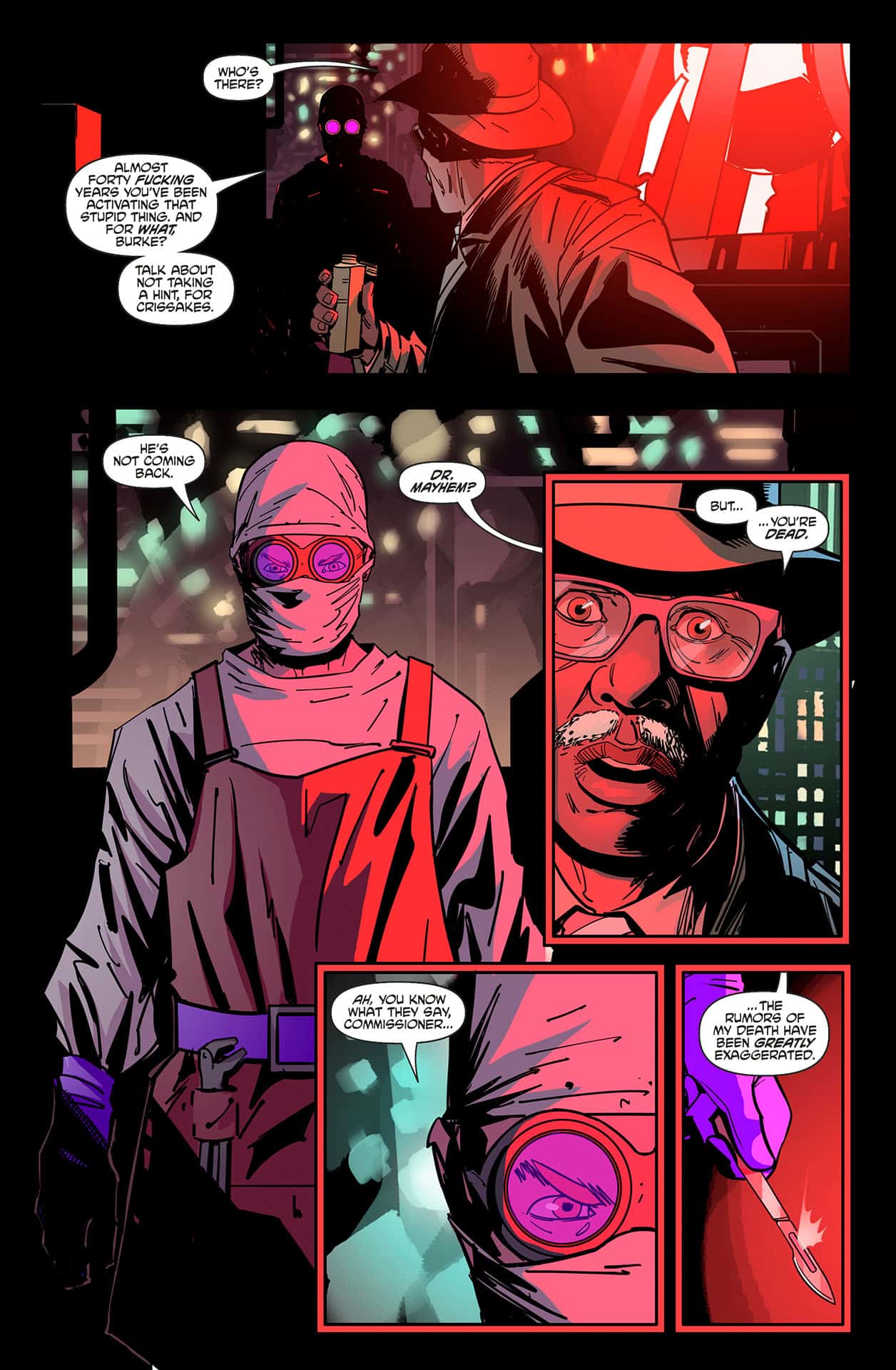
Once, Gotham City was watched over by a frightening vigilante, a creature of the night who made criminal predators his prey. The Batman inspired others to similar feats of heroism in the cause of justice and trained younger generations to carry on the battle he began. Cut now to Empire City, where all these same feats were performed by a masked vigilante called the Crimson Justice.
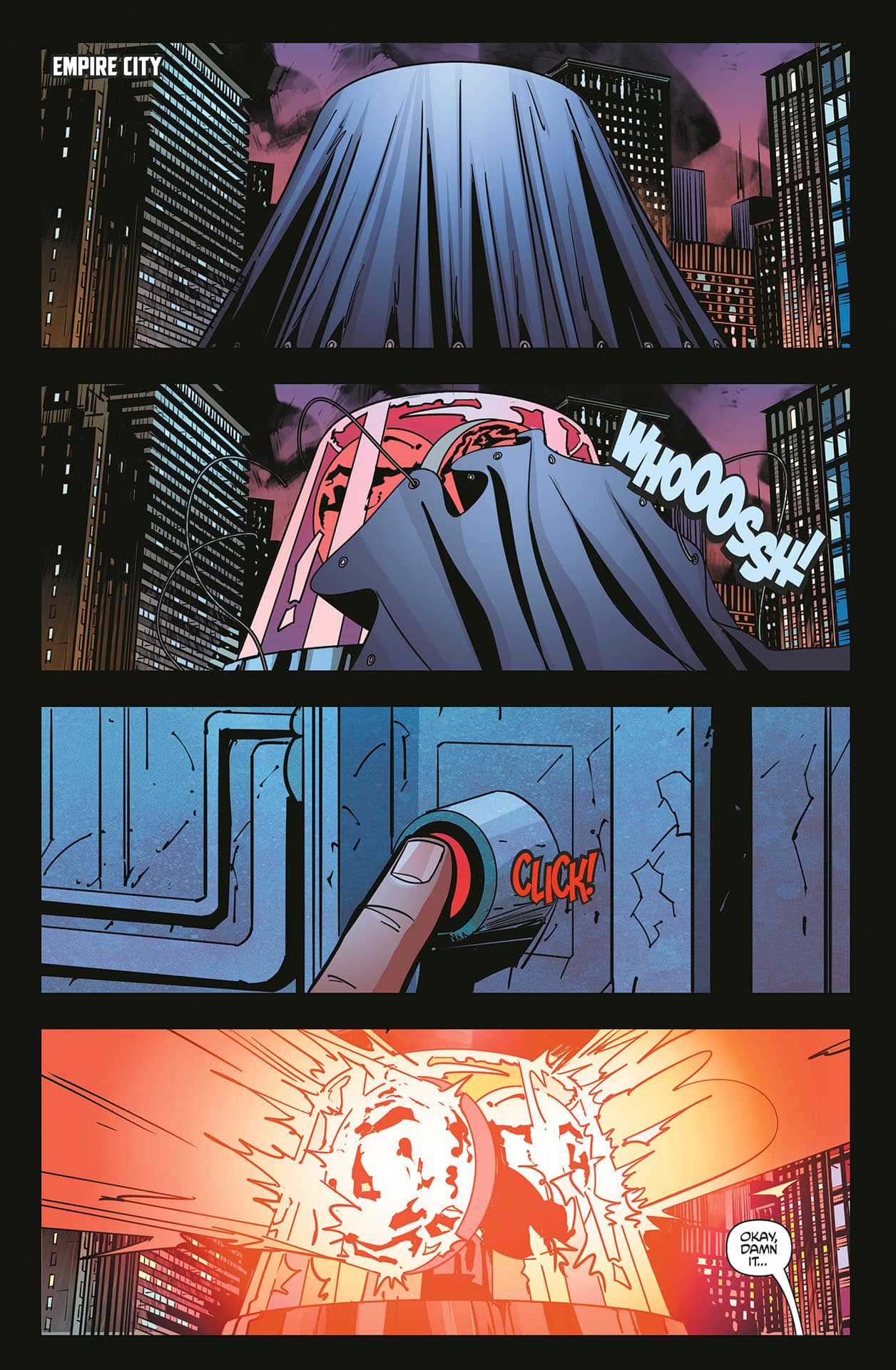
But that was nearly forty years before our story begins when the superhero and his wards Reddy and Scarlet Girl disappeared following a tragic hospital fire which not only apparently claimed their lives, but that of their greatest nemesis, Dr. Mayhem. In the years since, those masked men and women who once fought crime alongside Crimson Justice have met tragic ends of varying degrees. Meanwhile, Empire City has become a vice-infested corpse of its former self.
A few remember the glory days when, “Justice runs red!” made scofflaw blood freeze and brought hope to the urban masses. One of them is Willie, a wannabe writer researching the legendary exploits of the vigilante for his great American novel. Another is John, owner and short order cook of John’s Coffee Shop, although being the eldest of the two, he finds all the stories big on legend and short on fact.
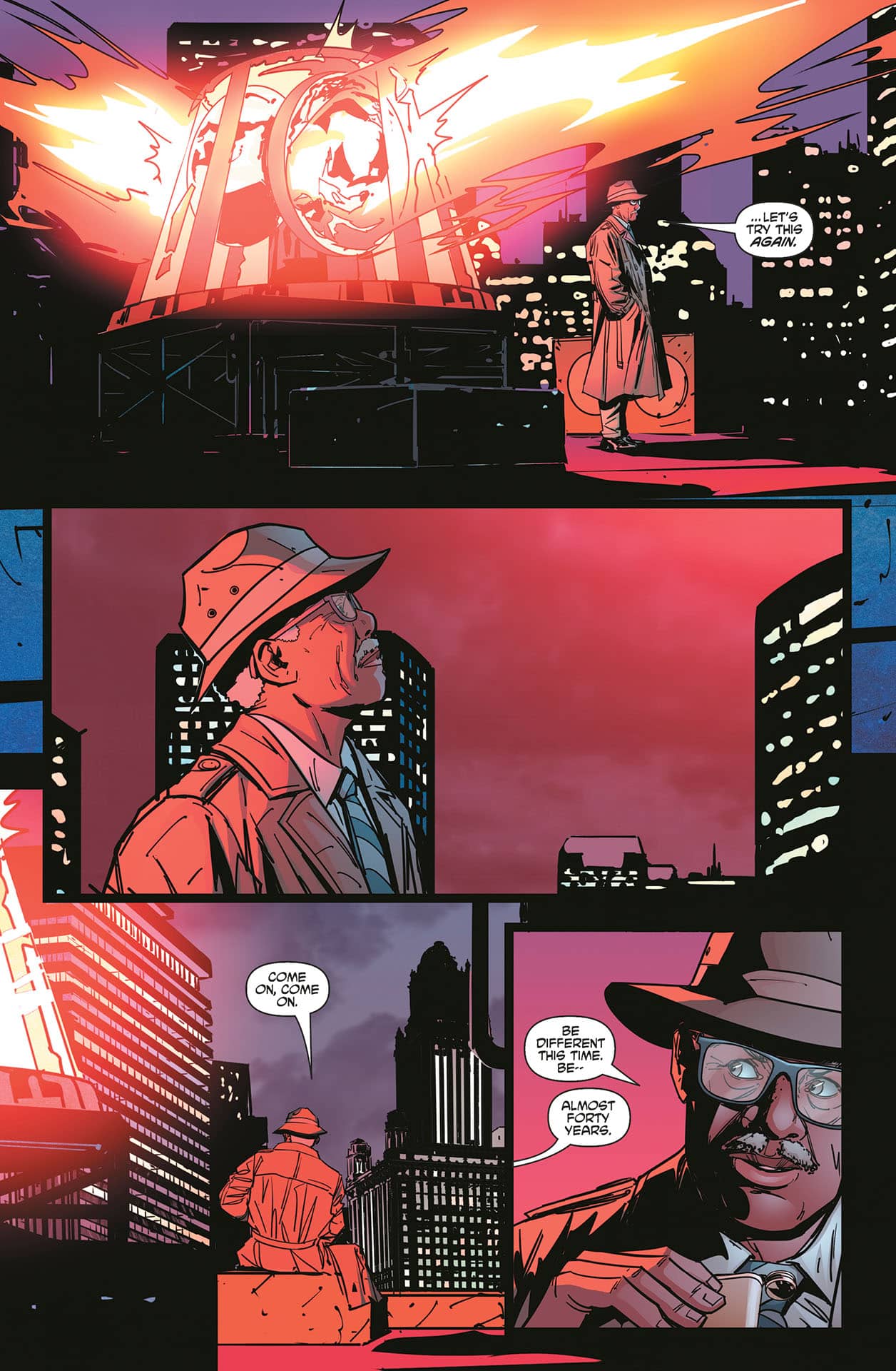
Until, that is, the sudden return of Dr. Mayhem and his murder of Police Commissioner Ted Burke. The crime suddenly brings the city’s focus back to the events of the Great Hospital Fire of ’85 and the exploits of the mysterious crimefighter long thought deceased. It’s that moment when Tieri begins applying a mature, finite lens to this melodramatic, Batman-like narrative and shows how, even in comic book stories, there are fates worse than dying outright for a cause.
True, DC has explored similar avenues in works like The Killing Joke but Tieri should have the benefit of freedom exploring avenues even the Black Label imprint would shy away from. We definitely get a peek at this grittier, seamier side of Empire in the first issue. As well, the matter of what sort of existence a masked vigilante might endure if forced into being only his secret identity, not his true self, is made ready for dissection. Under PTSD and severe trauma, could even the most dedicated crimefighter, the individual who is more the mask than the civilian beneath it, have a normal life once his existence is effectively halved? And if so, how?
The concept has promise and the first issue locks readers into finding out more regarding what happened in ’85 and how ghosts of that urban tragedy have risen red and wriggling four decades later. Inaki Miranda’s art certainly helps bring both the stalwart days of Empire and its seedy present into sharp focus. He has the talent for giving young followers of Crimson Justice a twinkle behind the mask, a grin beneath the cowl one panel, and a dead-eyed stare of timeworn, extinct hope the next.
The launch of Whatever Happened to the Crimson Justice should lock Batman fans open to exploring the possibilities of how far their Bat-Fam could fall if Gotham was a little more like the real world and their heroes more mortal than superheroic. Based on where the trail blazed by the creative team in the first chapter leads, it may bring uncomfortable seat-squirming for some. But if a vision of what failure and the clay feet of even legendary heroes might look like is something which interests you, this is a title you shouldn’t pass up. And chances are it’s going to spark comic shop talk among mature readers.
 Ghostbusters – Dead Man’s Chest #1

Writer: David M. Booher
Artist: Aviv Or
Colorist: Cris Peter
Letterer: Comicraft’s Jimmy Betancourt
Publisher: Dark Horse Comics
Review by Jordan Jennings
Set following the events of Ghostbusters: Frozen Empire, Ghostbusters: Dead Man’s Chest #1 showcases how the Spangler family is adapting to fame in New York City, which is best described as rough. On top of adjusting to new found celebrity, the gang has to deal with a Pirate ghost, which promises to be even more challenging than before.
Writer David M. Booher delivers a perfectly fine story, even if it isn’t exactly remarkable. I will be upfront and say, I haven’t watched the two most recent Ghostbusters movies. They just aren’t for me, but this issue avoids some of the intentionally saccharine nostalgia that the movies evoke. Booher introduces the cast of characters fairly well, but unless you have a passing familiarity with the movies, some of the cast will feel like blank slates. The plot is fairly rote in design with an introduction fighting an unrelated ghost, seeing the family go through their day, and ending with a stinger of the pirate ghost teased by the series title. It’s effective,but isn’t exciting.
The only real thing that was interesting was Phoebe’s new friend Sammy. There is something more to the character than there is on the page. I am curious to see what is up with them. I have my theories but I don’t want to get ahead of the book. If my thoughts bear out, I think this would be a welcomed addition to the Ghostbusters family.
I really appreciated that the art by Aviv Or is highly stylized and animated in design. It gives the comic a bit of life while retaining some of the likeness of the actors. The character work comes at the expense of backgrounds but that’s fine as the focus is where it needs to be for a story like this. The colors by Cris Peter are solid and vibrant. They ghost have the eerie otherworldly color which helps make them feel like they are from beyond the grave.
At the end of the day, Ghostbusters: Dead Man’s Chest #1 is an okay comic but it didn’t excite me. It is perfectly acceptable and there’s a nugget of something here that could be good, but as it stands, this book is a PASS.
Rapid Wednesday Comics Reviews
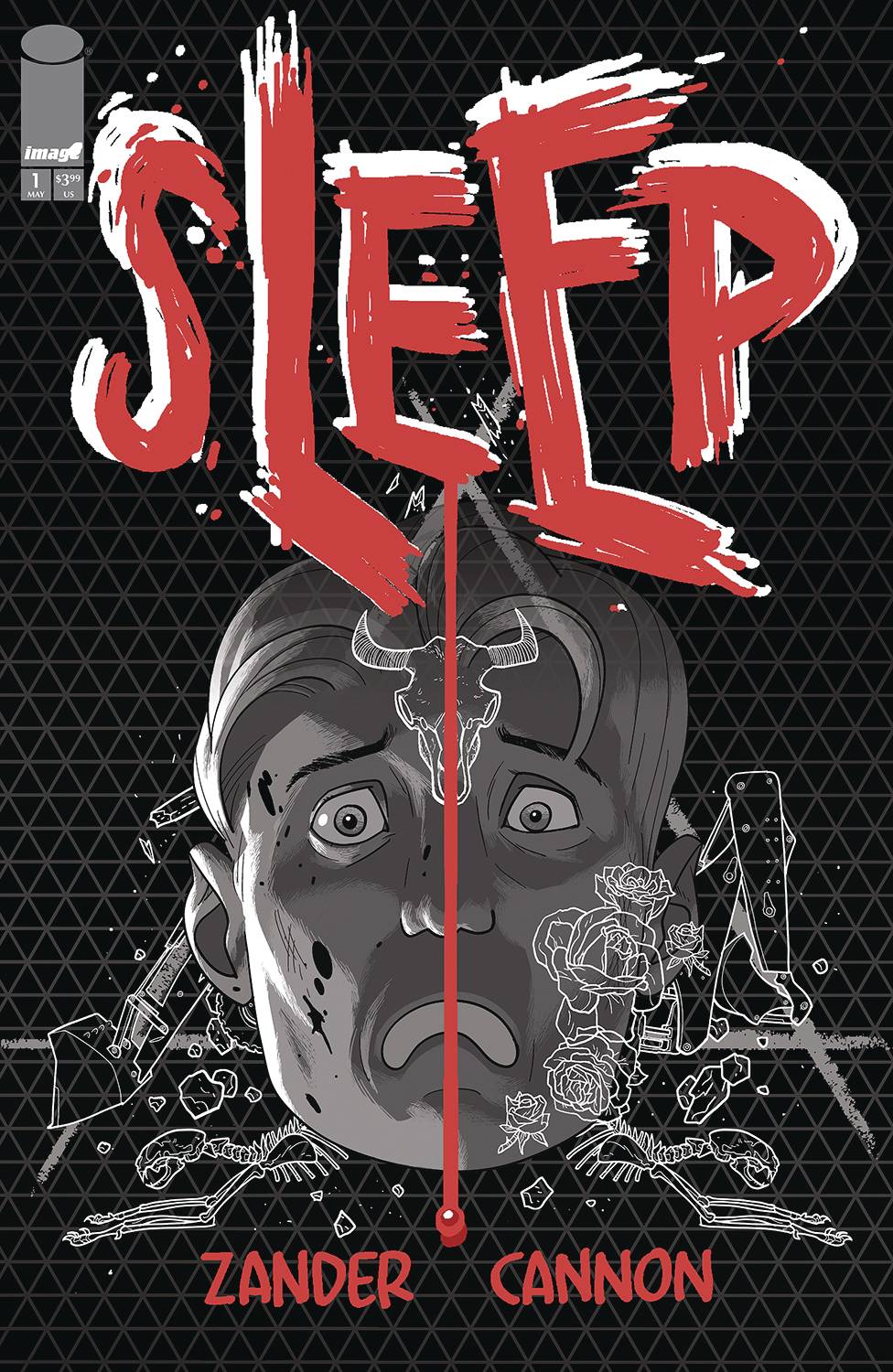
- Sleep #1 (Image Comics): Zander Cannon, best known for his work on the cult favorite story of the monster prison island Kaijumax, is back with a new offbeat horror mystery series. This first issue is a slow burn, an introduction to a small, quiet town and its unassuming inhabitants who are being haunted in the evening hours by something…monstrous. But our lead, Jonathan is completely unaware of the loud cries in the night. He awakens at the start of the issue, his house a mess, his cat missing, completely oblivious. Cannon’s art, all gray scale save for a pop of red here and there on various objects and small details on each page, sets the tone right away. The artwork is cartoony but the grayscale and pacing give a Lynchian discomfort. Things are too tranquil here, it is at odds with the moody noir monochrome. The small red detailing is a jolt of contrast that makes you question every item that appears in color. What do they mean? What message do they send? The religious imagery and Jonathan’s relationship to his church even as the horrors creep in around the edges, the mundane every day routines that these characters carry on, make the hints of the macabre all the more eerie. You could read this book and come away, unfairly, feeling that nothing happened. But Cannon is laying groundwork and backstory to an unfolding mystery about the dark nature of this too-perfect little hamlet and its people. The final page makes clear that this peace won’t last long, and that revelations will not be far behind. —Tim Rooney
FOC Watch
These books are available for pre-order now.
Benjamin #1

Writer: Ben H. Winters
Art: Leomacs
Colors: Luca Bertelè
Letterer: Becca Carey
Publisher: Oni Press
Publication Date: June 18, 2025
Review by Javier Perez
There is a very easy pitfall that a writer can fall into when creating a story with a character based on a recognizable influence. To avoid that pitfall, a story must navigate the very thin line between a successful homage and a knockoff that repeats the original work. Benjamin #1 by writer Ben H. Winters and artist Leomacs not only walks that line perfectly, it sprints to the other side and dares readers to keep up.
Benjamin #1 is a love letter to Philip K. Dick, which on its own would be enough for me to be interested as someone who read many of his books in my teens. What really makes Benjamin special, though, is the book’s willingness to not always flatter our main character. It’s refreshing to have an honest talk about these famous writers. Everyone has heard “never meet your idols” and what Winters and Leomacs are doing in this book is a special riff on that idea.
In the first issue, we meet Benjamin Carp, a science fiction writer who wrote a ton of novels in the ’70s, died in the ’80s, and then wakes up with no memory of how or why he got to a dingy motel room in Los Angeles in 2025. Carp is brash, egotistical and honestly kind of awful to everyone around him. He’s a man out of time, and the tension between modern sensibilities and Carp’s lack of restraint is incredibly funny. The dialogue is snappy, with a real humor to it, and the set up is elevated by questions of consciousness. This comic is a mystery story where the question is Why am I here? How did this happen? Is Carp living a plot in one of his novels?
As a writer, Winters is no stranger to work on television and film, and to me Benjamin #1 feels like an excellent pilot episode of a brilliant new show. It’s got heart, laughs, and enough of that classic pulp fiction to easily keep readers around. I can’t stand having to wait for the next issue (this is the binge streaming age, after all), but that’s a good problem to have.
Star Trek: Red Shirts #1

Writer: Christopher Cantwell
Artist: Megan Levins
Colorist: Charlie Kirchoff
Letterer: Jodie Troutman
Publisher: IDW Publishing
Publication Date: July 16, 2025
Review by Avery Kaplan
It’s one of the Franchise’s longest running jokes: don’t be an unnamed red shirt on an away mission, or you may find yourself dead (in order to raise the stakes for the named characters). But in Star Trek: Red Shirts #1, the titular cannon fodder takes center stage.
It’s sort of like a grim twist on Star Trek: Lower Decks. Written by Christopher Cantwell with art by Megan Levins, colors by Charlie Kirchoff, letters by Jodie Troutman and design & production by Neil Uyetake, Red Shirts #1 is a promising overture for the premise. The inaugural issue opens with an arresting splash page depicting a Mugato attack…and that isn’t the only gory fate to befall a Starfleet officer in these first twenty pages.
As you might expect for a book like this, there is a large roster of characters; a two-page dramatis personae included in the back of the issue is a welcome inclusion. Plus, it’s a huge perk to have an all-new, all-different cast of Star Trek comic characters. And no, you can’t expect everyone to survive even this first issue…it is called Red Shirts, after all!
Levins delivers some excellent art, while Kirchoff keeps the colors on the darker side (which suits the title’s mood). And as ever, Troutman’s lettering is thoughtful and well-executed. Whether or not this miniseries will fulfill its potential or not remains to be seen. However, there is plenty of potential here, so you’ll want to be sure and pick up the first issue and follow the series for yourself. Red Shirts #1 will be available at your LCS on July 16th, 2025, so call and let them know you want a copy now.
The Prog Report
 2000AD 2433 (Rebellion Publishing): I never thought I’d feel deeply sympathetic for a burning-alive vampire queen figure in the middle of a sci-fi war, but here we are today with Silver — Book Two; Perfidious, by writer Mike Carroll, artist Joe Currie, and letterer Simon Bowland. Perhaps more surprising is that the feeling of sympathy comes within the context of a high-concept sci-fi story that has suddenly started to feel like a very-personal exploration of the complex relationship and history between two characters. But that’s what makes Silver so excellent, I think: it’s top-tier comics art mixed with a sense of unpredictability. Very well done. This week’s cover (above) is by Colin MacNeil. As always, you can pick up a digital copy of The Prog here. —Zack Quaintance

This column is compiled and edited by The Beat’s reviews editor, Zack Quaintance. Read past entries in the weekly Wednesday Comics reviews series!
Next week, we look at Dark Honor #1 from the excellent Image Comics Syzygy imprint, plus the spooky noir Los Monstrous #1, and much more!


