Over the holidays, I had a chance to catch up with all of the Ignition Press releases to date — and I’m happy to report that these books were some of the most exciting comics I’ve read in a long while.
In fact, I liked what I read so much, that I sent a call out to our crack team of Wednesday Comics Reviewers, igniting (heh) the column you’re reading today, which is a look at every comic Ignition has published so far. So yes, below you will find reviews of all of the #1 issues from Ignition Press, many with context from having read coming issues.
And if you hadn’t heard, Ignition Press is a new publisher that debuted last year, masterminded by a trio of comics vets: Filip Sablik, Jamie S. Rich, and Jeremy Haun. You can learn more about the company here. Enjoy! —Zack Quaintance
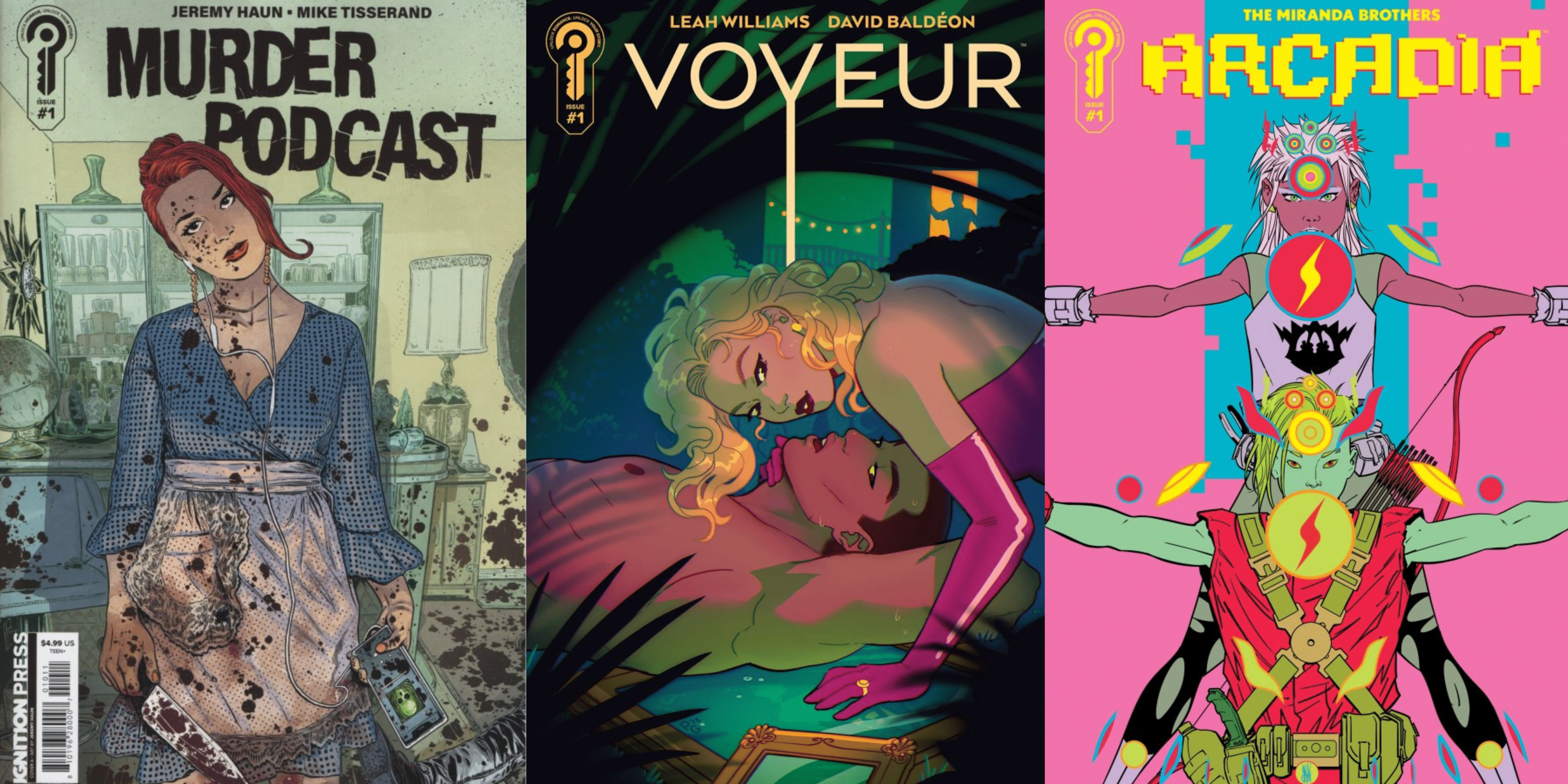
 Murder Podcast #1
Writer: Jeremy Haun
Art: Mike Tisserand
Colors: Nick Filardi
Letters: AndWorld Design
Review by Clyde Hall
It’s been a good long while since I opened a comic book and found characters I know in real life. As real in execution as the world around us. Real in good ways, bad ways, funny ways, sad ways, but nonetheless real-to-life ways and navigating beside us in a post-pandemic, socioeconomically challenging world. Then along comes a title like Murder Podcast. Because the creators have often worked in more escapist, even capes and cowls, comic book terrain, their level of realism here blindsided me in the very best ways.
In the opening issue, a follower of popular true crime podcast ‘Kill, Killers, Killing’ finds a new app offering on her phone, ‘Dead Sounds’. No doubt the all-knowing algorithm has assessed her taste in entertainment and chosen this as being of interest, right? Why wouldn’t she give a listen? You would. I would. But in this case, doing so leads to an unexpected lethal rampage worthy of the Winter Soldier post-“Longing. Rusted, etc.”.
Enter a closeknit group of young friends who also follow ‘Kill, Killers, Killing’ and other true crime podcasts for interesting conversation fodder when they all get together. It’s an interesting, eclectic gathering of personalities and professions, the kinds you’d imagine could bring considerable variety in sharing analysis of any cold case files. And they very quickly become involved with the ‘Dead Sounds’ murder spree phenomenon.
The concept tracks easily enough. If people known for listening to murder podcasts suddenly went on killing sprees, conventional wisdom would blame their entertainment choices. Which may be as baseless as the Satanic Panic, but easier than finding out who’s really responsible and how. Add in a very public Missing Persons case and dangling plot threads regarding the relationship backgrounds of our protagonist pool, and the first issue reads slick and spartan, sliding you right along into readiness for the next installment.
This includes a section some might consider an info dump on five main characters. At least that’s how it hit me at first. But writer Jeremy Haun craftily folds it into a larger selection of more layered exposition through insightful conversation. It’s just the right approach. As well as meeting the necessary need for quickly sketching out so many characters, their dialogue brilliantly reinforces how each one is exactly who we’re told they are. Which, done in this manner, crafts them into smart and capable young adults working out their places in a world still recovering from the traumatic years they came of age in. It makes for a fascinatingly relatable cast.
Last year I joined a local horror book club consisting of younger readers, and some of them are very into true crime presentations. They sound like Haun’s characters. Enough so, I was mentally connecting who was our group’s equivalents from his cast. Their turns of phrase and expressions mirror one another, and so do their ongoing concerns outside the safety of our horror fan discussion group. The writing in the first issue taps the pulse of such youthful worldviews now, then introduces a mysterious murder plague begging to be solved. Who better than clever young minds already attuned to true crime podcasts? The only question is whether they’ll survive or become victims before the storyline concludes. And by the final panel, the creative team’s given us reasons to care which happens.
The art from Mike Tisserand and color artist Nick Filardi reinforces the book’s spartan approach. Tisserand’s faces hint at the roiling concerns underneath even when the characters share lighthearted moments. He shows them making barely surviving look like thriving, and how none of the friends are entirely convinced at how well they represent. And without losing a beat, these mostly straightforward presentations switch to scenes of murder sprees in progress. The panels rarely change in angle or dimensions, granting an eerie everyday veneer whether the scene’s about grabbing a coffee or decapitating a loved one. Joined with a washed out, artificial lighting color palette from Filardi, the visuals combine for a tense, uncertain undercurrent which amplifies the book’s atmosphere of apprehension.
For fans of true crime facts or rue morgue fictions, Murder Podcast is a safe bet. More, it’s so well realized in execution, readers outside either of those genres will still be hard pressed not to appreciate what the creators have accomplished. And that’s a comic book murder mystery populated with people you probably know, set in a weary world you’ll definitely recognize as the one outside your window, in a story just bizarre enough, twisted enough, to be a news headline.
 Arcadia #1
Writers: Inaki Miranda & Roy Miranda
Artist: Inaki Miranda
Colorist: Eva de la Cruz
Letterer: Dave Sharpe
Review by Tim Rooney
 Deluge #1
Writer: Cullen Bunn
Artist: Marika Cresta
Colorist: Ronda Pattison
Letterer: Andworld Design
Review by Ricardo Serrano Denis
At first glance, Deluge looks like a mess of ideas that were put in a blender with the hope that something usable came out of it. A flooded woman’s prison, stranded convicts, and a snake-like creature swimming around all sound like hail Mary passes thrown in succession on the last few plays of the fourth quarter, all the way down from midfield. The thing about those types of passes, when they connect they make for memorable moments that get talked about long after the game ends.
All of this to say that Cullen Bunn and Marika Cresta managed to successfully make the play, making Deluge one of the most promising horror comics of 2026.
The story opens to hard rain. We’re in the Sieverville Correctional Prison for Women. A new nurse is starting her first shift there, meeting the women she’ll be treating while there. Suddenly, a nearby river breaks through the levees that were holding it back. The walls of the prison can’t hold the water back either, leading to the collapse of some of its walls. The river spills in, but something else comes in with it. Something slithery, fanged, and hungry. Then it’s a mad dash for survival with the chances stacked well against the prisoners.
Bunn excels at putting morally compromised characters in dangerous situations, much like Carpenter would in movies such as The Thing and Prince of Darkness. Clashes of personalities are just rich in storytelling possibilities. Bunn has the perfect cast of characters in this regard. By virtue of them being female prisoners, they’ll get judged by their crimes first and their personalities second. It helps that Bunn does not go light with their sins either. This allows for a deeper exploration of the characters and how they came to be in their current predicament.
Each of the main prisoners carries with them a serious conviction, and they’re not cases of mere theft or non-violent breaking and entering. These women have killed, dealt in heavy drugs, or conspired to murder multiple people. There’s an interesting play between innocence and guilt here, on whether the women might deserve what’s coming or not.
Cresta does an excellent job of portraying them as people not to be messed with, imbuing them with a sense of violence that makes each one come across as resourceful and independent. Special attention is paid to their facial expressions, making it easy to extract a lot of character from looks alone. There’s a darkness hiding behind each one that will make readers want to know more about their backstories.
Deluge #1 makes it clear the prisoners will have to work hard to earn our sympathy, which is where the creature comes in. There’s not much to go on regarding its brand of evil, but there’s certainly a degree of history behind its existence that hints at something that is not merely hunger and death. Just what this monster brings to the story other than a sense of unpredictability remains to be seen.
Ronda Pattison’s colors keep things grounded in reality in the beginning before expanding on the palette to allow for darker blues to inject fantasy horror into the mix. It works well to balance the roughness of the prison setting. The creature’s presence suggests an existential disturbance that turns the inside of the prison into something more than the sum of its parts, meaning its walls and hallways aren’t the solid and reliable structures they once were. They are now death traps for the prisoners to navigate.
Deluge #1 is the start of a terrifying new nightmare you won’t want wake up from. The setting, the characters, and the monster all fit together beautifully, setting up a story that puts the idea of freedom on unstable ground. The story seems concerned with the past things that define us and whether it’s possible to leave them behind. What’s freedom when there’s an aquatic snake creature waiting for you outside? Now it’s up to the remaining four issues to find new and inventive ways to flesh this out.
 Voyeur #1
Writer: Leah Williams
Artist: David Baldeon
Colors: Eva de la Cruz
Letterer: AndWorld Design
Review by Gianni Palumbo
With Ignition Press being a new publisher, it was crucial that the first wave of titles had interesting premises with exciting creators, and they definitely succeeded on that front. Voyeur was the one that immediately caught my eye when it was announced. Although historically hit or miss for me personally, Leah Williams and David Baldeon are a frequent writer/artist creative team (X-Factor, Power Girl), so I was interested to see another new series from them, especially one with an original idea.
Voyeur follows Rook, an art thief who doubles as the head of security at the Koh Kingfisher Thai resort, as he spies on and becomes obsessed with a mysterious and beautiful woman, Madeline. When she finds out Rook is not only spying on her but also what his real occupation is, she wants in.
This is a great first issue and overall an excellent set up for the whole series. It’s very much up my alley too. It’s a sexy thriller that touches on themes of parasocial relationships, and it offers up tense moments and great twists that keep the reader on the edge of their seat. As a massive cinephile, the set up reminds me of Hitchcock films like North by Northwest and To Catch a Thief, and the films of Brian de Palma with its erotic and somewhat psychosexual nature.
David Baldeon is the perfect artist for this series. I think he is the perfect collaborator with Leah Williams in general. His mix of hyperstylized and attractive characters, claustrophobic environments, and the multiple angles of Rook spying on Madeline are a match made in heaven for Williams’s sexy, tense, and thrilling script.
Overall, Voyeur #1 is a great set up, and I’m excited to see where Williams, Baldeon, and co. go with this sexy thriller series.
 The Beauty #1
Writers: Jeremy Haun and Jason A. Hurley
Artist: Emanuela Lupacchino
Colorist: Leonardo Paciarotti
Letterer: Andworld Design
Review by Jared Bird
Over the course of two years, an entirely new kind of sexually-transmitted disease has overrun the world; those infected shed excess fat, regrow hair, get more defined cheekbones, even get taller. It’s referred to as the beauty, and in a world already obsessed with beauty standards and the power of aesthetics, it causes utter mayhem. It may have deadly results, but who cares when you’re looking good?
Jeremy Haun and Jason A Hurley return to the series they began ten years ago at Image Comics for a brand-new relaunch under up-and-coming publisher Ignition Press. Now joined by artist Emanuela Lupacchino, it’s mostly a new beginning, following the same premise but not requiring any prior knowledge for readers before they begin. This new iteration follows Detectives Vaughn and Foster, who are investigating the first mysterious deaths of Beauty victims. What they find leads them into a world they never expected, a corrupt society of crooks and killers. The series utilises horror and mystery elements with a splash of ninjas, satire and spycraft in what makes for an interesting, albeit sometimes messy blend.
The writing by Haun and Hurley is good throughout. As someone mostly unfamiliar with their previous work together, they make for a strong writing team, for the most part presenting as one cohesive written voice. There are some moments that feel like two different people wrote them, namely some of the moments of witty banter and flirtation that often feel like a different book to what we’ve been reading, but for the most part they work together seamlessly as one voice. The story is consistently engaging and exciting and you’re never really able to pin down just quite where it goes next, yet every change in direction feels like it mostly makes sense for this world.
Lupacchino’s art is good throughout, very easy to read and conventionally ‘pretty’ in a way that makes sense in service to the book’s themes. It’s almost akin to the work of Terry Dodson, which I mean as a compliment, in that it harkens back to a certain widescreen style of the 2000s and early 2010s that has mostly fallen out of favour now. Her character expression work is good, and his panelling efficient, but sometimes I wish she took more risks artistically in order to lean into some of the books’ horror elements more; as is, it doesn’t feel as scary as it should be, really.
Overall, The Beauty #1 is a good start to a relaunching horror series, impeded slightly by some tonal problems and simply biting off a little more than it can chew at times. Everyone here is doing good work and the concept is absolutely fascinating, so I’m not surprised to see it return, because it feels like there are countless ways one can explore this premise. It’s coming to TV later this year as a series on FX, led by Ryan Murphy, so its relaunch feels justifiable and timely. The series is absolutely worth giving a shot before its upcoming adaptation.
 NO Place #1
Writer: Tim Seeley
Artist: Stefano Simeone
Letterer: Andworld Design
Review by Jordan Jennings
If you were to look over Ignition Press’ launch slate you will find a wide variety of comic genres being explored beyond the typical super hero or even horror comic fare. Case in point is Tim Seeley and Stefano Simeone’s fantasy deconstruction comic: NO Place. The story follows Mariposa Montiel, a young girl who has just returned from her fantastical journey to a far away land as their champion. She only thought she was away for a brief passage of time but in reality she was gone for three years. Mari struggles to live a normal life and the undue attention it has brought her. As a result of her notoriety and infamy, she has garnered the attention of Dorothy (Yes, that Dorothy) and Allen, members of The NO Place, which is actually an acronym for Nether Operations Place.
The series is a deconstruction of the outside champion fantasy trope ala Wizard of OZ or Chronicles of Narnia. The world Seeley and Simeone establish follows the pattern of a lot of similar fantasy deconstructions, but with a slight twist in execution. As the opening issues establish Mari’s past journey and the general trend of an Evil Witch and Monkeys, the series quickly finds a personal element in how Mari struggles in the normal world. Mari has just completed Heroes Journey and is ridiculed. Seeley’s characterization resonates with the human condition. Mari misses being SOMEBODY instead of the nobody she feels like. Where most fantasy deconstructions in this vein often lean into the dark aspect of being a child champion/ soldier, Seeley eschews the PTSD and instead focuses on that empty feeling of having essentially peaked as a child.
That is not to say the series isn’t dark, far from it. NO Place has horror elements throughout as we learn of the eldritch horror that is invading the realms and corrupting the fantastical worlds of Oz and more. NO Place presents the horror in a different flavor than other stories that deconstruct Oz. The series also appears to serve as a heroes second journey as we see early on Mari experiencing yet another call to action and crossing of the threshold, but there is still a ways to go for the series before we will know for sure.
The art by Simenone is lush in details and vibrant colors. The character models are very loose and animated allowing for Simenone to express a wide range of emotion which complements the human element of the story quite well. The fantastical moments of the NO Place or the various realms are truly otherworldly and I cannot imagine another artist reaching similar levels of expression. As much as the other realms are dreamlike, the horror elements are just as nightmarish. The eldritch horror and corruption of the realms is just repulsive in the best way and left me gasping at times.
As of writing, there have been three NO Place issues: The Cold Open as well as Issues #1 and #2. Issue #3 is due out in January and it promises to be something delightful. I highly recommend checking this series out. It’s a delight.
 Roots of Madness #1 – #4
Writer: Stephanie Williams
Artist: Letizia Cadonici
Colorist: Alessandro Santoro
Letterer: Andworld Design
Review by Khalid Johnson
Roots of Madness through its run has led Etta deeper down the rabbit hole so to speak. The seeds being planted by writer Stephanie Williams grow on the page with the art of Letizia Cadonici, colors by Alessandro Santoro and letters by Andworld Design.
I want to sing the praises of the whole team here for leaning into the appetite for Black historical fiction, the supernatural and honoring the significance of our cultural heritage, the roots that highlight the trauma and damaging effects of hair straighteners and the perseverance of a people having to survive and navigate a world and nation that feeds on our trauma. That connection to the flower and the idea of harnessing that for good is a poignant metaphor and metatextual element that I hope is only strengthened as the story progresses.
Etta’s fatal flaw is such a double edged sword because her pursuit is earnest as is the help that she seeks to provide to her community when afflicted by the effects of straighteners and chemicals, but she flies too close to the sun and learns secrets about herself and her family. Williams really nails the intrigue across this run and once we reach Cadonici’s stunning double-page spread in the fourth issue, it serves to blow things up, taking Etta deeper into mystery and the occult strangeness awaiting her.
We end with a cliffhanger but the set-up to that last page is so methodical and demonstrative of a masterful creative team that could hang weight on the seemingly mundane and the quiet of conversations before throwing you full force into a world with prophecy and thinning boundaries between worlds. This is one to pick up and a series to watch!
The Prog Report
2000AD 2464 (Rebellion Publishing): The headline for the first Prog of the year is that John Wagner is back writing Dredd to start the year, and he’s brought artist Mike Perkins along, as well as colorist Chris Blythe and letterer Annie Parkhouse. And this newest story picks up (almost) right where Wagner’s last work with Dredd left off — with the powers that be in Mega-City One revisiting their ban on machine judges. This first chapter is an intriguing one, reminding us what’s happening, why the robot judges would be helpful to the human judges, and ending with a decision on how and whether they’ll be used moving forward. Given that the title of this new story is Death of a Judge, I strongly suspect we haven’t yet scratched the surface of what will ultimately be the full scope of this one. The other very exciting thing for me in this week’s mag is part two of The Discarded, a new story by writer Peter Milligan, artist Kieran McKeown, colorist Jim Boswell, and letterer Simon Bowland. This is one of those comics that throws a good number of ingredients together — father-daughter relationships, activists vs conformist, a space landfill-cum-prison, and a computer chip that is maybe a symbiote of some kind — and part of the fun is in seeing whether or not the creators can get away with it and bring them together in a way that works. That’s part of the fun for me anyway, so I’m on bored with this one. This week’s cover (above) is by Mike Perkins. As always, you can pick up a digital copy of The Prog here. —Zack Quaintance
Column edited by Zack Quaintance.
Read past entries in the weekly Wednesday Comics reviews series or check-out our other reviews here!

 Murder Podcast #1
 Arcadia #1
 Deluge #1
 Voyeur #1
 The Beauty #1
 NO Place #1
 Roots of Madness #1 – #4
 2000AD 2464 (Rebellion Publishing): The headline for the first Prog of the year is that John Wagner is back writing Dredd to start the year, and he’s brought artist Mike Perkins along, as well as colorist Chris Blythe and letterer Annie Parkhouse. And this newest story picks up (almost) right where Wagner’s last work with Dredd left off — with the powers that be in Mega-City One revisiting their ban on machine judges. This first chapter is an intriguing one, reminding us what’s happening, why the robot judges would be helpful to the human judges, and ending with a decision on how and whether they’ll be used moving forward. Given that the title of this new story is Death of a Judge, I strongly suspect we haven’t yet scratched the surface of what will ultimately be the full scope of this one. The other very exciting thing for me in this week’s mag is part two of The Discarded, a new story by writer Peter Milligan, artist Kieran McKeown, colorist Jim Boswell, and letterer Simon Bowland. This is one of those comics that throws a good number of ingredients together — father-daughter relationships, activists vs conformist, a space landfill-cum-prison, and a computer chip that is maybe a symbiote of some kind — and part of the fun is in seeing whether or not the creators can get away with it and bring them together in a way that works. That’s part of the fun for me anyway, so I’m on bored with this one. This week’s cover (above) is by Mike Perkins. As always, you can pick up a digital copy of