This week’s main review is The Power Fantasy #1, an absolutely stunning new superhero comic that goes deep on philosophy, ethics, and consequences. Plus, the Wednesday Comics Team has its usual rundown of the new #1s, finales and other notable issues from non-Big 2 publishers, all of which you can find below … enjoy!
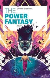
Writer: Kieron Gillen
Artist: Caspar Wijngaard
Letterer: Clayton Cowles
Designer: Rian Hughes
Publisher: Image Comics
Review by Jordan Jennings
When the superpower Heavy threatens to move his floating island of othered powered being over New York City, how will America respond to that threat? What are the geopolitical ramifications of these events? This is the world of The Power Fantasy. The new series from Kieron Gillen and Caspar Wijngaard that explores the nature of superpowers as a metaphor to being a nuclear state. The world laid out by Gillen and Wijngaard in this first issue is exhilarating and thought provoking in how it approaches the tried-and-true comic topic of “Superheroes in the Real World”.
Gillen is coming fresh off a multi-year stint at Marvel writing Eternals and Immortal X-men, and you can see those two series influences on the page in Power Fantasy. The story centers around the protagonist Mr. Lux as he deals with the logical and ethical conundrum of being one of the few Superpowers in the world. It is through Mr. Lux that Gillen builds the world around this nuclear superpower metaphor. There is an obvious ripple effect caused by the Nuclear Family and Atomics, and while we don’t see that on page just yet, there are moments of dialog that hints to this much larger world. The references to some event involving Tokyo and other past regrets happen naturally in dialog.
The Power Fantasy #1 avoids the common trope of using a montage of key historical events and how they are shaped by this world with superpowers and instead opts to let the key events play out organically. This is done by having the issue itself is set in two different time periods: 1966 and 1999. The two time periods do an excellent job showing the cause and effect of decisions made in the past affect the world later on and avoid hitting us over the head with it like the opening montage of the Watchmen movie.
Gillen’s worldbuilding is subtle and enticing. There are breadcrumbs strewn throughout the book that make you want to know more about this world but everything you need to know for the issue to work is all right here. It functions as a single issue but there is so much laid out in this first issue, you must read more.
Wijngaard’s art in this book is nothing short of amazing. The visual styles of the two different time periods is notably distinct but doesn’t dwell on the whole visual throwback to the time periods. Instead, the world of the 1960’s is much more vibrant and employs monochromatic color palettes on the panels to create very clear and emotional panels. While the pages set in the 1990s uses a color palette that is more saturated along with using far more greens instead of reds and blues. It is a small but distinct visual shift which helps set the eras apart. It is a common visual tool used by artist, but I am a sucker for it when done quite well.
The page layouts by Wijngaard are some of the bests I’ve seen in a comic this year. The way that Wijngaard controls the pacing of the story by changing the panel size and shape is wonderful, but the way he uses a circle-based panel is visually stunning. It is a perfect marriage of writing and comic art. The compositions of the panels themselves are equally great as Wijngaard plays around with negative space in visually interesting ways. This is a great looking comic.
Overall, while The Power Fantasy #1 plays in familiar territory of something like the Watchmen or The Boys, it does so in a much more novel approach. It doesn’t have that pessimistic tone of those works. It isn’t to say the book is optimistic. It is pretty heavy that there seems to be a delicate balance at play between the 6 superpowers in keeping the world safe. If you enjoyed Gillen’s recent marvel output, be it the Eternals or Immortal X-Men you are going to find a lot to love here. There are similar themes to those two titles at play, but the issue is not beholden to corporate synergies. There are some bold decisions made in The Power Fantasy #1 that you would not see in a Marvel comic. The art by Wijngaard is simply stunning and compliments a really smart comic.
Hands down one of my favorite comics of the year. I loved every page of it.
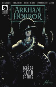
 Arkham Horror: The Terror at the End of Time #1
Writer: Cullen Bunn
Artist: Andrea Mutti
Colorist: Valerio Alloro
Letterer: Hassan Otsmane-Elhaou
Publisher: Dark Horse
Review by Steve Baxi
The world of Fantasy Flight’s Arkham Horror has just been expanded with a new 4-issue mini series, The Terror at the End of Time. Building off both the world of the game and H.P. Lovercraft’s Cthulhu Mythos, this series dives into familiar and sinister adventures in Arkham, Massachusetts. Written by horror comics veteran, Cullen Bunn, this opening issue strikes a good balance between mystery and supernatural occultism. Bunn is no stranger to many of these concepts, and his deft handling of the setup and the twist helps the story feel like it’s moving at a brisk pace, and keeps the reader engaged.
Andrea Mutti and Valerio Alloro’s art is top notch, giving us just enough teases at the horrors to come to keep us entertained without sacrificing the simple human relationships and charm of the characters. Alloro’s colors feel like a throwback to old school D&D monster manuals and horror novels of the 90s, which is perfect for the story being told.
Hassan Otsmane-Elhaou also brings his signature flair to the lettering. The diverse array of lettering choices feel like they’re contributing to the tone and art of the whole book, bringing real creativity to even some of the simplest conversations.
I’m eager to see how the mystery develops from here. The final pages raised several interesting questions, some of which are new to the world of Lovecraft. The whole team brings enough charm and originality to the material that its worth the cover price.
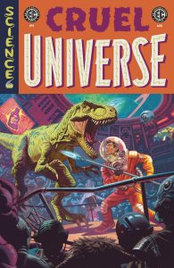
 Cruel Universe #1
Writers: Matt Kindt, Corinna Bechko, Chris Condon, and Ben H. Winters
Artists: Kano, Caitlin Yarsky, Jonathan Case, and Artyom Topilin
Colorists: Michael Atiyeh and Brittany Peer
Letterers: Richard Starkings and Tyler Smith
Publisher: Oni Press
Review by Jared Bird
I’ve spent many an evening wondering what a modern EC Comics would look like, or imagining a potential world where it was never shut down in the 50s after the creation of the Comics Code Authority. Oni Press seemed to wonder the same, and have gone in full-force with their revival of EC for modern audiences. With an ensemble crew of talented writers and artists, Oni Press is kicking off the science fiction anthology Cruel Universe with a forty page first issue, under EC Comics branding.
The first story in the issue, ‘The Champion’ focuses on a gladiatorial arena on an alien world, with our protagonist narrating his experiences as he changes over his time spent there. What starts off as a relatively typical premise changes, and takes you by surprise as it goes along, in true EC Comics tradition. Writer Matt Kindt (BRZRKR) pulls off an interesting narrative trick here which fans of classic pulp science fiction will greatly appreciate. Artist Kano (Immortal Iron Fist), does a great job replicating the classic visual style of pulp sci-fi, with a sense of energy and creative framing that make the story an exciting read. A killer short comic for sure.
The second story ‘Solo Shift’ follows an astronaut desperately trying to undo a horrible thing that’s happened to lover. The artwork by Caitlin Yarsky (Bliss) is really solid here, particularly the detailed spaceships and black hole central to the story. Writer Corinna Bechko (Invisible Republic) conveys a lot in a short span, and while some of the narration feels cluttered, the actual plotting itself goes in an interesting direction and definitely veers closer to the horror territory most would recognise from EC Comics.
The third story, ‘Drink Up’ is about a millionaire’s quest for eternal youth. Writer Chris Condon (That Texas Blood) brings his knack for poetic irony to this story in a clever way, but also struggles with needing to put a lot of information in a short span towards the start of the story. Jonathan Case (Little Monarchs) does a great job with the art, particularly the dark and pulpy climax of the story. This story also felt timely in a way that a lot of classic science fiction aspired to be, and for that it has my regards.
The final story, ‘Priceless’ is probably my favorite of the bunch. Written with tasteful minimalism by novelist Ben H Winters, it explores a man committing mysterious acts of violence for an unclear reason. The story is rife with mystery and intrigue, and feels like a clever modern take on the classic EC Comics formula. The art by Artyom Topilin (I Hate This Place) is energetic, readable and compelling, and the two creatives are working in synergy here to convey this story. It’s an intriguing story that’s come back to me since reading it initially.
Overall, Cruel Universe is a solid start to Oni Press’ EC Comics revival. If you are a fan of old-school EC Comics, you’ll enjoy it, or even if you’re just a fan of anthologies in general. Fans of pulpy science fiction like myself will be greatly pleased as well. Oni Press’ seems to be paying loving homage to EC’s classic style with new twists and turns on their formula, with excellent talent from a range of diverse backgrounds. It’ll be a fun read, and I’m excited to see what they do going forward with EC’s legendary library.
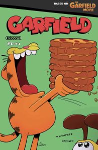
 Garfield #1
Writers: Ryan Estrada and Sarah Graley
Artists: Axur Eneas and Sarah Graley
Letterer: Stef Purennis
Publisher: BOOM! Studios
Review by Sean Dillon
Simply put, it’s a rather charming duo of stories with Ryan Estrada and Axur Eneas (of the Student Ambassador series) telling a simple story about Garfield overcomplicating a midnight snack to hilarious effect and noted Northamptonite and webcomics artist Sarah Graley exploring what Jon was doing during the movie while Garfield and Odie were traveling cross country. (The answer seems to be “Panicking, experiencing all the Garfield memes, and buying a second fridge.”) They are both good riffs on the character that help distract us from the permanent Monday the world has descended into.
 Red Before Black #1
Writers: Stephanie Phillips
Art: Goran Sudžuka
Colors: Ive Svorcina
Letters: Tom Napolitano
Publisher: BOOM! Studios
Review by Clyde Hall
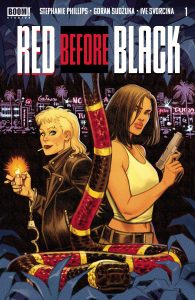
Writer Stephanie Phillips always delivers good dialogue, a combination of smart and blistering when applied against those opposing her protagonists. In the first issue of Red Before Black, Phillips gives great dialogue through Val, an ex-con and former soldier seeking opportunity after doing an 8-year prison term. Given what seems a very specific and martial skill set, she decides her best options for quick financial gain is within the illegal drug trade overseen by the bar-owner Miles, a comrade from her past.
With a rapier tongue applied using the skill of an Olympic fencing medalist, Val cuts through Miles’s retinue and makes her appeal. Her former associate needs no proof of her skills, but those Miles works with will. Thus, she’s assigned the task of taking out Lenora, AKA Leo, a now ex-employee seeing as how she lifted a shipment of Miles’s cocaine as severance pay. The final act peels away layers of psychological trauma and an underlying motivation for Val’s ‘audition’.
Red Before Black #1 sets up a firm and at times funny foundation for what should unfold into a Buddy Felon adventure. Phillips stays focused with minimalist introductions of the main players, and their stakes, through a neo-Noir lens. Goran Sudžuka on art sharpens that focus with layouts and panels paying off both sides of the coin, the neo against the Noir. His line work is uncomplicated, background details basic, yet they convey maximum impact through facial expressions and body language.
With this premiere, Phillips and Sudžuka work a bit of modernized Brubaker and Phillips magic. Val and Leo are tough, clever protagonists who may not be heroes, but they’re worlds better than their opposition. Flawed, tarnished, jaded, they’re still holding onto individual versions of hope, and we want to see the resulting payoff. As well as their payback.
Wednesday Comics Reviews
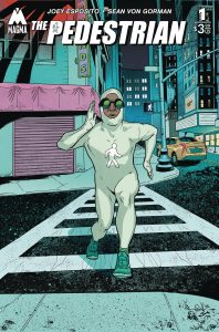
The Pedestrian #1 (Magma Comix): The Pedestrian is a strange book. It exists somewhere between parody and homage. It is funny, but not in a way that undermines the pure heart at its center. It is a surreal, inexplicable thing. Writer Joey Esposito and artist Sean Von Gorman draw us into multiple stories about individuals in Summer City—a small town right out of a Springsteen song where everyone is trapped and desperate to leave. Josh Jensen provides the rich colors against which the Pedestrian’s white suit pops. Shawn Lee’s letters elevate the issue’s dialogue and complement the art. The script follows five individuals who cross paths with the mysterious white-bodysuit-clad, speedwalking, traffic law following, silent hero THE PEDESTRIAN. A bright figure shining in the night, he does everything from stopping muggers to helping a pizza delivery driver parallel park. Most of the humor in this title comes from the Pedestrian’s sudden appearances and the reaction of these everyday people. But despite the hero’s silence and preposterous design, his compassion and deep care for the people of Summer City shines through. He’s not interested in pummeling criminals—he just wants to help everyone in the city he loves. Von Gorman’s art is rough around the edges but he renders believable, human-looking characters and The Pedestrian’s pudgy figure in that absurd costume is instantly endearing. This is as strong a debut as you could ask for. The Pedestrian’s human heart is infectious, and there are hints of something sinister building that adds a compelling hook. I can’t wait to read the second issue and find out more of this mysterious speedwalking do-gooder. —Tim Rooney
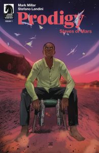
Prodigy: Slaves of Mars #1 (Dark Horse Comics): Prodigy comes back for a third stint where genius adventurer, Edison Crane, takes to solving his father’s murder, and reuniting [at some cost] with his estranged brother. Mark Millar, known for his love of debasing and debauchery, almost sets a self-record for finding the most turgid ways of setting a tense standoff to the tune of ball, dick, and butthole one-liners in the first three pages; if Millar’s high concept put-downs, spy-fi turns of favor, and familial passive aggression entertain you, then look no further! Though, after years of using Prodigy as a vehicle for alpha male adventure stories where Edison Crane could do it all and back it up, Millar finally removes everything that makes the character tick: his massive wealth, his monopolies, his home, etc. What’s left of the pulp adventurer’s world is up to Stefano Landini to dictate. With so much pared down in this third Prodigy volume, Landini has to fill in the aesthetic void, but this first issue feels more phoned in than a labor of love, so here’s hoping the next chapter lights a creative flame. The color moods keep consistent from scene to scene, so kudos to Michele Assarasakorn for turning fairly flat compositions and narratively efficient layouts into a lurid, textured world. To cap it all off, Clem Robins transforms Millar’s long-winded dialogue into a rote assembly of balloons that don’t split lines into beats as much as create a monotone pace with its structure of hamburger word baths and the last words emphasized in bold. While this formulaic approach breeds immersion and a clear rhythm, it can breeze readers through pages before they have time to take them in which overall reduces their poignancy. Look, Millarworld books are known to sacrifice poignancy for pulp, so if what you want is highfalutin adventure, then you’ll probably get it here sooner or later. I’m good on this. —Beau Q.
The Prog Report
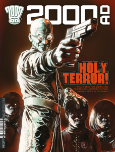
2000AD Prog 2394 (Rebellion Publishing): When Michael Molcher won an Eisner at SDCC for his excellent book, I Am The Law: How Judge Dredd Predicted Our Future, he had a message for the assembled comics luminaries — “Please value and honor John Wagner while he’s still here.” Well, as it would have it, Judge Dredd co-creator Wagner is currently writing the main Dredd story in The Prog, and it’s excellent. Hitting part three this week, the story is essentially Judge Dredd vs. AI. Illustrated by Colin MacNeil with colors by Chris Blythe and letters by Annie Parkhouse, it’s as good-looking as it is timely. It’s almost absurdly timely, in fact, given the fury in comics of late over former NFL quarterback Colin Kaepernick announcing a company to replace comics artists with AI. In this story, robotic judges have replaced Dredd and other human police, jailing them as they take over. It’s very good, and if you want to value John Wagner, you could easily start by reading and talking up and appreciating his classics as well as this new story, too. It definitely merits it. As always, you can nab a digital copy of this week’s Prog here. —Zack Quaintance
Read more entries in the weekly Wednesday Comics reviews series!
