
This week’s main review is Blood Squad Seven #1. Plus, the Wednesday Comics Team has its usual rundown of the new #1s, finales and other notable issues from non-Big 2 publishers, all of which you can find below … enjoy!
 Blood Squad Seven #1
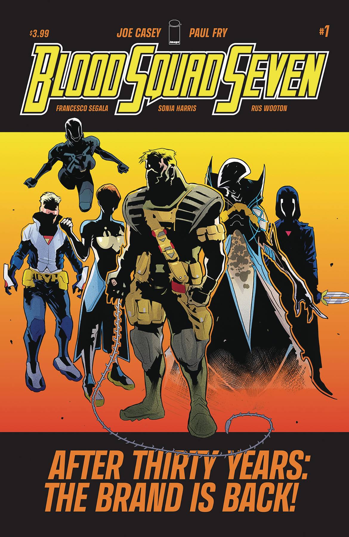
Writer: Joe Casey
Artist: Paul Fry
Colorist: Francesco Segala
Color Assists: Gloria Martinelli
Letterer: Rus Wooton
Publisher: Image Comics
Review by Jordan Jennings
Synopsis: It has been over 30 years, but Blood Squad Seven is making a comeback with a covert operation in Kharkiv, Ukraine. Back home, original Blood Squad Seven member and current government handler, Erika Richmond wrestles with rolling out the team publicly and managing team members. Is the world ready for the return of Blood Squad Seven
First things first, Blood Squad Seven is an obvious pastiche of Youngblood. In the backmatter of the issue, writer Joe Casey outlines his belief that that Image Comics need to have a voice in the current wave of 90’s fueled Nostalgia. The problem is that the original shared universe of 90’s image is in tatters with Wildstorm being over at DC and Extreme Studios properties being a tangled mess of bad business dealings and copyright ownership. Casey and Eric Stephenson (Extreme Studios original) determine that the biggest void is the Youngblood shaped one and that the best way to remedy this is to make their own Youngblood team.
With that in mind, it is best to approach Blood Squad Seven #1 as if it is a meta commentary about 90’s superhero comics and media culture in general. The bulk of the issue’s page count is spent on the original Infiniti trying to convince the media to support the team. It is hard to not see this as an allegory for Casey convincing the various powers at Image to pick-up this series. In this regard, I appreciate what is being done with Blood Squad Seven. That said, I feel like there is too much time spent with talking heads, but little reason given to be compelled by it.
Casey does set up some characterization with strife between Erika and her daughter, the new Infiniti. It feels a bit rote, but it is an actual character moment in an issue that is largely devoid of anything beyond broad 90’s archetypes. Honestly, the biggest flaw with Blood Squad Seven #1 is that the issue is so preoccupied with sending up 90’s tropes that it fails to capture what makes 90’s comics entertaining. It isn’t the shadowy dealings within the Pentagon, it is the explosive action and kinetic pace. This comic has more in common with The West Wing and Madmen than Youngblood or Brigade. There is a stated goal for this comic to be a maturation of the 90’s themes—updated for a modern audience. This isn’t it.
What is odd is that Casey’s Dutch was more successful in capturing that mature feel. I don’t know if it is due to having to spend time establishing this team as the replacement for Youngblood in the canon, or if its Casey was more interested in exploring the meta narrative. What I do know is that this wasn’t compelling or satisfying to read.
I am a 90’s comic aficionado. I love that chromium and die-cut era, but this loses sight of what made those comics interesting. For someone who is looking for a mature update to 90’s comics and something that embraces the comics of Image’s founding, I highly recommend Local Man. It may be not fair to Blood Squad Seven, but it is impossible to avoid making comparisons between the two series.
Paul Fry’s art is a nice complement to the comic. It does have a modern look that is sleek and takes advantage of modern art tools. Additionally, the characters are expressive, and the action scenes are well staged. Fry does make the talking head sequences visually interesting. There are several visual callbacks to Youngblood and other Extreme Studios characters such as references to Youngblood #1 and how the action figures were designed. Those are small touches that help the overall effort to help replace Youngblood’s place in the canon.
The colors by Francesco Segala with assistance of Gloria Martinelli continue to help give this comic the modern update that it is trying to reach for all the while the appropriate hues and saturation for the 90’s-era material is fitting of the time.
The fact we are more likely to see Grifter or the other WildC.A.T.s in the pages of an Image comic again before seeing Badrock again is astounding and insulting to the legacy. Inventing a potential fix to explain Dutch or Brigade’s history is a novel idea. That said, this comic left me wanting more. There is an attempt to mature the concept, but that maturation is boring national security jargon. It is impossible to not compare it to other series that are doing the same things. There is something to this concept, but for the first issue, this was an unsatisfying experience. Overall, I see what Blood Squad Seven #1 is trying to do and I appreciate it for that, but it doesn’t execute those concepts in an entertaining way.
Wednesday Comics Reviews
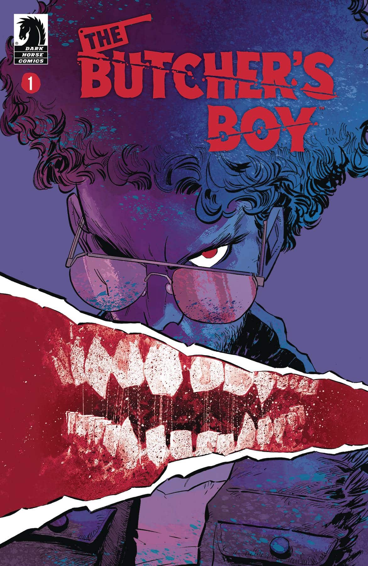
- Butcher’s Boy #1 (Dark Horse Comics): Promising a gnarly adventure within the first few pages, we are given a glimpse of what horrors await a group of friends (mostly) as they go on an annual trip. The catch is that the destination is different from the lake they typically vacation at, instead going to a pretty dead rural town. This town has a horrific story and the residents are drawn with this creepy and eerie feeling that speaks to the feeling of the town itself that artist, Justin Greenwood captures so well through the line art and use of spot blacks. Colorist Brad Simpson, encapsulates the feeling here, using warm tones to complement this desolate, arid feeling.The first pages are such a great visual hook, showcasing body horror, blood, and gore. It’s gnarly and the use of page space here is stellar, between spreads and a haunting last page, it’s a creepy and fun issue to read. The character writing is great, the tension is so thick as there’s drama bubbling under the surface. These guys do not get along and it’s rapid fire as they talk at and over each other, lettered by Pat Brosseau who excellently handles the words on page scripted by Landry Q. Walker who crafted the story alongside Pannel Vaughn. Not for the faint of heart, but an issue with a lot of charm and promise for bloody body horror to come. —Khalid Johnson
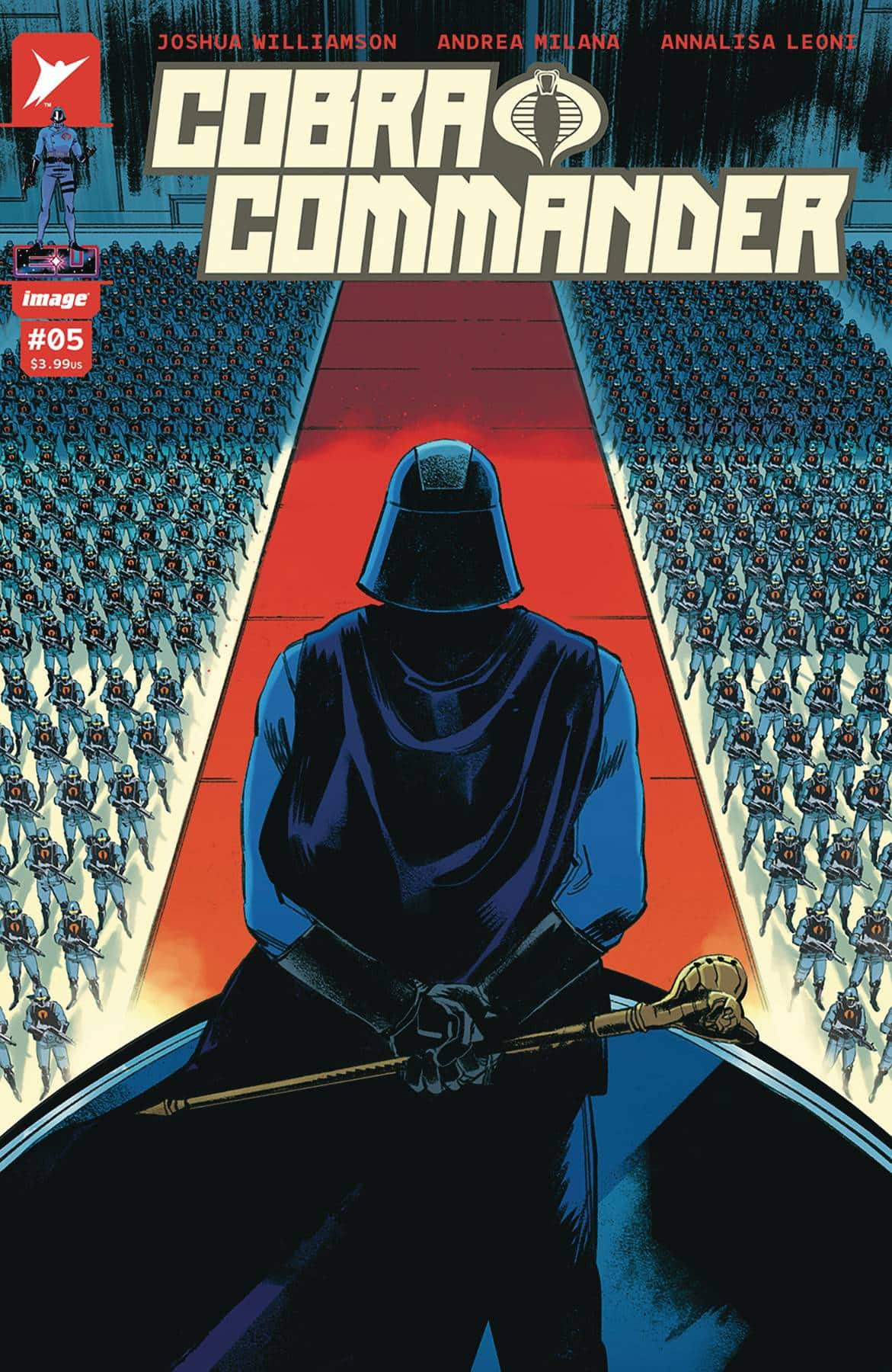
- Cobra Commander #5 (Image Comics/Skybound): At the outset of Skybound’s Energon Universe, the goal of Cobra Commander seemed to be to bring the G.I. Joe villain organization into the foray through a horror lens. Besides spending more time in Florida than I can recommend [as someone who survived growing up there], Cobra Commander has traded in turn-page jumpscares for a slow, methodical car crash where someone with a superior race ideology rapidly amasses untold power. What a villain of the time, amirite? Joshua Williamson guides this parade unto its narrative promised land of hooking Cobra Commander up with Destro and an ideologically-aligned militia to complete the Florida Man metaphor, but this is all denouement rather than climax, so it flattens the end for anyone expecting more. Barely registering the same vibrancy as previous issues, Andrea Milana sails this one home with first take layouts that work us through the motions rather than provide impact. The scathing and visceral world of Cobra Commander remains in the swamp, so colorist Annalisa Leoni brings out natural lighting and color moods that lack the violence of previous palettes. My guess is that by dropping the stylized color moods of Cobra Commander #1-4 for a tepid look, it undoes any accidental glorification during the reveal. Elsewhere, Rus Wooton at least gets some more chances to show off these wonderfully chaotic sfx that have stolen the show regardless of a panel’s compositional strength. If you must be a completionist, have at it, I guess. Otherwise, my recommendation is to avoid the Florida Man miniseries conclusion. —Beau Q.
The Prog Report
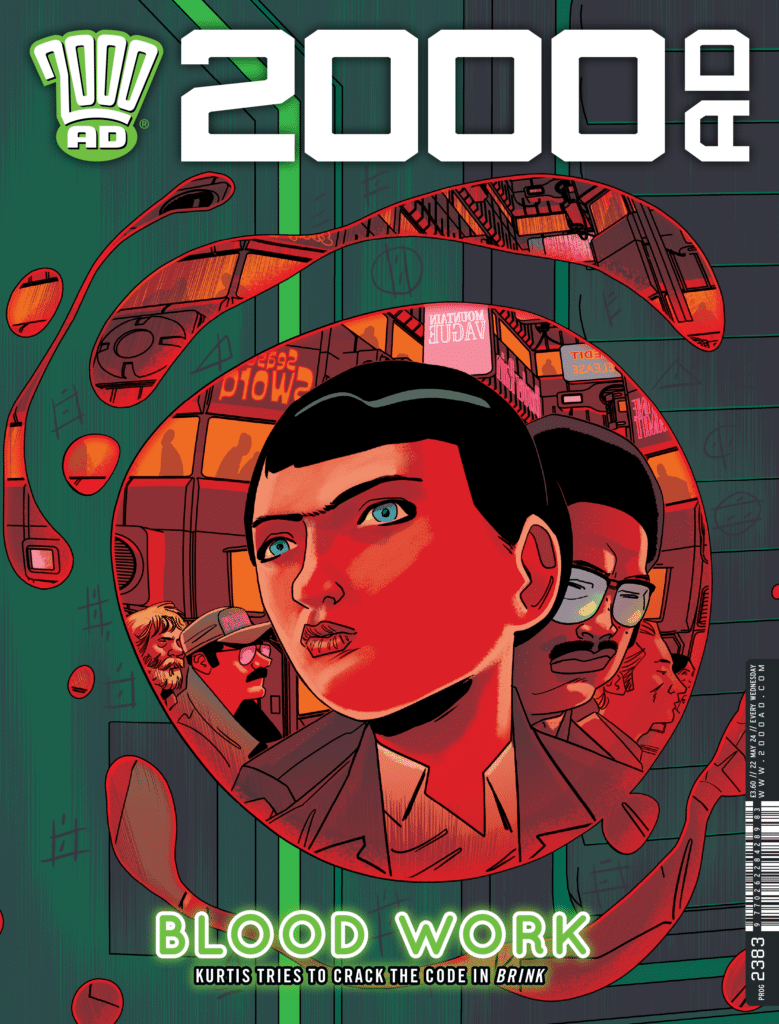
 2000AD Prog 2383 (Rebellion Publishing): This week’s Prog serves up the start of a new three-part, self-contained story called Blue Skies Over Deadwick by writer David Baillie, artist Nick Brokenshire, and letterer Annie Parkhouse. And it’s a great opening chapter. I don’t want to entirely spoil the premise here, but I will say that this story involves a quick twist in these first five pages, accomplished by sort of withholding the full scope of our early setting. It’s good fun. Past that, we get a hint at giant robot action to come, a moral dilemma, and, to be blunt, the makings of a great story. I really enjoyed this opening chapter quite a bit. As always, you can nab a digital copy of this week’s Prog here. —Zack Quaintance
Read more entries in the weekly Wednesday Comics reviews series!


")
