

This week’s main reviews are FThe Six Fingers #1, Godzilla Rivals: Mothra vs. M.O.G.U.E.R.A., and The Jaguar #1. Plus, the Wednesday Comics Team has its usual rundown of the new #1s, finales and other notable issues from non-Big 2 publishers, all of which you can find below … enjoy!
 The Six Fingers #1
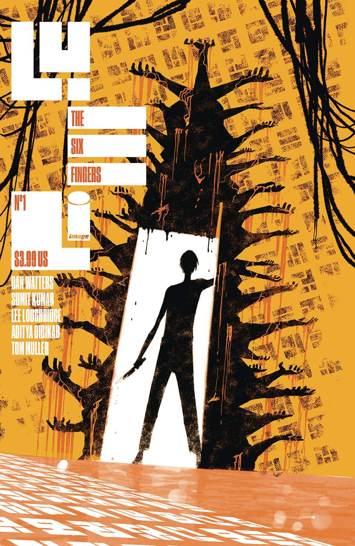
Writer: Dan Watters
Artist: Sumit Kumar
Colorist: Lee Loughridge
Letterer: Aditya Bidikar
Publisher: Image Comics
Review by Beau Q.
Not too often in comics do we have books that are in direct conversation with each other. Sure, sometimes books exist in the same universe, tie-in to one another, but rarely do they hold a conversation with one another. Comics tied together often do so with events, canon, and characters, but rarer still does their art, color, and lettering exist in a direct and organized dichotomy with one another. Better yet, none use this established publishing dichotomy to weave a cat-and-mouse serial killer/detective mystery. None save for The Six Fingers and The One Hand.
By the way, you are now reading a review of both The Six Fingers and The One Hand.
While The One Hand has Ram V writing and Laurence Campbell on art, The Six Fingers features Dan Watters writing and Sumit Kamar art. Between the two series Lee Loughridge colors, Aditya Bidikar letters, and Tom Muller designs furthering the subtle homogenization of styles into a taste all its own– The One Hand washing The Six Fingers, and so forth.
In The One Hand, we follow retiring detective Ari Nassar going back in on one last case which he solved twice prior involving the One Hand killer. As for The Six Fingers, we watch archaeology student by day, sci-fi janitor by trade Johannes Vale fall down the entire set of stairs called life until he decides to figure out why he’s doing some serial killing. So far, the two books don’t feature both protagonists, but follow their own arcs drawn in blood, bound to the One Hand killings. Both books are mostly dialogue driven crime fiction, saving inner monologues for dramatic turns of character arc. Where V took the approach to go full noir in tone, Watters doesn’t even let the rain fall until the end of #1.
Visually, Campbell goes for the shadow-heavy hardboiled look and formalist page layouts that strictly tighten Nassar’s calculated world into a chewed up neon-lit city. Kamar on the other hand isn’t beholden to this strategic rigidity, so Johannes’ world roams full-bleed free from sequence to sequence with a soft focus on using verticality to loom shifting power dynamics and symbolic imagery about the place. Not to mention the draw depth is different for both: Campbell’s shot selection is closer to the viewer with tighter closeups and larger figures to push intimacy whereas Kamar crafts these massive living spaces for gangly sci-fi folk to act out their prestige tv drama. Overall, The Six Fingers distinct lack of shadows and vivid reality expand upon the mysteries breadcrumbed in The One Hand, which allows Johannes the availability to solve his own mysteries.
Two distinct writing styles, two different artistic visions, and yet… they feel similar enough in tone and in tandem, which is thanks to the heavy hitters Loughridge and Bidikar! Loughridge reuses the same sepia between the two books; not for flashbacks, but rather for our protagonists’ best case scenarios where they feel their most powerful, before dragging them in separate directions: Nassar’s world a glow-heavy rain-soaked night cut between clubs, precincts, and crime scenes with the prerequisite texture stamps and radial gradients to match. Where Johannes resides, however, can feel both sterile and coarse with Loughridge applying reddish brown color holds to Kamar’s lighter strokes and underpencils; it makes everything look like a bruise. The sickly yellow highlight doesn’t help either since so much of Johannes’ world has an undertone I can best describe as soap scum pink. Given the two distinct rendering styles, one would figure them mostly contrasting one another, but I find that where their tangents meet feels inherently natural to both palettes, and we can expect more concentrated effort in this particular regard on the horizon.
Likewise, Bidikar provides an all caps font, white interior, black stroke balloon throughout both books with bold and italicized emphasis. But in The Six Fingers, Bidikar gets to flex a mixed case use font style to differentiate inner monologue from spoken dialogue. The thinner sans-serif font reminds me of Calibri, which feels like a subtle push for readers in the direction that this particular monologue is written in a word doc without having to tell us outright. It’s a brilliant example of the wit on display in Bidikar’s work; same can be said of the single sound effect used between either first issues and the narrative importance that creative decision holds going forward. Of notice is Kamar leaving more negative space open for lettering use and commanding placement more than Campbell’s pages that forced dialogue into grids and obscures art, which, for better or worse, creates a dichotomy between the two books that sings their differences loudly as it does softly.
As it often goes with mysteries, readers tend to only remember the ride when the ending aligns to their deduction or entertainingly outside of their prediction. If the mystery ultimately falls flat, the ride usually goes forgotten, because of an over-expectation/underwhelm ratio that casts a shade over the entire affair. This all remains to be seen however with only 1/5th the total puzzle on shelves now. So get out there, use your one hand and six of your fingers to flip those pages, and unravel the boldest cat-and-mouse game in town!
The Jaguar #1
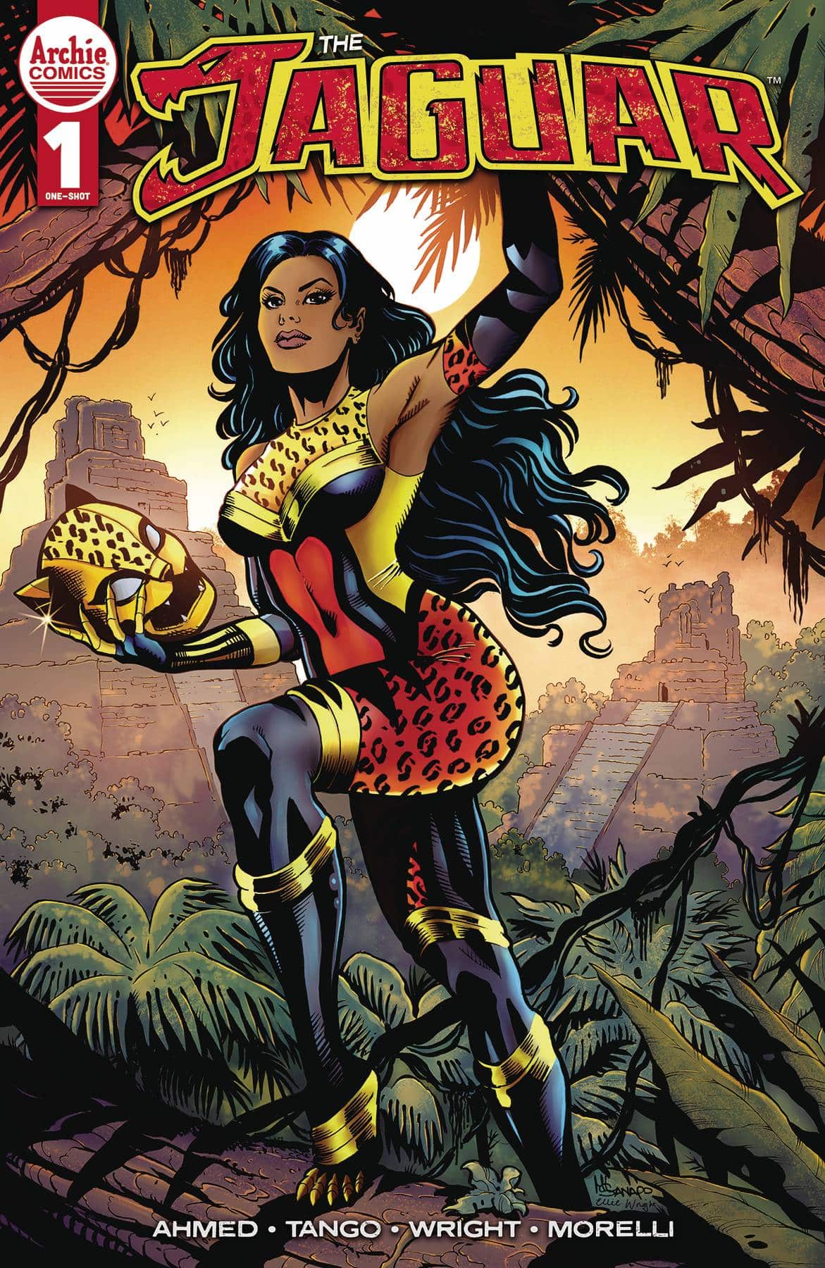
Writer: Keryl Brown Ahmed
Artist:Tango
Colorist: Ellie Wright
Letterer: Jack Morelli
Publisher: Archie Comics
Review by Clyde Hall
The MLJ/Red Circle superheroes have a lot of history to draw from, but not always a lot of endurance in their modern iterations. Their recent one-shots have given individual characters quality spotlights in the cases of The Fox, Bob Phantom, and Darkling. Seeing Jaguar scheduled for a similar treatment was very exciting because, from the earliest days of the character (I somehow scored a rummage sale copy of Adventures of the Jaguar #1 as a kid) through the Impact version, I’ve been a fan.
Writer Keryl Brown Ahmed draws the more recent Ivette Velez revision of The Jaguar closer to the initial Ralph Hardy origin story. Ivette has a heritage that extends back to the Peruvian birthplace of the mystical jaguar helmet and belt Hardy uncovered and used during his crimefighting career. But it’s a birthright she knows little about, until a zoological mission takes her into the lands of her ancestors. There she finds the source of The Jaguar’s powers and also encounters the modern manifestation of one of the Mighty Crusader’s classic villains.
The story solidifies the bonds between what’s gone before and the current Jaguar character, but expansion upon her from what we already know feels sparse, especially compared to the refining and thematic renewal the superheroes of those previous one-shots received. One element I’d hoped for was a return of power levels The Jaguar originally embodied, but which have felt toned down ever since the mantle was passed to a female hero. In short, Jaguar once had powers from across the animal kingdom but 1000 times the abilities found in nature. In other words, elephant or ant strength x 1000. Cheetah speed increased a thousandfold. It makes for a powers set exceeding many other animal-based superheroes, and Jaguar one of the New Crusaders’ heavy hitters. Ivette may, indeed, be that powerful. But based on abilities displayed here, we don’t get that affirmation.
Artist Tango has a unique aesthetic, their stylized linework making the world chaotic and lived-in while driving action sequences sizzling across panels. In both cases, the colors of Ellie Wright add a perfect amount of pop or restraint. Both the cover by Maria Laura Sanapo and the variant by Reiko Murakami give the feline hero appropriate leap-off-the-shelf appeal.
While everyone on the creative team shows respect and reverence for the talents who forged the character, there’s a sense of revisiting much that’s already established and a minimum of forward momentum. There are good narrative moments, especially in having a Peruvian pantheon artifact once more wielded by a descendant avatar. And while this would’ve made a good foundational entry for a miniseries, the standalone story may seem cursory to MLJ fans familiar with the character, while not quite engaging enough for new readers.
Verdict: BROWSE
 Godzilla Rivals: Mothra vs M.O.G.U.E.R.A
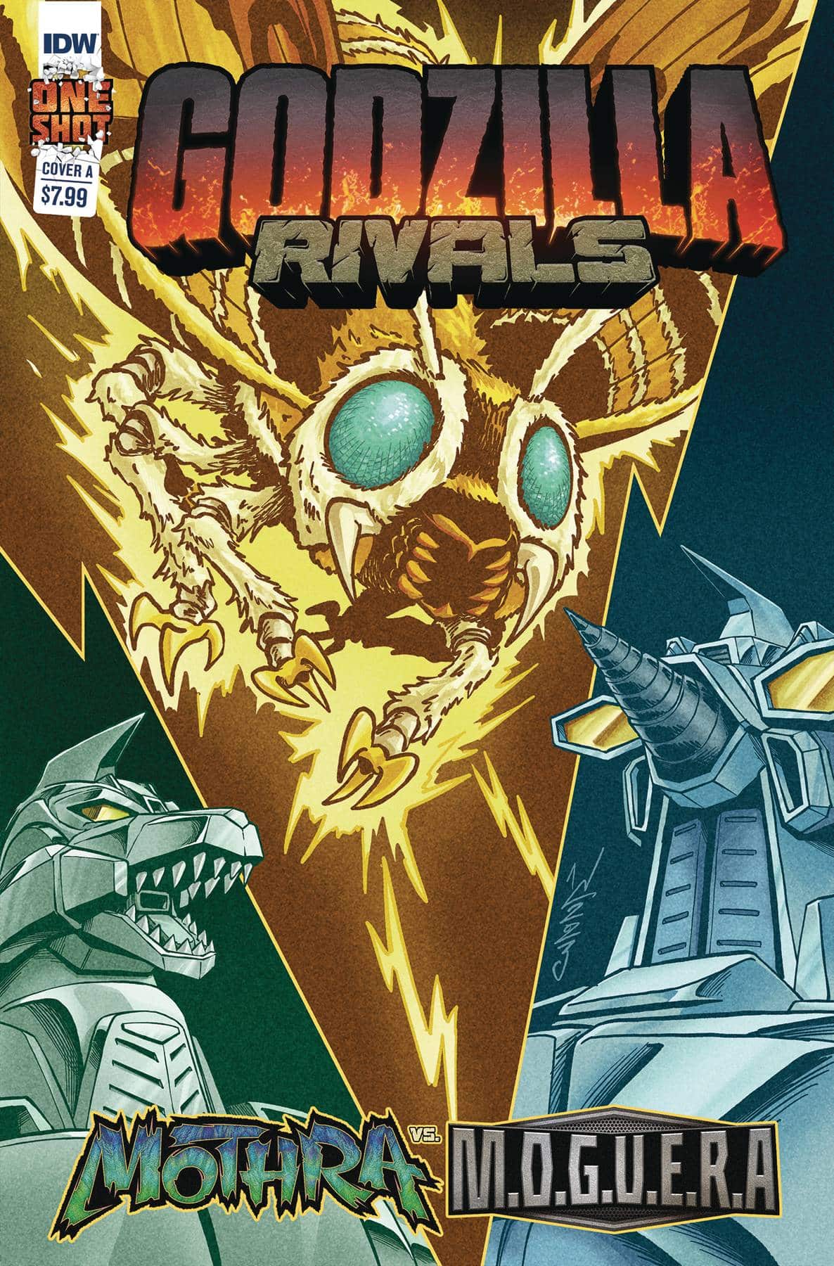
Writer: Johny Parker II
Artist: Winston Chan
Colorist: Josh Burcham
Letterer and Designer: Nathan Widick
Review by Jordan Jennings
The Plot: After a grueling clash with Ebirah, Mothra is down for the count. While the humans can help save their protector, it may be for not as the anti-Kaiju organization The Restorers has put forth into motion its plan to halt Mothra life cycle. To accomplish this, they are turning their stolen Mechagodzilla unit on Infant Island, the home of the Mothra Egg. As if that wasn’t enough, they are using M.O.G.U.E.R.A. With stakes high, the humans turn to their remaining ally Jet Jaguar to help stave off the anti-kaiju onslaught and help save humanity’s greatest defender.
Quick recap of the Rivals premise for the uninitiated—Godzilla Rivals is a series of one-shot stories that highlight a clash between two different Kaiju (or mech). The comics are largely continuity agnostic and only require general knowledge of the monsters. They often function as snap shots of a larger story that is occurring and as such Rivals tends to give the sensation of a larger lived in world that expands greater than what’s on the page. Godzilla Rivals: Mothra vs M.O.G.U.E.R.A continues that trend fairly successfully.
Johnny Parker II channels the spirit of a Mothra story by focusing on the connection between the lepidopteran kaiju and the various humans that have been affected by it. The human angle is one that people often deride when it comes to the movies, but they are glue that hold these stories together. This issue doesn’t have the most resonating story and it is a simple one, but it is effective and on par with a typical Kaiju story.
Parker balances the human plot with one of the most monster packed stories I have seen this side of Final Wars. In one single story we get to see Ebirah, Mothra, Mechagodzilla, M.O.G.U.E.R.A, Jet Jaguar, and even a cameo by Rodan. The plot is dense with action and kinetic throughout. This is thanks in large part by the use of ticking clock with the humans trying to reach Infant Island in time before the Mothra Egg is smashed. Parker sets up stakes that are simple and effective. This leads to a highly entertaining one-shot.
Winston Chan’s art matches the energy of the story by delivering some of the most dynamic use of Kaiju on the page. The brief brawl between Mothra and Ebirah goes beyond what you think a moth and oversized craysfish could do. Chan does a lot of interesting things with the fights especially with Jet Jaguar’s size changing abilities. They definitely do the most they could do with the printed page that is not constrained by rubber suits, models, and computer effects. The quieter scenes are equally as good from Chan as they focus on the human angle and mix up different panel compositions to give each moment the emotion it needs while also being visually interesting.
The only knock I have on the art is that Mechagodzilla’s character model is a bit wonky at times. Often it looks like a human more than a cybernetic machine. Yet, this divergence helps serve the energy of the scene and allows for Mechagodzilla to be much more exciting on the page. The model bothers me, but I can overlook it for the action.
Also, quick shout out to colorist Josh Burcham (of Transformers fame) for delivering some of the most textured and visually interesting colors to a Godzilla comic that I have seen in a while. Burcham uses a bright color palette on the stands out on the page. It’s always a delight to see his coloring on the page. I would love to see Burcham draw a Godzilla story at some point.
Godzilla Rivals: Mothra vs M.O.G.U.E.R.A is an entertaining read for casual Godzilla fans. It brings a high energy story to the comics that is fun to just sit back and read. I won’t lie, I marked out when Jet Jaguar showed up midstory and what they do with him is a blast as well. If I had to be honest, my biggest complaint about this comic is the title. It isn’t a Mothra vs M.O.G.U.E.R.A story. Heck, they barely face off in the story. It is a Jet Jaguar vs Mechagodzilla story and a darn good one to boot. My guess is that the title was done to spotlight the various members of the Kaiju gallery and that Jet Jaguar and Mechagodzilla just got featured Rivals stories.
Naming conventions aside, I recommend checking Godzilla Rivals: Mothra vs M.O.G.U.E.R.A out. It’s a blast.
Wednesday Comics Reviews
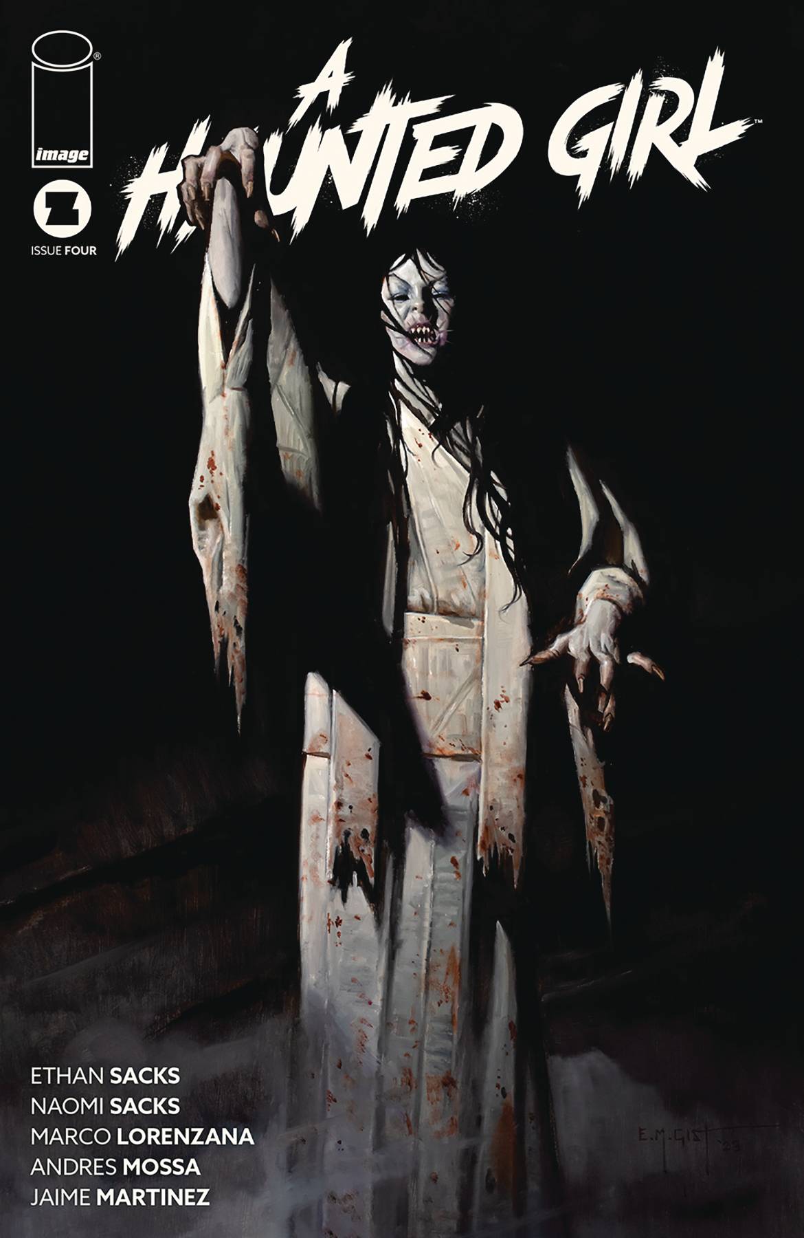
- A Haunted Girl #4 (Image Comics): The series written by Ethan Sacks and Naomi Sacks comes to a triumphant conclusion that looks at the strength that comes from a support system. It’s been nice to see Cleo open herself up to people and how that punctuates the nature of mental health struggles and that we need a support system. While she has opened up a bit, we find Cleo basically on her own at the start of this issue. Still struggling with self-doubt, she goes to confront Izanami, led there by the ghost kid. Artist Marco Lorenzana and colorist Andres Mossa come together to create a strong sense of the ethereal, and the mood here is for lack of better words, haunting. I mean what could possibly be more spooky than an abandoned psychiatric facility? There’s not much that beats it in terms of spooky settings and it’s a great environment thematically for Cleo to reconcile what’s been going on with her and how she’s growing. The character work from Lorenzana has been fantastic throughout the series and the characters and monsters have felt very distinct with distinct voices thanks to the lettering choices of Jaime Martinez. This is a tight conclusion to this four issue story that answers any lingering questions and sticks the landing.
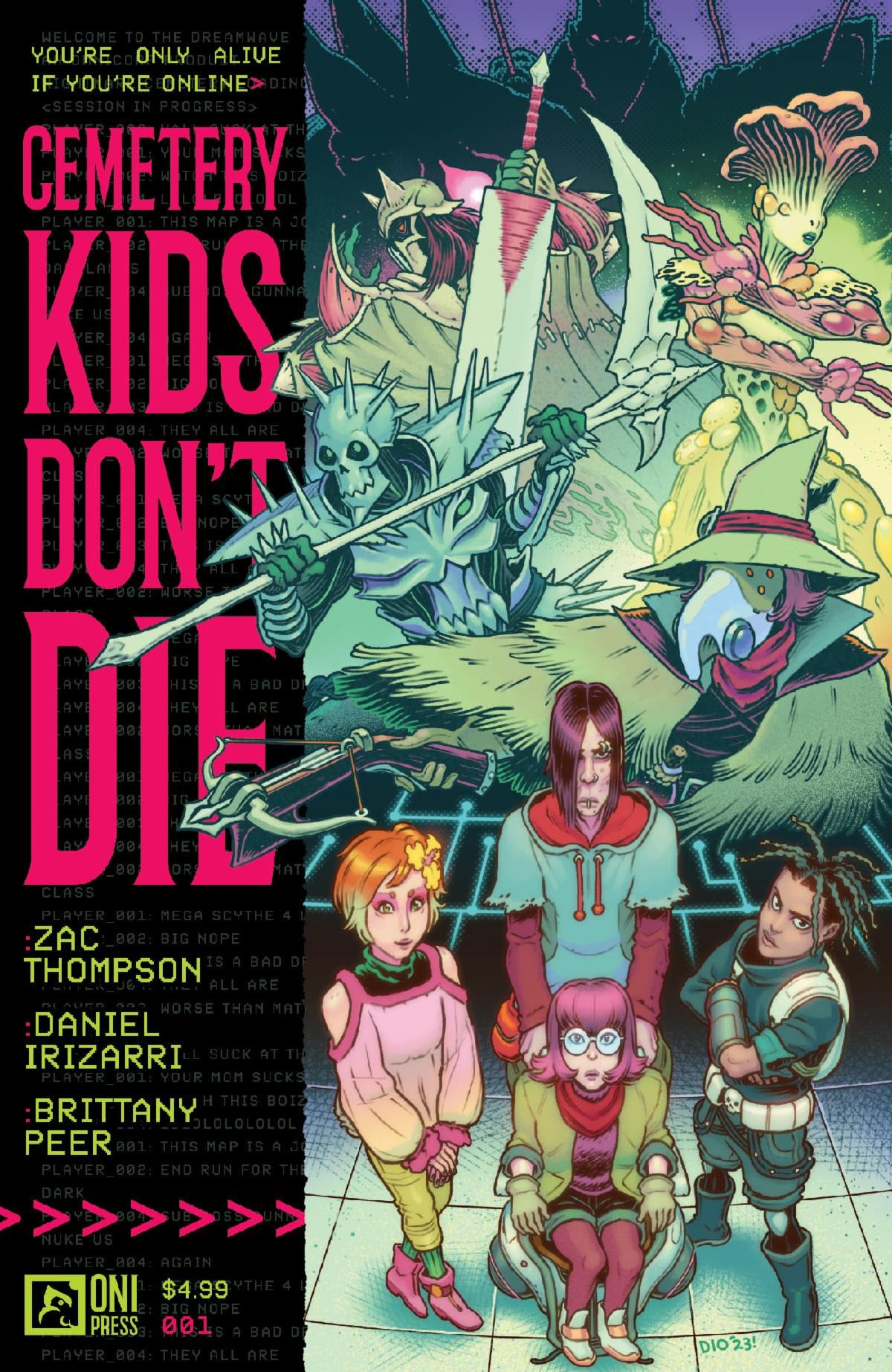
- Cemetery Kids Don’t Die #1 (Oni Press): Get in the dreamwave loser, we’re dealing with complex trauma while chasing the King of Sleep! Cemetery Kids Don’t Die is the perfect name for a comic that finds four friends deep in the middle of a futuristic video game world that they play while asleep. Zac Thompson wastes no time laying on a heavy tension between the friends in the video game world, trudging through swamps and bashing fish creatures, and the main character’s first person narration, which revolves around the loneliness of loss and grief in the first issue. With art by Daniel Irizarri and colors by Brittany Peer, Cemetery Kids can be equal parts slimy, bloody, and nostalgic, despite being set in a pink and blue near future. The centering of a video game world here allows the characters to be propelled into action and mystery, but also gives them permission to have distance from their personal lives. There isn’t a lot of time to consider whether your friend is actually okay when you’re out chasing the big bad guy in your sleep for eight hours at a time. This, for me, is where it is both good and kind of shallow equally. I think that, given the space of many issues, we’ll get there emotionally. There’s a lot to set up in the first issue. But for now, everything feels a little less grounded than I would want when being introduced to where the characters are in their lives. The trauma is too stark and directly expressed, the hook is too apparent. But, again, it’s only the first issue and I think there’s a lot of room to grow into a deeper story going forward. Cemetery Kids Don’t Die is out now from Oni Press! Written by Zac Thompson, with art by Daniel Itizarri, color by Brittany Peer, and lettering by Andworld Design. —Michael Kurt
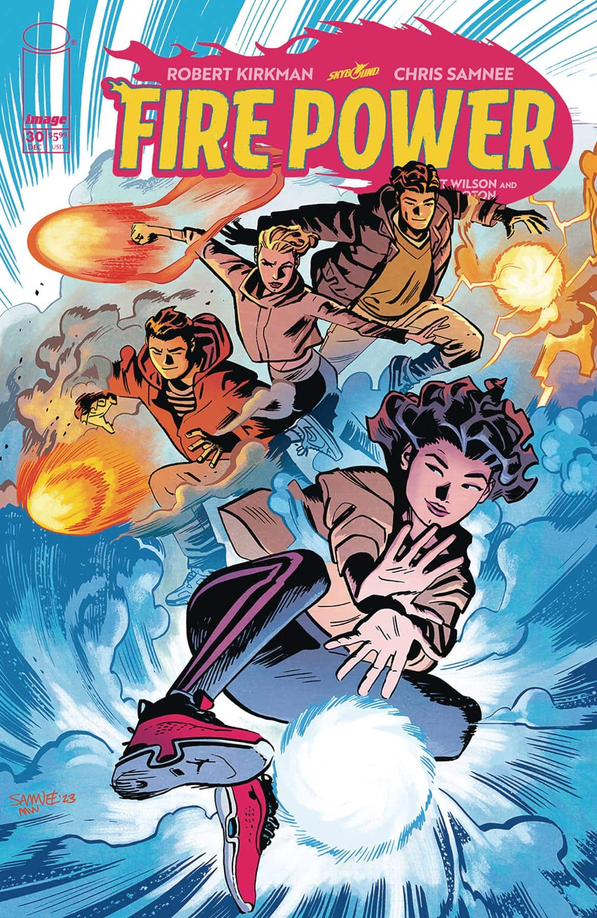
- Fire Power #30 (Image Comics – Skybound): The end of this series, while gorgeous to look at, landed with a bit of a thud. This final issue is indicative of the back half of this series: rapid fire pacing with very little time to digest what’s going on. Robert Kirkman has always written snappy dialogue, but this book plows through discussions that needed a little more time to breathe. Chris Samnee and Matt Wilson continue to be one of the strongest pairings in comics, with every page existing to showcase their incredible talents. The font Rus Wooton chose to letter this book with may be one of my favorite styles I’ve seen in a comic. There are a lot of great ideas and fun sequences in this, but it feels as though either the creative team either had other obligations or were getting tired of this series, because so many of those ideas have been crammed into this last arc. It’s not a bad book by any stretch, but it’s just frustrating to see how little time was taken for some of these larger moments. (Also they blew up Chicago and I’m only a little bitter). – Cy Beltran
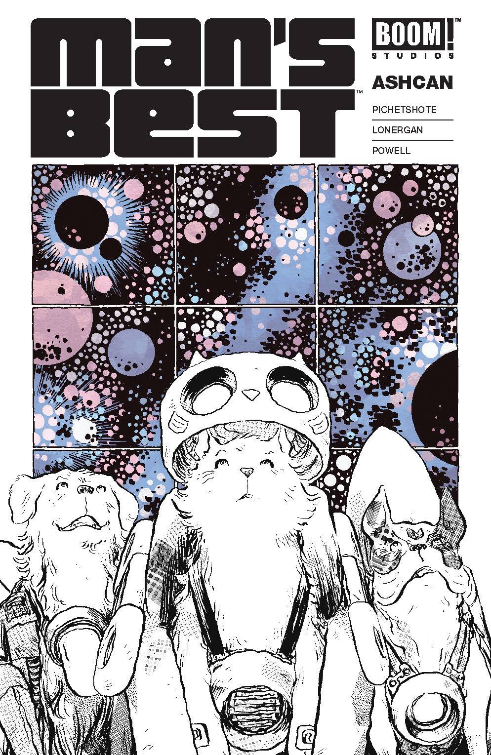
- Man’s Best #1 Ashcan (BOOM! Studios): Having Pornsak Pichetshote, the writer of the excellent The Good Asian and Jesse Lonergan, the meticulously brilliant creator of Hedra come together for a sci-fi story was more than enough to pique my interest. But on top of that, throw a story about the unwavering loyalty and love of pets into the mix, and it’s a downright must-read for me. This week’s MAN’S BEST #1 ASHCAN is a great preview of the series that sets up our trio of space-faring critters. This interstellar Paw Patrol is delightfully endearing right off the bat. Lonergan’s ability to play with time and space on the panel is on display from the very first page The shaky lines and intricate detail of his panel layouts are utterly distinctive but the emotion and nuance of the character acting is never sacrificed. Jeff Powell’s letters perfectly replicate Lonergan’s distinctive loose pen marks, making for a perfect marriage between script and art. While this preview does not get into the crux of the series’ dramatic pitch of “Homeward Bound in space,” we get enough of a taste of our four-legged friends to instantly fall in love. Some terrific design sketches of the human characters and the armored animals round out this preview. BOOM is putting a lot of effort into promoting this new series and if you are curious, this is not a bad three dollar preview. Though maybe just go ahead and save those 3 bucks, preorder the full miniseries now, and trust me that the series will be worth your future investment. —Tim Rooney
The Prog Report
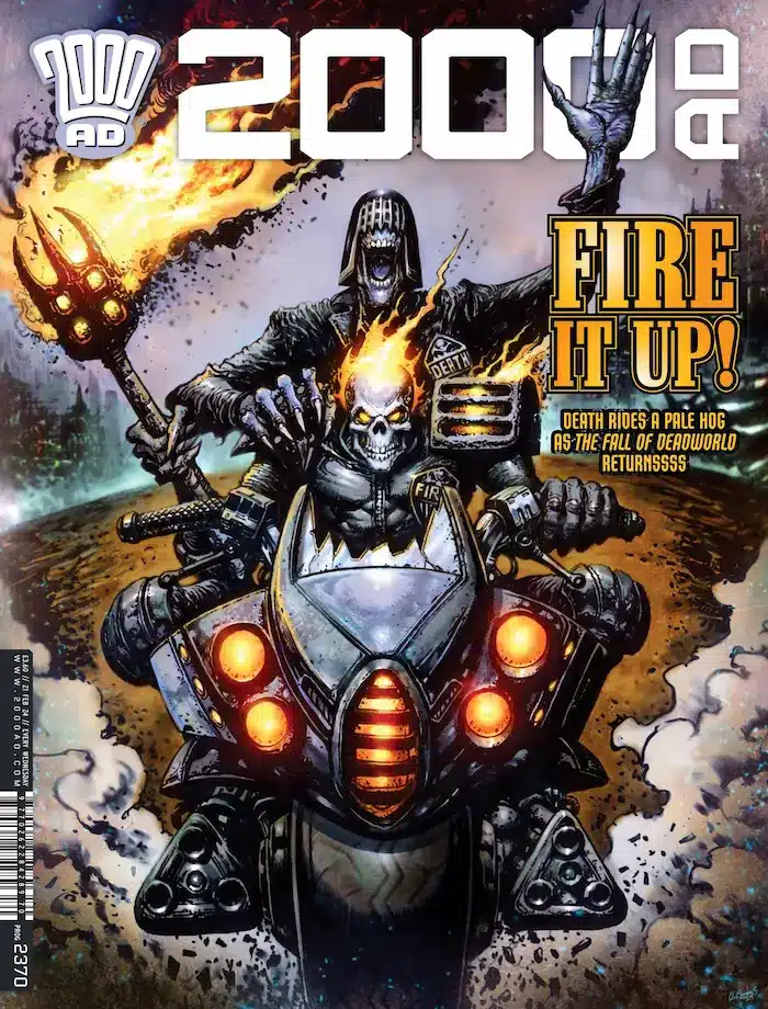
 2000AD Prog 2370 (Rebellion Publishing): This is a killer issue of The Prog, starting with an over-the-top and excellent metaphorical first page for Judge Dredd: A Better World (which I won’t spoil here). This story — an ongoing exploration of police reform, through a Judge Dredd lens — goes right at the role self-interested media personalities can play in interpreting public initiatives. At the same time, there’s another side to the coin — as judges on either side of the debate do battle with narrative, evidence, and bad faith demands for proof volleyed between them. Also, this story continues to deliver a star turn for Henry Flint, whose intricate linework and pressure cooker paneling is just a frenetic joy to take in. As always, you can nab a digital copy of this week’s Prog here. (Oh, and if you missed it the 2000AD podcast re-launched this week, and I guested to discuss how to jump into reading. Find it via podcast or YouTube). —Zack Quaintance
Read more entries in the Wednesday Comics reviews series!


