By Todd Allen
Do not underestimate the influence of Rob Liefeld. Never mind that he’s working on three titles for DC. Never mind that he’s relaunching his old Extreme line at Image with a decidedly more indie creator bent. No, the real influence of Liefeld is evident when you look at the redesigned Power Girl from this just unveiled cover for Worlds’ Finest:
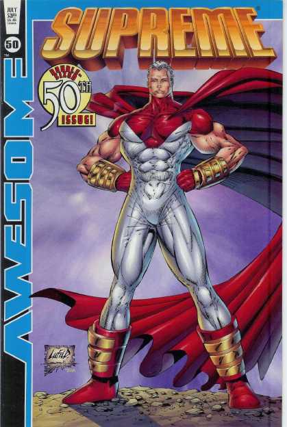
And then recall Rob Liefeld’s old Supreme character:
If Power Girl’s gloves were red… well, let’s just Rob’s influence has probably drilled down to the subconscious level. ;-)




I can guess why DC chose to alter Power Girl’s outfit, but I don’t think this is an improvement. Between the resemblence to Supreme and Perez’s basic style, she looks like she just landed in the present from sometime in the 80s.
And maybe I haven’t been keeping up with The New 52, but what’s going on in the background there? I like that costume substantially more, from what I can see of it.
Hmmm… Looking at the background figure… has anyone made a costume window using the negative space (the “fish”) from the Superman shield?
Second thought:
Has anyone ranked superheroines (and superheros) on how much of their body is covered? Huntress is on one end of that spectrum (surpassed by Spoiler and Cassandra Cain).
I do like PeeGee’s new costume. It’s functional, it’s stylish, it’s sexy. Without being blatant.
Ug! And I was surprised to see George Perez drew this. It looks a tad cartoony and not the normal modern Perez style.
And give me Power Girl’s “blatant” costume any day (no, I’m NOT ashamed to say it!). Her ample bosom sells comics!
Well, really, how many variations can you really do with the leotard-and-cape motif?
I am glad to see it has so many visible seams, because that makes it REALISTIC.
Boooo!
Has anyone seen a George Perez drawing that didn’t look like the 80’s. That man has a specific style and is stuck in his ways. I like the throwback look with better coloring.
Favorite comment from others in my office…
What is she Modesty Girl now?
Heh, Spot on.
That Power Girl doesn’t even have club feet. If anything, she’s a victim of foot binding.
Looks a lot better than the giant boob window, at least.
how does THAT look better?? and unless u play for the other team or a femenist, nothing is better than cleavage
George’s art just keeps getting worse, ugh. I like the absense of the peekhole though.
Meh.
On behalf of the gay community and as the BIGGEST POWER GIRL FAN EVER! I wanted to say that I miss the boob window already. I would have been fine with it covered up in a better design, but this one doesn’t move me, coupled with that bad short cut she had in the late 90s.
This isn’t as bad as the blue (baby/royal) with white and red accents and headband, but definitely doesn’t scream Kara-L to me.
Hopefully they’ve brought back some of the bitch to her personality, if they’ve gotten over her boobs define her, mentality.
Ditching Power Girl’s cleave-window is like ditching Superman’s S.
@Ken
Not really. The boob window isn’t older than the mid 90’s. The S is forever.
What are the armbands and boots of metal about? No, really…anyone?
The window was fantastic. They should have kept it. Maybe it’s still under there.
I think the window was a minor issue compared to the size and detail of her boobs. The window came in the 70s, but her boobs were drawn politer. (http://en.wikipedia.org/wiki/File:PowerGirl1st.png)
She looks really generic now but I’ll buy this book to see if she’s the same Kara I liked in her most recent series.
An ‘S’ window would be cool.
They ‘fix’ Power Girl’s boob window, yet DC still has Supergirl flying around in a Kryptonian diaper? Talk about artists with absolutely no sense of fashion…
I don’t mind the elimination of the peekhole, but this costume design is ugly and dated. Asking seriously given their roles in the New 52: Is this a Jim Lee/Cully Hamner design?
Just to clarify, the boob window has been in effect since the late 70s, so it’s definitely got more weight than a costume from the 90s.
@Jimmy… maybe she’s too strong now and needs the metal casings on feet and hands to hold her back… sigh, no sorry, that didn’t work for me either.
Would have been cool to see someone keep the window, and have her be brash and proud of it, not coming up with excuses for it. Really bummed about this, not so much the loss of the window, just totally not hot for this redesign… Wish someone like Amanda had been asked to do it, get a sexy lady to redesign a sexy illustrated character.
It’s a real shame. When I see this I realize that the decisions aren’t being made in NY any more.
I have also figured out why every hero has these seams in every costume. They’re all made by a single costume maker in the DCU and will lead into next years big cross over. DCs version of the Tinker.
@ChaosMcKenzie is correct. Power Girl was created with the boob window when she first premiered in All-Star #58 in 1976.
http://goodcomics.comicbookresources.com/wp-content/uploads/2010/02/lorensuper10.jpg
Ironically, when the legendary Wally Wood — famously known for drawing voluptuous women — took over the art, the window was filled in (though her boobs seemed to, uh, fill OUT). Later, the window reappeared. Generally, I’ve thought it was as much PG’s look as the chest-bat was Batman’s
WB had to get rid of the boob window during the 52 revamp so that the character is easier to sell into some other mass media project down the road (TV, animation, whatever), even if she only shows up in the background. But this design is just awful. So many other ways they could have gone to to create a new and still attractive super-suit.
This needless noodling (by Lee, Perez, etc), with these 52 costumes is getting ridiculous…I’m talking about all the seams and pointless details in the fabrics. No one at DC today has a clean sense of design or just plain common sense to at least try to make the detail work easier on the other monthly artists.
Welcome to the new Image Comics circa early 1990s.
This looks terrible. Absolutely terrible.
My god that looks terrible
Since PG (well she was called something else, Galatea??) was in the animated Justice League Unlimited I doubt the boobwindow is somehow too “showy” for animation.
I’m gonna miss it. So many potential cleavage-jokes going bye-bye here.
Not liking the new design either. Wonder Woman’ish arm-bracelets (or whatever one calls them) and comparing huntress here to huntress in Marcus To’s huntress mini, To’s huntress looks a lot better, so what’s up with Perez’s art? His covers to the FP: Secret Seven mini were amazing not a year ago.
I almost get the feeling PGs redesign was made by the same person who did the Katana and Black Canary redesigns, adding “stuff” to the costume (on arms and legs etc…) that doesn’t make sense.
I hate it! First, Super Girl’s mini-skirt and now Power Girl’s window in the shirt. These little sexy things are what makes them unique from all the other DC heroines. Even Amanda Waller has gone thru a whole lipo thing. (Sigh) This whole New 52 none-sense is just begging me to loose interest.
The metal arm-bands are how she contacts Buzz Lightyear and Star Command.
More importantly, the proportions seem off on PG (arms and legs specifically) on that cover, and the whole thing looks more like an amateur aping Perez rather than Perez himself.
All the damage done by so many reboots to PG (and others) from bad outfits to weird and ridiculously pointless origin changes was finally repaired by the Justin Grey, Jimmy Palmiotti and Amanda Conner run. The intro of Terra and PG’s interactions with men checking PG out played off the blatant sexuality that the character exuded but didn’t depend on it for a story. It was more like “yeah I know about the window in my costume deal with it”. I understand DC wants to be more realistic but a super powered individual would have little concern about a costume design displaying their ‘assets’ if it was what they wanted. That being said, the new costume ‘YAWN’ looks like it should fit into the new ‘YAWN’ story line set up in mister Terrific ‘YAWN’
end of rant