
by Zachary Clemente
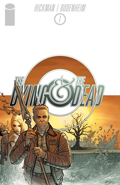
Writer: Jonathan Hickman
Artist: Ryan Bodenheim
Colors: Michael Garland
Letters: Rus Wooton
Publisher: Image Comics
Leave it to a project helmed by Jonathan Hickman (East of West, Manhattan Projects, The Nightly News) to be impeccably designed. The first issue of The Dying & The Dead brings together long-time collaborator Ryan Bodenheim as artist, colorist Michael Garland from Hickman and Bodenheim’s most recent Image series Secret, and lettering duties by Rus Wooton who currently works on both East of West and Manhattan Projects for a whopping 60-page issue; and the sheer amount of information conveyed is akin to a freight train dropping from the sky at terminal velocity. In a good way, I assure you.
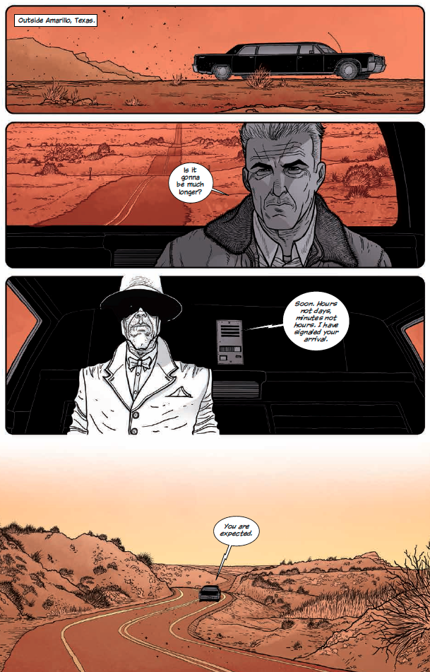
Something I’ve always loved about Hickman’s stories is the extraordinary depth of interconnectedness represented in his work; there’s an undying theme that plays out in iterations, each a microcosm of the previous. This is very present in the first issue of The Dying & The Dead as context and story filter together through different points of view with tiered indicators of how far you’ve plumbed. Each story beat is accompanied by a new setting complete with new a new color set, each reflecting on the past, present, and future both in the narrative as well as what the reader has seen, is seeing, and will see. Despite this, I never really felt lost in way I was uncomfortable with – an important distinction I need to make. These first 60 pages gave us at least 5 locations, a dozen characters to track; each with hints of their own sprawling allegiances and feuds. With the wrong team, this would be a massively unpleasant hot mess, thankfully everyone on the book appears to be more than up to the task.
I want to delve into the colors of the book; as it’s a trend I noticed in Secret, but found less narratively successful than in The Dying & The Dead. This very well may be because it was initially a stylistic choice on part of Garland born from Hickman’s own proclivities and design background and with how well it works with Bodenheim’s strong character lines; but this time around it plays an indispensable role with how characters represent their part of the story and their connection to each other. Each “chapter” of the issue utilizes only 2 or 3 colors, leaning heavily into the representations achieved by contrast, saturation, and highlighting. I’d gander that with a normal coloring technique – this book would be considerably harder to follow and ultimately less successful.
Here’s the thing about this issue in relation to Hickman’s other work, especially that of his other Image titles; it doesn’t feel too big for its britches. Hear me out, that’s not meant to sound like a criticism, it’s actually kind of a compliment. Perhaps this is because of the more than double-sized nature of the issue, but it feels more comprehensive and that makes the overall scope feel smaller than one of his usual titles. I personally find this a great thing, especially as someone who sometimes has trouble getting friends interested in books. His worlds are huge and heavily mired with realistic linkages that affect the fascinating and varied characters in ways that, if not mirror, properly represent the way it seems to happen in reality.
It doesn’t feel like a huge leap, which is something I’m mostly thankful for as a huge leap from the likes of this team would probably be something akin to a new method of delivering single issues to readers by shooting them from the Moon. What it does feel like is a spectacularly crafted beginning to a promising series that will nestle very comfortably in the part of the brain slowing being re-written to fully appreciate Hickman’s work. The more that comes out, the more we’ll understand; just the way it was planned all along.


I’ve been into Hickman’s Marvel stuff (just discovered it through Marvel Unlimited), so I’m ready to check this out. Thanks for the review.
Comments are closed.