

This week, our main review looks at Marc Spector: Moon Knight #1, the latest first issue in Jed MacKay’s ongoing Moon Knight run. Plus, we look at the finales of Amazing Spider-Man: Torn and Captain America vs. Alien; the debut of a new Cyclops series, and, because you demanded it, Star Wars: Jar Jar Binks.
 Marc Spector: Moon Knight #1
 Marc Spector: Moon Knight #1
Writer: Jed MacKay
Artist: Devmalya Pramanik
Colorist: Rachelle Rosenberg
Letterer: Cory Petit
Few writers understand Moon Knight the way that Jed MacKay has in his 50 plus issue run. He’s taken everything known about the character and honed the character and his opponents into a fine point. He leaned into the skid of making Moon Knight crazy and violent. But also he peeled back the layers to remind readers what a complex human being he is. MacKay loves Moon Knight and all of the weird characters in his orbit.
Unfortunately, Moon Knight has been the victim of Marvel’s constant series reboots. Now we’re on the fourth volume in MacKay’s run, Marc Spector: Moon Knight. MacKay has crafted one of the longest and most consistent runs on a character at Marvel currently. Why reboot every ten or so issues?
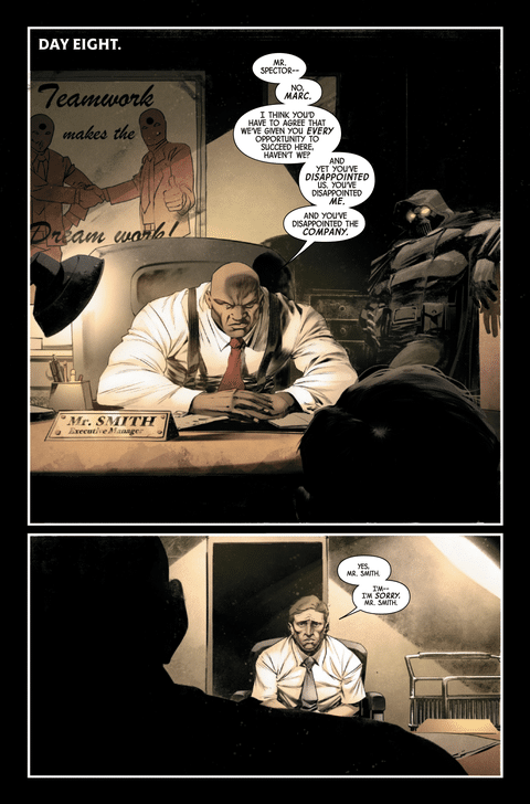
Thankfully, this new issue reads as an entry point into the series. It continues the ongoing theme of outside forces exploiting Marc Spector’s mental health. This time the hero finds himself believing he’s an office employee who can’t get the job done. Agence Byzantine (remember them from the Mark Waid Daredevil run?!) wants to break him for information about his old colleague Jean-Paul Duchamp. Yet despite his brainwashing, he’s fighting the programming every minute. This is all classic MacKay Moon Knight.
One of the highlights of MacKay’s run on the book is the artistic consistency. At this point in the run, he’s joined by artist Devmalya Pramanik. Pramanik is a master with page design, favoring nine panel grid but finding interesting ways to use them. He captures the paranoid feeling of this issue with tight framing on each panel. The grid becomes a prison for the character. The only time he frees up space on the page is when Spector envisions a fake TV show version of his alter ego. Pramanki favors mood in his pages which makes him perfect for a character like Moon Knight and the stories MacKay tells.
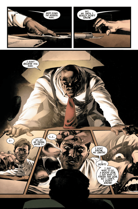
A shout out should be given to colorist Rachelle Rosenberg who has been on the book since issue 1 of MacKay’s run. Here she adds to Pramanik’s pages of mental anguish draping Spector’s banal imprisonment with drab oranges and browns. Her captors exist in a harsh flourescent blue as they watch his every move. This contrast shows why her colors have truly brought Moon Knights nightly adventures to new heights
MacKay’s Moon Knight run has been one of Marvel’s best books as long as he’s written it. Yet it frustrates that Marvel can’t just let his run be one continuous series. This new issue number at least 1 shows that the writer hasn’t run out of new problems to pit the character against.
Verdict: Strong Browse
Rapid Rundown
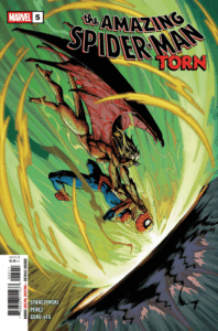 Amazing Spider-Man: Torn #5
t’s the end of Amazing Spider-Man Torn with issue #5, and with it, J. Michael Straczynski and artist Pere Perez may have just made one of the stand-out Spider-Man issues of all time. Nothing groundbreaking or unique, but it does capture the main cores of Peter Parker, his friends, and the responsibility that comes with being Spider-Man perfectly, in a way that almost brought me to tears. From the final fight in the issue that shows what makes Spider-Man a hero to the harsh reality of real life that sets in when the heroing ends, the series has always been excellent, but this final issue really nails that old-school Spider-Man drama in a way many Spider-Man fans would love to see return. What really catches my attention and makes me emotional while writing this is Perez’s art in the final pages. Perez makes the cast’s emotions stare you right in the face and leaves you feeling the same kind of emptiness they feel. Overall, it’s an excellent series that I can’t wait for the trade paperback for. -LM
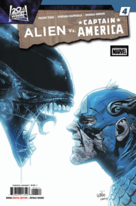 Alien Vs. Captain America #4 Writer Frank Tieri and artist Stefano Raffaele take a weird concept and make something that shouldn’t work, but does in this IP crossover I wasn’t expecting, which concludes as Cap, Bucky, and Fury are helped by Mar-Vell and the Kree to fight the Xenomorphs and Hydra on D-Day. This last issue is a fun nod to the movie Aliens, as one of the biggest battles of World War II is one of the settings for this high-action story with a crazy body count. Tieri gives us some cool moments with the action and blending of the two worlds, with characters like the Red Skull and Arnim Zola becoming more connected to the world of Alien with their transformations. Raffaele’s art, along with color artist Neeraj Menon, gives a weird sci-fi Saving Private Ryan vibe with the comicbook styling and muted colors. It does a solid job of keeping the energy of the story popping. This story probably works best collected, as ultimately, this wasn’t a story I was looking for, but it works with its sci-fi feel and references in a grounded moment in history, and with its coda, leaves room for a sequel. – GC3
 Star Wars: Jar Jar #1
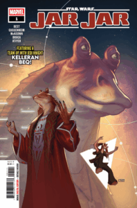
I’ve always treated Star Wars tie-in media with a take it or leave it attitude. If it’s good, I’ll accept it as a legit sidestory that enhances the films. If it’s bad, well, it’s an interesting diversion at least. No harm done. Jar Jar falls more toward the former, elevating Jar Jar Binks beyond pure comic relief and accidentally complicit fool who led to the rise of the Empire. Marc Guggenheim and Jar Jar himself, Ahmed Best, cowrite this tale of character redemption. It’s a fun, meta, decision to team Binks up with Best’s Jedi character, Kelleran Beq. But the decision works for the story based on what we know from Beq’s memorable appearance in The Mandalorian. There are a couple of too-cute moments of winking continuity but it’s forgivable for the heart of the story, which places the well-meaning but inept Jar Jar at the roots of both the Rebellion and the Empire. The art is solid, with the first three quarters by Kieran McKeown, who has a dramatic, high contrast rendering that gives this issue a raw sense of foreboding. The shift to Laura Braga is sudden, which makes the climax disorienting. Braga’s lines are much softer and the pages less detailed. Good on its own and I would love a whole comic by her, but an odd fit as a companion to McKeown. Mike Atiyeh’s colors and Joe Caramagna’s letters round out the creative team and both put in consistently good work that adds visual continuity between artists. I must admit, having been 10 years old when Phantom Menace released, I’ve always had a fondness for Jar Jar Binks. This issue, though a bit overstuffed and rushed in its pacing, does the character justice by doing more than treating him as bumbling comic relief. There’s still plenty of that though, and a number of visual gags that made me genuinely laugh. This is a fun adventure, and one I’ll happily place into my Star Wars canon. – TR
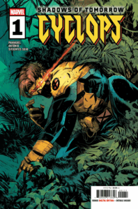 Cyclops #1While Cyclops is a team-based character it is shocking to see Marvel not give the man some time to shine all that much. Sure, we have had a couple one-shots here and there and arguably he’s been the focus character of the various flagship X-Men books since his return from the death in 2019. But we have only had one actual Cyclops series. Well, that ends this week as the X-Men’s leader has a new series with Cyclops #1. As a longtime Cyclops fan, I must say it is one of the best Cyclops solo stories we have had. Writer Alex Paknadel’s take on Cyclops is different than past renditions of the character but simultaneously in-line with the character since the earliest Claremont issues. Paknadel focuses on an idea that inside Scott Summers is someone that is just wild and driven as Wolverine. It is that Cyclops mutant gift and head trauma that forces him to button down and control himself. Cyclops possesses the concussive force of a hydrogen bomb but can’t control it without external aid. The fear that any slip in composure can lead to untold destruction is one of the main things that’s always eating at Scott. In Cyclops #1, Paknadel takes Cyclops through a bit of a ringer of some of the character’s strife be it the plane crash that changed his life, the Essex orphanage, or his fraught relationship with his brother Alex. All of this before throwing him into the Canadian wilderness without his Ruby Quartz visor. Paknadel cited Wounded Wolf as an inspiration for this series and I can see why. This is Scott Summers having to survive when all bets are off and he is not in control. The art by Roge Antonio is kinetic and driven. There is a bit of house style at play but not to the issue’s detriment. There are a lot of moments of brilliance that are breathtaking. One of my favorite moments was when Scott’s visor shatters. Antonio gives it a couple of beats before the big splash page. It is simple but effective pacing. The design of the new Reavers is gristly and full of visually distinct character designs. This issue had everything I wanted and then some. I highly recommend all X-men fans, but especially Cyclops fans to check this out. It’s a damn delight. -JJ
Can’t wait for next week’s books? Catch up with past editions of the Rundown!
And check out most recent comics reviews from The Beat!


