

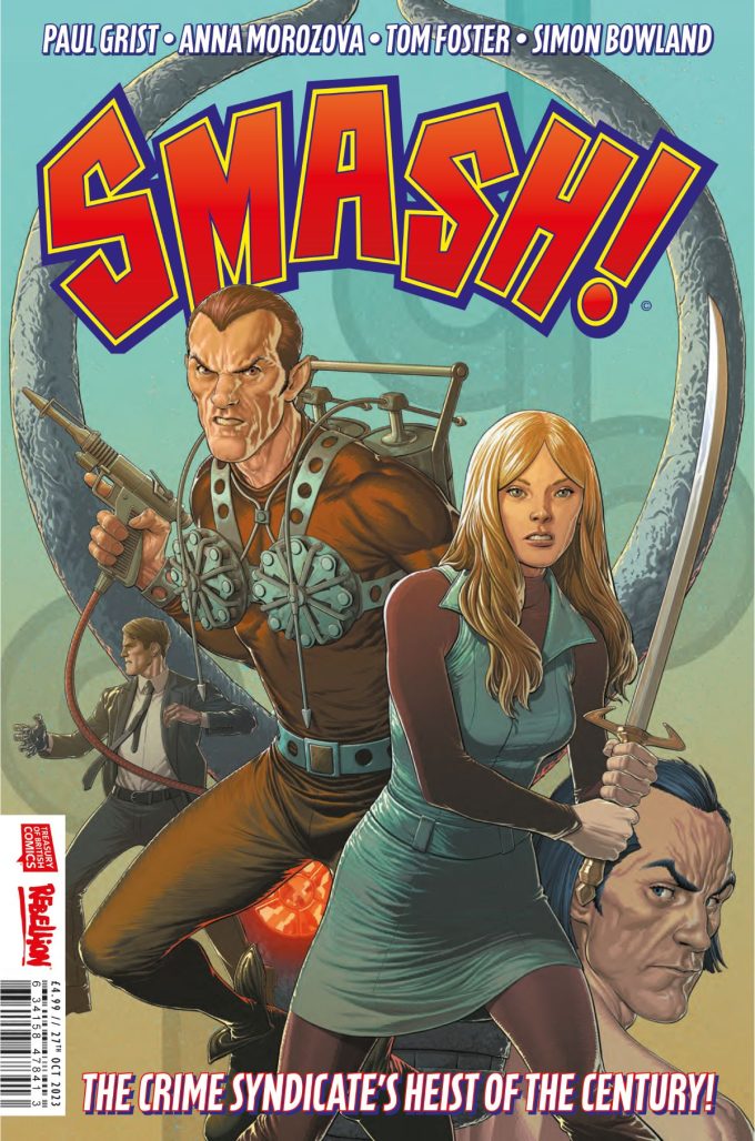
Following hot on the heels of Rebellion’s Battle-Action war comic revival miniseries comes SMASH!, an action caper through the ages that gives a fresh lick of paint to the super-parts of Britain’s vintage comics archive. Featuring the likes of The Spider, Steel Claw, Jane Bond, Janus Stark and others, this three-issue series comes to readers from the pen of writer Paul Grist, lettered by Simon Bowland, and realised by a cavalcade of artists – Tom Foster & Anna Morozova (on SMASH! #1) Jimmy Broxton (SMASH! #2), and V.V. Glass (SMASH! #3).
Series writer Paul Grist and artist Anna Morozova took some time out to talk with Dean Simons about the background to the new Treasury of British Comics series.
DEAN SIMONS: What drew you to the SMASH! miniseries. What really cemented your interest in signing on?
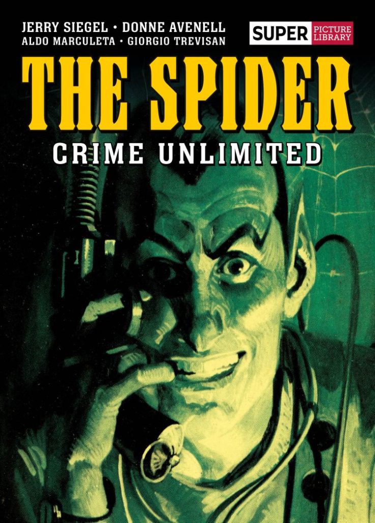
PAUL GRIST: I’ve been a fan of The Spider since I first read his exploits in a Summer Special whilst on a family caravan holiday as a child in the 60’s. I was fascinated by the scratchy spidery drawings (Reg Bunn), and I think the Steel Claw was also in the same collection. That was my introduction to the slightly shadowy world of the British Comic Hero. Whilst they only ran in the comics for a very brief period of time, they captured my imagination to such an extent that when I created my own British Super Hero character, Jack Staff, I wanted to set him in that sort of world. So, when I had the chance to write the exploits of The Spider taking on all comers the history of British Comics, I was hardly going to turn it down! This is the comic I’ve been waiting over 50 years to do!
ANNA MOROZOVA: I was very much excited by the initial email from the editorial. By the time my editor got in touch asking me if I would be interested in contributing art to the project, I was already familiar with the characters he had listed in the line-up. The Spider, in particular, was the character I was especially excited to be working on. Simply put, I did not require much convincing: I replied back to the email within minutes after seeing it land in my inbox.
DS: Can you go into more detail on your first experiences with the various characters we are seeing in SMASH! (e.g. The Spider, Jane Bond, The Steel Claw, Robot Archie)? Did you first encounter them as reprints or at original serialisation? What really stuck out to you on first reading?
PG: Whilst I read The Spider stories in the Summer Special, I didn’t really read the weekly comic strip adventures until a few years later when a comic came out called Vulcan (1975). This was a European comic which reprinted the exploits of The Spider, Robot Archie and the Steel Claw in a weekly comic, which was really quite wonderful as I’d been a bit too young to read the stories first time round! Jane Bond, being a character from a girls comic, was completely unknown to me as comics had a wide gender divide you weren’t allowed to cross in the 1960’s. But she was great in a kind of ‘What would Buffy have been like if she’d been a Secret Agent instead of a Vampire Slayer?’ kind of way. So much so I was quite sad to finish the first issue and know that I wouldn’t get another chance to write her. So I did bring her back for a quick curtain call at the end of issue 3!
AM: Witnessing the core published material during the original run would be rather a challenging scenario in my case as I got introduced to this planet a bit later on down the timeline. The only ways for me to get a hold of original issues would either be a time machine or eBay (and the latter one was indeed used on a couple of occasions). I believe there were newer runs too, but unfortunately, I am not that well familiarised with the continuity as the ‘archive’ in such a case would be quite extensive and require deeper research. I would be mostly looking at reprint collections on top of the reference art provided by Rebellion prior to the project start. I would also refer to some European comics featuring The Spider: he was a popular character in some countries outside the UK, so there is an audience around the globe that is indeed familiar with his adventures. Some Italian copies published in a smaller, ‘digest’ format I would often refer to were, for instance, originally published copies found and purchased online.
All the material I had a chance to look at would be of exquisite quality, representing that extraordinary mastery of comics craft in the 20th century. To me, as an art fan, that was an immense source of inspiration; seeing how different artists would tackle the same characters in such a variety of ways. Coming across one of The Spider comics published for the Italian market in that exact ‘digest’ format, was particularly influential as it featured art completed with a brush rather than an ink-pen – something that, I believe, made me go for a similar technique when inking the pages.
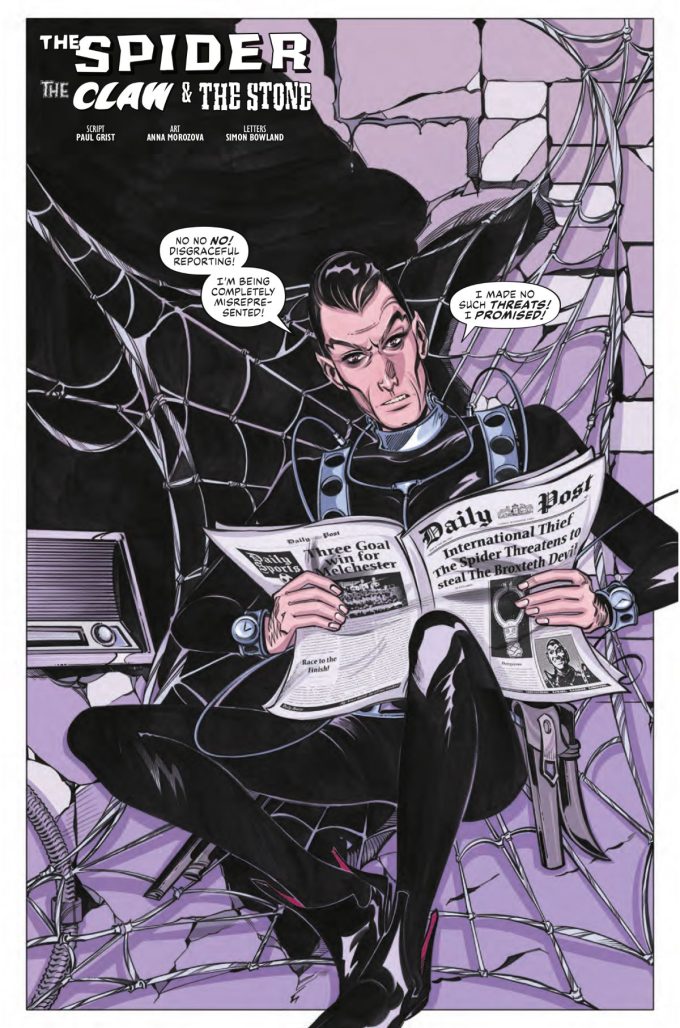
The Spider, in general, had stuck out to me the most as a character. I was especially excited to illustrate his appearance in the first issue of the miniseries. Reminiscent of Diabolik in his visual presence, he has a particularly expressive personality that gives much to work with and interpret artistically.
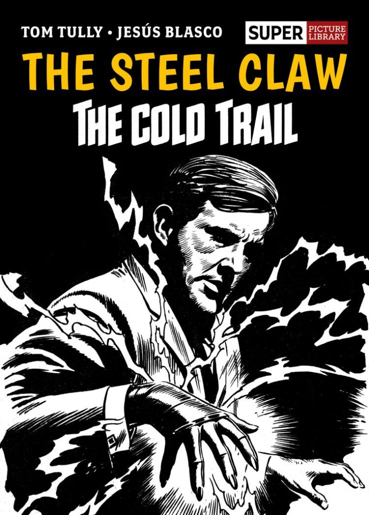
The Steel Claw, on the other hand, is a way more elusive character (the clue being in his supernatural abilities). Unlike The Spider, he does not have a striking design so easily and instantly recognisable except for the actual steel claw. This being said, I was fascinated by the way artists had tackled him visually. Turns out, there is a variety of creative ways in which you can draw invisibility; be it a floating claw in space or an actual figure drawn in ‘negative’ (with white ink against dark background, for instance).
As you can see, I have primarily been admiring the artwork, yet, the stories themselves deserve a more attentive read from my side. This being said, I am currently contemplating a purchase of Best of Jane Bond collection featuring Mike Hubbard’s artwork and published by Rebellion.
DS: There seems to be a little bit of Alan Moore & Kevin O’Neill’s League of Extraordinary Gentlemen to the story here (disparate classic characters put into period settings). Did you notice the potential connection readers might make? Did it inform your approaches to the story in SMASH! ?
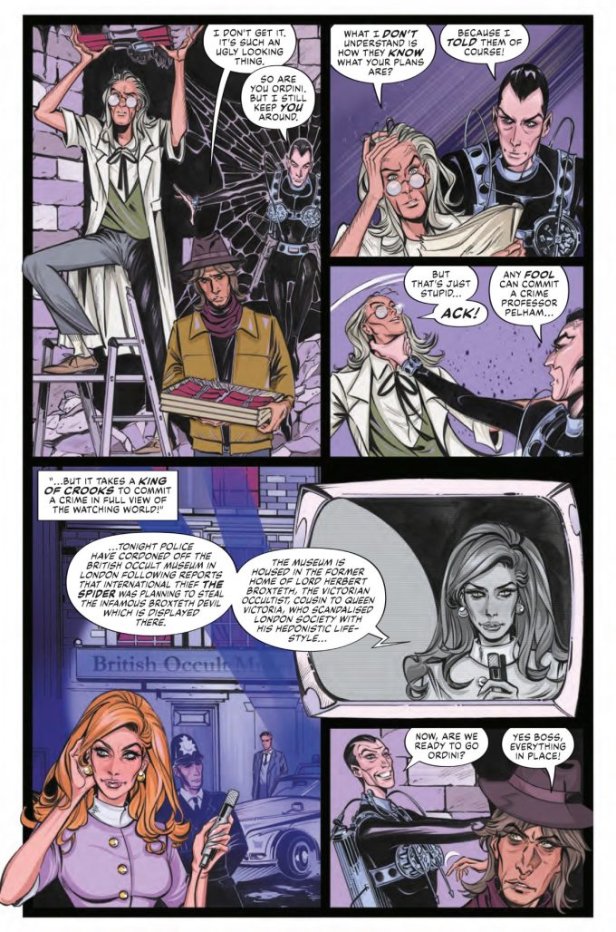
PG: I’ve tried to keep the characters in ‘appropriate’ time settings. The Steel Claw, who’s a kind of secret agent/spy character, is ideally suited to a story set in the 1960’s. Robot Archie turns up, a little bit rusty round the edges, in the 1980’s. Adam Eterno, who floats in and out of the time stream, pops up in the final issue set in the modern day. Meanwhile The Spider dances agelessly across a time frame of 60 years. But there’s always been something a bit timeless about him!
DS: What was the research like? Was there much pressure in getting the characters depicted “just right” for fans?
PG: Fortunately, Rebellion have put out some terrific collections of the original comic strips so my research basically consisted of reading a bunch of old comics whilst sat on the beach and reminding myself of just what it was about the characters that caught my imagination as a child. Sometimes you have to suffer for your art. This wasn’t one of those times.
AM: The research primarily involved me going through the provided material as well as looking into any additional publications that would be available to me at the time. Due to the time setting given in the script, I kept the character designs in alignment with the original depictions. I did not deviate much from the original visuals. Also, who would possibly deviate from The Spider’s iconic look? This is a truly striking, elaborate design that one would rather keep as one of the core elements of visual narration in a story so centred around this specific character. As for Jane Bond and the Steel Claw, for instance, I would have to [look] to some fashion references of the 1960s, which is also a fun part of the research.
Though of course, the end result does have differences if compared to the pages published back in [the] day; primarily due to the techniques utilised when producing pages. Especially considering the fact that I used the mix of traditional and digital approaches. Specifically, the use of digital colour alone would make finalised pages appear very different when compared to original runs, as most source material in this case is in black-and-white. Gladly, I was allowed much creative freedom when working on this project. The main source of pressure was acknowledgement of all that legacy work produced throughout the decades before me. Quite logical, considering the beauty and the quality of the pages I would have to refer to, but sometimes it is important to switch yourself off from fixating on the work done prior to your involvement and focus on delivering the project.
DS: How do you feel the characters are placed for contemporary audiences?
PG: I think they were very much ahead of their time. Although coming out of the 50’s/60’s they’re all quite ‘grey’ in their moral approach to life. The Spider could be a crook or a hero depending how he felt that morning. The Steel Claw tried to terrorise America on his first outing! So nobody would call them ideal role models for young children!
AM: The classics never age. I believe the legacy characters with such an extensive history will live through decades. The variety of creative teams tackling them only adds to their multidimensional presence. Another fascinating element here is, in fact, that re-introduction of legacy characters can always evoke interest amongst new readers and encourage them to look into the previous publication runs. On top of that, the current re-introduction does not require preliminary knowledge from a reader. These characters will be well familiar to readers and fans who have read them before, but the story works as a stand-alone piece too, being an open invite to those who would like to explore more.
DS: What are your favourite characters from the vintage era of British comics? What draws you to them?
AM: Well, one of them is The Spider now! A peculiar antagonist that sometimes ends up on the goodies’ side. Also, a character of a brilliant visual design that evokes some fantastic visual representations of him by a variety of artists.
I really enjoy looking at artwork that would appear in British girls comics back in [the] day… To give an example, there is an absolutely brilliant collection of Sugar Jones strips (written by Pat Mills, illustrated by Rafael Busom Clua, published by Rebellion). Now that I think of it, I can see some similarities between Sugar Jones’ character and The Spider: two quite antagonistic, narcissistic personalities relying heavily on their entourage and assistance with an intent to bask in glory.
Now that really sounds like I am into reading about antagonistic characters with non-exemplary traits… In my defence, I would say that I am first drawn to the artwork. Those are the first two characters that came to mind. I am a huge art fan, and that exact vintage era of British comics is an endless source of inspiration for myself as the art produced during that era is of outer-worldly quality.
DS: Were there some you wanted to use but couldn’t make the cut?
PG: There are so many I could have used, but I really didn’t want to overstuff the comic with characters, which could end up a very unsatisfying read. So I’ve just focussed on a few.
The only one I really wanted to include but didn’t was Tim Kelly and the amazing Eye of Zoltec which prevented him from any harm. But the absence of Tim is all over the stories, so I think his presence is certainly felt, even if he doesn’t make the stage.
DS: Designing the characters for the series. Have there been any changes or adaptations made to modernise the characters?
PG: Writing wise, no, I’ve tried to keep the characters pretty much as they were in the original comic stories. I do feel the characters were all pretty unique and well defined, so my job was to try and tell an interesting story which would help introduce them to a new audience.
AM: Given the time setting in the script – no. In the first issue, we start off in the Victorian era, and the first five introductory pages are illustrated by Tom Foster. The ‘main body’ illustrated by myself is taking place in the 1960s, so I kept the designs in alliance with the circumstances and original visuals. Though just like I have mentioned previously, the final pages, generally speaking, do have a different look and feel to them. That would be determined by my current skill level, influences and drawing techniques utilised.
DS: Will the story stand alone or do you reckon it could springboard into a sequel mini or two?
PG: Each individual issue stands on its own, but there are threads which go through each issue which are hopefully resolved in a satisfactory conclusion in the final issue. That said, there is so much more that could be done, so many more stories that could be told with these characters, so I hope this serves as an introduction rather than an ending for them!
DS: Paul, how does working with other artists compare to being the sole author of a work?
PG: It makes a nice change to hand the actual hard work of drawing the comic over to someone else – and everyone seems to have risen to the occasion so I’m pretty pleased with how it’s gone so far!
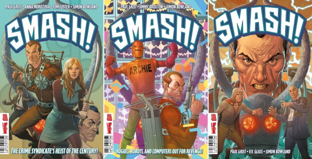
SMASH! #1 (of 3) is available from UK newsstands, comic shops, and in physical or digital editions from the 2000 AD webshop on Wednesday (October 25); followed by the US comic book store release on November 29 [Diamond code AUG232169]


Yeah more Paul Grist comics! Can never get enough. Definitely interested in this after reading Jack Staff. Now if only the Kane revival would come out.
Comments are closed.