
Doomsday Clock is an upcoming 12 issue series by Geoff Johns and Gary Frank that wraps up the “button/Watchmen” storylines from Rebirth. It’s Superman vs Doctor Manhattan, which….well, I’m not a big fan of resurrecting the Watchmen characters but that’s how the world goes. Johns knows he’s taking a risk in writing the story but has said that it’s a story he needs to tell and he and Frank are giving it their best shot.
And so come variant covers have been revealed via tweeter.
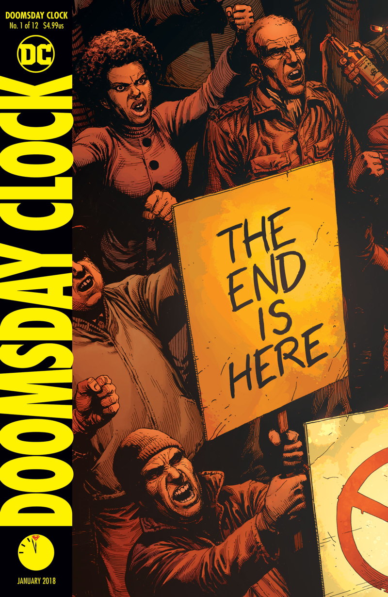
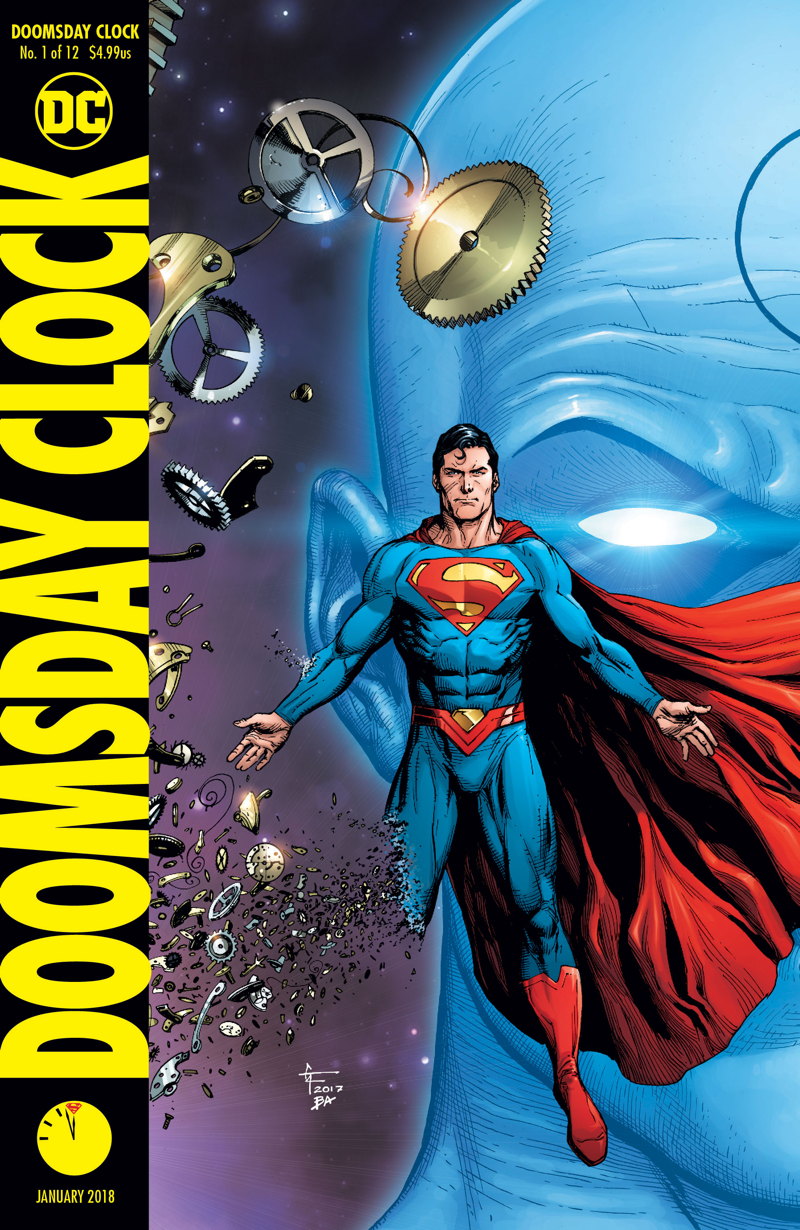
The main and first variant cover are by series artist Gary Frank. The second variant is one side to a lenticular cover, using preexisting art by Dave Gibbons. The full lenticular is coming in a few weeks. UPDATE: a different comics news website that we’l call Trowel (because it’s a weeding tool, see) says this image was “leaked” – if by leaked you mean mailed out by a DC Comics or rep. Beware the propaganda!
The branding uses the classic yellow-and-black Helvetica look that scream Watchmen no matter where and when you see it. Don’t mess with success.
The first issue goes on sale on November 22.


It’s obviously going to be insane, but that’s why I read comics.
It looks like lenticular covers are going to be the new norm now on hot books. What are the publishers going to do when that rehashed gimmick no longer works?
Ed, they will then glue plastic gems to the covers.
LL
Don’t know what typeface the Watchmen logo is for sure (It looks a lot like Flyer Extrablack Condensed except for the M, but it may be a hand-designed logotype, given the vintage), but it’s definitely not Helvetica.
Comments are closed.