

Interview by Avery Kaplan and Ollie Kaplan
Design is one of the least-discussed elements of graphic novel publishing. To help bring a creator’s artistic vision to life in a way that’s easily navigable for the reader, a team of artists, designers, and art directors shapes how that story will be seen, felt, and navigated. At Ten Speed Graphic, the book design process is both highly collaborative and deeply craft-driven, blending intuition, technical precision, and a willingness to “throw spaghetti at the wall,” as designer Meggie Ramm puts it.
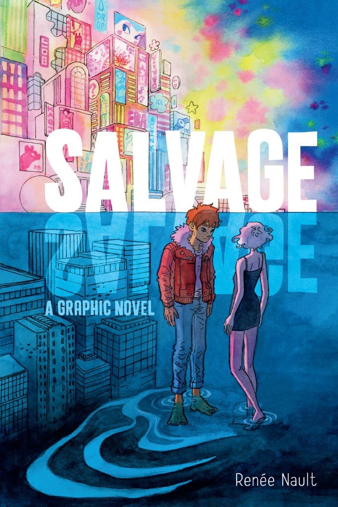
The Beat caught up with Ten Speed Graphic’s design team—Chloe Rawlins, Executive Art Director, and designers Meggie Ramm and GB Tran—to learn more about the artistry behind designing graphic novels—from developing cover concepts to shaping interior layouts, from choosing typefaces to solving the quirks of printing signatures, the team walks us through how each book becomes its own bespoke object. Plus, we have a first look at some new covers designed by the team: Mister Magic: The Graphic Novel, written by Kiersten White, illustrated by Veronica Fish and Andy Fish, and adapted by Scott Peterson, and Salvage by Renée Nault.
This interview has been lightly edited for length and clarity.
AVERY & OLLIE KAPLAN: Can you tell us about your design process?
MEGGIE RAMM: My design process is mainly throwing spaghetti at a wall and seeing what sticks. We all look at comparable titles and use that as a jumping-off point for style direction, and from there, I try to make a bunch of different iterations based on that research. I don’t know if something is working or not working until I try it, so it’s throwing a lot of noodles and making a lot of mess. (My folder structure is a nightmare, and thank god no one else has to witness it.)
CHLOE RAWLINS: We work very collaboratively at Ten Speed Graphic. Before we start designing a graphic novel, we meet with the author and the editor to discuss the project to help us get a feel for the story and artwork. As the illustration starts to come in, we begin to think about the color palette and typography and how they will be incorporated in the cover and interior. We ask our artists for some directional cover sketches and begin exploring what the title lockup will look like. We design several directions and begin to refine based on feedback from the author, editor, creative director, sales and marketing team, and publisher. Once we have a cover direction, we use that to help guide the interior design and layout. We look to the artwork for inspiration as well. Are there textures we can use to make the front matter more visually interesting? Is there an element of the art that we could use in a pattern or decorative element? We want our design to help immerse the reader in the story from the moment they pick up the book.

ENSIGNS KAPLAN: Can you tell us about the relationship between the text and the book design?
RAWLINS: When I am beginning to design a new graphic novel, I give a lot of thought to the content of the story and how the design should fit into that world. For a Romantasy graphic novel, I may design with a softer color palette; for a historical graphic novel, I may try a more literary typographic direction; for horror, I could go with a design that has a more dramatic flair. Our intention is for the design to complement the story.
ENSIGNS KAPLAN: Have any books presented a particular challenge in terms of design?
GB TRAN: Being the newest member of TSG’s design team, combined with how long it takes a book to become the thing you hold in your hands, my sample size is relatively small. So, generally speaking, I think every book has its unique challenges, and it’s through solving these challenges that we are given the greatest opportunity for creative growth. Whether it’s how to most legibly design a long title that demands a very decorative font or making all the story and front and back matter perfectly fit a total page count that’s a multiple of 16, each design challenge is a chance to try something new and be surprised by the solution.
RAMM: I had a book series where elements on the front cover had to line up across the series, which was very cool and very tricky to pull off as the covers were being designed years apart.
RAWLINS: I have been designing graphic novels for many years, and yet I still learn new things with each one I work on. Sometimes it is problem-solving an issue with a file, or trying out a new workflow, or learning a new technique for a typography effect. Every book has its own personality that we want to capture and express in the design, and the challenge can be figuring out what that personality is.
ENSIGNS KAPLAN: What elements come under the purview of design that readers might not expect?
TRAN: Readers might not know that offset-printed books’ total page count is always a multiple of 16 due to the printing process. One of the idiosyncratic things about book design that I enjoy most is when the book’s content doesn’t perfectly fit in a multiple of 16 pages–i.e., a printing signature–which then lets me play with how those “leftover” blank pages get used in the book’s design. For example, are they used to add more pages to the front matter to help build atmosphere and set narrative tone? Or do I tack them at the very beginning/end to elevate the package with decorative pages? Or maybe I can insert some chapter break pages, etc. That said, getting a story that perfectly lands on a multiple of 16 pages is a pretty happy, nerdy design feeling, too!
RAMM: Spine design! I love designing spines; it’s such a small area of real estate, but it faces the consumer just as much as the cover. I’ve gotten to work on several series where the art continues from one spine onto the next, and those are so delectable to work on.
RAWLINS: There is a lot of finessing that happens within the overall design. Sometimes a particular font will need kerning between letter pairs so the spacing looks even. There are times when the art looks great on screen but starts to look flat when we convert it for print, and we need to color correct. We will often adjust where the text lines break for a smoother reading experience. There are so many little details we look at for every book.
ENSIGNS KAPLAN: How much of the design process is a team effort? What positions are “on the team”?
RAMM: The goal is to have a finished project that the designers and editors and creator are all happy with, so part of the process is mediating between what we as publishers want for the book and what the creator wants for the book.
RAWLINS: Being a book designer can vacillate between a lot of collaboration while workshopping design ideas, to quiet, solitary moments where we are creating the interior and cover layout. Our core team consists of two designers, an art director, and a creative director.
ENSIGNS KAPLAN: Are you particularly proud of how any specific books turned out?
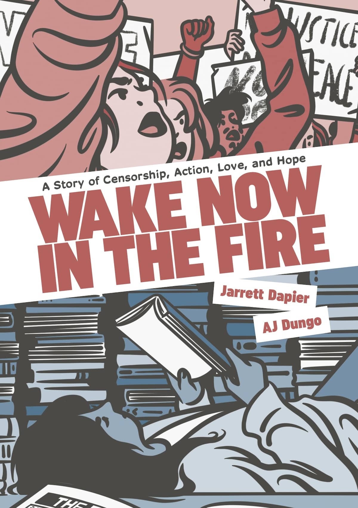
TRAN: As mentioned earlier, I’ve only had a few books come to fruition at TSG, but each one had a special design challenge to solve that made it a unique book that I’m proud of. So instead of picking my favorite child, I’ll just go with my most recent one that went to print: Wake Now in the Fire by Jarret Dapier and AJ Dungo, which goes on sale in February 2026. This amazing project had a lot of exciting, uncommon graphic novel design opportunities: a jacket with flaps, a printed image on its hardcover case, and an unusually wide spine (because it’s 464 pages!) that all allowed for some fun, creative exploration. It was extremely satisfying to think about how all these physical traits could be designed to communicate the weight of this powerful, extremely relevant story about teenagers fighting the banning of Marjane Satrapi‘s Persepolis in Chicago schools.
RAMM: I have two comics that I’m working on right now, and they are GORGEOUS. I cannot wait for them to come out in print so I can hold them in my hands. They are in an art style I haven’t worked with before, which means learning new tricks to make the pages really shine. One of these projects is a YA graphic novel called Salvage, out in summer 2026 – it’s a solo debut from Renée Nault, the adaptor/illustrator of The Handmaid’s Tale graphic novel adaptation. That’s my favorite part of the job: every book is different and requires new tools, and each new book is enjoyable because I have a higher skill set with each new challenge.
RAWLINS: I absolutely love our whole Ten Speed Graphic list, and a particular highlight for me to get to work on Zodiac: A Graphic Memoir by Ai Weiwei. I am a huge admirer of his work; it was an honor to get to design the package for the special edition. I got to use a technique I had never used before called Cold Foil, which allows you to get a foil effect on much finer lines than traditional foil allows. It looks stunning when the light hits it.
ENSIGNS KAPLAN: How have your previous roles in the industry influenced your contributions to the design process?
TRAN: Before I joined Ten Speed Graphic, I’d been a publishing cartoonist and graphic designer for 15+ years and a comics professor for 10+ years. Getting to now help other comic authors, artists, and cartoonists bring their labors of love to fruition is a dream come true! I’d like to think all those prior creative endeavors–that I still do outside of my job as a TSG designer– continue to help me better understand the author’s intent and goals, and more effectively design graphic novels in a way that will make the story linger in the reader’s mind long after they’ve finished the book. And will look really freakin’ cool in a store window display!
RAMM: I’ve rolled around in a bunch of different jobs in the industry, from art assistant to retailer to kids comic teacher, and I also have my own comic series out through Abrams. Through these experiences, I’ve been able to translate publisher speak for our cartoonists, and vice versa. My first published book was going through the design process when I first started at Ten Speed, and it was really trippy. It was like making the sausage and watching the sausage get made simultaneously.
RAWLINS: I have been designing books for over two decades, first with Ten Speed Press and now with Ten Speed Graphic. Each role I have taken on over the years has help shape me into the designer and art director I am today. I rely on the skills I have learned and try to build on them, and keep pushing my book design work forward.
ENSIGNS KAPLAN: Are there any comics (or any other kind of stories) that you have found particularly inspirational lately?
TRAN: I recently finished the video game Clair Obscur: Expedition 33. One of the best stories I’ve ever experienced in any medium. IYKTYK.
RAMM: You and Me on Repeat by Mary Shyne was absolutely brilliant. My favorite comics are ones that have a fresh story with amazing art, along with some insanely designed pages, and Mary hit it right out of the park. I’m also avidly waiting for the next Knights of Guinevere update, because they have SO much they can build on after that first episode.
RAWLINS: I am currently reading the Yotsuba&! manga series for the second time. The joyfulness of everyday moments in the story is just what I need in this current moment in time. I recently read Ocultos by Laura Pérez, and really loved it. The artwork is just so beautiful.
ENSIGNS KAPLAN: Are there any other storytelling mediums that especially influence your design process?
RAMM: I’m going to be honest, I mostly mainline comics. I’ve read over 300 books this year, and the majority of them are graphic novels. As for seeing something outside the norm, I love seeing what indie cartoonists are doing at the smaller conventions. They push the medium in ways that are harder to accomplish on a larger scale, and I’m always on the lookout for strange little comics.
RAWLINS: I sometimes like checking out movie posters for inspiration. Like a book cover, they need to capture your attention and pull you into the story without giving away too much. They often creatively use color and typography to set their tone.
ENSIGNS KAPLAN: Is there anything else you’d like us to include?
TRAN: You know that old adage, “You can’t judge a book by its cover?” Welp, don’t ever say that to a book designer lol.
RAMM: I have my own comic series out with Abrams called Batcat, and book four comes out in April of 2025. I’m currently working on my first YA graphic novel about the history and gender politics of the Olympics. And I’m trying to read 365 books by the end of the year.


