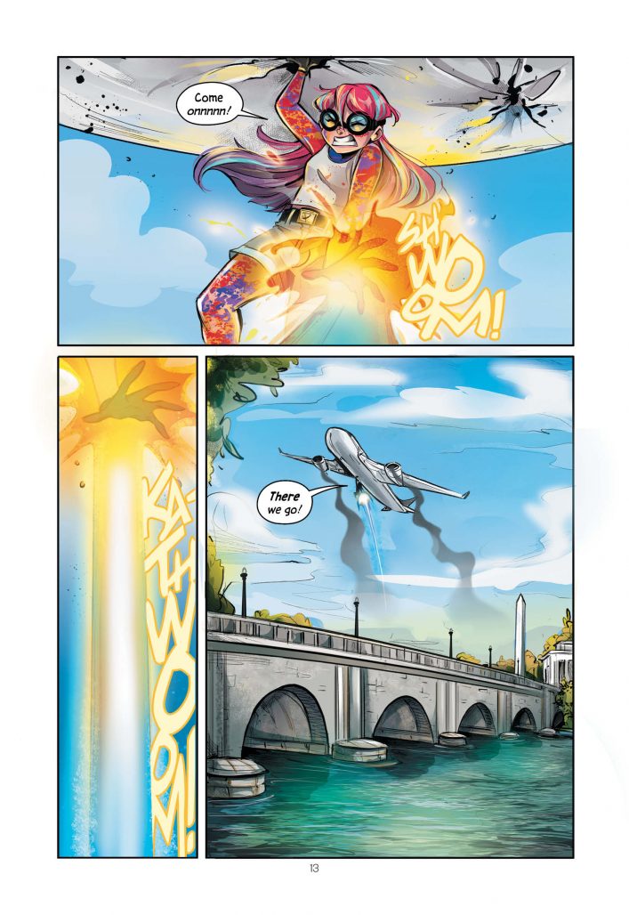
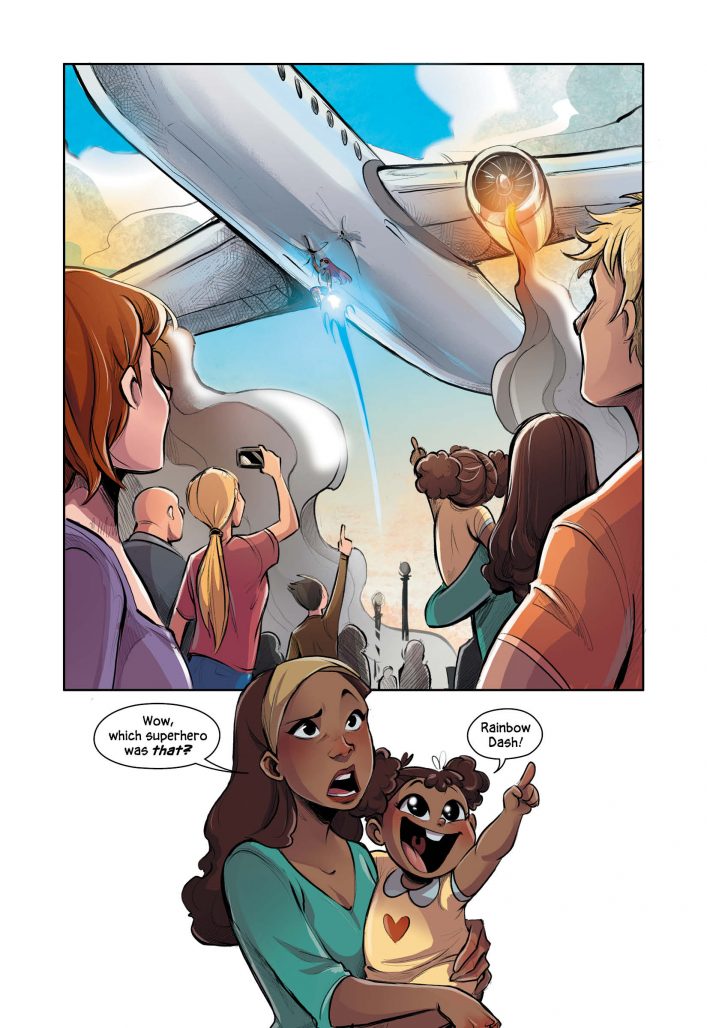
This week marks the release of Primer, DC Comics’ new YA graphic novel from writers Jennifer Muro and Thomas Krajewski, and artist Gretel Lusky.
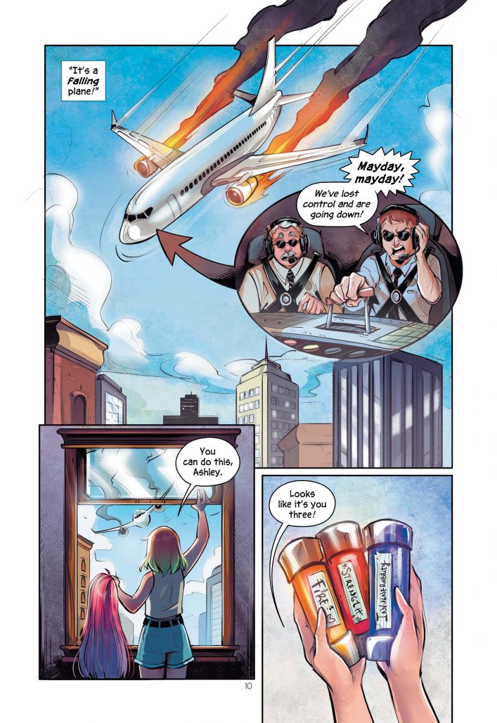
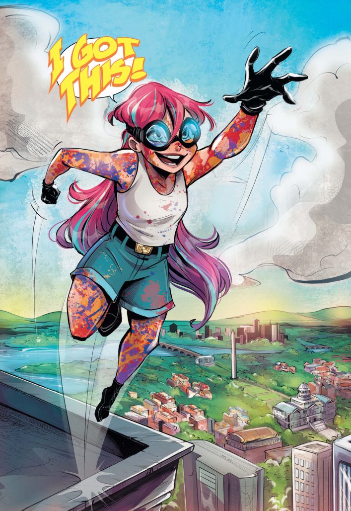
The book, which debuts an entirely new young woman superhero, has a colorful premise, to say the least: in this story the young heroine comes across a set of body paints that when applied give her super powers. The paints were developed by the military, and our hero must use them to do good while avoiding a military in search of its missing weapon.
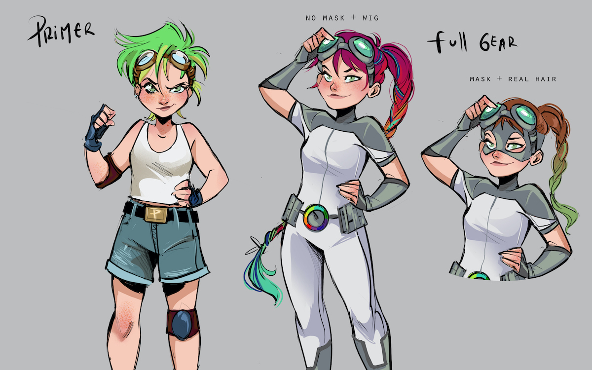
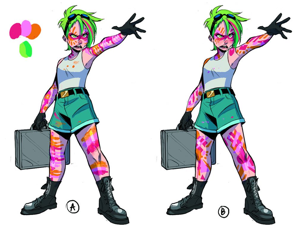
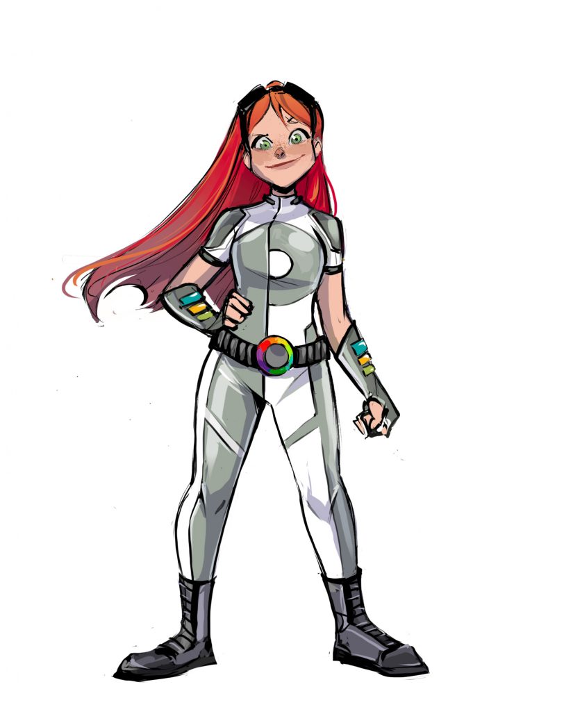
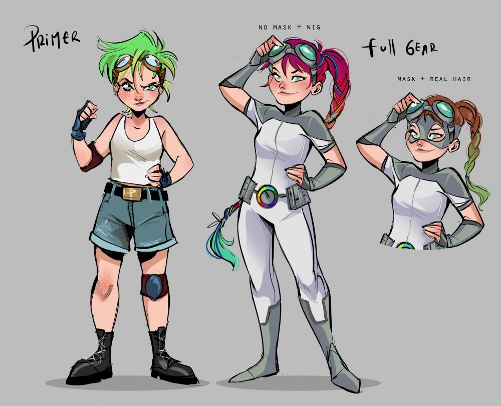
Powering the action is the work of artist Lusky, whose use of color is innovative and striking throughout, and today, The Beat is honored to have an exclusive unveil of new character designs from Primer. In addition, we also have an interview with Lusky about the work. Check out the designs below, followed by our interview.
Enjoy!
ZACK QUAINTANCE: I love your design for Ashley’s character, which is recognizably both an artist and a young hero. How did you approach designing an entirely new superhero for the DC Universe?
GRETEL LUSKY: At first, when they asked me to do some design tests, it was really challenging since there wasn’t a lot to go on, aside from Ashley’s age and personality. I wrote down some aspects and characteristics we haven’t seen represented much in pre-existing characters, like freckles or half-colorful dyed hair or ripped jeans covered with paint and stuff like that. I also wanted to include little things that fit well with Primer’s artistic personality. Primer’s superhero form was even more challenging, because the way the paints could work and interact with her outfit was pretty much limitless. I did a lot of designs and different superhero suits we refined along the way with Jen’s and Tom’s feedback and ideas too. Looking back, I can definitely see Ashley’s essence in those very first explorations, and that’s proof of how much we all shared the same vision for how Ashley should look like but also the creative freedom they gave me during the whole project, which made the whole process worthwhile.
QUAINTANCE: Did you draw inspiration for Primer from any other depictions of DC characters in creating Ashley?
LUSKY: At first glance, not really, since I wanted her to look as different as possible from all other DC Super Heroes. However, I did try to capture that goofy and cheerful energy so characteristic of a teenager, and for that I’m always heavily influenced by the Teen Titans, which have been a huge inspiration to my work. While working on Primer, I made up so many scenarios in my head about Ashley meeting and hanging out with them or doing silly stuff together.
QUAINTANCE: What makes this story so fun to me is that it’s an artistic work about a hero who basically needs to make herself art to have powers…how did that change the work for you as an artist? Did you feel closer to this world and character as a result?
LUSKY: Definitely! When I first heard it was going to be a story not only about a completely new DC character, but also one who happens to be an artist, I was stoked. I loved the premise and I knew it would be a blast to illustrate it. When I was a kid, I really believed drawing was my superpower, so getting to draw this graphic novel that combines both elements was really special, as I’m sure will be special for many young artists out there who get to read the book, as well.
I felt an instant connection with the characters and the world around them almost immediately! I really enjoyed decorating Ashely’s bedroom slowly as the story goes, and filling up Kitch’s studio with all my favorite art supplies and stuff I have on my own studio.
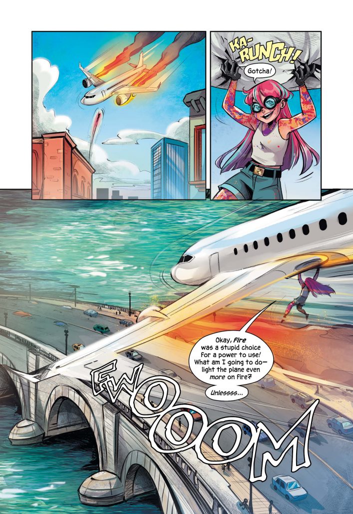
QUAINTANCE: I think your color work in this book (and in your other work online) is just phenomenal. Can you talk a little bit about how you approach colorwork in your comics just in general? It feels like you’re having quite a bit of fun with it as you work…
LUSKY: I like to experiment a lot. I’m not the type of person who does much planning beforehand so I go with whatever feels right for the moment and change/tweak stuff along the way. Generally, I start with two or three key colors for each panel and start building atmosphere from there. Using various layers set to different modes to add effects is also very helpful. It’s really an intuitive process of trying out things and seeing what works and what doesn’t!
QUAINTANCE: Finally, one thing I really loved about this book is there’s a lot of inherent darkness to Ashley’s backstory, and yet this book never feels overly dark or cynical. I think the visuals were a big part of that. How did you balance that in your work in this book?
LUSKY: Since Primer is targeted to a younger audience, I tried to keep the art as uplifting as possible. I used bright, saturated colors to make the reader feel Primer’s surroundings were safe to live in, though I also think it’s important to have those darker moments which give the story more depth. For those moments, I tried to be as honest as possible and inject it with some of the innocence our protagonist has. I think the graphic novel works thanks in part for Ashley’s positive attitude which helps balance the dark points which is also a testament to the writing.
