

Critical Thinking is an ongoing column that analyzes academic writing on comics and art.
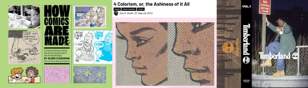 How Comics Are Made: A Visual History from the Drawing Board to the Printed Page
Written by: Glenn Fleishman
Published by: Andrews McMeel / $40
Jun 2025
“4 Colorism, or, the Ashiness of it All”
Written by: Zoe D Smith
Published by: WWAC
May 2019
The Timberland Tape Vol. 1
Produced by: Soles of Mischief
Released by: Unofficial Official / £5
Oct 2025
How Comics Are Made is at its heart a technical book, but flowering from all the details compiled and explained are thousand offshoot insights. Glenn Fleishman‘s focus is more about comic strips than comic books, but also more about printmaking and cultural anthropology than the qualifiers between different types of graphica. The physical world of print runs is their shared territory, and Fleishman’s concern. The physical world is also where things tend to get complicated. Looking at the process of making comics means confronting the labor that produced it.
Zoe D Smith looks into the politics of printing people of color in her article for WWAC, “4 Colorism,” a truly next-level piece of comics criticism I found digging through the citations in Qiana Whitted‘s Desegregating Comics, which also informs this essay. Smith’s perspective lends dimension to the technical elements Fleishman explains, but beyond that, WWAC being a free source of information that anyone can access- maintained on hiatus!– is important to this writing as well.
So while at first blush a comics history of Blackness and the printing process that doesn’t make it past the 1980s seems to have little to do with hip-hop music produced in the 1990s and 2000s, Soles of Mischief are on to something. Their series of branded mixtapes explore the cultural relationship between rappers and fashion with songs, interviews, and other sonic documentation. Works like the Hilfiger Tape and the Timberland Tape both get into how Black culture innovates with the established to create something new. Like taking a draftsman’s tool used for shading backgrounds and using it to bring representation forward, into the 20th century.
How Comics Are Made is a sign of the medium maturing. At least in America. A lot of the stuff that Fleishman covers is from a world normally removed from the comic reader. As ubiquitous as their IP is, comics themselves are ephemeral, an aspect of their production, rather than their content. As most comics disappear over time, what is kept and by whom can seriously skew one’s view of history and reality, depending on what they have access to. You’ve got to read a certified textbook to see some of these comics at all, despite having circa circulation in the hundreds of thousands. Fleishman’s work is from a traditional publisher, Andrews McMeel, not an academically reviewed but financially daunting specialty university press. How comics are made isn’t just a niche interest? Cool.
The Black community is as underrepresented in American history of comics as they are in most other American histories of things. The progress Black educators have made in their fields so that Black history is a part of taught history has taken great enough strides that an important medium whose critical theory is nonetheless still in its youth- American comics- gets to share in an era of remarkable academic exploration. But behind a wall of profit constructed by companies like RELX. The push and pull of access and culture is what this is all about. I see Fleishman’s book as a good resource for people who aren’t enrolled in a university (though it’s good for students and teachers, too) but still want to learn about the history of Black cartoonists. Here’s why:
How Comics Are Made is about how we see color. Indirectly, as it gets into the way that inks are combined to print color, the artist’s process in relation to the printer’s, and how perspective influences how colors are calibrated. Blackness in color is an artistic expression of an idea, not a number you can point to, so here’s a catalog of swatches to choose from. And directly! Fleishman has a chapter about how Black cartoonists used different processes to depict ethnicity. Illustrators’ tools designed for shading were given reimagined meaning through the creation of Black comics. Blackness without color is art, it is vision inspired by practical interpretation, it is what we’re here for.
Hard to read, like hard to find to read. Comics has an industry built on white guys that does little to no Black cultural preservation unless it’s connected to a franchise. Historically, white publishers made it hard for Black comics to exist in the first place, forcing Black periodicals to build their own networks. Academic collections exist, though you’ll see more pieces of original artwork preserved from private collections than the comics as they were printed, and access is extremely limited.
A world without Black comics is eagerly proliferated by an online community in the throes of corporate nostalgia. The comics that are preserved are done in the name of completion- this run, that artist, this publisher- regardless of quality, a breadcrumb trail followed back in time from a starting point of mainstream, contemporary popularity.
This paints an unrealistic portrait of what was coming out (and what mattered to readers) based on contemporary restrictions. Is it crass to compare the absence of Black comics to survivorship bias? You have to buy books about comics to learn about Black creators, or visit the Billy Ireland Museum, instead of being able to turn to primary sources.
Even in circles of higher access, mostly you don’t get to read the comics themselves, just about them. Glimpses of isolated pages, strips, and panels that are referred to in the published essays. But times are changing. Studying comics in academic circles have opened the medium up to multidiscipline analyses from other arts studies who are already institutionally legitimized. Which means, good reads on the work, new perspectives on old ideas, and the proliferation of these new takes through already-established avenues. Longstanding assumptions about comics are finally starting to topple as the medium is allowed mature, heuristic investigation.
The comics you can actually read are still largely influenced by the whiteness of the comics industry. All-Negro Comics has been recently, lovingly reprinted. It’s genre comics, the cliches of its day but with Black protagonists instead. Detectives and gangsters, jungle heroes, cheesecake. It being genre comics is why folks are drawn to it now- it’s why it got made in the first place. Black creators wanting to see themselves in an industry they contributed to the building of is far from an unreasonable desire, then or now. And while superheroes might be falling perilously behind kids comics in the money market, they maintain a steel grip on publishers, editors, and the folks who work in the industry.
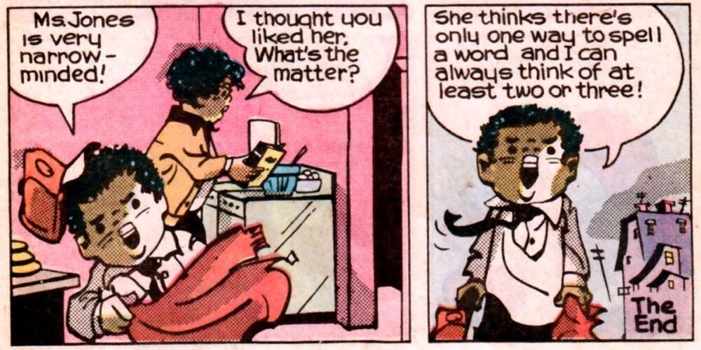
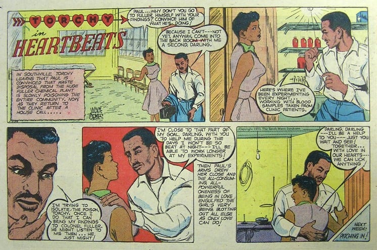
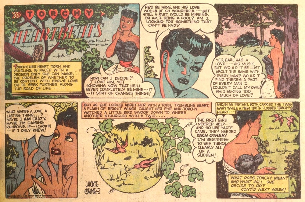
There are several comics and books about Jackie Ormes, but no collections of Torchy. But there’s a demand in the larger publishing world for socially-minded graphic novels about historic figures and their experiences overcoming being othered. Normative white audiences, a reading group centered by a largely white publishing industry, are only interested in stories about marginalized protagonists that they can use to pathologize the behavior of people of that identity. So it’s getting easier to read about Ormes, for a mix of right and wrong reasons, but still just as hard to read her.
How Comics Are Made is a book about comics. Not from a university press, but intended to be educational nonetheless. I wanted to focus on this book as a Black comics history resource, but doing that means skipping over a great deal of the book. Which is a shame, as the phrase “treasure trove” comes to mind when relating this book to knowledge.
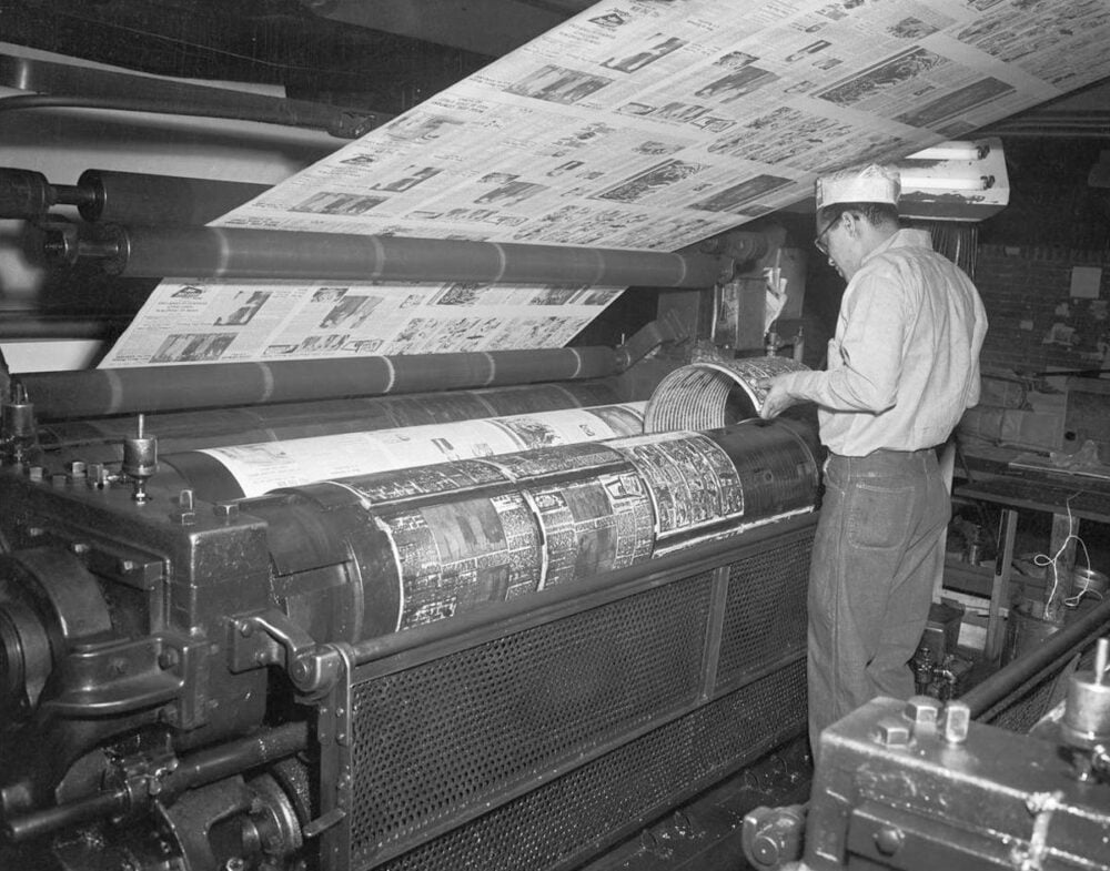
There’s lots in there. Flongs (immature chortle). I was delighted to see a Love and Rockets color cover printing separation process, and shocked to learn it was Roberta Gregory of Naughty Bits who did it, among other covers. The bit on how big old newspapers were printed- think iconic Pixies songs that start with a Kim Deal bassline- was another indulgence of interest for Fleishman that lasts a page or two, but was a paradigm shift for me and my understanding of the past.
Culture is the weapon able to defeat autocracy. But that means being flexible enough to reflect the changing times instead of sticking to precepts. Reading to learn things can and should occasionally knock you on your ass. I would start following a thread in the reading, and suddenly! A new way of articulating what I know (or thought I knew) would send my mind reeling. Fleishman is slow reading in that sense, like a lot of good academic works are. You have to stop reading every couple paragraphs because how you see the world has been altered.
It is in the interest of seeing the world accurately that we turn to How Comics Are Made. An interest in what we are seeing. Comics are a virtual art, similar to film, where there is a physical component, but it exists as a vehicle for a story that is only in the mind of the audience. This has been exploited in practice through the commodification of art, treating the comic as the idea of the writer, with the artist as a replaceable part of a post-studio process bringing the auteur’s vision to life. How Comics Are Made wades knee-deep into the complicated reality that plays a part in these virtual stories’ stories, and keeps going.
Blackness without color. Black representation has a troubled origin story in comics. Fleisher opens with Frederick Opper and a 1901 essay for The Independent on “caricature country,” a world of misrepresentation he played a part in perpetuating. The iconography of early comics drew from racist stereotypes and caricatures and, in the case of Black people, minstrelsy. So, from the beginning, cartoonists and readers alike were aware that what they were doing was the repugnant perpetuation of the grotesque. Fleisher cites Jeet Heer‘s observation that protesting disrespectful caricatures had already had an effect at the time of Opper’s writing, with (at the time, white-passing) ethnic organizations pressuring publishers to stop racist depictions.
Not so for minstrelsy. Several noteworthy cartoonists broke minstrel-coding in spirit, but keeping it in form. Frank King. Black children’s groups began to protest the minstrel characters in prominent series like Captain Marvel and New Funnies, and it worked. Alternately Will Eisner kept his minstrel sidekick until the early 1950s, regularly touting his progressive popularity, but also creating a strange, vitriolic “response” comic with the character in the 70s against the Black community and the criticism that Eisner had previously claimed didn’t exist.
King and Eisner moved the needle on treating Black characters will respect for their intellect, but held the line for visual storytelling that was antithetical to Black dignity. This differs, in my eyes, from the détournement of George Herriman, a Black cartoonist whose comic poetics engage with the subversive satirist tradition of Black minstrelsy. Herriman’s work in Krazy Kat transcends the linguistic aesthetics of oppression by speaking with the humanity and wisdom that the mask of prejudicial caricature is intended to obfuscate. King is saying that Black folks are fit to be members of white society. Herriman is saying that white society is a joke.
Rebecca Wanzo, an advocate for bringing newspaper strips and political cartoons into the historic conversation about comics, says the medium perpetuates grotesque caricature because that’s the medium it was born out of. Political cartoons are in comics DNA, terraforming caricature country. But the intention of the depiction varies according to who holds the pen. The golden age is full of depictions of being Black that aren’t negative stereotypes- made by Black creators. Limitations on opportunity and self-expression in the comic book industry led several Black artists to leave it for political cartoons in newspapers and magazines. Ormes was making comics with sophisticated and varied depictions of Blackness in the 1930s! In a segregated environment, for Black publications.
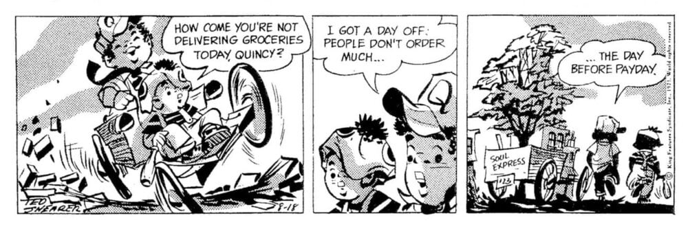
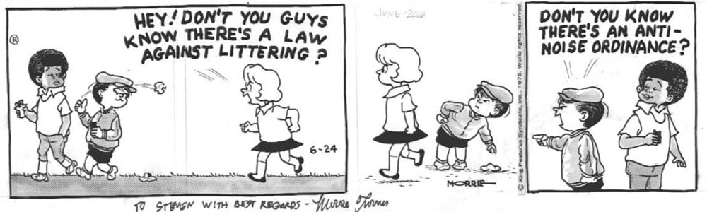
Wee Pals, Luther, and Quincy, Black comics by Black creators, blazed a trail for syndicated integration as a part of the momentum of the civil rights movement of the 1960s and 70s. They were considered new depictions of Blackness, sharing an industrial visual lexicon with Black Panther Party agitprop, part Rainbow Coalition and part Sesame Street. Despite being new to the white world of comics integration, the work of cartoonists like Morrie Turner and Ted Shearer came decades into artistic expression through the medium and its analogues. Ormes showed hundreds of thousands of readers in the 40s how shading tools for illustrators could be used to create realistic, nuanced depictions of Black people. These new strips were ready to take what was established and reinterpret it as something new.
Comics is industry and culture interwoven in that way, a tool from one profession is used in another, changing its context. Suddenly a type of adhesive sheet is the signature of a revolutionary artist. Brands and Black expression goes back, way before Girbauds hanging baggy, Tommy Hilfiger top gear. Even in comics. Ormes, who drew fashion plates of her heroines to accompany her comics, was not only invested in marrying Black fashion to broader Black culture through inclusion in her strips, she was also pushing for more attention to be paid to Black fashion, and conscious support of the companies who worked with the Black community. Unlike Tommy.
So it’s worth noting that, while you could frame what follows as a bunch of brands being essential to Black history and artistic advancement, the real story is that, like turning an all-weather outdoor work boot into an iconic shoe you keep as fresh (and own in as many colorways) as a sneaker, it was Black imagination that saw in an artist’s resource intended to give advertisements of cars and lamps and cans of soup visual depth an untapped potential for artistic self-expression- that would remain, in some cases, unmatched today. “We took it and started to perceive it as something else, and the value went up.”
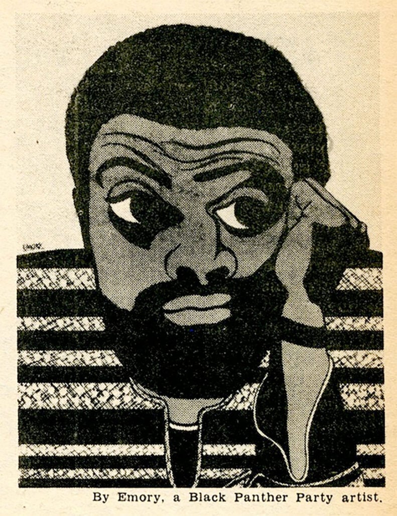
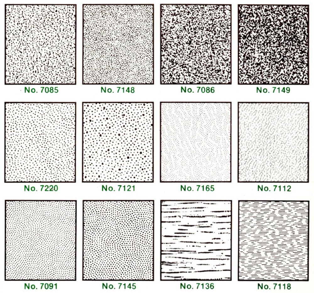
But to tell the story of Black comics is to tell a story set in Craftint dots and Formatt shading textures. The work of artists like Morrie Turner and Emory Douglas established a new language Blackness could be communicated through. The process was eventually adopted by white artists. Even Charles Schultz started to use dot shading for Franklin, once Schultz’s prestige meant he could negotiate size minimums into his contracts. Er, once he could ensure his art was preserved for its quality, a lifelong concern of his.
So adhesive sheets like what Formatt produced had to have their patterns cut out and applied on top of the strips. And Craftint made pages that had invisible tone patterns that brushing the canvas with a special type of solution revealed. You could draw on the page with pencil and ink, and then add the shading by drawing as well. The stylistic freedom Craftint pages gave artists- in the name of producing at a greater speed- is closer to how we see dot shading applied today, with a stylus. Blackness was a multidiscipline creation that today couldn’t be more comics.
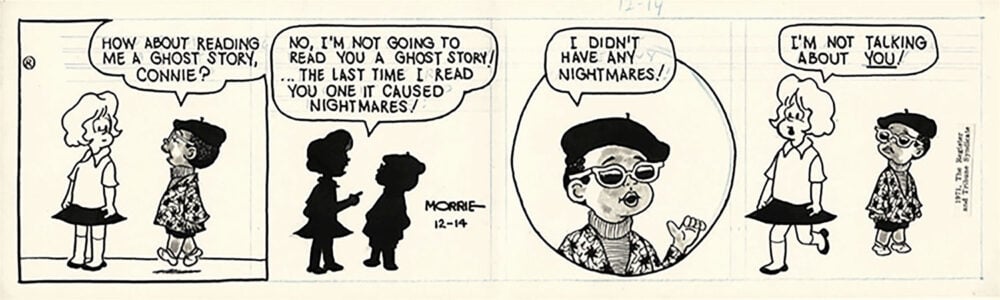
The generation that followed, who came up in an integrated industry, would eschew zip-a-toning Blackness for an even more refined attempt at cartoon caricature. Artists celebrating the features of the people they’re depicting. Caricature, but positive? Seeking representation that speaks for itself. Fleishman notes that Barbara Brandon-Croft’s Where I’m Coming From has removed its original toner dots shading from modern reprints, relying on the aesthetic and the voice of the strip to communicate Blackness.
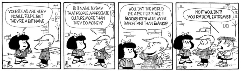
Not that Wee Pals was apolitical. Turner was following in the footsteps of Quino’s Mafalda as much as the precocious insight of the Peanuts gang. The innocence of youth used as a lens through which to view the world, you can reap some real sardonic results in the funny pages when you start to consider how many bad people in power play at childlike ignorance.
Quincy was a dynamic mix of it all. The linework is stylized, expressive, artful. Shearer expresses traits of Blackness in his depictions without evoking negative stereotypes. His use of dot patterns, applied with a disregard for realism that borders on the abstract, is really quite singular. Stylistically, you could easily mistake a strip dated 1974 as something from Drawn and Quarterly three decades later, a comic to be found in the anthologies that used to come out for SPX. Normalizing Black childhood to a society it’s critical of travels a narrow path of publishability. It really is an immense shame how hard these comics are to find.
Blackness in color. Where Fleishman was overtly political in monochrome, his approach to color is much more technical. How Comics Are Made gives you the pieces, but it’s up to you to see it. Colorists have been a comic book job for long enough that there are a few truly exceptional ones out there. Tamra Bonvillain is probably the most recognizable colorist working in the comics industry? A glow as enchanting as it is distinct. But that’s how comics are made, not how comics are made, which is what How Comics Are Made is about. In the comics before colorists were a part of the assembled creative team, color was a part of the mechanical industrial process.
Coloring was a number system, from a catalog sent by the printer. Number your comic and the printer will fill in the corresponding spaces. Colorists were nameless, a deskilled part of a Taylorized labor process instead of afforded the prestige of a title. Replaceable workers, filling an order, given no say or credit in the art they were creating. The industry treated the original artwork the same way, tossed aside once it had served its purpose and entered the duplication process. Comics themselves were ephemeral, printed cheaply without expectation of preservation. Most printed copies of comics are gone, too, the greater the percentage the further back you go.
On a side note, the art of coloring comics has continued to grow and change. Speaking of brands, we’re in a Riso age of comics, where the artists making them are printing them, and learning the technical printing process influences the complexity of their coloring. Dreaming in Color, a book of prints by Natalie Andrewson and Peow2, gets into the technical properties of printmaking like Fleishman does, but from a creator’s standpoint rather than a historian’s. How to speak from the heart when thinking of mixing colors is a matter of math. By, ahem, seizing the means of production, artists can apply their creative license of discovery to the formerly powerless role of the craftsperson. As Elliot Eisner put it: “In the arts, ends may follow means. One may act and the act may itself suggest ends, ends that did not precede the act, but follow it. In this process ends shift; the work yields clues that one pursues.”
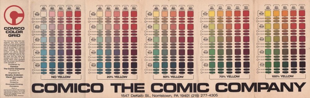
How Comics Are Made features three color charts. Two from newspapers, a 1980 “65 Line Comic Color Chart” and a 1995 “Color Palette” from American Color. And one for comics, a “Comico Color Grid” from Comico: The Comic Company. They’re all grids, not just Comico, grids within grids, hundreds of colors that come from tweaking the percentage of three primary colors the printing was actually done in. There’s a weird hue to the charts, particularly the ones from before the 90s, as if the yellow even at 100% isn’t that strong. The effect is the colors look both like pastels and jewel tones simultaneously.
The color charts immediately reminded me of Genevieve Yu’s book on film and feminism, Girl Head. Before the movie begins, before the audience enters the theater, there is a piece of film that comes at the start of the reel. A color chart, for the projectionist to adjust their equipment to, a product of the lab that does the developing. Also, a reference photo, that was traditionally of a pin-up girl. Does the skin of this white model look the right hue of fair, compared to the bed she lays on, the robe she wears? You’re calibrated. “It is not surprising,” wrote IEEE EIC David Munson on the persistent overlap of Playboy models and standard test images, “that the mostly male community gravitated toward an image that they found attractive.”
The problem, if it needs to be said, is calibrating a color system to one type of skin tone. Well, there are lots of problems here, but that’s the one that relates to what you’ve been reading. Film is developed so that white people looking good is prioritized over reality. Complexion was the basis for reality.
We take the filmed image for granted as reality, rather than representation. The mechanical eye of the film camera is supposedly as objective as our own vision, a denotative representation of the real (as opposed to a drawing, an image that connotes what it represents). So okay, the supposedly objective pallor of the world as we see it projected onto the silver screen is really actually skewed in one specific direction. At least the cartoonist can decide which colors are used themselves.
The number of colors available in the 90s is double that of the 80s, a result of modernized systems being capable of 10% gradients instead of 20% ones. Well, part of it is the technology. Good color reproduction has always been sought by newspapers. Comics moved units. The work to be the best was constant. And as cartoonists in the 80s saw their strips turned into merchandise empires, they were given the power to negotiate the quality of how their strips were printed. The palette developed because the demand was there.
Schultz pops up here, too. He was always conscious of the clarity with which his stuff was printed, and was someone who already had several decades of memorabilia under their belt by the 80s. He had witnessed the physical size of the broadsheet itself shrink. Like many other cartoonists, Schultz would send a color guide (a hand-colored strip) to publishers as well as the catalog numbers for the colors. I doubt he wanted more colors to work with.
If there is an industrial precedent for muddying the printed image worth fearing, we can set it aside, because white creators were doing that just fine on their own. Despite having 114 colors to work with (and then black to further temper things), Black folks in comics sometimes look grey or green. Ormes was able to depict two different skin tones in the same panel, but decades later Luke Cage looks like spoiled spinach. Julian Chambliss wrote about printing Black comics in color, inserts for syndication that were done by a specialty printer, Carousel. Ormes’ art received the bespoke attention to detail that Peanuts fought for- and 1970s Hero for Hire is missing.
Smith attributes some of the problem to the paper comics are printed on, which absorbs certain colors of ink more than others and cancels out some of the finer percentage points. Without a three-quarter option, the color chart shrinks down to 64. That said, it’s another example of people of color taking the most damage so that a company can cut corners and stay (financially) in the black. The process is not apolitical.
Smith also observes that getting brown through a layered printing process means a heavy amount of ink on the page, several passes that create an odd effect that out of harmony with the visual texture of skin. Whiteness, on the other hand, can rely on the blank page itself for half of its tone. Beyond the mores of cartoonist and the coloring company, there are physical aspects to the creation of comics that influence their cultural impact.
How Comics Are Made is the kind of resource that can help on a reader’s journey to developing a deeper level of insight. Understanding how the post-studio process of the medium works is to connect the art to its place in the world. The studio process in art is supposed to be the phase of pure creation where the artist is free to pursue their vision. But now the studio as we understand it is also a real place, one that imposes limitations and form on the works created within it. There is no separating the art from the artist, one must come from the other.
We want to be able to picture the past accurately because comics matter. The history of the art ought to reflect reality, but how can you tell when a story’s true? The comics that have survived mostly have done so in some private collection or another. So primary points of reference are a challenge for most of us to get access to. We are forced to imagine what we can’t observe.
Understanding the process of production is something to work with. To know what could or couldn’t be done during a specific decade. How a piece was likely to be styled, based on its creator’s peers, plans, and past. Recognizing what the visual tells of authenticity are. Fleishman, Smith, Wanzo, Yu, nobody’s going to just give you a checklist, as no such thing could possibly exist, but instead knowledge, so that you can figure it out yourself.
Arpad Okay has degrees in education and journalism, but writes in third person on the internet. If there are deductive flaws, they are a reflection of my work and not the source material. Read the previous installments of Critical Thinking here.


