

This is the third season in a column that judges a book by its cover. Catch up on the current season, or view the complete archive. Spelling corrections are welcome.
Everyone knows the Marvel Universe began in 1961 with the launch of Fantastic Four #1. But do you know what day it went on sale?
August 8.
History is repeating itself, and today there is once again a Fantastic Four #1 being released on August 8!
How do you even plan for August 8 to fall on a Wednesday? It’s not like they looked at their calendar and said “next time August 8 falls on new comic day, that’s when we’ll relaunch it!”
Initially I thought this was fantastic coincidence, because I haven’t seen it mentioned anywhere online in the last month, but it turns out it was briefly mentioned in a solicitation way back in May (which is like three years ago in 2018 time):
CELEBRATE THE LAUNCH OF FANTASTIC FOUR #1
WITH A MIDNIGHT RELEASE ON AUGUST 8th,
THE 57th ANNIVERSARY OF THE ORIGINAL SERIES RELEASE!
But so many comic anniversaries are celebrated on a randomly chosen day (or even month), I’m not sure how many people it really registered with? If I were Marvel’s marketing team I’d be touting this LOUDLY (like I’m doing right now, I guess), and spelling out that this isn’t just a random anniversary that changes every year (like Batman Day…).
Anyways, enjoy having a new Fantastic Four comic on Fantastic Four Day. Your only dilemma will be trying to figure out what variant cover to choose. I mean, I remember back when Gen 13 #1 launched with 13 variants, and that felt like overkill. Now it’s like Marvel and DC are in a contest to see how far they can take it.
They could’ve stopped at 40 variants to fit the “4” theme, or even 44 variants. Or 57 variants to go with today’s 57th anniversary today, on this date today. But they just couldn’t stop there, with 60+ variants. Comic Burst has tried to record them all, but I’ve already seen a few they don’t have. What if it turns out there are 88 covers (because today is 8/8)…?
Yeah, so I can’t discuss all of them, but here are a few of my favorites.
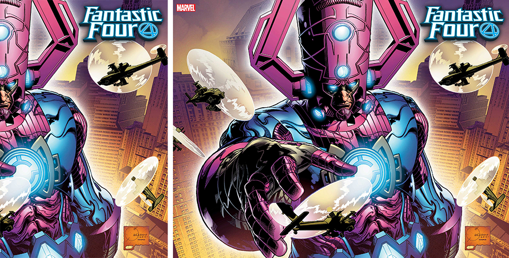
FANTASTIC FOUR #1 by Joe Quesada
This is so epic, I love the sense of scale. But I wonder if it would’ve worked better flipped, so the front cover was Galactus reaching towards a helicopter? The sense of scale is amazing when the image is open, but the front cover by itself isn’t getting the feeling across.
Note: This isn’t the final cover. In a tiny photo I saw on eBay, it looks like the logo is larger and has been masked so it’s behind the helicopter. It’s also a little larger, and overlaps Galactus’ headpiece. Unfortunately it still has that cheesy black drop shadow. I’d rather the logo had gotten smaller than larger, let it be dwarfed by Galactus too.
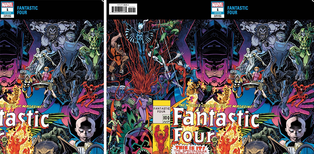
FANTASTIC FOUR #1 by Arthur Adams
This one is even more epic. I dare you to even try to out-epic this. I think this was originally done as a commission piece, and I remember being so impressed with how clever it was, a cover breaking out of the boundaries of the cover.
Unfortunately, I just don’t think this print treatment does it justice. I mean, you have to buy two covers in order to get the full picture? Even it wasn’t broken up in a way that kind of destroys the image, it’d still feel kind of exploitational. I mean, more exploitational than 60+ variants already feels.
Personally, I feel like this was a missed opportunity for a truly epic fold-out cover. Picture this: At first it looks like a regular cover (cropped in on the regular cover area of the image). But then you notice the cover feels extra thick, like there’s two covers. You pull the top edge down, and it opens up like a fold-out poster! No one has done that, they could’ve been the first!
Oh well.
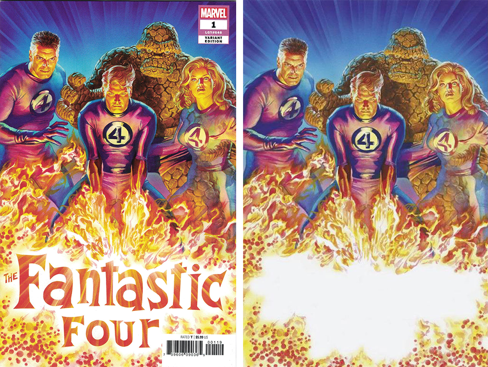
FANTASTIC FOUR #1 by Alex Ross
My favorite subgenre of cover is characters attacking their logo. Attack that logo, Johnny! Get it! Putting the flames at the bottom of the image also provides dramatic lighting for the characters.
What I don’t like is the textless version. A good textless cover feels like a complete composition. When there’s an empty space that was clearly intended for a logo, it makes for a weak cover. The example at right is the worst I’ve ever seen. Alex Ross carefully left an empty space the exact shape of the logo, with logo placement in mind, and some yahoo decided to just toss out a textless version of it. I feel like they didn’t understand what the appeal of a textless cover actually is.
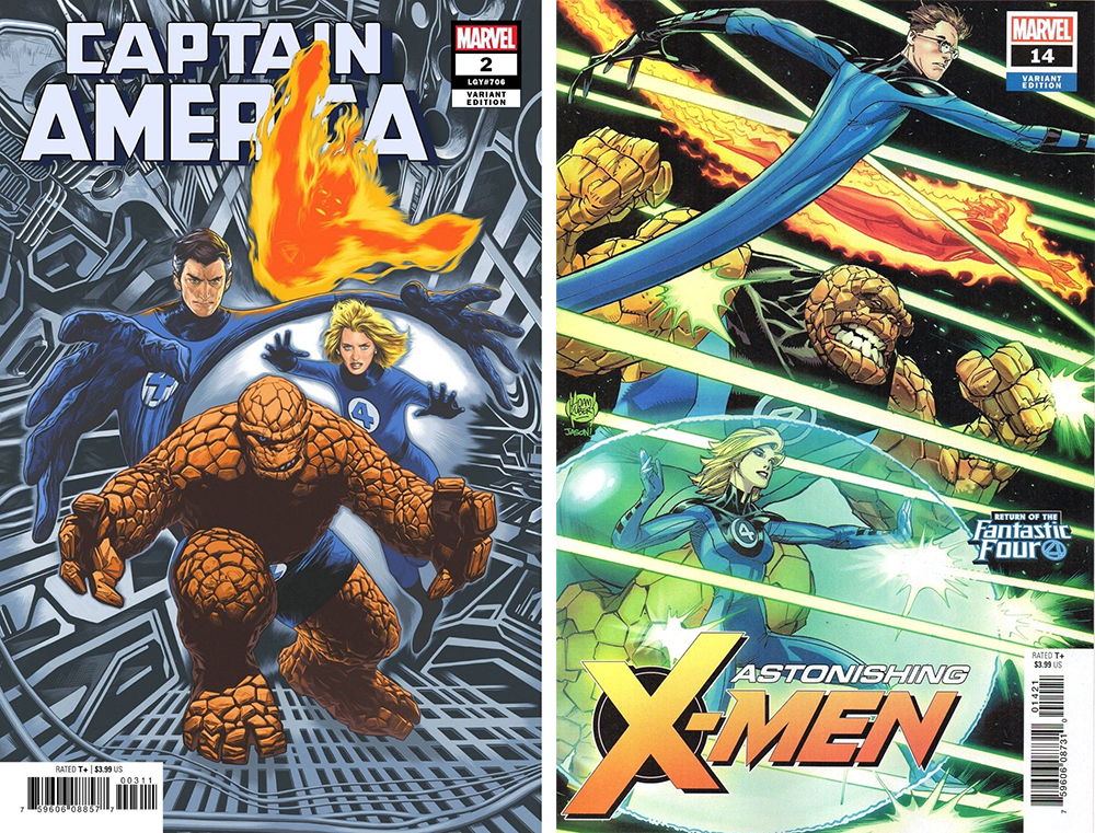
CAPTAIN AMERICA #2 by Travis Charest / ASTONISHING X-MEN #14 by Adam Kubert
Most of the FF variants are variations on “the team lunges at you,” which gets pretty repetitive and boring when there are 50 of them. These are my two favorites of that bunch, because Charest’s background is interesting to look at, and Kubert has them lunging to the side.
Coincidentally, neither of these are actually Fantastic Four #1 variants. Instead, they are another pet peeve of mine: the “variant for the wrong series” trend. It just doesn’t make any sense. Even if the intent is promoting another series, it means you’ve basically placed an ad on your front cover. Please stop.
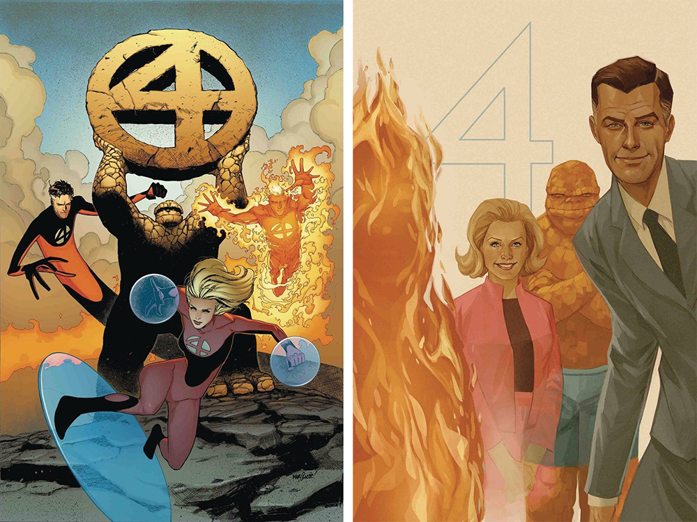
X-MEN RED #7 by Steve Marquez / THE SENTRY #3 by Phil Noto
These “house ad” variants don’t come out until later this month, but they would’ve made such great FF variants.
They also fit another one of my favorite themes: the logo drawn right into the cover. Personally, I think the FF logo is at it’s coolest and most stylish when it’s a simple minimalist “4.” If you see a comic and it’s logo is “4,” you know what book it is. On the left, The Thing is holding the logo triumphantly (or maybe he’s about to fight it!). On the right, half the team is out of costume, which makes it stick out from all the other covers here.
But y’know what else stuck out this month among the 88 variants? Covers that didn’t have the FF in them at all.
This Week’s Covers
Every week I pick a handful of covers that I consider particularly well-designed, not just well-illustrated. My personal criteria for a well-designed cover is that the illustration and design elements complement each other rather than fight each other, and that the resulting image stands out from the crowd.
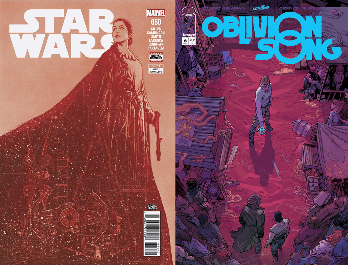
STAR WARS #50 by Travis Charest / OBLIVION SONG #6 by Lorenzo de Felici
I’m a big Charest fan, so I was surprised I didn’t recognize this as his work. It’s a look I haven’t seen him do before, yet I still immediately liked it. The high contrast dark and light fields really grabbed my attention, and I like the way the general shape points up to Leia’s face, which is pointing at the logo.
The way Leia overlaps the logo gives it depth, and I wish this Oblivion Song cover had done the same. I absolutely love this logo, by the way. Making the blue hand match the blue of the logo — the only other element that’s the same blue — is really effective in drawing focus to the hand. But like I said, I wish his head was overlapping the logo. Moving the whole composition up would also show us more of the crowd, who are hard to see at first because they’re colored to blend in with the background.
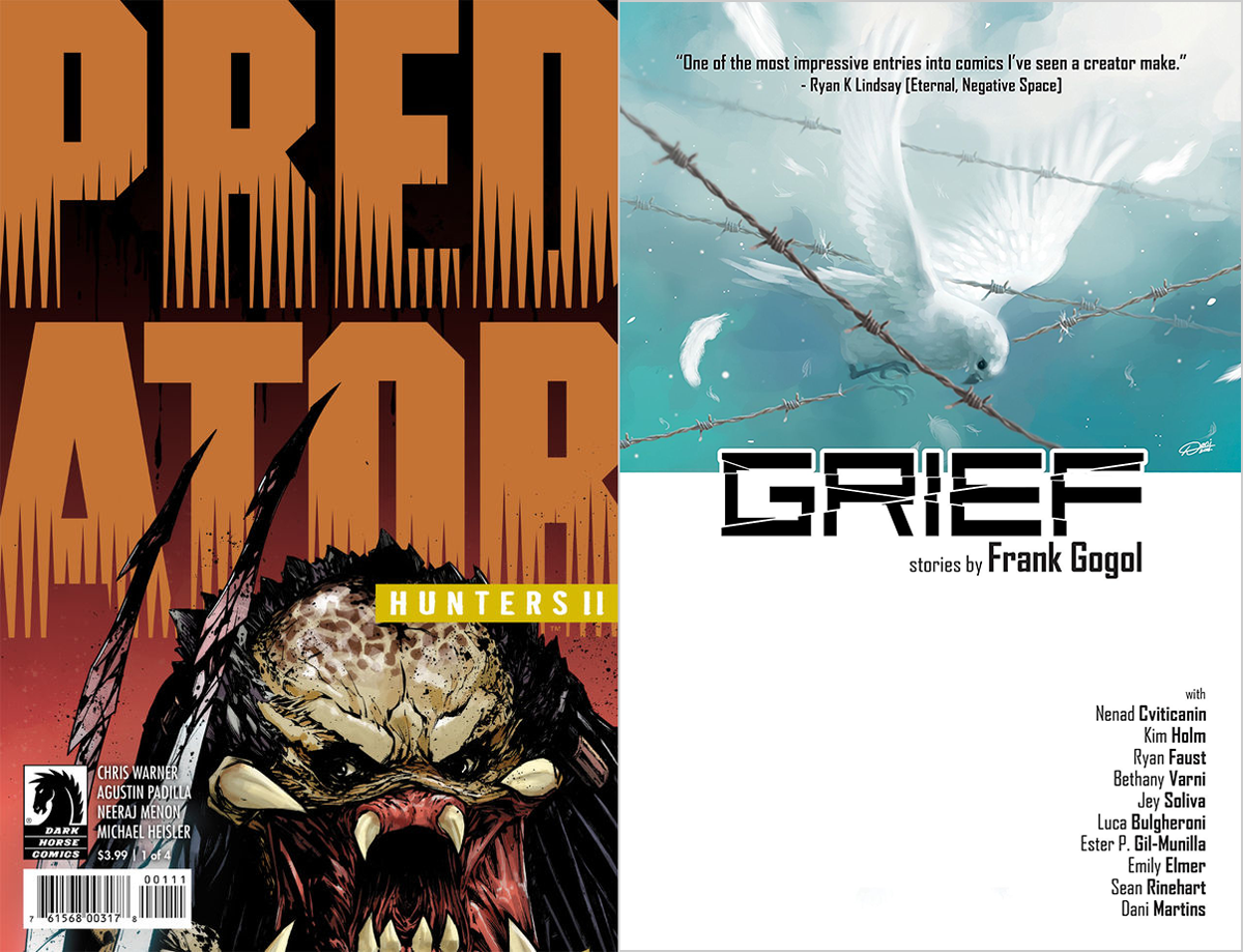
PREDATOR: HUNTERS II #1 by Andy Brase / GRIEF by Dani Martins
Both of these covers limit the illustration to a small portion of the cover, which can lead to really bold designs.
I love this giant version of the Predator logo, it’s so different from what covers usually do. It’d get kind of boring if it happened too often, but I love it in small doses.
Grief goes in the opposite direction, letting white space dominate, and it’s equally effective. The logo isn’t…great, but I like the layout and how it frames the illustration, forcing us to focus on it.
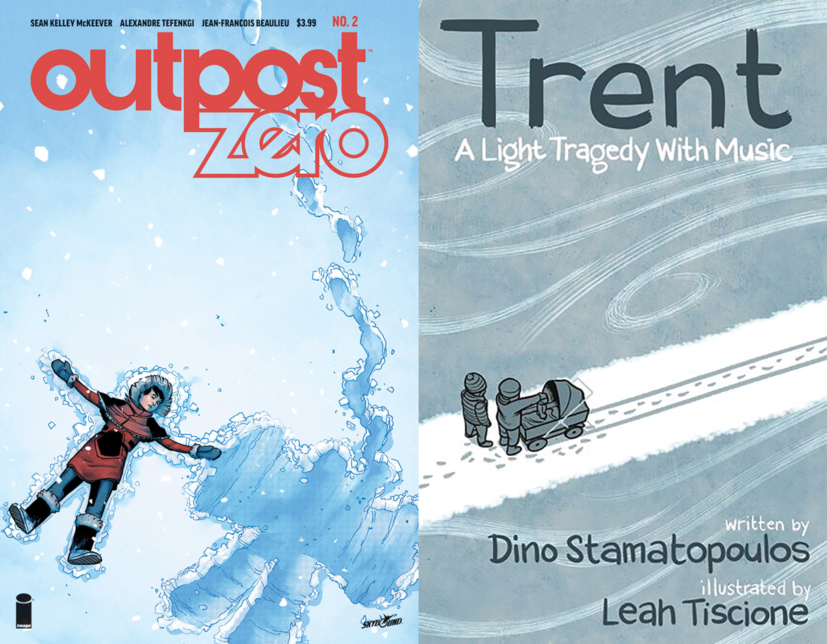
OUTPOST ZERO #2 by Alexandre Tefenkgi & Jane Francois Beaulieu / TRENT: A LIGHT TRAGEDY WITH MUSIC by Leah Tiscione
These two covers use footsteps to convey an action that’s already occurred. In the video game world this is called environmental storytelling, where the aftermath of an event tells the story of what happened.
Outpost Zero shows a friend who’s walked away by indicating the friend’s absence, though I was a little thrown off at first by there being only a set of footprints away and not the two sets of footprints towards. The missing footprints are probably cropped off at the bottom of the cover, but at first I questioned whether the visible footsteps were actually going towards or away from the snow angel and maybe the other character was a flyer. Sometimes little details like that are important just for clarification.
Trent‘s footsteps indicate that these two people were walking in opposite directions and met up in this spot. However, a closer look reveals one of the figures is…palming the child’s head like a basketball? I don’t know what’s going on here, but I want to know more.


Thank you so much for the shout out Kate! Awesome article here and yeah the 57 variants for 57 years would have totally made sense right?
With the communities help we’ve added a ton more pics for the variant covers to the checklist. If you see any we’re missing please let us know :)
Great article! Well said and I completely agree… there are certainly a LOT of variants out for this one…
Comments are closed.