
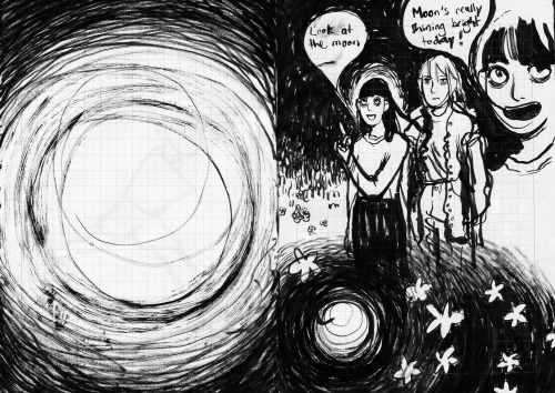
There are some artists that reinvent themselves and experiment with various method of work. Whether it’s to try to find a style or to see what they’re capable of. Shee Phon is one of those artists. I’ve reviewed two of her comics (Idealism and Idealism II) as part of my ThreeCAF series earlier in May. But these two comics barely scratch the surface of her ability as an artist. I’ve been fascinated by her use of colours, but there’s plenty of other things to pick apart in her work. Her use of pencils, the way she experiments with layout, how she uses emotions in her comics. She’s a progressive artist. Progressive in the sense that she’s continuously trying to improve, to experimenting to get better at her craft. We’re going to look at her work a bit more closely and specifically focus on four comics: Things, Dogs, Chilled Fruit and I know it’s not about me, but I don’t want to die (hereafter I know it’s not about me).
—
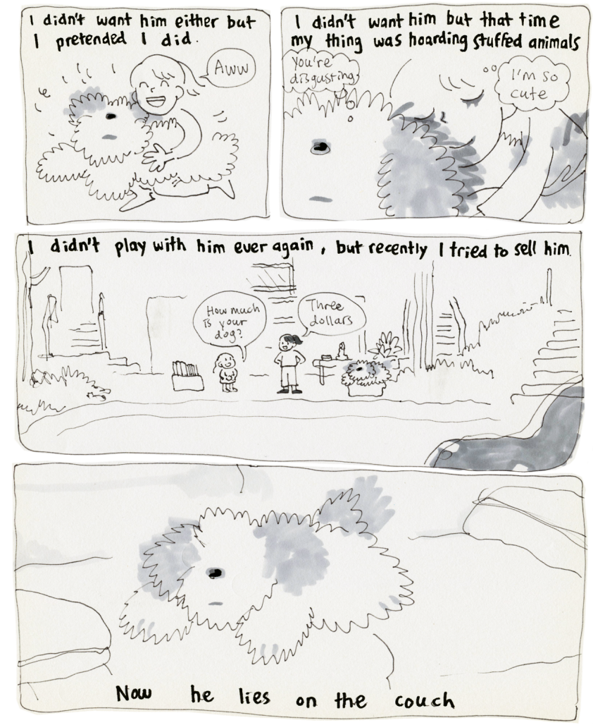
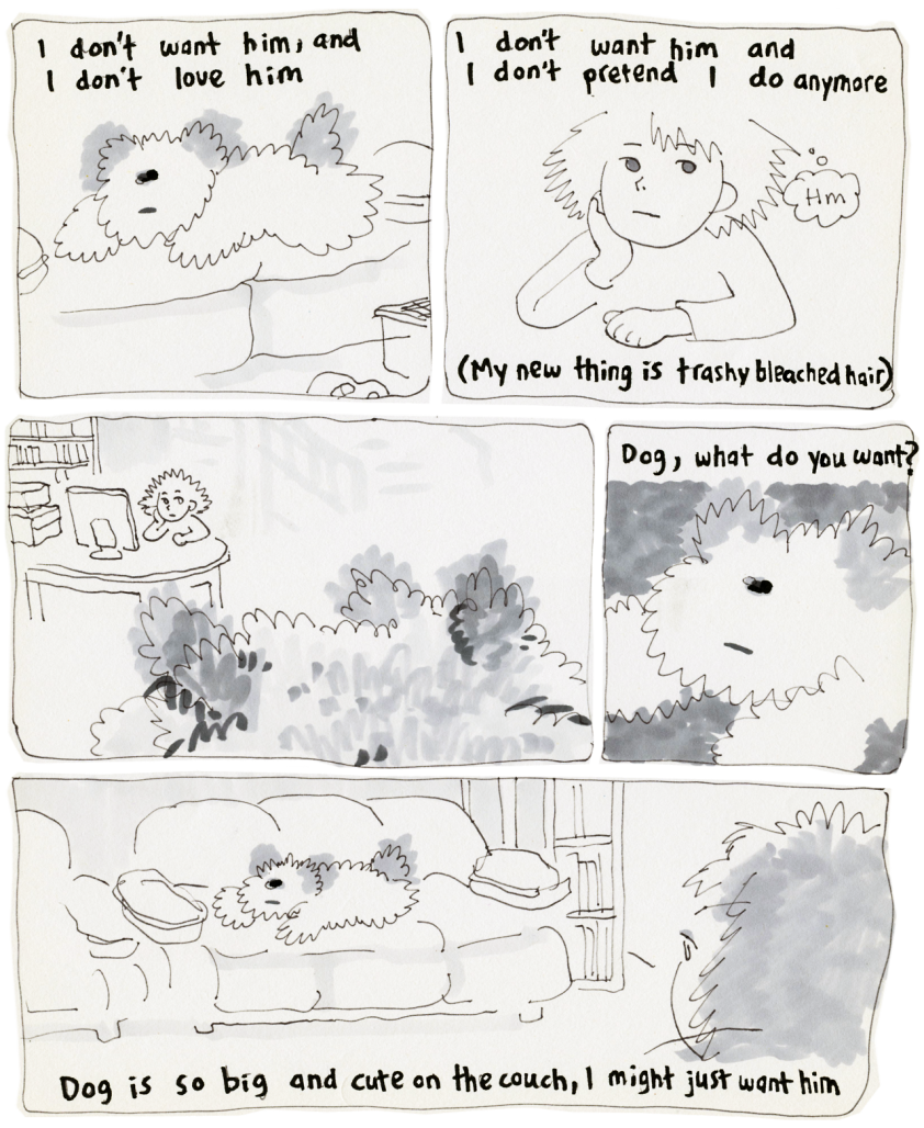
Let’s look at one of her latest short webcomic Thing. It’s about a young girl who begs her parents to adopt a dog, only to grow irritated by him and wishing he’d go away. Like most of her work, it felt really personal. It struck a chord in particular for me. I adopted a cat in 2012 from the Ottawa Humane Society. Within a few months after I’ve adopted him, we had to rush him to the veterinarian clinic because he was sick. Turns out he had a pancreatitis caused by undiagnosed diabetes. He’s diabetic now and he requires insulin shots at every meal now. I need to ensure that he’s taken care of by someone who can inject him if we’re away from the house. He’s annoying, he’s a lot of work and sometimes, I wish I hadn’t saved him from the pancreatitis. I wish he was gone. I feel terrible about having these thoughts, but I have felt them regardless, “I don’t want him and I don’t pretend I do anymore,” she says of the dog as he lies down on the couch. I’ve had these thoughts about my cat a few times, though I wish I didn’t. He’s a lovely cat, extremely grateful and friendly. He loves hanging out with my son, which is incredible. The frustration and feelings that she talks about in this comic were very familiar to me. Her comics are often like this, there’s a raw honesty that destabilizes the reader and feels really rough. It’s such a personal anecdote that you can’t help but feel devastated by the truthfulness of it.
I’ve had the chance to meet Toronto-artist Shee Phon during TCAF (possibly one of the nicest people I’ve met yet in my time writing for the Beat). She mentioned in our interview that her work is very personal. “I guess (…) I don’t have limits to what I reveal about me. I think I have a terrible desire to reveal everything I think is horrible, but I don’t know how to do that in a straightforward, meaningful way”. This personal connection and exploration of hurtful or difficult moments comes back often in her work. Obviously in Thing, but also in Idealism in which a girl’s younger brother is upset at her. You can tell that there’s frustration and pain in this story. It’s also palpable in I know it’s not about me, in which a woman laments the passing of a friend while at the same time, contemplating her own cowardice towards her inability to end her own life, frustrations with the aftermath and reaction to her friend’s passing. It goes beyond simply sharing a story, Shee is expressing deeply personal feeling, regardless of how it may make the reader feel. It shows an uncanny ability to allow herself to be vulnerable and describe feelings that aren’t often discussed. There is a certain part of surrealism in her work or more accurately exaggeration or distortion of the truth as was the case in Brother. This exaggeration manages to hammer emotional points incredibly well. The emotions evoked are real and they make for a very satisfying read.
Shee also keeps experimenting with layouts. In Dogs, she flips the pages horizontally and uses two borderless panels separated by a wonderful drawing of three oranges with leaves. In Chilled Fruit, she plays with the 9 panel grid by connecting two to three panels for a larger image. In I know it’s not about me, she only uses 3 horizontal panels. Each of her comics changing layout to try different methods of storytelling. This exploration feels like Shee is parsing through what makes each of these types of layout unique. The 9 panel grid in Chilled Fruit help to pace the story, but also allow for flexibility to account for the length of a specific action. She uses 3 panels to show the passage of time or to show a coach on one strip of 3 panels, then the 6 horses pulling it in a second strip of 3 panels. Then just as soon as she’s figured out how to use a layout properly, she’s onto something new. For example, her latest comic Don’t Read! If You Are Sensitive to…Suicide, Depression, Anxiety is illustrated on ruled paper and change layout on nearly every page. Each new layout a newer tool she can use elsewhere.
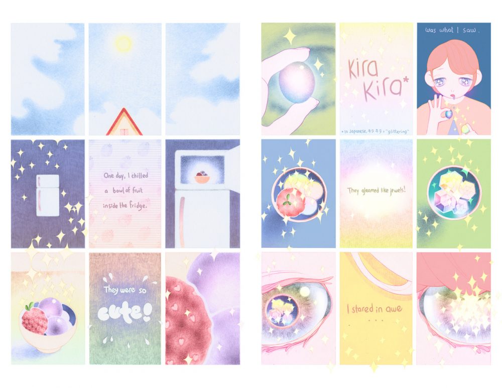
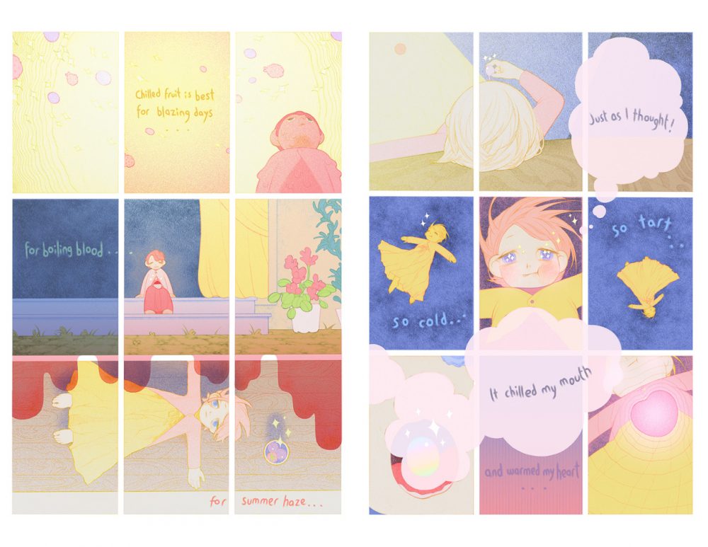
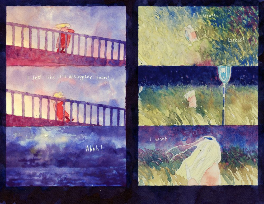
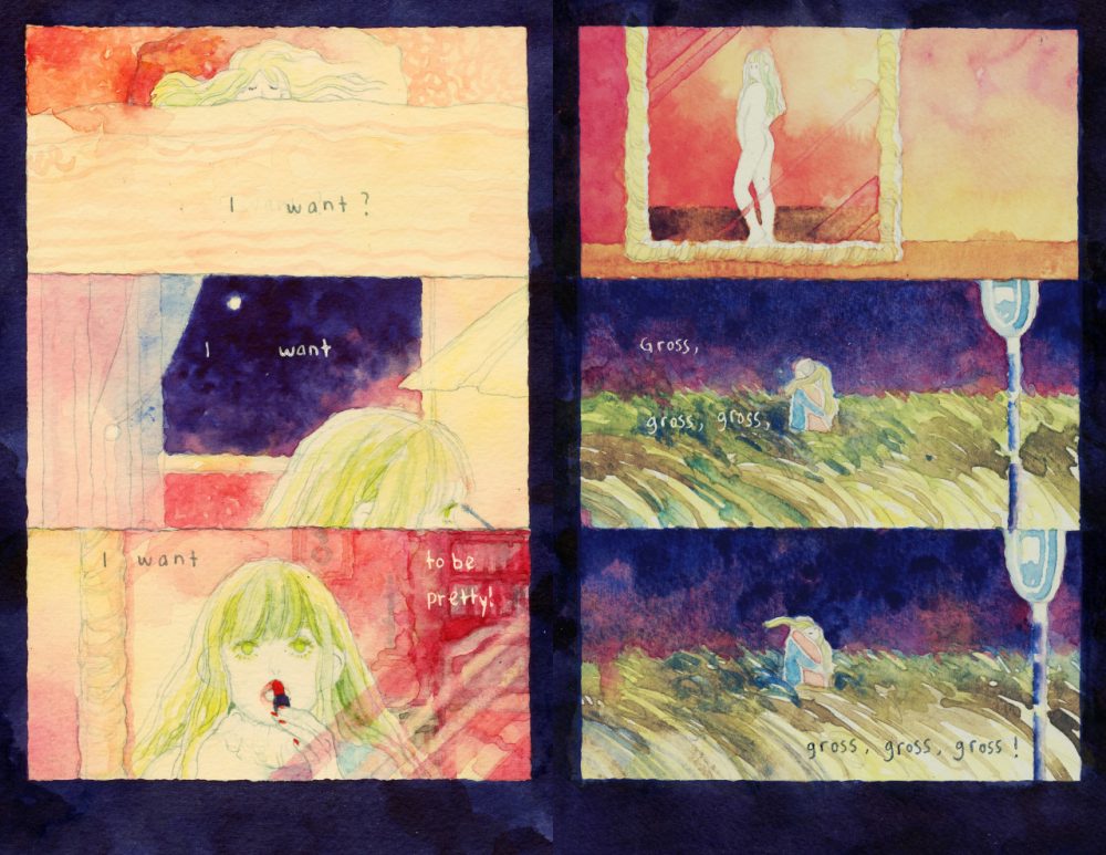
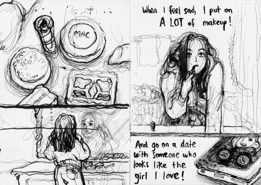
Her use of colour is also very impressive. She works mostly with watercolour, using vibrant colours and heavy layers. It gives each pages an incredibly satisfying look. Each page looks deep and beautiful. It’s often in contrast with the themes and emotions she explores. Again, since she explores with different methods. She mentioned in our TCAF interview that “I’m trying to use more realistic colours, do studies, improve my sense of colour. I hope eventually I’ll be able to use colours tastefully. I’d be able to make a scene as muted or as vibrant as I want, and not just BAM COLOURS all the time. (I’m still not able to paint tasteful muted scenes by the way.)”. This idea, that she is studying and improving her sense of colour is present in her comics. There’s an evolution to her colour, but unlike her use of layout, she actively works at improving this one technique. A quick look through her tumblr page reveals that she is taking this training to heart. Even in the pages above, you can see that the two pages from Chilled Fruit uses different methods of using colours. Chilled Fruit is much more muted and lightly applied than those in I know it’s not about me, which uses much more layers.
All of those elements combine into her comics and each story are enhanced because of it. She has written varied and diverse and diverse stories that feature various experimentations. Chilled Fruit is about a woman finding fruits that have been slightly frozen to be heavenly. It’s a simple premise made riveting by her use of layout and colour. Dogs is about the final day of a dog. It’s understated, quiet and sombre yet beautifully light and bright. I know it’s not about me is about the passing of a friend and its impact. Her three panel structure allows to pace the comic in such a way as to emphasize the repetitive nature of life and the quiet despair our protagonist feels generally. All of those displays various combinations of skills and techniques that showcases just how good Shee can be.
While Shee Phon only has a small body of work, she has used the momentum of each comics to move forward stylistically. This is the most exciting thing about comics, seeing an artist who’s doing work you enjoy getting progressively better at their medium of choice. Each of the sample images in this post are from her. She keeps experimenting with new techniques and it’s exceptional to witness. I’m looking forward to see what her next comics will be. It will be surprising, new and progressive.
—
You can find Shee’s comics on Tapastic or on her Tumblr Page. You can also find some other stories on her tapastic page (Oneshots (https://tapas.io/series/chilledfruit) and Idealism (https://tapas.io/series/Idealism). You can also read I know it’s not about me, but I don’t want to die on her Tumblr Page.
You can follow her on Twitter


Comments are closed.