
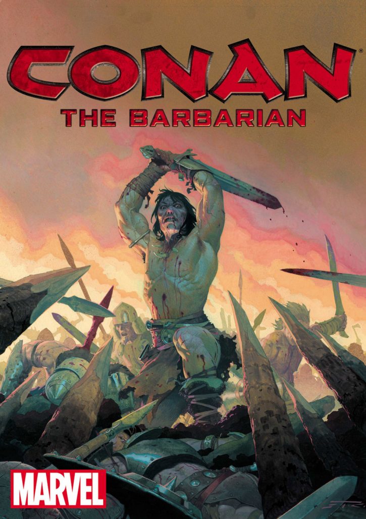
Let’s face it: few creators have a resume as impressive as colorist Matthew Wilson, the man in charge of the colors behind Conan, The Mighty Thor, The Wicked + The Divine, and more. Wilson sat down with The Beat to promote an appearance amid a sea of musicians, comedians, and an all-star line-up of great comics talent at ALT 98.7 Presents BIG ADVENTURE in Costa Mesa on Nov. 3rd and 4th. Don’t miss the festival or our interview with the creator featuring his thoughts on the brand new era of Conan!
Alexander Jones: Let’s get the big announcement out of the way! Conan is a title with a lot of history, and it’s coming back to Marvel. Did you have any previous experience reading the property, and what is it like to join Jason Aaron again on the book?
Matthew Wilson: I’ve not read any of the original works by Howard, but I grew up with the Schwarzenegger movies, and I’ve read some of the Marvel Conan comics from the ’80s and ’90s as well as most of the Dark Horse stuff since the early 2000s. There’s a lot of Aaron’s writing that I enjoy, and that to me shows he’ll be a great writer for Conan. On top of that, after the news was announced, Jason posted the portion of his bookshelf that contained his Conan books and it was extensive. I’m willing to bet Conan will be in very good hands with Jason, and I’m pretty excited to be a part of it.
Jones: With so many titles as part of your workflow, how do you sort which one to work on on any given day?
Wilson: What’s due soonest and what book has the most inks available for me to work on. I almost always try and work on one book at a time until it’s done, as opposed to jumping between projects from day to day. Sometimes I don’t have a choice, and have to switch projects on a daily basis, but that’s not my preference. So, if two books are due at the same time, I go with the one that’s turned in all its inks.
Jones: Is there a particular style with which you approach a Marvel book versus an Image title?
Wilson: Nope. I determine my approach based off the story and what the artist is doing. The publisher doesn’t really factor in. Earlier in my career, I would be a little more hesitant to do certain, less mainstream, things for a bigger publisher. But I realized I wasn’t serving anyone very well with that approach. So I leaned into some of my instincts more, always making sure what I was doing worked for the story and art, and the bigger publishers in most cases were really receptive to my not-so-mainstream approach to colors when it made sense.
Jones: Are there certain collaborations or issues you have worked on that were more difficult than others?
Wilson: For sure! Usually it’s just down to me not “getting it,” not really knowing what I want to do, or thinking ahead of time that I should try an approach that doesn’t end up working as well as I thought it would. And then there are some art styles that I’ve found I just don’t gel with as naturally, so then coming up with an approach in those cases is a bit more work. Whereas there are some collaborations that just flow out easily and naturally. Almost like the work just colors itself, without second guessing or struggling. That’s the great thing about being a colorist, and working on a wide variety of styles and projects. As soon as I’m getting my fill of one project, it’s time to start working on another.
Jones: Are there any titles you work on that have a more collaborative process than others?
Wilson: Sometimes. Usually on shorter projects. And that’s often just due to the quick pace of getting comics out every month and the colorist doing their part toward the end of the process. But most of my current books are projects I’ve been working on for years, so all of those are very collaborative.
Jones: Do you perceive that Big Two comics have a ‘house style’ in the approach to coloring and art, or is that idea a myth?
Wilson: No, it’s not a myth. I think it’s definitely happened over the years. Sometimes on purpose due to an editorial decree, and other times by happenstance because a certain coloring style or certain techniques start trending amongst colorists. Either way, there’s never been a time when every single book a publisher puts out is colored in the same style. There’s always been room for different styles of coloring. That said, certain styles of coloring work better with certain styles of line art. So it makes sense that if a lot of mainstream superhero art is in a similar style, then the coloring of that art will be of a similar style. So as the variety of lineart in mainstream superhero art has increased over the last 20 years, that’s also made room for new styles of coloring. And thank goodness, or I would’ve never been able to color Marvel and DC superheroes!
Jones: When you are coloring a particularly heady page from Russell Dauterman or Jamie McKelvie, do you look to the artist for direction?
Wilson: I always ask any artist or writer for any notes or thoughts before starting. I want to know as much about the “why” behind every scene. Sometimes that means understanding the emotions of a scene, or the character’s state of mind. And other times it’s as simple as knowing there’s a window just out of the shot that we can’t see, but would make for a great secondary light source in this scene. The more information the better when it comes to making color decisions. I see all that info as tools I can use when crafting the scene. I may not need or use all of that info, but if I’m having a hard time on something, one of those bits of information may unlock a solution. So, yeah, I’ll often pose questions to the rest of the team during the coloring process.
Jones: How much does your approach to coloring rely on the script of the issue?
Wilson: A whole lot! Yeah, I get probably two-thirds of my ideas for my approach from the script. My process isn’t really so formal that I could actually pinpoint how much comes from the script and how much comes from the art. It’s definitely a mix of both, and often an organic process that comes from reading the script while looking at the line art. But if I had to break it down, I’d say the mood and palette often come from the script, and then the rendering style will come from what complements the art the best.
Jones: Do you think some colorists rely too heavily on one particular palette of colors?
Wilson: I mean, maybe? Maybe I do! I think all the things that go into making the finished page, in the end, they don’t really matter. All the different digital brushes, the Photoshop techniques, the color palettes we use, they’re all just tools. And when a reader is experiencing the story the tools don’t matter. What matters is the end result. Do the colors add to the storytelling and enhance the art? If so, then I don’t care if they relied on only a small handful of tools. But, if relying on a particular palette seems to detract from the story, then yeah, that would be a bad idea in my opinion. So, to answer your question, a palette is just a tool, and any tool can be used poorly.
Jones: How many issues fit into your workload per month or do you usually get assigned titles by week?
Wilson: I’m usually working on anywhere from 4 to 7 titles per month. They generally each fall into the same timeframe each month, so this book is always the second week of the month and that one’s always the fourth week of the month, and so on. Then that can shift due to all kinds of circumstances, so I’ll need to be a bit flexible. But I know that as long as I’m doing around 5 pages a day on most of the days in a month, that I can pretty much hit any and all of my deadlines. I can, and I used to, keep a very detailed calendar of exactly what pages I’m going to do on any given day. But that’s so likely to change, that I don’t bother doing it anymore unless I’ve got a particularly busy stretch and a lot of overlapping deadlines to keep straight. Otherwise I just keep an eye on my due dates and go with the flow.
Jones: Do you have any advice for colorists looking to break into the industry?
Wilson: So this will be specific to someone looking to be a colorist, as opposed to someone wanting to color their own work. For your coloring portfolio, search out professional art to color. You can often find sample pages online. If you’re not drawing on a professional level, sub-par line art can be distracting to the person evaluating your color work. Also, editors will want to see how you color a story, so your portfolio should be 80-90% sequential pages, and not single standalone images. It’s fine if you have a few pinups or covers in there at the end. But storytelling with color is gonna be key to getting jobs as a comic book colorist. Then, show your work, both online and go to conventions to show other creators and editors. Do a lot of work/practice, then get eyes on all that work. The more you do and the more people see it, the better chances you’ll have at getting work. Also, get to know other people that are doing what you’re doing. Interact with other colorists online. Especially others that are also trying to break in at the same time. You’ll develop relationships with people that may end up knowing of work and passing your name along. All of my breaks can basically be traced back to going to cons early on and meeting artist and writers that were trying to break in, and showing them my work.
Jones: How did you learn how to color a title professionally?
Wilson: Hm, professionally? That came through a whole lot of practice. I learned the basics of using Photoshop to color in college, but I was nowhere near a professional level. Then I just built upon that basic knowledge by looking at what professional colorists were doing, and trying to learn how to do that myself. I’d study colors that I liked and figure out what exactly about a certain palette or scene or rendering technique made me like it so much. Then once I pinpointed the elements that spoke to me, I tried to incorporate those ideas into my own work. The only thing that’ll make you better is doing it over and over again. And while you’re doing all that practicing, just keep searching out and consuming inspiring material.
Jones: What title did you just finish and what title are you about to work on?
Wilson: I just finished two issues of The Wicked + The Divine, the final issue in our latest arc which was drawn by Jamie McKelvie and one of the past pantheon stand alone issues which was drawn by Ryan Kelly. Next up is an unannounced Marvel project with… people I’ve worked with before! Sorry, that’s all I can say on that one.
Jones: What was it like to have a key role in the death of The Mighty Thor?
Wilson: I loved Jason Aaron’s work on Thor prior to working on the book, and a lot of his past creator owned work like The Other Side and Scalped, but never worked with him, so I was very excited to finally get to work with Jason. I had colored a few covers with Russell before working with him on Thor, and quite enjoyed them, so I was happy to have more opportunity to work with Russell. And in general for me, it could’ve been for just about any title because what I’m more interested in is the artists and writers I get to work with. No matter what character we’re all working on, I know that a good writer and good artist will give me really awesome material to color. That said, and having completed our run on The Mighty Thor, it is special to be associated with an important bit of the character’s and publisher’s history. That’ll be a story that’s forever referenced as a big moment for Thor, and any time someone looks at that artwork or goes back to reference it, they’ll be looking at my colors. I feel lucky to be there, and proud of the work.
Don’t miss Matthew Wilson at ALT 98.7 Presents BIG ADVENTURE in Costa Mesa Nov. 3rd and 4th!

")


