
In this week’s Wednesday Comics column, we look at the new superhero series, Knight City, as well as the revival of Thundarr the Barbarian! Plus, FOC Watch and The Prog Report!
 Knight City #1
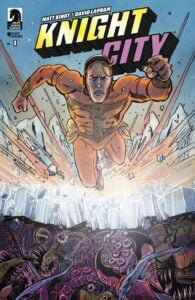 Knight City #1
Writer: Matt Kindt
Artist: David Lapham
Colorist: Matt Kindt with Sophia Hilmes on assists
Letterer: Joshua Reed
Publisher: Dark Horse Comics
Review by Jordan Jennings
Superman pastiches and homages are literally as almost as old as the Man of Steel himself. It’s easy to see why. Besides capitalizing on Superman’s themes and motifs as a cultural shorthand, it’s hard to not want to take a crack at the super power fantasy and the literal archetypal superhero. That said, Superman breaking bad is a worn out trope. I bring all of this up because Knight City #1 is straight up a Superman homage. It’s billed by Dark Horse as Fight Club meets Superman. Frankly, I was tepid going into the book because that sounds like another edgelord taking on Superman. Yet, this book subverted my expectations tremendously.
What Matt Kindt does with Knight City #1 is quickly gets the reader into not just this world but also the mind of Knight, the Superman analog. Instead of breaking bad we see a hero breaking down under the emotional toll of being the planet’s defender. Where a lot of Superman clones tend to take a broken mirror approach to the character, Kindt explores more into the modern Superman challenges of struggling with responsibility and worldly connection. Knight in this story is completely detached from reality as he is overwhelmed by all of the guilt and pressure. This world keeps a tally of all of the lives lost while Knight is off duty. Poor dude can’t sleep. In a lot of ways Knight is written a lot more like Alan Moore’s Dr. Manhattan. He is so overwhelmed by the sense of being that he completely detaches himself. It’s interesting and refreshing to see a real deconstruction of the Superman archetype that doesn’t devolve into edgelord actions like killing his enemies or proclaiming themselves god king of the Earth.
The central premise of the book–that when Knight is asleep, he is actually a normal man living a normal, banal life–isn’t exactly novel. It has shades of The Sentry and other heroes in general. Its execution is still masterful as we slowly see the villain Zero’s plan pay off. The twist on the premise is a bit convoluted but feels very Bronze Age in a way that I can’t help but enjoy. I also appreciated the small nods to Superman’s supporting cast such as Knight’s love interest being named Laney and the boss being Mr. Perry. It doesn’t get too cute with the references but it’s enough for Superman fans reading along to enjoy.
David Lapham on art is as unconventional as you could get for a “Superman-style” story. Sure he has done superhero books in the past, but when the story does veer into the more fantastical it is often more supernatural horror. Yet, Lapham kills it here in the book featuring a man flying around and fighting super crime. There is a bit of a Bronze Age grit to the character designs and actions all while managing to keep Lapham’s signature cartooning style.
Lapham is able to evoke strong emotional responses out of his characters and pull off these slight visual beats that are just masterful execution of the craft. He takes a character like the Knight, who again, is almost like Dr. Manhattan in his coldness, and is able to convey not only the character pushing all those who care for him away but also the sheer burden of the world. It’s visually no small feat and to do that and do a complete tone shift during the dream sequence? Phenomenal. Then you factor in Kindt’s watercolors elevating the book to something visually distinct and complements the tone of the story.
For as tired I am of Superman homages, I am equally excited for Knight City. This book took me by surprise and had me engaged into its world. Kindy and Lapham knock it out of the park here and I cannot recommend this book enough. Easily my favorite new comic I have read in 2026, so far.
 Thundarr the Barbarian
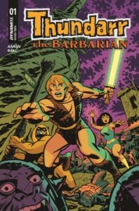 Thundarr the Barbarian
Writer: Jason Aaron
Artist: Kewber Baal
Colors: Jorge Sutil
Letters: Taylor Esposito
Publisher: Dynamite Entertainment
Review by Clyde Hall
‘Derivative’ was my initial, late-stage teen assessment of the Ruby-Spears cartoon Thundarr the Barbarian back in 1980. Its concept was a magic-infused, post-apocalyptic Kamandi swipe which was in turn a more anthropomorphically varied, post-apocalyptic riff on Planet of the Apes. The futuristic Conan Lite who carried an energy blade and travelled with both a princess and a growling, hairy humanoid sidekick was clearly aimed at the Star Wars crowd as well.
But the Starlog article heralding it hooked me anyway, because I appreciated the talents involved. Created by Steve Gerber whose Howard the Duck I adored, and with other comics notables on the writing staff, the animated series drew me in. Its graphics drew me even closer. Alex Toth’s art style was notable, and right from the intro I spotted Jack Kirby’s designs on Gemini, a dual-visaged villain who might easily manage fire pits on Apokolips. Despite its analogous elements, the series held creatively imaginative high ground for Saturday morning cartoons in 1980.
Which meant, like similar shows from Land of the Lost to Star Trek: The Animated Series, it wouldn’t last long. Two seasons and done was industry standard for the era, and it tracked once more here. But Thundarr, Ariel, and Ookla were fondly remembered, riding across childhood memories long after their adventures became reruns. When Dynamite announced a comic book series based on the cartoon, my first thought was checking on other adaptations. This couldn’t be the first time that a hero borne of such comic book legends was coming home to roost. But, that’s exactly what the first issue of Jason Aaron’s and Kewber Baal’s Thundarr the Barbarian is.
The setting is two thousand years after a runaway planet hurtled between Earth and the moon, tearing Luna in half and raining natural disasters across the globe, collapsing human civilization. Cosmic radiation plus tidal and geothermal upheaval turn our world into a petri dish of runaway evolution, rapidly mutating life.
Nostalgic touches abound for longtime fans here, including that classic introduction. But there are surprising developments as well, twisty enough to wrap newcomers into the savage, super-scientific, sorcerous world of our hero and his companions, Princes Ariel and Ookla the Mok. Backstories seldom got more than casual oh-by-the-ways in bygone cartoon years, and Thundarr was no exception. Aaron wastes no time expanding scant details from the original source material regarding the protagonists’ early years.
Thundarr is part of a slave consignment being auctioned to various competing factions as the story opens. The humanoid rat-kin called Groundlings, the cold-blooded Carocs, and the Man-Apes all have uses for hardy homo sapiens. Including a dive-until-drowned underwater search for ancient technology being conducted by the Groundlings. They take the entire lot of slaves for this purpose and Thundarr soon finds himself treading murky depths. It’s a ploy, with Ariel and Ookla soon arriving for their barbarous partner and the mechanical McGuffin he’s after.
Things naturally go awry, but unnaturally…not entirely the awry way one might expect. Questions rise concerning how true previous inferences and rumors are regarding Thundarr’s origins. Which definitely plants a hook for subsequent issues.
The narrative pace is fast and organically shows us many details from the original cartoon series instead of outright telling or exposition- overloading the readers. The work Aaron has put in the last years on Absolute Superman is exceptionally noteworthy, and that’s admirable in an imprint filled with noteworthy titles. His scripting reputation only grows here with how he handles the adaptation process. There’s even balancing between original Thundarr concepts and Aaron’s own expansions on the heroes and villains established back when. The result is an opening storyline true to the source material, exploring it further, and branching it into new possibilities.
The artwork by Baal rises above any attempted aping of the original animation’s Toth-Kirby look. Instead, their design details can be glimpsed as sparkles beneath the artist’s own style. Within each panel, he captures the spirit of the cels, then adds a detail layer impossible for TV animation of the day. The battle against a sea serpent illustrates how skilled Baal is making the clash between barbarian and aqua kaiju resonate the cartoon’s aesthetic but with its own grisly horror vibe. If you enjoyed his creepy creatures in Elvira in Monsterland, get ready for next level illustration in Thundarr.
Final analysis, if you’re a Thundarr fan who’s been waiting for the comic book continuation of his adventures all these years, this title was worth the wait. And if you’re a reader who simply likes postapocalyptic fare, Thundarr the Barbarian #1 is a good book for your pull list. Revisiting the ruined Earthscape of 3994 as imagined in this ongoing series, you can easily see threads of a Fallout beta test. The mutated monster fauna and postapocalyptic competing factions would give Ghouls, Deathclaws, and Brotherhood Knights a challenge. Gerber was always ahead of his time. It’s good seeing the talents of Aaron, Baal, Jorge Sutil, and Taylor Esposito helping us catch up and continue his vision.
FOC Watch
The following title is currently available for pre-order at your local comic shop!
Narco #1
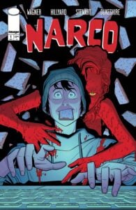 Narco #1
Writer: Doug Wagner
Artist: Daniel Hillyard
Colorist: Dave Stewart
Letterer: Ed Dukeshire
Publisher: Image Comics
Due Out: March 4
Review by Zack Quaintance
If you are somehow still unaware, writer Doug Wagner and artist Daniel Hillyard make great comics. They’re usually a little murder-y, a little smutty, and very likely to surprise you. Primarily published by Image Comics, you can find some of the duo’s past collected editions on the publisher’s website. Most recently, they teamed for I Was a Fashion Serial School Serial Killer, which told you what it was going to do and then went and did it.
The duo’s new team-up is called Narco, and on this effort they are joined by the industry’s current best colorist, the great Dave Stewart, as well as their frequent letterer, Ed Dukeshire. On first blush, it appears to be right in line with most of their body of work: the main character has a crush on a sexy neighbor, and he seems to inadvertently witness her murder. He also has a condition that when his heart rate (and excitement level) get so high, he passes out.
That’s an okay premise, one that I came into the book more excited because this veteran creative team were set to execute it. And like most of their book’s, they use that as a starting point and add to it. I particularly enjoyed this first issue’s opening, where we learn our main character has made a hobby out of sowing (relatively harmless) falsities to conspiracy trolls online.
As expected, the edition of Stewart’s colors are a big boon to the duo’s work, sharpening Hillyard’s already-crystal clear visual storytelling with nice moody tones, where it’s called for.
This first issue is primarily setup, but the creative team has likely earned your trust if you’ve read to this point. I found the lead character to be interesting to engage with on account of his condition, and I’m willing to bet there’s more to the mystery started in this first issue than there seems. Narco also sees the duo working with editor Keven Gardner, who is the head of 12-Gauge Studios, which makes these books. Gardner is also credited as a co-creator here.
The Prog Report
 2000AD 2468 (Rebellion): I haven’t really had a chance to write about Herne & Shuck: Power Trip in this space yet, despite it now being on its sixth chapter. But this week is a good chance to do so, because for the first time in a while there’s nothing beginning or ending in the magazine. The creative team here is writer David Barnett, artist Lee Milmore, colorist Gary Caldwell, and letterer Annie Parkhouse. This chapter, and really this entire strip, does a great job bringing something tonally different to the rest of the strips in the magazine right now, which are a bit grimmer and heavily leaning sci-fi, taking on things like someone set on murdering Judge Dredd as he grapples with having a robo-partner or a space landfill being used as a prison (you know, those old canards). But then there’s Herne & Shuck, which has been exploring its lead character and his background, putting him through a series of challenges. This week’s is a fun installment, wherein he is faced with a puzzle, but his true enemy is hos own presumptions. Pair that with what seems to be rising action on the last page, and I thought this was this story’s best installment yet. Excited to see where this is all headed. This week’s cover (above) is by Cliff Robinson with colors by Dylan Teague. As always, you can pick up a digital copy of The Prog here. —Zack Quaintance
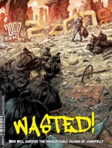 2000AD 2468 (Rebellion): I haven’t really had a chance to write about Herne & Shuck: Power Trip in this space yet, despite it now being on its sixth chapter. But this week is a good chance to do so, because for the first time in a while there’s nothing beginning or ending in the magazine. The creative team here is writer David Barnett, artist Lee Milmore, colorist Gary Caldwell, and letterer Annie Parkhouse. This chapter, and really this entire strip, does a great job bringing something tonally different to the rest of the strips in the magazine right now, which are a bit grimmer and heavily leaning sci-fi, taking on things like someone set on murdering Judge Dredd as he grapples with having a robo-partner or a space landfill being used as a prison (you know, those old canards). But then there’s Herne & Shuck, which has been exploring its lead character and his background, putting him through a series of challenges. This week’s is a fun installment, wherein he is faced with a puzzle, but his true enemy is hos own presumptions. Pair that with what seems to be rising action on the last page, and I thought this was this story’s best installment yet. Excited to see where this is all headed. This week’s cover (above) is by Cliff Robinson with colors by Dylan Teague. As always, you can pick up a digital copy of
 Column edited by Zack Quaintance.
Read past entries in the weekly Wednesday Comics reviews series or check-out our other reviews here!


