
In this week’s Wednesday Comics column, we look at the wildly titled The Florida Hippopotamus Cocaine Massacre #1, a new Image Comics debut with Death Fight Forever #1, the Muppets going noir, and more! Plus, FOC Watch and The Prog Report!
 The Florida Hippopotamus Cocaine Massacre #1
 The Florida Hippopotamus Cocaine Massacre #1
Writer: Fred Kennedy
Illustration: James Edward Clark
Letters: James Edward Clark
Publisher: Mad Cave Studios
Review by Clyde Hall
Temptation may be to look at the title and think, “Oh, sounds like the movie Cocaine Bear.” Reading it might, on the surface, leave you thinking, “Is this a book that wants to be an unofficial sequel to Cocaine Bear, without obtaining the rights?” They do both have a mid-1980s setting, drug lords and their cartels, innocent bystander casualty counts, and coked-up fauna/exotic animals.
What the first issue of (The Laser Drug Force in) The Florida Hippopotamus Cocaine Massacre manages is slightly different, though. Writer Fred Kennedy and illustrator/letterer James Edward Clark haven’t come to replicate the tone and themes of Cocaine Bear. They’ve come to gather up everything that made the 1980s memorable from McGruff, DARE, Reagan-era American optimism, cop coolness à la Miami Vice, horror films, and Airplane!, to aquatic theme parks, sexy femme action heroes, and straight-to-VCR films, and to praise it. Then mix well in a cannon and fire it over-the-top.
The result is a silly, high-energy romp worth the cover price in its humor and outrageous nostalgia. Any similar themes or tropes from Cocaine Bear lampooned in the context of this new, 4-issue miniseries are simply collateral damage from the same decade, done large.
In our opening, the publicly adored founder of popular Disco-Hippo Wonderland theme park, Jans M’Jor ‘Disco’ Discau, has come into the crosshairs of First Lady Mandy Laser as Target #1 in her war on drugs. Cocaine has made him rich, and a new coke variant is about to make him even wealthier. Heading up a special Laser Drug Force assigned to bring the kingpin down is Clarke Nebraska, Federal agent and femme dangereuse. Simultaneously, Discau’s operation has been infiltrated by undercover Flamingo City Police Department Detective Tico Senecoza. As Nebraska and her task force close in for an arrest, Senecoza’s cover is blown and he’s taken prisoner.
Which spurs his impetuous older brother, Miquel Senecoza, also FCPD, to his rescue. The resulting gunplay and explosions drive Discau, his bodyguards, and his militant nursemaids into a vast underground complex beneath Disco-Hippo Wonderland before Nebraska’s team can intercept him. The drug czar arms explosives set up around the park for just such emergencies. And then he shares his newest illicit drug discovery with the hippos, all as cover to make good his escape. The result is instant pandemonium and panic spurred on by homicidal hippopotami quickly becoming more predatorial under the influence of super-cocaine! Meanwhile, a hurricane begins making landfall amidst the absolute chaos.
Kennedy drafts the narrative like a WWF copywriter scripting a confrontation promo rich with kayfabe. But one aimed at starting a feud which gleefully throughs any pretense of ‘worked shoot’ out the window. Then hits it with a metal folding chair. In interviews, he’s maintained that a touchstone for him was the Airplane! movies. There’s more than a dash of The Naked Gun meets Sledge Hammer! in the stew as well. Juvenile and jovial the dialogue may be, but it’s also switched to fully automatic. A second reading is required to catch all the barbs and bwahahas.
The Clark art goes so big, it’s homeless. Or at least nomadic. Big hair, big guns, big hippos, big busts, bigger explosions. Add in large crowds with humanly humorous expression ranges capturing them like an era accurate Da Vinci profile study, and you have a sampler of the layouts here. His lettering matches so perfectly, you’ll be grateful he did it himself where the onomatopoeia’s concerned. The color palette is the only area that goes more pale and less epic, and I’m uncertain why. Why for example a multiple page celebration of automotive perfection isn’t all up in hot rod red, but instead confined to Mary Kay career car coloration.
As creative teams go, everyone here apparently saw Ferris Bueller’s Day Off when they were kids and took away this childhood nugget of wisdom: “A. You can never go too far.” They’ve fermented it into a pull tab intoxicant celebrating the 1980’s upsides. And it helps us remember that while no era’s perfect, all are someone’s childhood. They can be sources of laughter and joy when you experience them, or relive them, through young eyes.
If that’s not enough of a takeaway regarding how well The Florida Hippopotamus Cocaine Massacre miniseries will fit with you, here’s another. Fond memories of any 1980s staples mentioned here, plus how big a fit you’d have thrown at your neighborhood video store to make your parents rent a movie with that title, set your bar. That’s the brand of humor Kennedy and Clark unapologetically shot for, and with all calibers blazing. The result? There are lots more bullseyes here than there are misses.
 Death Fight Forever #1
 Death Fight Forever #1
Writer: Andrew MacLean
Artist: Alexis Ziritt
Letterer: Lyndon Radchenka
Publisher: Image Comics
Review by Jordan Jennings
As of late, there have been several series launched to homage and parody the superhero comics of the late-80’s and early-90’s, but Death Fight Forever is the first one in sometime to eschew the Liefeldian aspects of pop culture in favor of the video game aesthetics. Death Fight Forever #1 channels the frantic energy of 80’s arcade games, GI Joe, and a healthy dose of R-rated action flicks into one radical issue. The issue goes all in on the video game influences as it opens with an arcade level select screen outline all of the issues of the mini-series, which I haven’t ever seen in a single issue comic before. On top of this, we get a chapter title card for the issue reminiscent of something you see in the original Ninja Gaiden. The level of detail and care given to just the design of the comic alone is something special.
The story and dialog by Andrew MacLean is equally as over the top as the series premise. The focus of the issue is on Thunderfang’s GI Joe-esque forces raiding the pyramid base of Lord Slyther. The writing of the issue largely matches the tone of a more mature episode of Regular Show with the over-the-top pastiches, character designs, and style of humor. MacLean leans hard into the late-80’s/early-90’s machismo of the inspiration sources to create something that is genuinely funny and exciting.
The art by Alexis Ziritt captures that ultra detailed and visceral aesthetic of the era’s video game cut-scenes. The character models are definitely more of what we think of the 80’s today but done with a genuine affection for the source material. Ziritt’s line work and colors feel like something a teen would draw in that era. It’s visually unlike most comics on the shelf today and captures a Tom Scioli-style aesthetic. The way Ziritt uses flat colors along with monochromatic panel composition perfectly captures not only the look of the era, but gives the comic that visual pop that I don’t think would have been possible if it was done in a more modern house style.
Death Fight Forever #1 is an action packed thrill ride through the jungle. The issue executes its vision perfectly and is one you should not miss. Highly recommend checking this out today.
 Muppets Noir #1
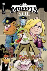 Muppets Noir #1
Writer/Artist/Letterer: Roger Langridge
Colorist: Dearbhla Kelly
Publisher: Dynamite
Review by Khalid Johnson
Muppets Noir #1 is exactly what I expected from the Muppets.
It feels like a Muppets adventure, with such care given to characterizations and the world by artist, writer and letterer Roger Langridge. In this book, Langridge really brings the charm that so defines these iconic characters.
With the familiar Muppet Show backstage as a starting point for our story, hijinks ensue and Kermit soon finds himself in a dream, working as a hardboiled private investigator looking for Miss Piggy at the behest of her wealthy pie-business running aunt. Dearbhla Kelly’s coloring really punchs up the noir aesthetic through a gray (sometimes sepia) world colored solely by the Muppets, and then a fun little musical number that fully introduces color into that setting.
The art throughout is fun and whimsical, and the tone of the story really lands what Langridge is going for. Overall, Muppets Noir is a great first issue that throws you into the world of the Muppets as well as a noir setting. Personally, I am living for all the new Muppets art, and this is a great and welcome addition, accessible for all readers.
 White Sky #1
 White Sky #1
Writer: William Harms
Artist: JP Mavinga
Colorist: Lee Loughridge
Letterer: Ed Dukeshire
Publisher: Image Comics
Review by Tim Rooney
It’s hard to separate White Sky from its influences, which to writer William Harms’ credit, he fully admits in the note at the end of this first issue. But recognizing ones’ influences isn’t enough to justify your own work when it fails to meaningfully add to that conversation. White Sky isn’t bad. JP Mavinga’s art is too strong to totally discount. The first few pages, especially, are thoughtfully laid out to emphasize the loneliness of this barren earth. Mavinga opens wide on a burning skyline, as the forest of California burn in the diet and, a dead parking lot of wrecked cars are strewn across the foreground. The opening shot is cut into three wide panels, increasing in detail as our eyes descend down the image from the smoky sky to fallen earth. Our leads, father David and daughter Violet, are tiny in the bottom frame. Just silhouettes among the debris. It’s an effective establishing shot to show how alone they are.
That loneliness is made clearer on the next page, as the two characters stomp through the empty space of the page, sparsely littered with garbage and abandoned machinery. It take up about a third of the page, the other 4 panels consisting of two close up shots and then more wide landscape. Mavinga effectively sets the mood of this wasteland, with Lee Loughridge’s desaturated colors pulling out all warmth and adding minimal detail to make us feel unwelcome and uncomfortable.
This is a world destroyed by ghosts, having sucked the warmth from the world and leaving the climate to collapse in their wake. But the text of the story doesn’t actually tell us that nor does it give us much about this conflict to the very end, instead focusing on David and Violet and a few wasteland marauders in a set piece that is agonizingly familiar. Harms just does not to do enough with the ghost concept to make this particular family post apocalypse feel fresh, instead hiding most of the danger for, I assume, a later reveal.
By avoiding what might make this story not just a reskin of The Last of Us, it becomes a comic without an identity of its own. That could change with later issues, with its intended focus on the daughter rather than her dad, but this issue is so focused on mood and place, that it’s hard to be compelled by the plight of its characters or curious about the mysteries of what left them alone.
FOC Watch
The following title is currently available for pre-order at your local comic shop!
Dead Teenagers #1
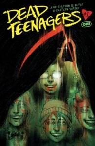 Dead Teenagers #1
Writer: Jude Ellison S. Doyle
Artist: Caitlin Yarsky
Letterer: Becca Carey
Publisher: Oni Press
Due Out: March 18, 2026
Review by Zack Quaintance
Jude Ellison S. Doyle has fast become a must-read comics writer for me, having penned a couple of recent favorites with Be Not Afraid and The Neighbors. Doyle writes complex, surprising comics that don’t rely on genre tropes, and don’t feel the need to over explain to the reader. His newest is Dead Teenagers #1, from Oni Press, and it sees him teaming with Caitlin Yarsky, whose work is also a must-read in my world, especially when it gets into odd original ideas.
The pairing of the two creators together, unsurprisingly, makes for a great book, or at least (so far) for a great debut issue. Dead Teenagers is set in a high school in the late ’90s, which as anyone who was there can attest, is inherently a great setting for a horror story. But Dead Teenagers is not just a horror comic. As Doyle describes it in online promo, it’s actually a “slasher-time-loop-coming-of-age-teen-comedy-drama-kaiju-etc.” comic.
And while this sounds like a lot, the first issue is actually really straightforward and easy to understand. It opens on a prom night replete with the usual teen drama, a character jilted about her crush, crying to her friends, etc. By the bottom of the first page, its bedlam, and a kaiju has crashed the prom. From there, we go on a multi-scenario time romp reminiscent of stories like Groundhog’s Day or Edge of Tomorrow, all perfectly made clear by a really subtle yet bit great of lettering from Becca Carey, who lets us know which number scenario we are watching by simply numbering the scenarios. This is combined with first-person narration that gives the reader insight into what’s going on.
It’s essentially a high concept horror-sci-fi romp with a relentless motor fueled by teen dramedy and pitch perfect banter. And it’s all in service of the conflict and the plot, rather than just being banter for the sake of banter. On top of that, it’s also a great artist showcase for Yarsky.
There’s a four-panel page at one point that teases four different doomed scenarios, and it’s a ton of fun, like a quick-hit clip show of visual concepts that could be full segments or even issues. But they’re drawn in a way that gives us just enough to extrapolate the whole things from them, get back to our main plot, and keep moving.
Overall, Dead Teenagers #1 is a fantastic debut issue. A morbid, fast-paced first chapter that seeds something much deeper and is told in a way where the story could go seemingly infinite directions and still make sense. Simply put, you want to pick this one up.
The Prog Report
 2000AD 2470 (Rebellion): Well, if nothing else, this week’s Prog taught me what Budgie Smugglers are…kidding, mostly. But after last week’s mag brought us the finale chapter of Death of a Judge, this issue did feel like a bit of a comedown. That said, both Judge Dee and The Discarded continued moving their plots ahead this week. I still have faith in The Discarded — from writer Peter Milligan, artist Kieran McKeown, colorist Jim Boswell, and letterer Simon Bowland — to end up being a really interesting comic (the start was so good), but it has been taking a bit longer to get there than I’d like. While this week’s Judge Dee from writer Ben Wheatlley, artist Simon Coleby, colorist Jack Davies, and letterer Simon Bowland, really gave Coleby and Davies a chance to cut loose with some great new character designs. Anyway, I’m off to read the Megazine now, where I’m really looking forward to Rok the World. This week’s cover (above) is by Clint Langley. As always, you can pick up a digital copy of The Prog here. —Zack Quaintance
 2000AD 2470 (Rebellion): Well, if nothing else, this week’s Prog taught me what Budgie Smugglers are…kidding, mostly. But after last week’s mag brought us the finale chapter of Death of a Judge, this issue did feel like a bit of a comedown. That said, both Judge Dee and The Discarded continued moving their plots ahead this week. I still have faith in The Discarded — from writer Peter Milligan, artist Kieran McKeown, colorist Jim Boswell, and letterer Simon Bowland — to end up being a really interesting comic (the start was so good), but it has been taking a bit longer to get there than I’d like. While this week’s Judge Dee from writer Ben Wheatlley, artist Simon Coleby, colorist Jack Davies, and letterer Simon Bowland, really gave Coleby and Davies a chance to cut loose with some great new character designs. Anyway, I’m off to read the Megazine now, where I’m really looking forward to Rok the World. This week’s cover (above) is by Clint Langley. As always, you can pick up a digital copy of
 Column edited by Zack Quaintance.
Read past entries in the weekly Wednesday Comics reviews series or check-out our other reviews here!


, plus we have several more reviews!)