
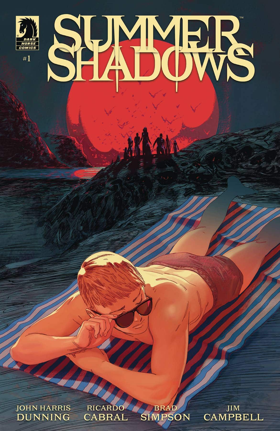
This week’s main review is Summer Shadows #1, which really brings the seasonal spookiness. Plus, the Wednesday Comics Team has its usual rundown of the new #1s, finales and other notable issues from non-Big 2 publishers, all of which you can find below … enjoy!
 Summer Shadows #1
Writer: John Harris Dunning
Artist: Ricardo Cabral
Colorist: Brad Simpson
Letterer: Jim Campbell
Publisher: Dark Horse
Review by Steve Baxi
Fall is right around the corner, which means monsters, blood, and some good scares. Summer Shadows takes full advantage of its September release, providing a bright, fun, beach setting on the Greek Island of Avroxos, juxtaposed with sinister looking silhouettes, missing persons and a complex mystery that might more appropriately be an island-wide conspiracy.
The first thing to note about this book is Brad Simpson’s color work. From the opening sunset sequence, followed by blood red moons and murky waters, Simpson renders every one of Ricardo Cabral’s scenes with a palpable gothic atmosphere. His use of shadows and cool colors transform the fun beach into something otherworldly. Cabral’s art is also excellent, with rich environmental details. A horror story on a Greek island is a fun idea in its own right, but it wouldn’t work without Cabral’s ability to give you the clear architecture and geography. The contrast between the day and night help to sell the hidden agendas and mysterious occurrences on the island.
Some people go missing, others are being watched, and we have a slightly deranged looking man warning us to get away. A cursed aura creeps in as we meet our main characters in these circumstances, and John Harris Dunning’s script does a great job of juggling exposition with clear emotional beats and relatable character motivations. Like any good horror story, there’s a slow build up of tension as we get bits and pieces of our monsters, but no clear answers (yet). You immediately feel the familiar fun of the genre, but the presentation is new and exciting.
Summer Shadows is a treat and a great way to get into Spooky Season. From the atmosphere to the script, there’s a lot to enjoy here and I’m eager to see where it all goes.
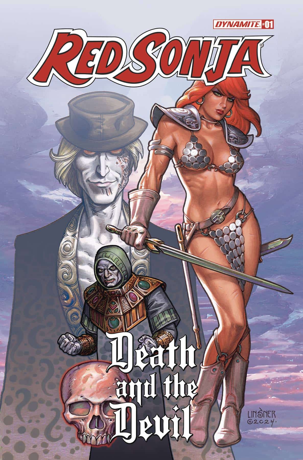
 Red Sonja: Death and the Devil #1
Writer: Luke Lieberman
Art & Colors: Alberto Locatelli
Letters: Dave Sharpe
Publisher: Dynamite Entertainment
Review by Clyde Hall
The latest Red Sonja offering from Dynamite checks most of the barbarian epic boxes in its premiere issue. Daring assaults against a numerically superior force in their stronghold? X Brazen tactics that are reckless but often effective? X Peepshow featuring scantily or skyclad protagonist She-Devil because reasons? X
And writer Luke Lieberman adds laudable touches within this formula. Humor in freeing a sacrifice to Set who doesn’t want rescued. Insight alongside Sonja on how doing the right thing by ending a tyrannical king’s reign opens his long-suffering subjects to more abuses. Sonja not letting the situation sit, but rather seeking the only surviving heir and taking responsibility for seeing him ascend the throne. As warring interests vie for control, she’s also determined that the young prince won’t become anyone’s puppet figurehead.
Therein lies the promise of this initial entry, and the necromantic assassin called Bloodless gives the tale added traction. Lieberman makes the young and impulsive Sonja interesting, but at times delivers her from the fallout of her inexperience easily. Add in how Bloodless wrestles the spotlight away from her at certain points as if auditioning for his own title, and what makes the storyline work overall, the portions piquing interest the most, grow dim. A spate of dialogue editing errors midway through the issue sadly adds to the casting-about-for-story-footing climate.
The Illustration by Alberto Locatelli has a satisfyingly awry quality which promotes the Hyborean Age handily while his color choices are wan and paler than one might expect in a barbarian title. It conjures the spirit of Elric of Melniboné, which isn’t a bad thing, and perhaps it’s quite fitting for a story involving the Necromantic arts personified in Bloodless. Points for taking an unexpected path, yet I can’t help but wonder how the hues of Sonja’s and Bloodless’ worlds might have contrasted, and how they might have collided, given a more varied palette.
In the first issue of Red Sonja: Death and the Devil, there are enough of the X’d categories above, plus sufficient departures from them, to satisfy many Sword and Sorcery fans. Others could take a pass when it comes to subsequent entries. The difference may heavily depend on the litany of excellent variant covers and the talent backing them. Dynamite excels at this proven strength and the covers previewed will draw apt attention. But the interior elements may not hold it.
Transformers #12
Writer: Daniel Warren Johnson
Artist: Jorge Corona
Colorist: Mike Spicer
Letterer: Rus Wooton
Publisher: Image Comics / Skybound
Review by Jordan Jennings
Synopsis: The Second Arc of Daniel Warren Johnson’s Transformers run comes to its thrilling conclusion as Optimus must lead the Autobots against the forces of the Decepticons lead by the cruel Shockwave. Yet, with the Autobots not at full capacity and suffering massive losses, can the team overcome their trauma and save the Earth from the evil forces of the Decepticons.
Transformers has been on fire this past year with visceral and kinetic storytelling. Transformers #12 serves as an excellent pay off to this arc and the past year of comics. This second arc’s theme is dealing with the scars and trauma of war with Autobot and Decepticon alike struggling with the horrors of unending warfare. Daniel Warren Johnson has definitively shown that even when he isn’t doing the art on a series, his writing still manages to find those emotional beats that has made his work resonate with me. Despite being seemingly robots that know no age, the Cybertronians have such emotional heft about them.
For example, Johnson’s characterization of Optimus is really compelling compared to most media adaptations. He embodies the idiom “Heavy is the head that wears the crown” as he tries to fight for peace. He is a warrior and revolutionary that is at odds with himself with the cost of this war he starts. Throughout the issue, we see Optimus beginning to come to terms with his actions and what he feels is right. Trying my best to avoid spoilers here but there is a decision Optimus makes at the climax of the battle that is just emotionally devastating for everyone in the story.
Johnson’s plotting on the series so far has been one of frenetic chaos that keeps building on each moment until it reaches an emotional crescendo. There isn’t much time for quiet moments. Yet, when it reaches that crescendo, Johnson knows to let it breathe and sink in. The impact of which just hits you in the gut.
The story itself wouldn’t be anything without the art to back it up. When Johnson pulled back to just being the writer on the series, I was concerned. Johnson art has this energy that fits right in with his writing style. How could anyone match that? Well, this arc has proven to me that it is very possible. Enter: Jorge Corona. Corona’s artistic sensibilities are of the same flavor as Johnson and is a perfect match to Johnson’s chaotic, escalating action-driven writing. Transformers #12 exemplifies this to the nth degree.
The amount of entropy that is somehow contained on the page by Corona boggles my mind. In this issue, we have Optimus taking on Devestator, the individual Bruticons, and Shockwave. All while escaping from the villains’ evil lair as the planet Cybertron shifts back to its true galactic alignment. There is A LOT going on. Corona successfully makes it easy to follow and visually stunning at the same time. His eye for detail is tremendous with each Cybertronian having various cracks and chips taking out of the armor plating.
What’s even more impressive is the amount of emotion Corona gets out of these robots, which most of the principal characters don’t even have a full face. The body language and composition on display here is masterful. This is best showcased in the climax as Optimus makes his consequential choice regarding Cybertron or Earth. The emotion on display between Optimus and the autoboot Elita is heavy. The despair, anguish, and resignation in both characters jumps off the page that I did not expect in a Transformers comic.
Colorist Mike Spicer does a great job bridging the gap between Johnson and Corona. The use of Purple to symbolize the sheer amount of Cybertronian/Energon tech provides a nice contrast to the more primary colors of the Autobots. Honestly, with so many visual details embedded into the art, Spicer’s colors are essential to differentiating what is going on in the panels.
Overall, Transformers #12 is an amazing pay-off to what has shaped up to be an emotionally charged and difficult arc for the characters. The stakes are higher than ever and the ending leaves the reader a good but hollow feeling as we watch Optimus questions “What have I done”. This series is firing on all cylinders and a must read each month.
Wednesday Comics Reviews
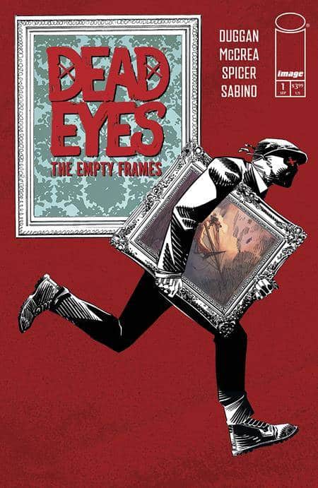
- Dead Eyes: Empty Frames #1 (Image Comics): Since the first Dead Eyes series wrapped up a few years back, I’d always kind of wondered/hoped that the creative team would come back and do more. It felt like the introductory mini had really built an interesting character, and I couldn’t help but wonder what a story free of introducing said character would be like. Well, this week I don’t have to wonder any more with the arrival of Dead Eyes: Empty Frames #1 by writer Gerry Duggan, artist John McCrea, colorist Mike Spicer, and letterer Joe Sabino. This is a fantastic crime comic, one with a fun main character whose design and local legend power the action in equal parts. McCrea is one of my favorite artists, and he’s colored here to moody perfection by Spicer, right from the first pages. I also enjoyed Duggan’s thematic interests in what was happening here. The last thing I should note is that this comic stands alone on its own merits, and I think even folks who missed the first mini series will enjoy it. —Zack Q.
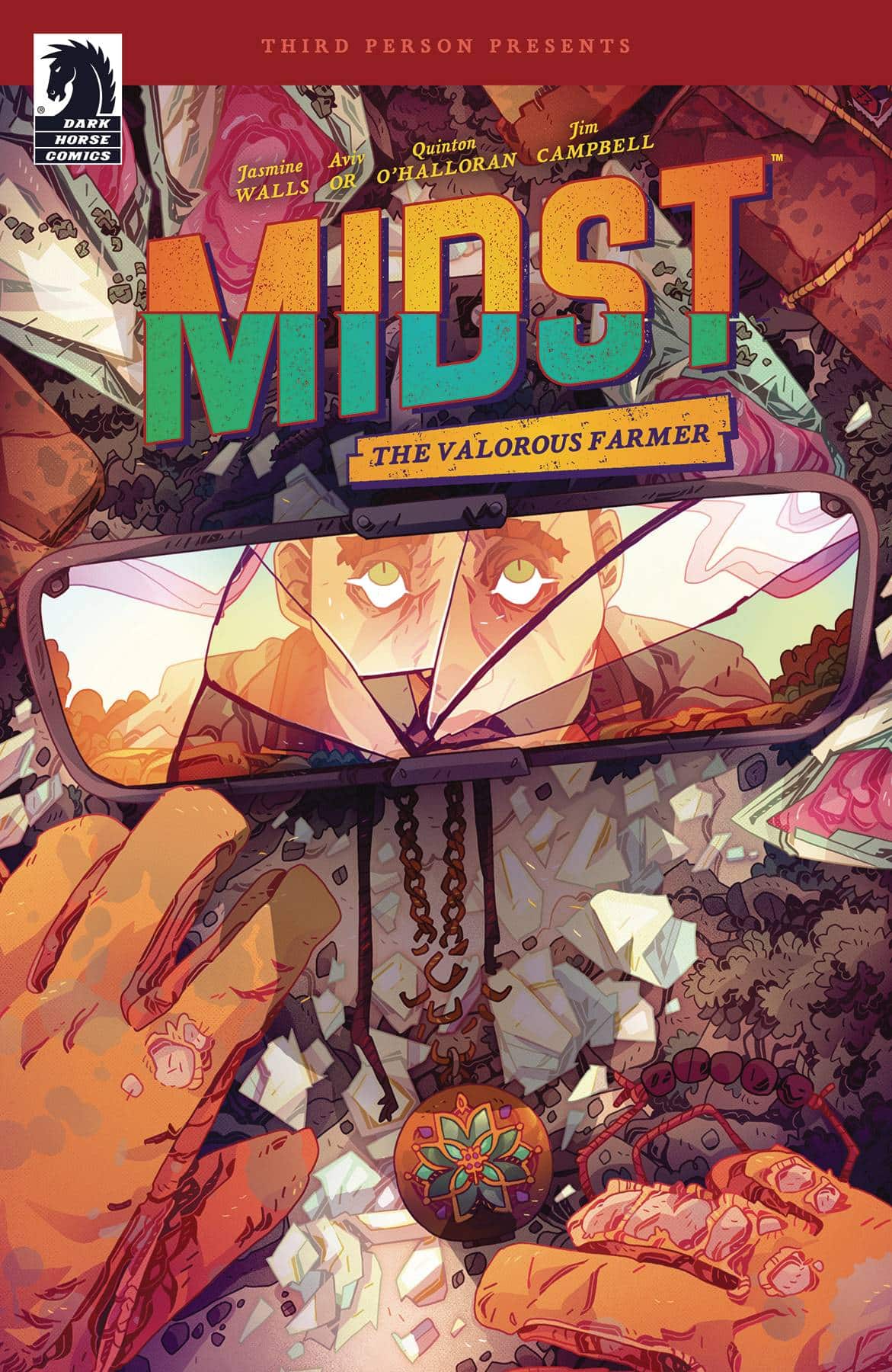
- Midst: The Valorous Farmer (Dark Horse Comics): Going into this book, I didn’t know of Midst as a podcast, but it doesn’t matter because Valorous Farmer stands out as a stellar and emotionally cathartic piece of work. Jasmine Walls casts farmer Hildebrand out into the worst day of their life with everything from their business to their truck to their finances crumbling. With every scene built to bring affecting insight into this world’s everyday struggle and conflict/resolution loops that are nearly pyrrhic in their math, Valorous Farmer proceeds to a decently poignant conclusion; even if some will find it a bit twee — but forget those haters. Hildebrand and their world express life and stress with atmospheric body language thanks to artist Aviv Or. The art clearly focuses on how emotions can weigh characters differently, utilizing side-by-side repeated shots to communicate narrative differences. This formalist-lite approach can create stagnant layouts, but as a feature it frames every moment with human interaction rather than extraneous worldbuilding data. Or’s high concept environments can be fairly sparse, but the dissonance between the warm human spaces and empty sci-fi island realm helps reinforce the themes at play — and with visual density low enough for the pacing and compositions to be lean and effective. Quinton Winter aids this with a playful yet dour palette, which is the general vibe on Hildebrand’s worst possible day. Winter keeps the range from midtones to highlights with subtle textural depth that grounds Hildebrand’s world without pulling too much attention to itself in the process. There is one hiccup however in Jim Campbell’s lettering process where Or leaves significant negative space, but he doesn’t take advantage — no dialogue splits for fairly wordy lines, nothing but non-diegetic balloons slapped onto Or’s panels. Though Campbell’s color choices appropriately stay within Winter’s palette, a key moment has its impact lessened by a Blambot font that didn’t stylistically work and was far too big and repeated in the page composition. It’s a touch that feels inconsequential, but could ultimately alter the climax. My SFX gripes aside, Valorous Farmer is a large-sized work of genuine sci-fi genius that keeps its ambitions low enough to be over-delivered by a stellar production team and stand out in today’s competitive market. —Beau Q.
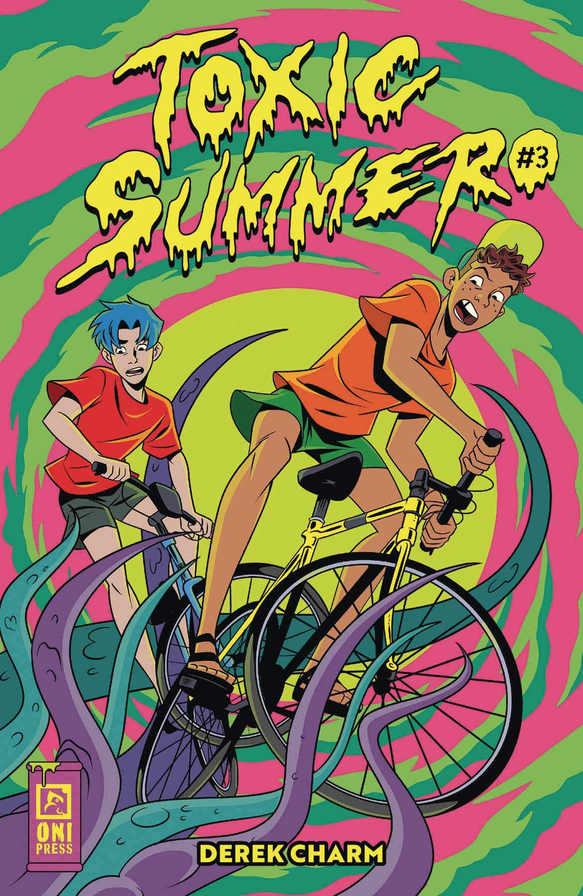
- Toxic Summer #3 (Oni Press): The Toxic Summer conclusion comes at Summer’s end as the mystery of the creatures and the toxic beach unfold. The sharp sense of wit to the series is consistent and is a height of reading these characters and their charming interactions. Questions are answered in a way that keeps with the story’s comedic tone and the loose ends and the book are tied up with a neat ending that is simultaneously satisfying and disarming. I didn’t anticipate the nature of our antagonists but the way it was handled made me go “Ah, I get it.” The art is stellar, I can’t gush enough over the colors and choice of palettes, the expressiveness of the characters, the monster design and the almost Mystery Inc. feel of the book on the whole. Derek Charm brings it for all three issues, doing everything but the letters (Frank Cvetkovic has been consistently amazing over this run) and that should be celebrated as much as possible. I had a fun time with these queer boys and their quest for beach fun and all of the eerie mystery that floated around the beach. Toxic Summer is well worth your time. —Khalid Johnson
The Prog Report
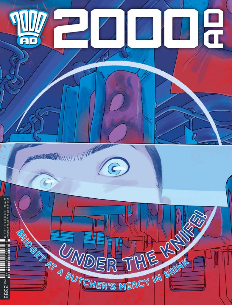
 2000AD Prog 2399 (Rebellion Publishing): In this issue, I went straight to the finale of Silver by writer Mike Carroll, artist Joe Currie, and letterer Simon Bowland. If you read this space regularly, it may seem like I’ve loved this story — because I have. Currie’s art applies a loose-but-detailed sci-fi aesthetic to the proceedings, and I find it filled with interesting visual choices. There is, for example, an explosion at the start of this chapter that I just loved. Overall though, I’ve found this to be a surprising and engrossing story. It essentially started as what felt like a subdued horror take in a graveyard, and within the course of 10 Prog installments, it has convincingly built into an alternate timeline war between robots and vampires for the future of our planet. What a trip. And while I called this a finale at the top, it’s really just a finale for now, with another set of these stories promised for the future. I can’t wait. As always, you can nab a digital copy of this week’s Prog here. —Zack Quaintance
Read more entries in the weekly Wednesday Comics reviews series!


