
This week the Wednesday Comics Reviews team is looking at a pair of planets with Captain Planet #1 and Free Planet #1, as well as the return of Heavy Metal Magazine, among other releases. We also look ahead at a new title eligible for pre-order, with The Oddly Pedestrian Life of Christopher Chaos: Children of the Night #1, which spins out of the hit Christopher Chaos main book. Plus, as always, The Prog Report!
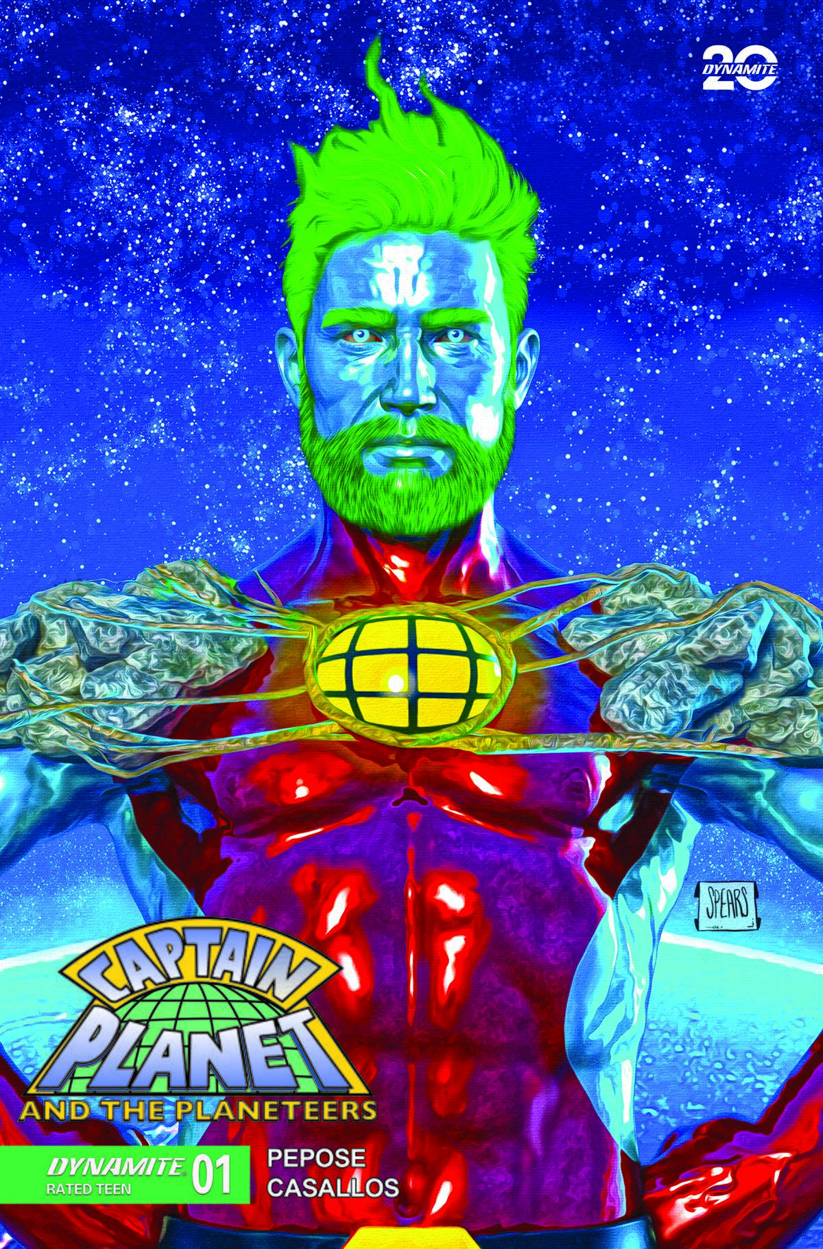
 Captain Planet #1
Writer: David Pepose
Artist: Eman Casallos
Colorist: Jorge Sutil
Letterer: Jeff Eckleberry
Publisher: Dynamite
Review by Jordan Jennings
When I first learned about Captain Planet and the Planeteers #1, I was nervous. I was worried that a creator would lean too far in either direction (grimdark or self-parody). Captain Planet is a bit silly, but well intentioned in creation. He embodies an optimistic outlook that stems from the end of the Cold War. This is despite the uncertainty of the time. He is as much about hope as Superman. Unfortunately, Captain Planet has also been the source of countless ridicule over the years. “His weakness is pollution?” “One of the Planeteers has the power of HEART?!” and many more are a common refrain to this day. I can safely say writer David Pepose assuaged my concerns when I got to read the book this week.
Captain Planet and the Planeteers #1 is a modern update to the Captain Planet story that treads carefully in conveying the serious intent behind the characters, but while staying away from the Grimdark path. The story on the surface does feel discordant of the original TV series. As the comic literally opens up with Gaia (the mentor of the Planteers) on the run from a private military company. During the fray, she summons Captain Planet and we witness the character get gunned down with depleted uranium rounds. YET, the serious tone matches what was permitted at time by networks’ board of standards and practices. I understand that I may be looking for seriousness in something seemingly innocuous and benign, but if you read about the vision of Captain Planet and understand the tone of many of the shows, you can see those elements are there.
To be blunt, environmentalism is inherently political. It requires political entities to pass and enforce environmental regulations. This requires political capital and willpower. It also requires the people to stand up for themselves and what’s right. Captain Planet’s catchphrase is “the power is yours”. It has been derided by most as the epitome of environmentalist ineffectiveness much like the Lorax and “Unless”. The truth of the matter is that both of their messages are true. It is true that individually we can cause great impact. Your individual actions are important. Reducing consumption, reusing what you can, and recycling whenever possible can be huge, but what Captain Planet symbolizes is that together our powers combine into something greater than the sum of its part. Together we are strong.
Pepose understands this wholesale. Just looking at the updates to the Planeteers we see varying changes to them. First, they are presented closer to the fictional ages, if not older. Second, some, namely Mah-Ti, receive massive changes. In an interview with The Beat, Pepose states he envision Mah-ti as a Batman like character—Someone who experiences great pain but finds in their heart to seek Justice and not vengeance. Mah-ti is revamped into a more radicalized version. With his people, the indigenous Kayapo, experiencing great pain from lithium mines in Brazil, Mah-ti uses his powers for much more effective and novel ways. It’s easily the most compelling part of this update and one I applaud Pepose for doing.
The comic isn’t all serious. Pepose injects levity throughout the book. The line about Captain Planet only losing once during the cretaceous made the biologist in me chuckle, as that was the extinction of the dinosaurs. The pacing of the issue is swift and quickly gets the band together. The pacing is impressive as each planeteer gets 2-4 pages each. Simple introductions but as mentioned with Mah-Ti effective.
My only issue with the book comes from the art. Eman Casallos delivers an acceptable book as the story is easy to follow and the action is solid. The problem stems from the facial expressions. At times they look stiff and over-referenced. It undercuts the emotional moments sometimes and looks rough at others. The coloring by Jorge Sutil
is equally fine, but could be improved. Tone and emotion isn’t conveyed in the palette which weakens it some. Also, the skin tone has this artificial sheen to it that isn’t bad, but not fitting. Just to be clear, the art is perfectly fine. I understand the nature of comics and deadlines. I think it could just be elevated through some small adjustments to bring the book to the next level.
I truly enjoyed this book. It gave me pause to think about the nature of updates and environmentalism. It is thought provoking, engaging, and a lot of fun. I’m excited to see future issues.
Final verdict: BUY
 Heavy Metal Magazine #1
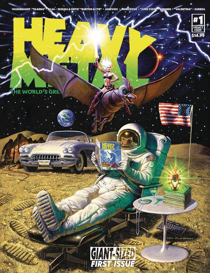
Creators: Frank Forte, Chris Thompson, Chris Porteous, Dave Kelly, Ton-Ward, Luis Guaragna, Felipe Sobreiro, Agustin Alessio, Enki Bilal, Joshua Sky, Vicente Segrelles, Craig Wilson, John Workman, Jose Ortiz, Antonio Segura, Ian Spelling, Steve Mannion, Leah Moore, John Reppion, Anna Morozova, Michael L. Peters, Fernando Dagnino, Dwayne Harris, Keron Grant, John Stanisci, Dave Baron, Michael W. Conrad, Ilias Kyriazis, Lia Bozonelis, Joseph Michael Lisner, Janevsky, Jim Rugg, Jonathan Wayshak, David Quinn, Tim Vigil, Sergio Gerasi, Jason Pell, Jok, Paul Kirchner, and Curt Melo
Publisher: Heavy Metal
Review by Zack Quaintance
Following a mega-successful Kickstarter campaign last year (one that racked up nearly $800,000), Heavy Metal Magazine has now returned to newsstands with a new #1 (legacy #321). And, whoa man, it’s a big one. This slab of comics and prose clocks in at more than 220 pages. With a price tag of $14.99, that’s a pretty excellent value in the comics market. I think anyone interested in Heavy Metal will be satisfied with what they get for there money here.
See, within those 200-plus pages is, essentially, a celebration of Heavy Metal, which prior to the Kickstarter campaign seemed like it might have ended (although this is comics, so does anything truly ever end?). I’d describe this book as both celebratory and relieved, relieved that a publication with such an august and celebrated legacy is not actually down for the count. I know I felt grateful as I cracked this bad boy and got lost in its pages.
And, indeed, a lot of what’s found in here should feel familiar to anyone who knew and loved the old magazine. With a history that dates back to April 1977, many of the artist and other creatives who made this magazine iconic have now passed on. But not all, and the magazine wastes no time in getting to work by one of its greats, specifically Enki Bilal, whose new comic Bug is the first comic story to appear here, with a translation by Ian Irvine, lettering by Tom Williams, and edits by Chris Thompson. That was a wise and welcomed move, to be sure.
And Bilal is not the only Heavy Metal great onboard here. The main cover is by Greg Hildebrant, and there’s a variant by Frank Frazetta. Another choice in this massive book that I enjoyed was to mix in articles about the publication’s history, along with tributes to its legacy contributors, both in the form of prose as well as their art.
And while there are too many comics stories to go into detailed review of most (or perhaps even some, for our purposes) the other piece of significance that feels worth mentioning is the short that stars the publication’s most famous character, Taarna: The Last Tarrakian, written here by Leah Moore & John Reppion, illustrated by Anna Morozova, colored by Ellie Wright, lettered by Tom Napolitano, and co-edited by Dave Kelly and Chris Thompson. In this piece Taarna fights monsters with a sword, takes a topless shower, and just generally does Taarna things. It’s a solid introduction to the character, one that sets up more stories to come, and it also looks fantastic. Morozova and Wright are just the perfect art team for Taarna, and I hope they are currently working on new Taarna stories.
All in all, I think this new Heavy Metal Magazine #1 is well worth a pickup. It’s just such a satisfying mix of new material with a celebration of one of sci-fi/fantasies most stories publications, both its history and its characters. You get a week’s worth of reading here for a $15 price tag, which is not bad at all. I certainly enjoyed my time with it.
 Los Monstruous #1
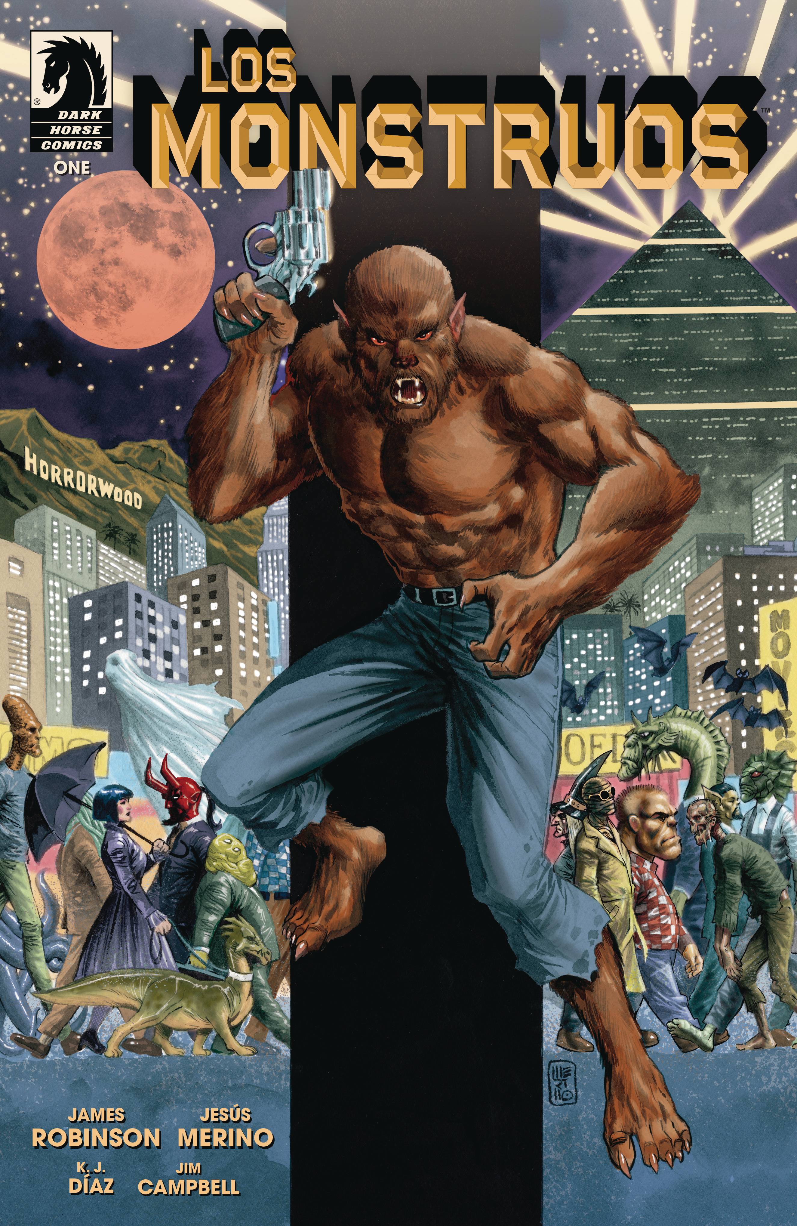
Writer: James Robinson
Artist: Jesus Merino
Colorist: K.J. Diaz
Letterer: Jim Campbell
Publisher: Dark Horse Comics
Review by Jordan Jennings
When an elderly man comes looking for his lost love who happens to be a vampire, it takes him to Perry Cutter, werewolf PI. This is the story of Los Monstruos, an American city populated 100% by monsters of legend and screen. Los Monstruos #1 quickly establishes a world akin to most Hollywood neo-noir films. A disgraced police officer turned hard boiled private dick is on the case of a missing heiress as he navigates the seedy underbelly of the city.
Writer James Robinson is playing in his wheelhouse here with this period piece. Robinson leans on conventions of the neo-noir genre in an effort to help efficiently build up this unique world. I am talking stuff like the hard boiled internal monologue from the detective that provides context and perspective to the common tropes of crooked cops and missing heiresses. It is a great shorthand to get the story across. The story itself is an extremely well-executed detective story ala Chinatown. I am a sucker for these kinds of stories and this issue is no different. I consumed the comic in a matter of minutes just loving the dialog first-person narration.
Artist Jesus Merino really delivers here by creating this Los Angeles analog into Los Monstruos. There’s A LOT of monsters on the page here and I am talking about all sorts of monsters from human flies to gill monsters to giant skeleton men. It’s an interesting and eclectic mix of monsters that make the crowd scenes stunning. Merino isn’t shying away from the large crowds either. One of the main reasons that this world feels as lived in as it does is because of these massive scenes of monsters and bustling streets and police departments. The figure work Merino puts in here is also amazing. The vampire family at the beginning of the story has a lot of love and compassion for their returned son that isn’t even mentioned in dialog. It’s all done in the body language that Merino imbues into the characters.
Colorist K.J. Diaz deserves a shout out here. Despite having large expansive crowd scenes at times, nothing ever feels too crowded either. This is due to their excellent use of balance and coloring. All of the principal cast stands out of the crowd and we, the reader, can easily follow the page. This is thanks to how the stuff that needs to catch our eye is able to catch it via selective color use. This on top of the mood setting colors for the day and night, that is so important for neo-noir. It’s masterful stuff.
Overall, I loved Los Monstruos #1. It is successful in its efforts of establishing a neo-noir in this monster world. It is absolutely gorgeous in its construction and presentation. I highly recommend checking it out.
 Vanishing Point #1
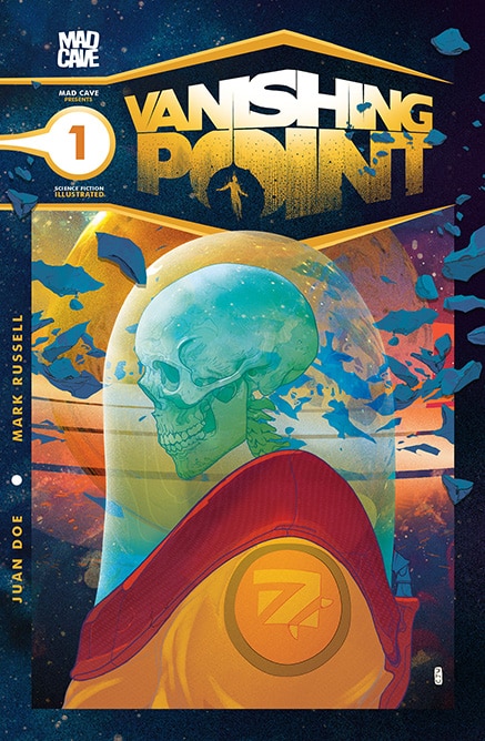
Writer: Mark Russell
Artist: Juan Doe
Letterer: Carlos M. Mangual
Publisher: Mad Cave Studios
Review by Zack Quaintance
In a deep space dystopia, asteroids mine you (that’s a Yacko Smirnoff reference, because I’m nothing if not current…). Old-timey jokes aside, that really is a key part of the concept in Vanishing Point #1, the first issue of a new sci-fi anthology series written by Mark Russell, for which he is joined by artist Juan Doe and letterer Carlos M. Mangual. The concept is that our protagonist is alone in deep space. In this future, one of the few jobs remaining for humans (and not machines) is mining asteroids this way. Science is a little baffled, but there’s something about the human brain — and only the human brain — that can assess which asteroids will provide the minerals Earth needs.
If you read the Eisner-nominated Travelling to Mars, you know Russell is in familiar thematic territory here. He deploys a first-person narrative captioning for a protagonist who is alone in space doing work for an exploitative company. Travelling to Mars was heart-rending and personal, a really beautiful comic in which you could feel the desperate solitude of the narrator, who was also suffering from a terminal illness and going back through is memories of a life that wasn’t exactly well lived.
This first issue of Vanishing Point trades the hyper-personal reflection for a horror motif, with tinges of Moby Dick (this is even right there on the page, with the narrator referring to a psychological break in space as “Going Ahab”). The result is a really moody, sci-fi horror comic that will have you rapt from the first page. This is a very polished and precise book, with a one-shot structure that escalates and pays off perfectly.
It also looks fantastic. It’s been a while since I’ve read a Juan Doe comic, but Doe’s linework is clean and interesting, and his character designs are as good as they get. There’s a bit where our narrator wields a giant space axe, and it couldn’t look better. It’s a great pairing too for how precise Russell’s scripting here, with the two creators truly elevating each other, all set to the lettering of Carlos M. Mangual.
In the end, I found this first issue to be excellent. I also take it as an indicator of more great things to come. The one-shot comic format is not one that has traditionally been common in direct market periodical comics. But with new series like this — as well as stunning stories like last week’s Free For All — that might just be poised to change.
Rapid Wednesday Comics Reviews
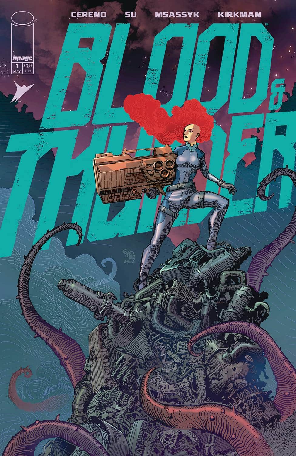
- Blood & Thunder #1 (Image Comics / Skybound): It’s been a while since I remember reading a new #1 for an original story from Skybound, so busy has the publisher been with its ongoing, megahit Energon Universe, perhaps back to the launch of Dark Ride in October of 2022 (although I’m probably forgetting something. All that is to say that I was excited when Blood & Thunder #1 popped up with the Skybound logo on it, as I tend to find their series have a lot of built in verve to them. And Blood & Thunder #1 is no exception. It’s got shades of Rogue Trooper to it, in that the main character has a sentient gun that dispenses advice as she goes about bounty hunting, although the talking gun is where the similarities with Rogue Trooper begin and end. Blood & Thunder is a faster, more slapstick comic, one that makes great use of its sci-fi setting to quickly build both its world and character. Throw in some familiar elements of hard-boiled police procedurals, and you’ve got a series debut that feels like good fun all around. This comic was written by Benito Cereno, illustrated by E.J. Su, colored by Msassyk, and lettered by Rus Wooton, with a created by credit going to Cereno, Su, and Robert Kirkman. —Zack Quaintance
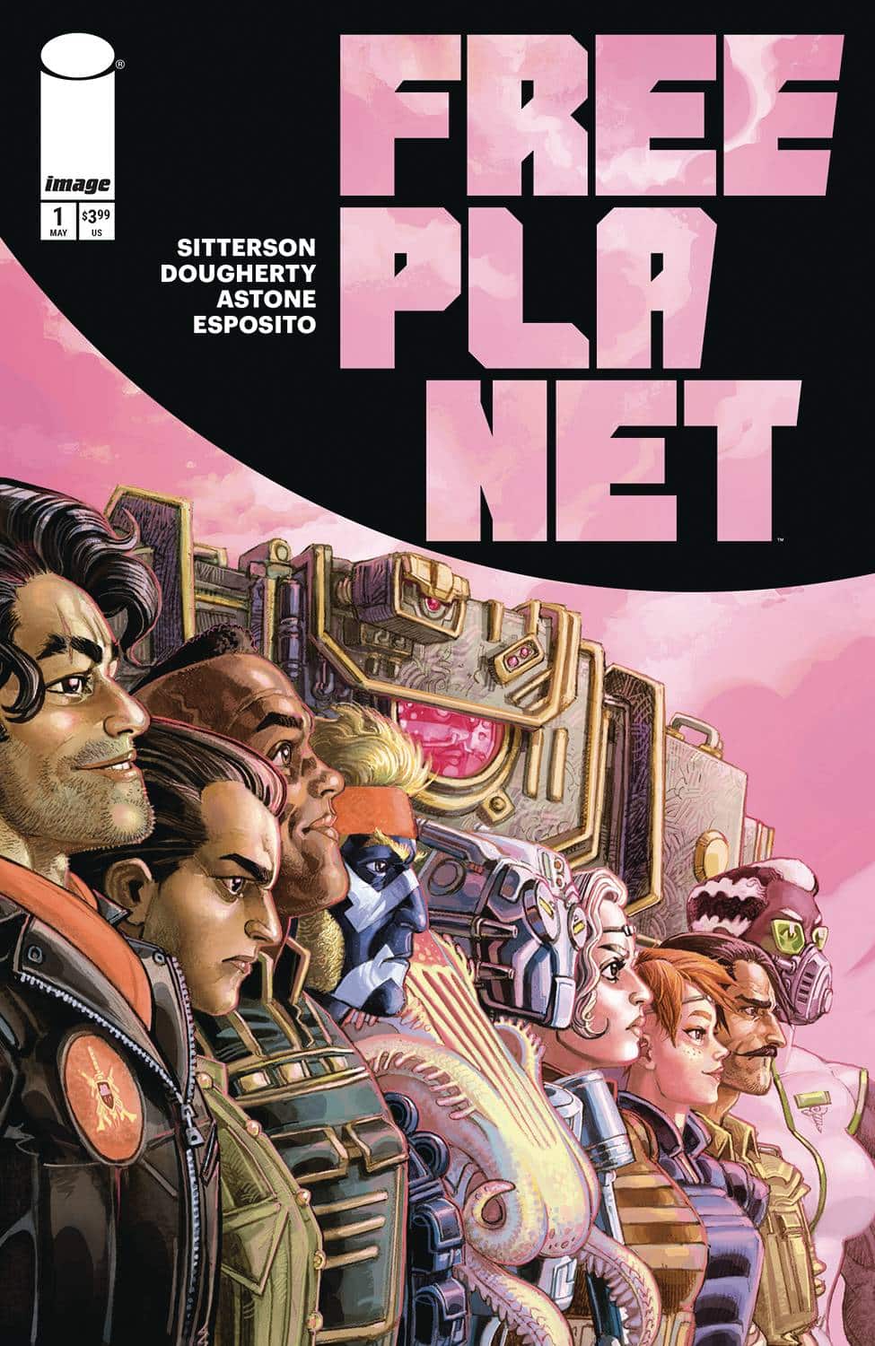
- Free Planet #1 (Image Comics): You can’t fault Free Planet for lack of ambition. The new Image sci-fi series by writer Aubrey Sitterson and artist Jed Daugherty is a sprawling tale of what comes after revolution. The scope is immense, the cast grand, and the visuals are wild and inventive. Unfortunately, the weight of that ambition is also what breaks Free Planet. The art is buried beneath an overabundance of narration boxes that read like a dry RPG sourcebook. Dancing around those captions are the jam-packed word balloons. Letterer Taylor Esposito does his best to make it all work and read coherently, but there are moments where the flow of the dialogue is broken amid the twisting layouts. I found myself lost on the page on more than one occasion. Daugherty’s craftsmanship and design work is impressive with a rough-hewn, grungy style that makes this universe feel lived-in. Vittorio Astone’s colors are bold and weird and vibrant, making the visuals stand out compared to typical, antiseptic sci-fi. Unfortunately, with so much exposition packed onto every page, the book simply feels overwhelming. There are compelling ideas in the bones of this story about democracy and ambition, I just wish the creators trusted the readers to pick up on the history through the characters and narrative as opposed to meticulously documenting the history of the galaxy. —Tim Rooney
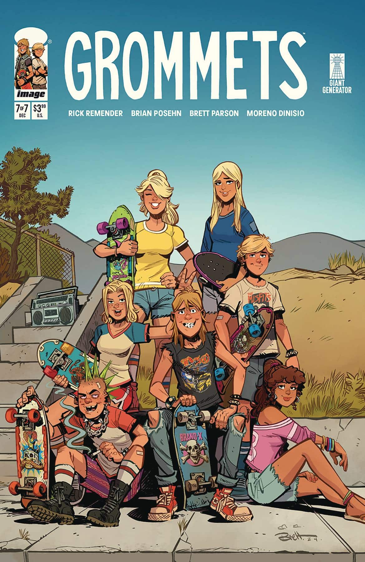
- Grommets #7 (Image Comics / Giant Generator): This week’s miniseries finale, Grommets #7, was a long time coming, with the last issue having dropped six months ago in November. That said, I didn’t have much trouble picking right up with the story and the characters. This is has really been a pretty straightforward teen skater comic, where the entertainment value is in the execution, specifically in the charm of both the scripting and the artwork. The comic is co-written by actor/comedian Brian Posehn and Rick Remender, with art by Brett Parsons, colors by Moreno Dinisio, and letters by Rus Wooton. It’d be really easy for a comic like this to feel too obvious or predictable, and, I suppose, in a way I did mostly know the scope of what was happening here. There was skating, parties, teen boys flirting with teen girls, and the tragedy of best friends being separated by a move. But it didn’t matter. The art was so detailed and immersive, and the characters were as entertaining as they were relatable. But, again, the word I just keep coming back to here is charm. That’s what drives this gnarly skate comic, and that’s what I’ll miss now that the miniseries is over. —Zack Quaintance
FOC Watch
This book is available for pre-order now.
The Oddly Pedestrian Life of Christopher Chaos: Children of the Night #1
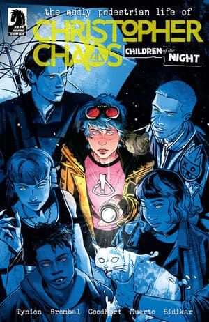
Writers: James Tynion IV & Tate Brombal
Artist: Isaac Goodhart
Colorist: Miquel Muerto
Letterer: Aditya Bidikar
Publisher: Dark Horse Comics
Publication Date: June 18, 2025
Review by Zack Quaintance
The Oddly Pedestrian Life of Christopher Chaos returns this month with a new #1 and a new subtitle, Children of Night, as well as, thankfully, the same creative team from the first book. It’s also picking up largely where the first series left off, albeit with a new school year and a determination to explore monster archetypes up against the characters and the world that have been created here. If you liked the first set of 15 issues (which wrapped up in January), you’re definitely going to want to pick this new series up. It’s a direct continuation, with all the things you loved about the book coming back.
I’ve written this before in discussing the first series, but this book has some of the best character designs in teen comics. Christopher is just so perfectly designed and rendered by Goodheart’s clean, almost-classic linework, and the bold energetic coloring of Muerto. That’s all back here, as is the static-y video storytelling motif. The book continues to look just as good as it always has, which is very good.
Story-wise, the status quo has evolved in this book to become less of an odd alienated teen concept, and more of a found family story, with Christopher and his friends forming a group they call the Monster Club. This new #1 does a great job serving as a jumping on point in that regard, simultaneously reminding old readers of the status quo while introducing it to new readers. The book has only been gone five months, but as someone who reads (and reviews) a lot of books, I found the reminders tremendously helpful, which tells me new readers should be just fine.
Ultimately, the book also pushes into new territory too, introducing this world’s take on Dr. Jekyll and Mr. Hyde, which I found intriguing. And if that isn’t enough newness, this series has enlisted writer/artist Bradley Clayton to team with letterer Bidikar on flipped book, Monsters In Love back-up stories. The book description suggests there’s an EC vibe to these, but like everything else in this book, it’s with a Christopher Chaos styling that makes it feel very much of this exact moment.
The Prog Report
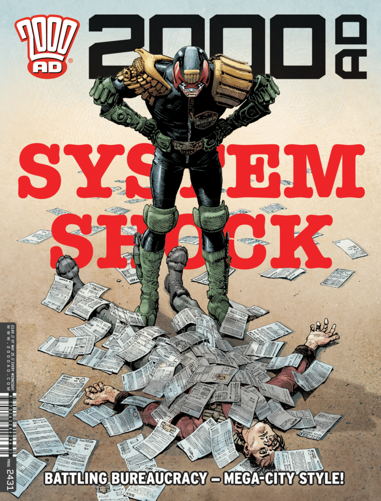
 2000AD 2431 (Rebellion): The highlight within this week’s Prog was easy to spot for me — it was the one-off, nominal Judge Dredd story, Judge Dredd: No Place Like Home by writer Dan Abnett, artist Rob Richardson, and letterer Annie Parkhouse. In just six pages, this creative team manages to tell a poignant human story around concepts of housing scarcity and cold, poorly-designed bureaucracy. Not to get too wonky about this, but human-centered design as applied to government systems is one of the topics I write about for my day job. Essentially, what it means is that we as a society should strive to design systems to work for the needs of real people, rather than requiring our people to navigate archaic systems. In this story, a lead character has lost their home after a medical issue resulted in them erroneously declared them dead. Try as they might, they cannot get the error reversed, and as such, they cannot get their home back. Rather than some kind of despotic droid, or alien invader, or even Dredd himself — the primary villains in this story are benefits forms that force you to fill them out multiple times, receptionists at desks who are reading files that defy reality in front of them, and just generally uncaring systems that have taken hold without any thought to who they are serving and why. Anyway, needless to say — I found this story timely and thoughtful. Abnett’s scripting of course was impressive in conveying the frustrations of the lead character at a slow boil that eventually leads to (predictable) tragedy. And Richardson’s art was interesting and immersive, reminding my lightly of Charles Burns. Great stuff. This week’s cover (above) is by Cliff Robinson with colors by Dylan Teague. As always, you can pick up a digital copy of The Prog here. —Zack Quaintance
This column is compiled and edited by The Beat’s reviews editor, Zack Quaintance. Read past entries in the weekly Wednesday Comics reviews series!
Next week, we return to a familiar old world with Invincible Universe: Battle Beast #1, check-in on the hottest new shared universe in comics with a look at the reprinting of FCBD’s Energon Universe 2025 Special, and much more! Plus, as always, FOC Watch and The Prog Report…don’t miss it!


