
")
In this week’s Wednesday Comics Reviews, the team reviews the return of Assorted Crisis Events, the launches of Death Dog and Space Scouts, and more! Plus, Ensign’s Log, FOC Watch, and The Prog Report!
 Assorted Crisis Events #6
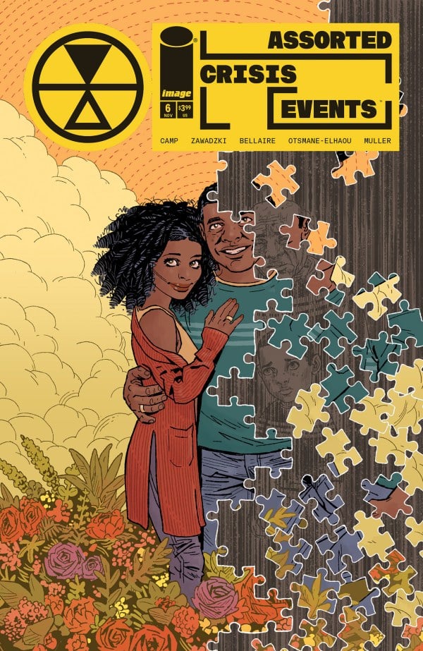
Writer: Deniz Camp
Artist: Eric Zawadzki
Colorists: Jordie Belaire
Letterer: Hassan Otsmane-Elhaou
Publisher: Image Comics
Review by Jared Bird
How does one person handle everything going awry at once, all the time? What’s it like to lose your grip on time itself? How do you find the human spirit amidst endless existential terror? If you haven’t been reading Assorted Crisis Events, now is the perfect time to start, as Deniz Camp and Eric Zawadzki’s critically acclaimed philosophical sci-fi anthology comic returns for its second run of issues. Focused on mind-melting explorations of different ‘Crisis Events’, which see our various protagonists faced by challenges to space and time itself, this is possibly the best series on the shelves right now, and I am overjoyed to see it continue.
Sasha and John have been married for years. On some days, decades. On others, they’ve not even met yet. John suffers from Retro-Anterograde Temporal Diminishment, you see, which is another way of saying he’s become ‘unstuck’ in time. He will age backwards or forwards in the fraction of a second, his entire mind and body changing with him. Sasha has taken on the role of his loyal caretaker, but it’s beginning to take a toll on her. Taking cues from both The Curious Case of Benjamin Button and Slaughterhouse Five, this is a story about love, and what it means to take care of someone who is incurably ill. That’s going to strike a chord with many people out there, and I don’t think you see this very real experience presented all that often in popular culture, so I applaud the creative team of this book for doing so.
Sasha and John’s relationship feels sincere and deeply genuine, allowing you to truly buy into why she goes so far to look after him. Across its thirty or so pages, Sasha especially becomes such a flawed, multi-faceted character, and you can understand her internal conflict over whether or not to continue looking after John as his disease gets worse. They really make the most of every single panel of every page here; it’s maximalist comic storytelling, but never feels overstuffed or anything less than a masterful usage of space and dynamics. The energy is intense and propulsive, and it’s hard to put the book down even when it becomes emotionally agonising to read.
Camp’s script and writing is fantastic. He has a keen eye for narration, using it perfectly to flesh out characters by expertly utilising a biased third person perspective. He makes every single word count, and it’s been no wonder he’s had a meteoric rise to comic book superstardom, because he’s operating in such a bold and clever way at a super consistent level. The dialogue feels human and organic, and the concept feels like it’s explored in just enough depth to leave you satisfied but not without wanting more. Every single issue of the series so far has emotionally hit me, and this one was no exception, especially its sentimental and moving ending that really reframes the narrative and the direction you expect from it.
The artwork by Zawadzki is nothing less than stellar. His page layouts are out of this world, expertly weaving the narrative through every method of visual storytelling at his disposal. This book isn’t afraid to play with paneling or structure, and you’ll need to dedicate your full attention to it to really get all of the details and nuances Zawadzki and colorist Jordie Bellaire put into the visuals. Don’t let the slightly exaggerated art style fool you, this book delves into some dark and uncomfortable spaces, and Zawadzki perfectly blends the tonal shifts, complimenting Camp’s writing at every turn. Part of the reason for hiatus was to ensure Zawadzki remained the book’s sole artist and it’s for the best, as he’s a core aspect to why it works so well.
Overall, Assorted Crisis Events #6 kicks off the comics’ second batch of issues on top form, with another stellar and emotionally devastating exploration of existential terrors and the emotional complexities of time. By honing in on one central emotional thread, it creates one of the most vibrant issues yet, and a great starting point for those who have yet to check out the larger series. It remains a truly remarkable example of what comics can be like at their best, and I cannot recommend it enough.
 Death Dog #1

Writer: Bryce Ingman, with James Finn Garner
Art: Alan Robinson, with Joe Orsak and AR Sullivan
Colors: Paul Little
Letters: Rob Steen
Publisher: AHOY Comics
Review by Clyde Hall
Simply by their nature, dystopian futures push our worst case scenario buttons regarding society and the state of the world. The Hunger Games deathmatched teens representing different poverty-ridden districts for the pleasure of the Capitol authorities and citizens. Soylent Green gave a nightmarish world of disappearing natural resources and staples made from the only resource still in abundance thanks to overpopulation. The original Planet of the Apes film franchise explored a future Earth ruled by evolved apes following devastating atomic wars that left humanity in a mute, animalistic state.
But of all the dystopias of late, the one in Death Dog may be the most frightening to me. John Wick would have a hard time there. And it even mirrors some of the setup for that old Apes series. There, ape evolution accelerated after a space-borne disease wiped out all cats and dogs. People began keeping apes as pets, until they discovered other uses for them. Basically, as eventual slaves when the apes began showing rapid progress toward sentience. That’s not a million light years away from the concept writer Bryce Ingman presents in this first issue.
Dogs of the future aren’t ‘man’s best friend’ anymore. They’re instead mechanoid canines programmed as the ‘best loss prevention investment’ of corporate overlords. Programmed with pure, single-minded canine aggression and none of an organic dog’s redeeming qualities, these Death Dogs keep poor dregs living beneath the wealthy 1% in line.
Until, that is, the neural programming of one Death Dog reintroduces the better angels of canine behavior into its matrix. Fierce loyalty. Social instincts. Affection. Communication. It attaches itself to a shoplifting suspect it initially chased down, 13-year-old protagonist Wyatt, and from there, we begin to see a boy-and-his-Death Dog story unfurl.
It’s a tightly written, winning introduction for the main characters and the Last Capitalist Standing world they live in. Now the question regarding the remaining entry of this storyline is simply: Will it have a Judge Dredd meets Lassie kind of ending or be a mechanized Marley & Me hybrid. Personally, I’m rooting for something less Old Yeller, but it is dystopian.
Alan Robinson handling the art with colors by Paul Little, the issue avoids the often dreary, warzone, or urbanization run amok appearance of many dystopias. That would be bad for business, and nothing can get in the way of business if it knows what’s good for it. Which makes the forced, cheery consumerism façade all the more unsettling.
As with most AHOY titles, we also get two short prose fiction pieces after the main story. One is “Open to Interpretation, or Bullet Points” by James Finn Garner and with an illustration by Joe Orsak. It’s an amusing examination of exactly what a hero’s classic calling card left beside captured bad guys might mean. After hearing a crowd of onlookers weigh in, crimefighters like the Sandman and Rorschach may have the rethink the trope.
The second story is “Infinite Snacks”, written by Bryce Ingman and with an illustration piece by AR Sullivan. It’s a twisty little ‘working the system’ yarn with Doctor Faustus overtones.
The Death Dog main story isn’t bad. It feels page-lite, but sufficient introductions are made. Any drawbacks could come in the follow-up and how the story gets resolved. Because, as a reader who actively avoids stories using animal demise to garner emotion, I’ll be disappointed if dystopian Big Retail wins out over the humor and charm of a very good robotic dog. And it’s hard to tell which direction the story will go from this opening.
Both the text tales are entertaining, and they’re also an attractive throwback to days when comics often had short stories filling spare pages or half-pages. These bonus bits are also an AHOY hallmark, and I respect that. But some readers may wish more of the main story and less unrelated add-ons. Add-ons, in fact, which are only loosely connected genre-wise to the main story, as I see it. Also, given the cover prices and page counts these days, should there really be ‘spare’ pages to fill? For me, with this particular issue, I’d have swapped one short story for a few more pages getting to know Wyatt, his Death Dog, or portions of their world better.
As premiere issues go, Death Dog #1 works just fine, and its entertainment value ranks high. What comes next isn’t as certain. But the fact that the creative team makes me care as much as I do how the story continues speaks well for their efforts.
G.I. Joe #13
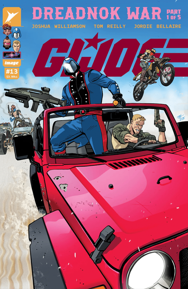
Writer: Joshua Williamson
Artist: Tom Reilly
Colorist Jordie Bellaire
Letterer: Rus Wooton
Publisher: Image Comics – Skybound Entertainment
Review by Jordan Jennings
Cobra Commander has manipulated, coerced, and stolen his way to the top of a terrorist empire, but as his greed gets the best of him, he finds himself depending on the GI Joe, Duke, to save him from the Dreadnoks. GI Joe #13 kicks off the the latest arc of Joshua Williamson and Tom Reily’s GI Joe run and already the arc is promising to be the most action packed and high octane one of the young series.
Williamson delivers an incredibly action packed issue full of intrigue and emotions as we come to expect from the series. The central premise of the arc is shaping up to be a cursed road trip for Duke and Cobra Commander, who are handcuffed together, trying to escape the Dreadnoks, who can only be described as extras from the Mad Max films. As for the issue itself, Williamson sets up the scenario and provides new and lapsed readers the context necessary to understand the subterfuge taking place at Cobra. I have always found the internal dynamics of Cobra to be far more compelling than that of the Joes. Williamson plays that up to nines with Destro manipulating the competing factions within the organization against each other. It is not like the Joes are done a disservice though. We get reminded of Duke’s motivation in the Energon Universe–being anti-Transformers as well as anti-Cobra. We get brief flashbacks to the triggering events that kick start this series done in a way that doesn’t detract from the narrative but enhances it.
Tom Reilly and Jordie Bellaire do a stellar job on this issue. Reily’s art style is minimalistic but emotionally evocative. The weight on Duke’s shoulders during the flashback sequence is a great example of the body language Reily commands. The body language complements the tight pacing Reily employs in the varied layout and page structure. One of my favorite techniques Reily employs is the traditional 9-panel formalist grid (think Watchmen or most Tom King comics). Reily is judicious in his use of the formalist grid, opting to save it for specific action sequences that require a lot of flashbacks or quick cuts. This is where Bellaire really shines. The issue is beautifully colored but during these formalist scenes, Bellaire changes the color palette to a much cooler tone and creates a nice visual distinction between the past and present. It is a simple visual device but a very effective one when employed well.
GI Joe #13 is a fantastic start to a new arc that is welcoming to new and current readers alike. There is something to love in this issue for everyone and serves as an excellent jumping on point for anyone curious about the Energon Universe that is just starting to heat up 2 years in.
 Space Scouts #1

Writer: Matt Kindt
Artist/Letterer: David Rubin
Publisher: Dark Horse Comics
Review by Tim Rooney
Space Scouts is the latest release in the Dark Horse/Matt Kindt collaboration Flux House. This first issue sees a young woman with enhanced abilities from a backwater planet named Ember swept up in a cutthroat contest to join a galactic team of heroes called, you guessed it, the Space Scouts. It is a good comic. Kindt’s script is a funny, compelling twist on classic narrative archetypes, knowingly winking at the hero’s journey, while also managing to be an effective satire of reality television and social media. It’s a sharp story that would be entertaining on its own merits, a more scifi twist on the Hunger Games. With a good artist it would be a perfectly fine book.
But the book is drawn, colored, and lettered by David Rubin and the sheer imagination and inventiveness in every panel is simply unreal. It is a kaleidoscope of psychedelic colors and creative character and background design. In just a handful of pages, Rubin defines Ember’s homeworld, dull and gray except for the harsh rays of the setting sun. She is then rocketed into a world of neon color at the center of the galaxy. The culture shock is immediate and clear in a single page turn. Kindt and Rubin smartly play into readers’ familiarity with these kinds of stories and don’t waste time showing us Ember’s dull and dreary life before the contest.
Rubin’s work is meticulous and highly detailed but knows when to eschew that detail in the background to focus on the characters, relying instead on the color and hints of shape to express the story beat or emotion. With Rubin at the helm on every visual element including letters and colors, he is able to construct the page completely, building dialogue, caption, and SFX into the makeup of the page. It’s hard not to get lost in admiration at the sheer skill and creativity.
None of this is meant to undersell Kindt’s contribution to the dialogue and story, but it is the visual spectacle that makes Space Scouts stand out beyond its core concept, which is itself an engaging, metatextual satire that is no doubt holding back its biggest surprises. After all, this is only the first issue and we’ve already seen Ember go from obscurity to a finalist in a broadcast across the stars. And we are just getting started! Comics don’t get much better than this.
Ensign’s Log Stardate 11052025
As IDW’s Star Trek comics continue to expand, Ensign Avery Kaplan has enlisted here to keep a careful log!
Star Trek: Red Shirts #4

Writer: Christopher Cantwell
Artist: Megan Levens
Colorist: Charlie Kirchoff
Letterer: Jodie Troutman
Even by the standards of this miniseries, the penultimate issue is a brutal and gruesome affair (complimentary). In past reviews, I have mentioned how useful the dramatis personae has been. Now, it has become a savage reminder of this series’ exceptionally high body count.
This is no big surprise, but by the time you’ve reached the end of Red Shirts #4, there’s very few of the titular characters left alive heading into the miniseries’ fifth and final issue. Overall, I think Starfleet is best when approached as an idealized, optimistic vision. Does that reflect anything in our day-to-day experience here and now in 2025? You know it doesn’t! But, I do think there’s value in modeling a utopian society, for the purposes of hope.
However, I’m more willing to let the somewhat pessimistic view of the organization pass here, considering how fascinating and unique the story writer Christopher Cantwell has built around that half-empty glass. While I’m still not as attached to these expendable characters as I might have been, I am very invested in finding out how the conclusion plays out.
As the narrative relocates to orbiting Klingon, Romulan and Akronian ships, the art by Megan Levens continues to be excellent. I especially enjoyed the first page of the issue, which recalls the various methods of death to which our Red Shirts have been subjected before…and opening with the transporter accident from the previous issue was an excellent choice. The colors by Charlie Kirchoff are especially well done in this issue; keeping the Klingon ship in red and the Romulan ship in green makes it a breeze to differentiate between locations from panel to panel. And Jodie Troutman’s lettering, which offers different alien languages in different fonts, remains unimpeachable. Finally, Neil Uyetake’s design & production on these issues maintains the high level of quality to which we have become accustomed.
I also want to give a shout-out to Group Editor Heather Antos. The IDW Star Trek comics have only become more excellent under her guidance, and this series — which pushes the boundaries of what the Franchise can do rather than delivering more of the same characters on the same old missions — is a great example of why that’s the case. I’m very excited for the final issue of Red Shirts, and I expect that there’s some kind of twist in store… But what?
FOC Watch
This comic is currently available for pre-order.
 Our Soot Stained Heart #1

Writers: Joni Hägg, Stipan Morian
Artist: Stipan Morian
Colorist: Ropemann
Letterer: Hassan Otsmane-Elhaou
Publisher: Mad Cave Studio
Due Out: Dec. 10, 2025
Review by Zack Quaintance
I’m often reluctant to say that a specific comics creator’s work is unequivocally must read, especially when it comes to creators who make comics as part of collaborative teams. That said, Stipan Morian is doing absolutely incredible things right now with his art, and I think anything he puts out is a book that you should at least give a chance. I would certainly recommend picking up Our Soot Stained Heart #1 when it lands in shops this December (it’s currently up for pre-order).
Morian’s new project is a sort of Fairy Tale with touches and themes taken from the Gilded Age, and it’s gorgeous. Co-written by Morian and Joni Hägg, the book will hook you with its lush, almost Dickensian aesthetic, before it next spends much of its extra-long first issue familiarizing you with its world, the stringent code that runs it (one must make quota), its lead character, and the impact even a single person with integrity and the will to rebel can have on a status quo.
A lot has been written about Morian’s work, typically in the context of praising his Deniz Camp collaboration, 20th Century Men, so apologies if any of this seems repetitive. But Morian is an artist who knows exactly when to exaggerate his people, places, and things, as well as when to stylize the point of view. It feels like all his pages have been carefully considered, labored over in a good, productive way to ensure that there’s not a single boring stretch in the comic.
And, of course, as a co-writer of this script, in Our Soot Stained Heart #1, he delivers visual set piece after visual set piece, ranging from battles on top of a train, to slogs through the snow, to the chilling speechifying of the book’s lead villain. It sounds cliched, but there’s not really a dull moment in this comic.
And while the moralistic quota for doing bad things in the world might feel like it’s laid out one too many times, I think establishing this comic as a bit of an allegory or fairy tale dispels the repetition as something that might take one out of the story. Everything is heavy, everything is over-the-top, everything is exaggerated so that the world and the comic feel larger than life.
In brief, I unabashedly loved this comic, and I’m not hesitant even a bit to call this one a must read.
The Prog Report
 2000AD 2457 (Rebellion Publishing): I have written quite a bit of late about the two marquee stories in the Prog right now — Dredd and Rogue Trooper — and I’m sure I will again as those story arcs get nearer to their conclusions. So, this week I’d like to touch on a pair of other strips that are currently running right now, those being Void Runners Book 2 and Red Dragon. I haven’t been crazy about Void Runners. I’d maybe chalk this up to it being a bit too stony for my tastes. It definitely knows what it is and is comfortable with that, but I find the material about the nature of god, chosen peoples, and drugs to feel at times like a meandering conversation with someone who has indulged a bit too much in edibles at a party. I am sure there are readers enjoying that vibe quite a bit, though, and so obviously your own mileage may vary. It’s just not my favorite. That strip is by writer David Hine, artist Boo Cook, and letterer Annie Parkhouse.
Red Dragon, meanwhile, has quickly become the strip I look forward to most in The Prog of late. I find the way it is paced and structured to be a complex and carefully calibrated balancing act that fuels the book’s central mystery — what happened to Red Dragon — rather than distract from it. I sometimes object to comics that take a less linear approach to time, finding them to be unnecessarily jumbled in a way that hides a weak narrative, but this story is actually about a journalist and documentary film crew unraveling the mystery themselves. It’s not a neat 1:1, but to some extent, we are learning what happened as they are. On top of that, I’ve been impressed with how in the space of six weekly pages, the creators manage to incorporate what feels like an equal look at both the story’s timelines every week. It’s all just working for me, and I’m hanging on each weekly revelation. This one is from writer Rob Williams, artists Steve Yeowell and Patrick Goddard, colorist Dylan Teague, and letterer Simon Bowland. This week’s cover (above) is by John McCrea with colors by Jack Davies. As always, you can pick up a digital copy of The Prog here. —Zack Quaintance

Column edited by The Beat’s reviews editor, Zack Quaintance.
Read past entries in the weekly Wednesday Comics reviews series or check-out our other reviews here!


