
In this week’s Wednesday Comics Reviews, the team reviews the surprisingly complex White House Robot Romance, the newly collected Image Comics one shot Closer, the new western zombie story Everything Dead & Dying, and much more! Plus, Ensign’s Log and The Prog Report!
 White House Robot Romance #1
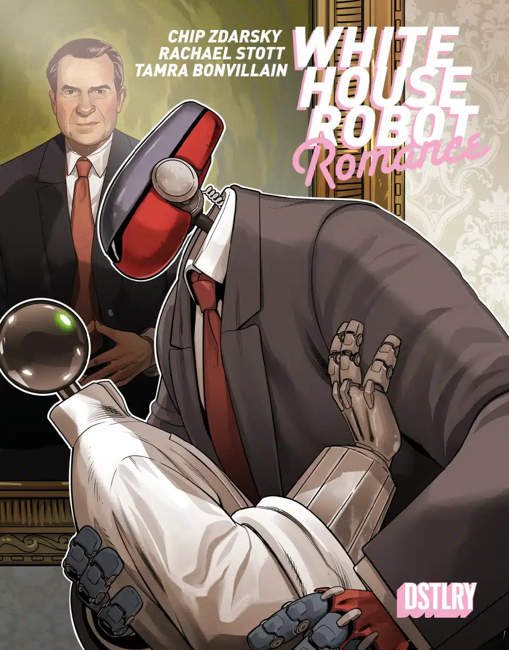
Writer: Chip Zdarsky
Artist: Rachael Stott
Colorist: Tamra Bonvillain
Letterer: Ariana Maher
Publisher: DSTLRY Media
Review by Zack Quaintance
With a name like White House Robot Romance, this book in some ways tells you exactly what to expect: a White House robot romance. Obviously. But what it doesn’t tell you is that there are also a lot of complex plot points and themes waiting for you beneath its very funny veneer (and it is funny, just look at the Nixon-who-likes-to-watch on the fantastic cover above).
So yeah, much to my surprise, White House Robot Romance #1 is actually a really thoughtful treatise on AI, global relations, and where the lines between human and non-human both start and stop. Aside from the dual leads (our titular White House robots in love), there’s an interesting cast of characters, including dissidents, artists, and one very grumpy West Wing waiter who’s just doing his job, at least partially on account of his ex-wife. And the creative team does a fantastic job sewing it all together into a really tense, coherent first issue.
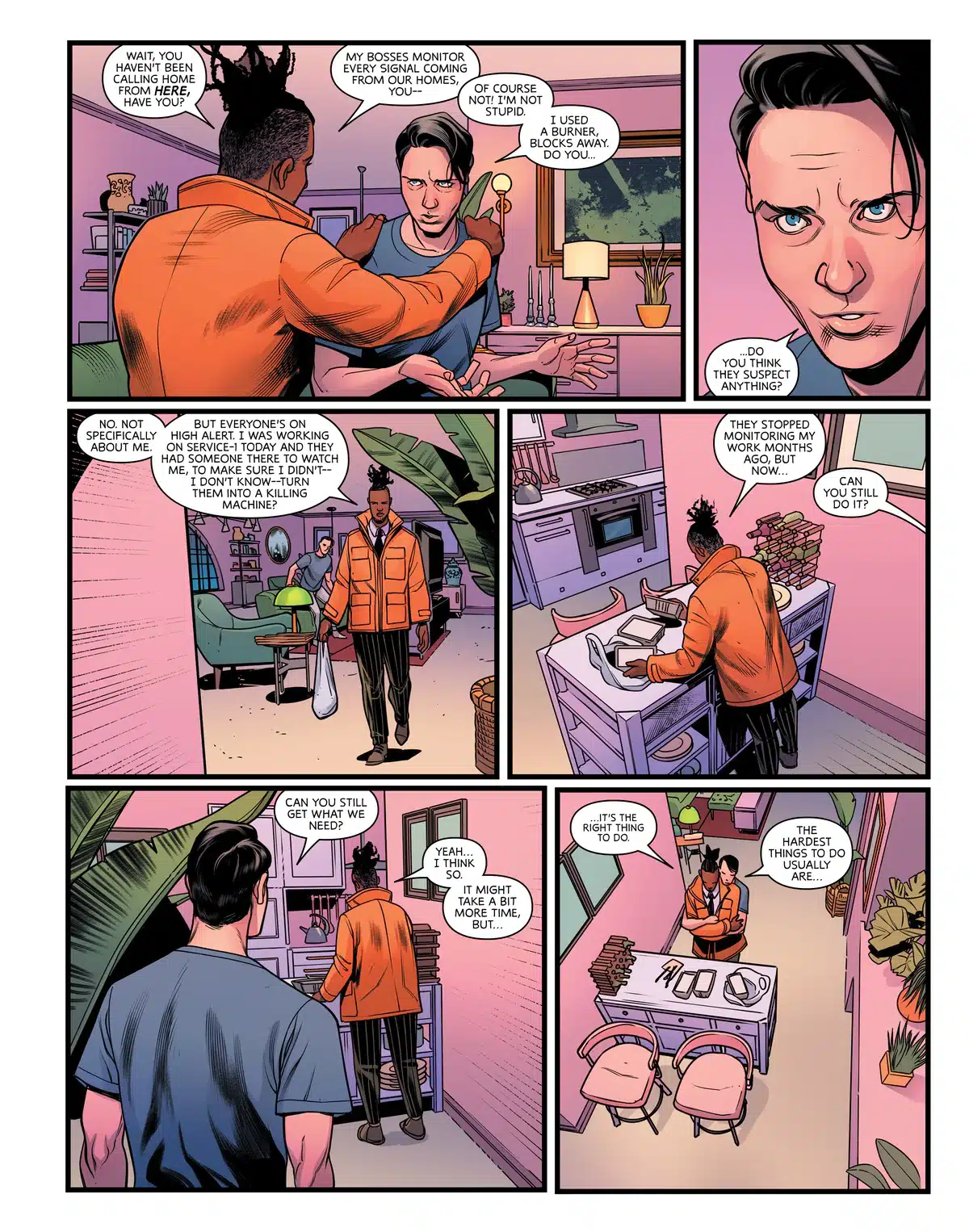
There’s some great pacing at work in this comic, a build from what at first feels like a quaint mismatched romance into a global political thriller that is putting the lives of its entire cast at risk. There’s action, there’s laughs, and there’s a wonderful last page reveal that promises much more of all of it to come.
Writer Chip Zdarsky’s script is air tight. It knows when to drill down on individual scenes between its leads. It knows when to introduce a character who will play a big role later without it feeling clunky or forced. And it really knows when to ratchet up the danger (and, indeed, operating anywhere in the orbit of the folks at the top of the current American power structure is portrayed here as itself being inherently dangerous).
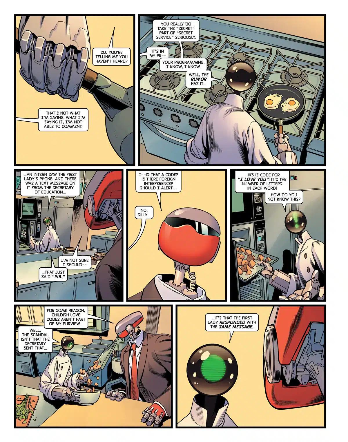
And the team of artist Rachael Stott and colorist Tamra Bonvillain are absolutely perfect for this comic. The aforementioned cover with the Nixon gag is just perfect, but so is all the interior storytelling, from robots fighting each other and busting through walls, to robots tasting food, to a struggling artist taking our her frustrations on a sculpture. This is an immersive and great-looking comic, and its elevated even further by the pristine lettering work of Ariana Maher.
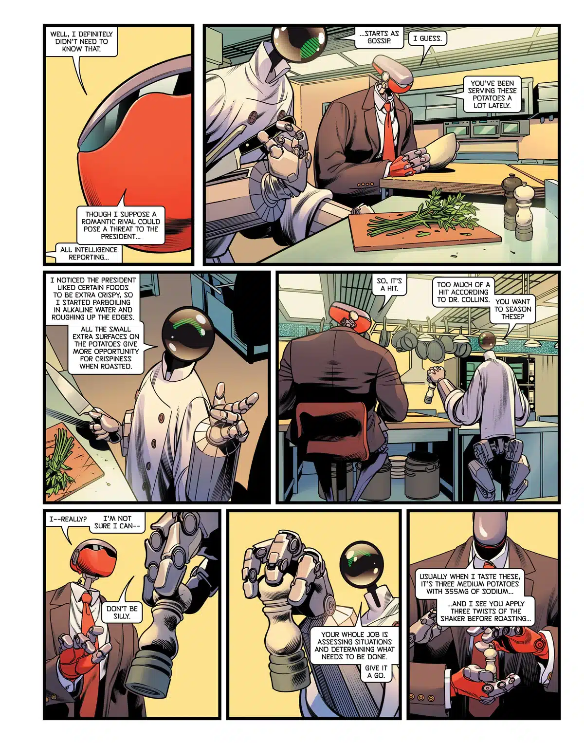
But more than all of that, I think the most laudatory thing I can say about this comic is that for as much as I enjoyed it throughout, the reveals in the final three pages made me absolutely certain that I’d be reading this story through to its end. And I highly recommend you pick up this fantastic first issue to see if you feel the same way.
 Closer #1
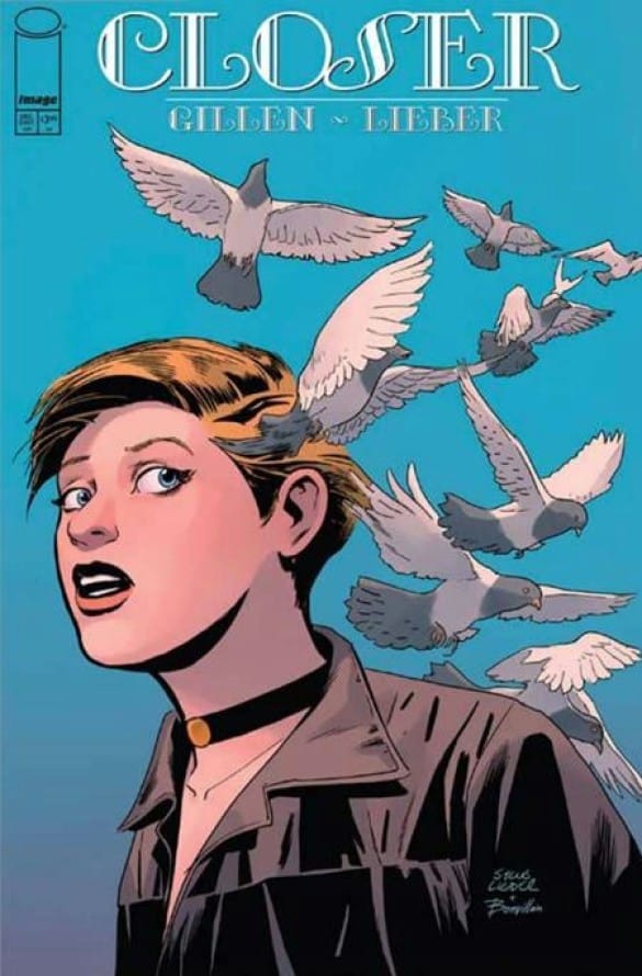
Writer: Kieron Gillen
Artist: Steve Lieber
Colorist: Tamra Bonvillain
Letterer: Clayton Cowles
Art Assistant: Tom Rogers
Publisher: Image Comics
Review by Khalid Johnson
Oh how I love a standalone story.
It’s not constrained by continuity, but instead self-contained, a true one and done. The very idea of a standalone sits with closure: it’s open and shut, which is a lot easier to embrace than an ongoing relationship.
Closer frames the apocalypse through these reality-shifting moments while then sharing flashbacks to contextualize where we are and how we got here. The song Closer sets the pace, and what the flashback reveals as a tender moment then frames obsession in the present as metaphor becomes real and horrifying.
The art of Steve Lieber with colors by Tamra Bonvillian stun throughout as they visualize Kieron Gillen’s apocalyptic interpretation of the song by The Carpenters, taking a romance and exploring the idea of closure with an insistent man. Maybe I’m reading too deeply but the choice of title with the song feels like a neat play on words in that regard. Where the idea of closure is being close to one, and getting their desired outcome (control), closure to another is just that it ended. Clinging to some idealized version of a person is bound to fail, bound to create distance.
Not being willing to engage with the reality of a person or reality in general will bring things to a close and I think there’s so much to get from this cosmic horror. It’s throwing a lot at you visually and it’s gorgeous, with letters by Clayton Cowles tying it all together.
Gillen writes at the end of Closer about the experience as a writer and his passion for stories like these when the industry traditionally has not been too enthused about supporting these kinds of stories (profit incentives and capitalism at the end of the world.) He explains his gratitude to have had the opportunity to work on it with peers that he has admired and previously collaborated with. I adore stand-alone stories and for the sake of seeing more and hopefully being something the industry takes interest in, I think you should check this one out.
On its own merits, this book is simply a beautifully-crafted and thoughtful exploration of an apocalyptic romance.
 Everything Dead and Dying #1

Writer: Tate Brombal
Artist: Jacob Phillips
Colorist: Pip Martin
Letterer: Aditya Bidikar
Publisher: Image Comics – Tiny Onion
Review by Zack Quaintance
I’m not sure how much I can really say about this one without spoiling some of the central qualities that make it a compelling read, but I will try my best to articulate what makes Everything Dead & Dying a very worthy comic to pick-up. I think first and foremost, it’s important to know that this is a very moody comic. Everything Dead and Dying is without question a horror story, one that as the above cover implies features illness and the undead, but moreover, writer Tate Brombal has scripted a story that deals in universally-relatable terrors, in things like imagining your loved ones suffering and also in occupying a prison of denial.
It’s from these familiar fears that the genre touches in Everything Dead and Dying grow. The other central quality that seems likely to reel in most readers is, of course, the artwork of Jacob Phillips, who is quietly establishing himself as the go-to creator for far-flung stories of rural America. Phillips has honed his visualizations of this setting (which is, presumably, a bit unfamiliar to him, as he’s British) for years now, dating back to his star turn on That Texas Blood. And it shows in this book. Everything from the scenes out in the field to the farmhouse interiors are really spot-on. And colorist Pip Martin enhances it all the further, doing the tricky work of oscillating between Americana and gritty, bloody horror viscera. And, of course, Aditya Bidikar remains arguably the best letterer working today.
So, all the individual contributions in this book are absolutely ace. And — again, I don’t want to spoil it — Everything Dead and Dying #1 also has somewhat of a twist ending that makes it feel like a different sort of zombie story, or at least one that wants to use a fresh jumping off point to explore the genre. I’m not entirely sure the western setting has earned its way in just yet — honestly, it feels like this one could be set in any pastoral smalltown, but hey, westerns are fun.
Overall, Everything Dead and Dying #1 gets a very strong recommendation from me, ranking as it does in the upper tier of new #1 debut issues I’ve read this year. Don’t miss it.
 Black Diamond #1
Writer: Brendan Columbus
Art: Danilo Beyruth
Colors: Lee Loughridge
Letters: Saida Temofonte
Publisher: Panick Entertainment
Review by Clyde Hall
Owen Welch won’t win any Father of the Year awards. But then, he’s spinning lots of plates. Separated from his wife Victoria, navigating shared custody of his son, Chip, on a ski trip to Norway, eager to pawn the kid off on a beginners ski class so Owen can tackle the experts-only Black Diamond slopes. As far as parental responsibility is concerned, Owen thinks he’s Teflon Dad, but his failings keep sticking to him regardless. It’s that series of foul-ups beginning with leaving the kid’s ski jacket back home which culminate in a seriously dangerous situation.
What if the last time you saw your child safe and loving you despite all your shortcomings was the last time you saw him, ever? What if, in slaloming your way out of responsibility for your kid, you end up being 100% responsible for putting him in a life-or-death situation? What if you are the only one who can, then, fulfill the unspeakable requirements for his safe return?
In the new limited series premiere of Black Diamond, writer Brendan Columbus drafts a skillful character portrait of Owen. One that lives up to the series’ description of part Hitchcock thriller, part Wicker Man horror. Even though Owen has issues, even though he’s a very flawed protagonist, Columbus still builds empathy for him as he’s backed into a corner. Therein sits a bed he made himself, but one his kid didn’t. And when Owen’s forced to lie in it, most of us can recall shortcomings that placed a loved one into a bad situation we never intended. Only Owen’s is much, much worse. The process is reminiscent of many Hitchcock heroes, placed into peril or threat of punishment despite being innocent of crimes, but guilty of behaving unwisely. Humanly. And it places Chip’s fate in the hands of a group dedicated to the Nordic old ways, the Forn Sidr practices of nature, of ritual. And of blood.
The first issue isn’t one that begs for a recap. I found the best parts of it came from the panel-to-panel buildups, payoffs, and twists. By the end you’ll be sharing Owen’s tension as he watches his lies turn into ever more complicated falsehoods and as his world begins crumbling under their weight and his guilt. You know this kind of narrative, especially done so well, will result in a major pile-up of fractured lives and fatal consequences.
Danilo Bayruth’s art captures the vast, snowy setting but keeps its majesty tightly contained with focus on the characters in the foreground. It’s a fitting approach, given Owen’s priorities on the great outdoors and its potential skiing challenges rather than on his largely inconvenient son. Like the panels Bayruth creates, though, Owen’s attention is forced away from the slopes and onto Chip as the tale unfolds.
The styling is appropriately stark, and colorist Lee Loughridge capitalizes on it with matching monochromatic contrasts. Overall this works beautifully. There is one instance, however, regarding an item of clothing which might have been better served with more specific coloration. It’s an important plot point, and I nearly overlooked it despite dialogue highlighting it fairly early on.
The letter art of Saida Temofonte on this issue deserves special recognition. She keeps everything onomatopoeia minimalistic at first. A shop bell. A smartphone ding. Yet, when the characters get to the slopes, I ‘heard’ every captured snowy sound she created. The ‘krrts’, ‘shaks’, and ‘thuffs’ of skis and fallen items? Yes, I heard those sounds thanks to Temofonte. Her work brought deserving attention to the frigid mountain setting Owen’s confronted with as his desperations mount. The sound effects offset that mentioned focus away from the terrain yet still keeps the reader beside the characters slogging their way through it.
The first issue of Black Diamond succeeds in generating those suspenseful, Hitchcock vibes. The ones that make your heart beat a bit faster and your conscience cloud while looking for what’s ‘right’ and what’s ‘wrong’ given Owen’s circumstances. The creative team places you in his shoes for what increasingly feels like a dead man’s walk. This is effective storytelling, the kind that will hit its stride into and through the ‘Ber months of spooky doings with the remaining three issues. Get your October mood on now and pick this title up. It’s a great time to Panick.
The Adventures of Lumen N #1
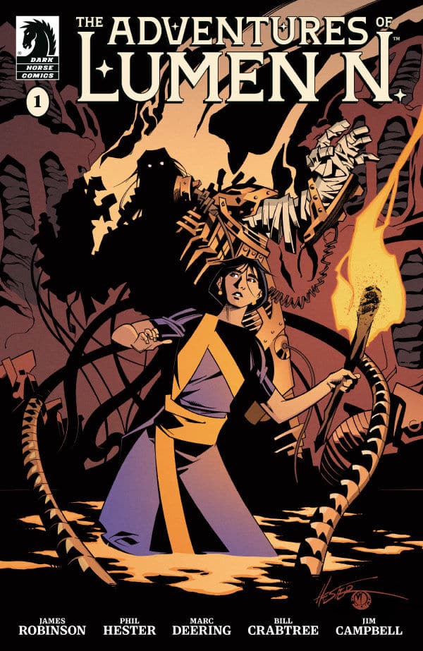
Writer: James Robinson
Penciler: Phil Hester
Inker: Marc Deering
Colorist: Bill Crabtree
Letterer: Jim Campbell
Review by Jordan Jennings
James Robinson and Phil Hester team up to bring this modern all-ages adventure featuring Lumen, the granddaughter of the famed Captain Nemo, in The Adventures of Lumen N. #1. Lumen #1 spends the first issue establishing Lumen and her world. We get to meet a grateful teen that finds herself wanting more out of life, as teens are wont to do. As with most stories of this nature, her desire to see more out of the world comes to a head as adventure is thrust upon her.
Robinson is delivering the goods with this issue. The pacing is brisk and full of intrigue. The story structure is surprisingly complex with multiple cutaways to different scenes which gives the issue even more depth and richness as we get to see more of this world while moving the plot forward. Beyond the cutaways, Robinson uses a 3rd person narrator to help set the stage and move the story along. I really appreciate that literary device so much in books like this because it allows for the action to start. I understand that 3rd-person narration in comics is considered dated and it can be overwrought. YET when it is executed well, I think it deserves its place in comics and should not be avoided all the time.
It is clear Robinson is a fan of the work of Jules Verne and it shows here on the pages. In the Afterword/annotations in the issue, Robinson states his vision of this series as an all-ages tale of legacy in this turn of the 20th-century Steampunk world. I feel he is successful in his goals here as we get to meet a well-rounded main character in Lumen and still get to see all of these amazing steam punk titans.
As much as I enjoy James Robinson’s writing, the big draw for me when it came to Lumen #1 was the magnificent Phil Hester. I am always in awe of his beautiful line-work and page composition. There are multiple pages where Hester plays around with silhouettes as panel borders and gives the page this almost story book style layout where the panels are much more freeform and fluid. These pages are just stunning to look at and to look so effortless takes a lot of work. Hester, alongside the wonderful inks of Marc Deering, uses few lines and instead favors purposeful linework that gives an almost animated look to the page not unlike a Darwyn Cooke or a J.Bone. There is a bit more body to Hester’s character work, but it gives it a distinct look I am a fan of just seeing. The colors by Bill Crabtree are visually stunning and help complement the comic perfectly. The tone and mood are well executed.
I adored The Adventures of Lumen N. #1 deeply. It was like it was made for people like me. Robinson’s love of the source material and Hester’s fantastic art style come together in the perfect marriage of style and substance that is unparalleled in comics. I highly recommend checking this one out today.
Ensign’s Log – Stardate 932025
As IDW’s Star Trek comics continue to expand, Ensign Avery Kaplan has enlisted here to keep a careful log!
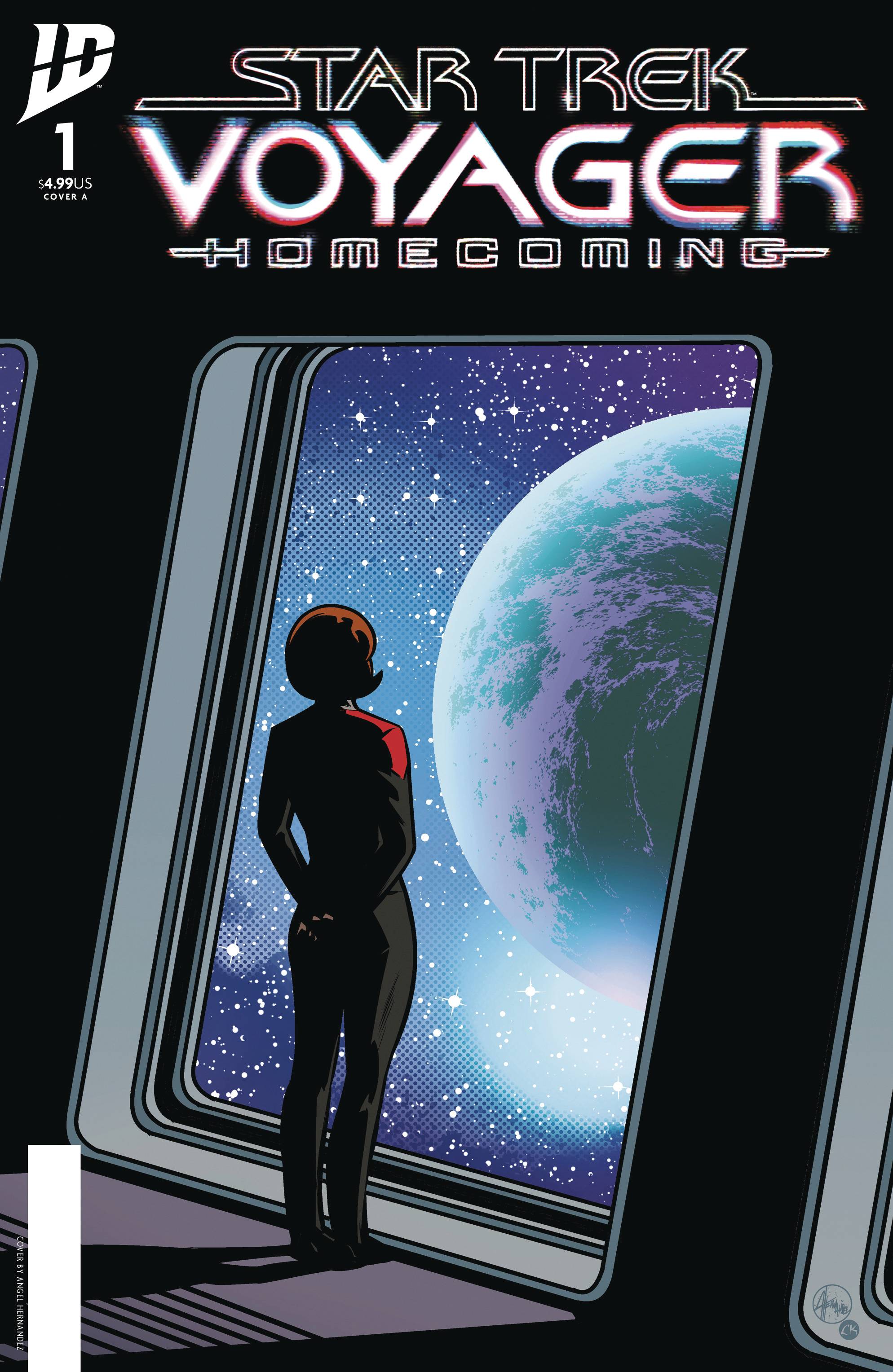
- Star Trek: Voyager — Homecoming #1: We’ve all wondered what happened the the U.S.S Voyager after it arrived back at Earth in the final minutes of May 2001’s Star Trek: Voyager series finale, “Endgame.” And while Star Trek: Nemesis, Star Trek: Lower Decks, Star Trek: Prodigy and Star Trek: Picard have given us hints, we’ve yet to have seen the details of the story of Voyager’s homecoming… until now. In Star Trek: Voyager — Homecoming #1, written by Susan Bridges & Tilly Bridges, with art by Angel Hernandez, colors by Charlie Kirchoff and letters & design by Neil Uyetake, Captain Kathryn Janeway and her intrepid crew reach Earth. Presumably, anyway; because as with every other episodic adventure undertaken by Voyager and its crew, getting home proves more complicated than it might seem. Without spoiling anything, suffice to say that this first issue promises more from all the familiar crew members (minus Neelix), along with some intriguing issues obstructing their completion of that goal. Hernandez’s art renders the familiar characters easily recognizable, Kirchoff’s colors bring the panels to life and Uyetake’s lettering is straightforward and well-done. One could easily imagine this is a lot like what the opening salvo of a hypothetical eighth season of Voyager might have looked like. Just remember what Jack Ransom said: this is Voyager — things could get freaky.
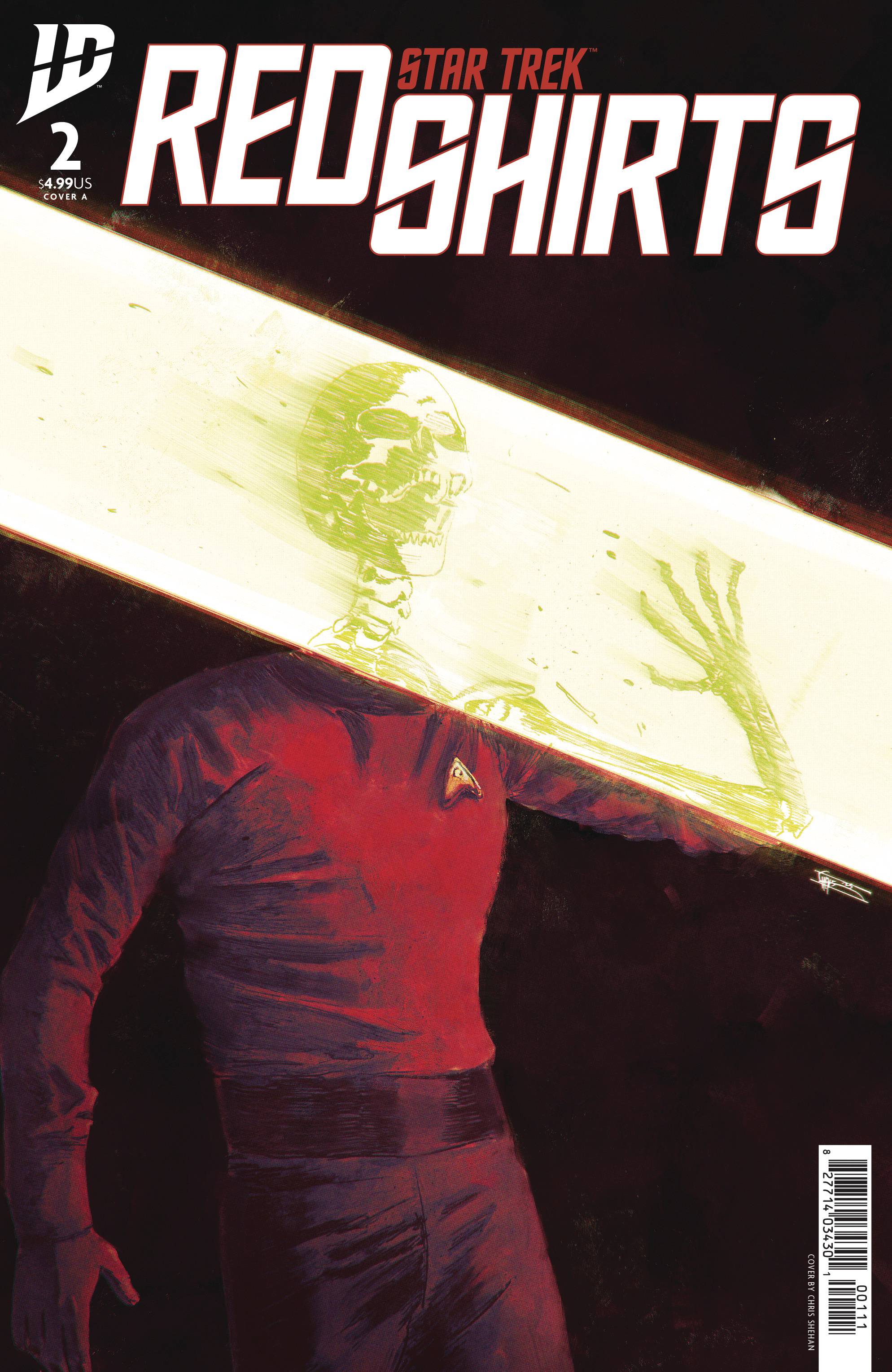
- Star Trek: Red Shirts #2: Kelvin McCoy was right: space is “disease and danger wrapped in darkness and silence.” The body count increases in Star Trek: Red Shirts #2. Like the first issue, this one was written by Christopher Cantwell with art by Megan Levens, colors by Charlie Kirchoff, letters by Jodie Troutman and design & production by Neil Uyetake. This one helpfully opens with the two-page dramatis personae from the first book, but with the dead characters X’d out. This is followed by a recap delivered by way of an officer’s handwritten diary entry — a particularly well-executed touch (the process for which was explained in the first issue). As you might expect, Red Shirts #2 doesn’t skimp on the violence. Several more characters meet grisly and graphic fates in this second issue. These gruesome deaths provide the fuel that keeps this story powering along. While some fragile character relationships are set up, it remains to be seen whether or not any of these officers will prove to be too memorable — particularly since the threat of gory dismemberment is always oppressively present. Levins’ art keeps the “graphic” in sequential graphic narrative, while Kirchoff’s colors keep the action horribly clear. Troutman’s lettering expertise is always evident and Uyetake’s design is a cut above on the series. At this point I still can’t be sure I’ll remember many of these phaser cannon fodder characters after the series is done, but I’m fairly invested in showing up to see how they all go out anyway. Also: how great are the covers of this series? In some local comic shop today, some kid is getting scarred for life the same way I was by the transporter malfunction in Star Trek: The Motion Picture. Now that’s Gene’s vision.
The Prog Report
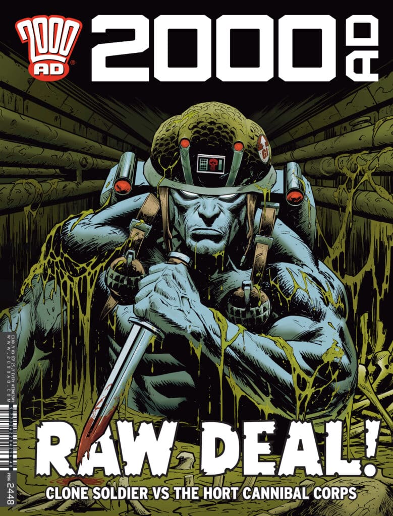
 2000AD 2448 (Rebellion Publishing): We get another standalone Dredd tale this week as the wait for the delayed ending of Judge Dredd: Tunnels continues. But it’s a good one: Judge Dredd: The Wild Man of Brian Eno by writer Ken Neimand, artist Cam Smith, colorist Emilio Lecce, and letterer Annie Parkhouse. It kind of feels like this comic started after someone threw out the name of it as a joke…which is totally fine, as it’s a very funny name. The actual story itself is a pretty cookie cutter Dredd adventure, with the notable development that here is now loose character named The Wild Man of Brian Eno, who we will hopefully see again. Other than that, this is largely a rising action Prog, ahead of many of the current stories ending, with a resent on tap in two weeks in the page of 2000AD 2450. This week’s cover (above) is by Karl Richardson. As always, you can pick up a digital copy of The Prog here. —Zack Quaintance
Column edited by The Beat’s reviews editor, Zack Quaintance.
Read past entries in the weekly Wednesday Comics reviews series or check-out our other reviews here!


