Marvel are kicking off a weekend of announcements today with news about some Original Sin tie-ins. The main Original Sin series will see The Watcher get shot up something rotten, his eyeballs getting ripped out, and everybody finding out deep and dark secrets which previously only Uatu knew about. It’s like superhuman wikileaks, basically. And amongst the tie-ins has just been announced a five-issue miniseries from Jason Aaron, Simone Bianchi, Al Ewing, and Lee Garbett: Loki and Thor: The Tenth Realm.
Those would be the creative teams for Loki: Agent of Asgard and The Mighty Thor, of course. The storyline also concerns another character, however – the noted Angela, fresh from her stint in the Guardians of the Galaxy. After a lot of wondering about why she was important to the Marvel Universe, and why it was such a big deal that she arrived, courtesy of Neil Gaiman, into Marvel Comics… it appears the answer has finally come.
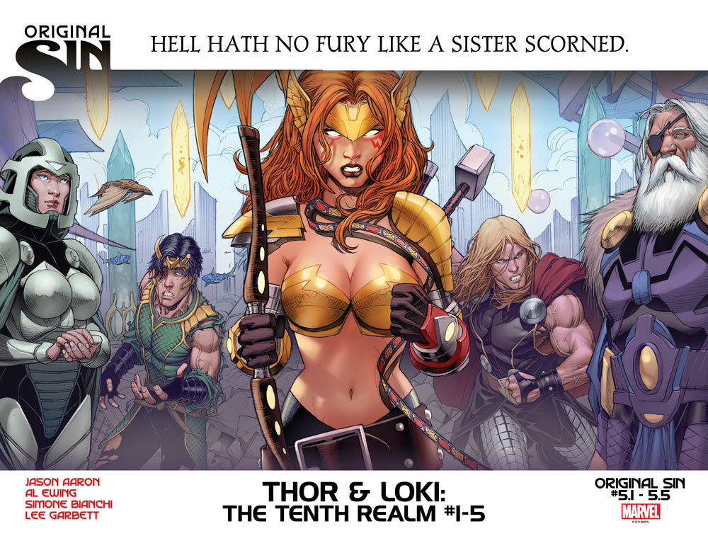
She’s Odin’s daughter. Making her the sister of both Thor and Loki. Uh-oh! In this five-issue miniseries, Angela will be heading across for a family reunion, causing problems for Thor, Loki – and also for Odin. You have to imagine that Frigga won’t be particularly thrilled, either.
Marvel note that the series will be numbered as Original Sin #5.1 across to #5.5. It’ll start this July.


Silly plot for a silly character? I’m fine with that.
I don’t know who drew this and I wouldn’t want to bash on story or artwork I haven’t seen, by a group of talented craftsmen —
But if you’re trying to communicate “fury,” or “dangerous,” or “powerful” or anything like that, why is there a big graphic X to the design of this piece focused squarely on her breasts, making them the focal point of the drawing? Does glossy photoshop shimmer-y cleavage say “fury” these days?
Shouldn’t the focus be on her expression, or on a more furious stance? If you brought Thor and Loki closer and put Odin and Green Woman farther back (or if you just swapped their positions), the lines of force in the art would converge on her face, instead. Same cleavage, same shiny Photoshop coloring…but all of a sudden the drawing would be about her expression, not her breasts.
Maybe it’ll be a great story, and the concept sounds like a good way to anchor the character into the Marvel Universe. But this one piece of art makes me think, “Is that really what you’re trying to present most strongly with this ad? Really?”
Random Saturday morning art critique…
kdb
Kurt, Kurt – you’re totally missing the point here. The overtly large breasts represent the many-leveled duality of the situation. To wit: Two brothers. Two parents. Two worlds. So vast in scope that it can barely be contained by the shiny metal bra of meager human comprehension.
Looks like lousy Witchblade art. Lady Death cannot be far behind. It’s all about the rack.
Comments are closed.