As we told you on Tuesday, DC Entertainment unveiled a brand new logo for all its branding across all platforms. It’s more of a “print” type throwback logo, designed by Pentagram, specifically partner Emily Oberman, just in time to give DC a “rebirth” to its older, more hopeful and optimistic self.
Of course as with all branding changes, the unveiling of this logo revealed that comics social media consists of about 300 million amateur designers – all of them just as knowledgable as a design firm that has taken on projects around the world – but also some professional ones, who also took a crack at their own tweaks. Here are some of them.
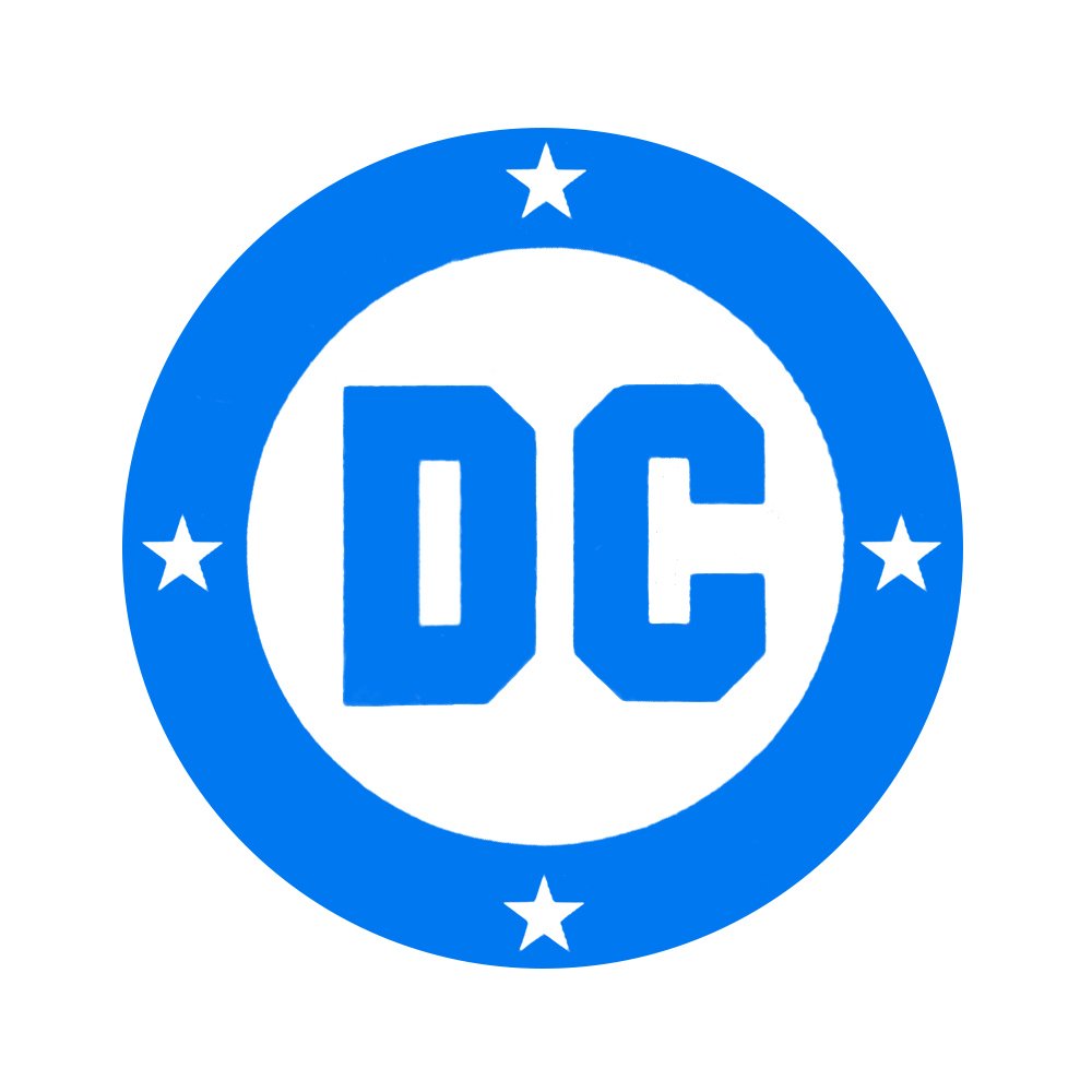
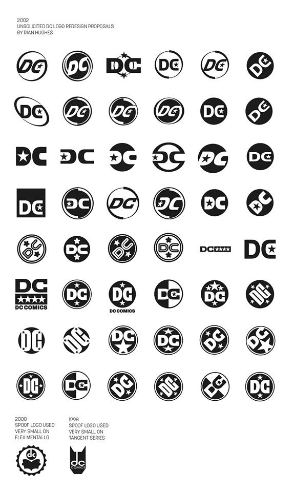
Designer Rian Hughes, who designs logo as other might eat potato chips, once designed 50 unused logos on a lark in 2002. Many of them keep the circle and stars that are integral to the 1976 Milton Glaser design.
Occasional (and much missed) Beat contributor Kate Willaert had a completely different take on the logo that breaks completely with the Milton Glaser classic.
The Twitter user known as @Donsterdamus had a more complicated take:
I thought of mirroring the D in the C more…maybe with emblems? pic.twitter.com/8ieh7ff91w
— Don Juanabe (@Donsterdamus) May 17, 2016
A lot of people were bothered by the “funky serif” in the Pentagram design, and while we must mourn that there will never be a Beastie Boys song called Funky Serif, letterer/designer Matt Krotzer tried removing it, with attractive results.
simpler is better… pic.twitter.com/7mDZf5aJR8
— Matt Krotzer, the Letterer Supreme (@mattkrotzer) May 17, 2016
Another artist, Scott Drummond, tried updating the Glaser logo by removing some of the lines.
Did a little rework. :) pic.twitter.com/IDSftMK4G5
— Scott Drummond (@scottdrummond) May 17, 2016
Bobby Timony mashed up all the elements, including the angled lettering (funky serif looks better on its side.)
I fixed the new DC logo #DCComics #logo @DCComics pic.twitter.com/4qxUip22J3
— Bobby Timony (@BobbyTimony) May 18, 2016
Finally, Sean Gordon Murphy suggested that we were all going in a very wrong direction:
https://twitter.com/Sean_G_Murphy/status/732918315090333696?cn=ZmxleGlibGVfcmVjcw%3D%3D&refsrc=email
I’m sure there are hundreds more variations on this out there. Post your favorites in the comments.
My opinion? The logo is a throwback that references Glaser with a more modern type treatment. I know the funky serif looks funky but it’s these discrepancies that gives things more character.

The Marvel logo of the 90s was better than most of the comics.
Hire Kate Willaert yesterday. That’s a winner
The one where they fire Eddie Berganza, Jim Lee, DiDio and rehire Karen Berger is the logo that will work. It’s all just lipstick on a pig until then.
Also: put back the OVERSHORTS.
PS: Clearly Milton Glaser needs to be called in to update Milton Glaser’s design. It’s not like Chip Kidd wouldn’t jump at the chance to take it on either.
The one with the 200 logos; last full line, third from the right. But then not on a slant.
The wonky, wobbly C of the new logo really hurts my aesthetic eye.
Also, I just tightened up Matt Krotzer’s version some more – Removed the nick in the C and made the bottom of the hole in the D square, so that the D and the C mirror each other diagonally more.
http://imgur.com/EMSKElH
I think the 5th deckchair from the smoking room window on the Titanic looks the best!
The DC logo used from 1949 to 1970, with the words “Superman” and “National Comics,” was the best. They should bring that back, along with the go-go checks.
http://comicsalliance.com/dc-comics-logo-history/
George:
https://imgur.com/7SX5mzj
Kate: I love it! Maybe that would spark a full-scale ’60s revival, with DC’s chief rival calling themselves “Marvel Pop-Art Productions” again.
Logo redesigns come and go. Surely the real news is that they might change their name to “DG Comics.” Bold move after all these years.
Does “DG” stand for Damaged Goods?
The new logo looks like it was printed from the bottom up, and the printer had a hiccup 3/5 from the top.
The new logo is growing on me.
“PS: Clearly Milton Glaser needs to be called in to update Milton Glaser’s design. It’s not like Chip Kidd wouldn’t jump at the chance to take it on either.”
Chip Kidd would just re-submit Milton Glaser’s design and try to get paid for it. (See also: the Convergence variants.)
OMG! WOW!!! Just saw TATEDESIGNGROUP1.com redesigned DC Comics Logo. It’s a killer Design.
Here is the Link: https://www.facebook.com/TateDesignGroup1/
Comments are closed.