
The Toronto Comic Arts Festival is one of the most influential and important comic book event in North America. It’s mission is to “promote the creators of comic books in their broad and diverse voices, for the betterment of the medium of comics”. In the spirit of this mission, the Comics Beat has conducted a series of interview with some of the phenomenal cartoonists in attendance at this year’s festival. The Comics Beat will be releasing a series of interview with cartoonist in attendance. We hope that these interviews will improve our understanding of these creators voices, techniques, interests and influences.
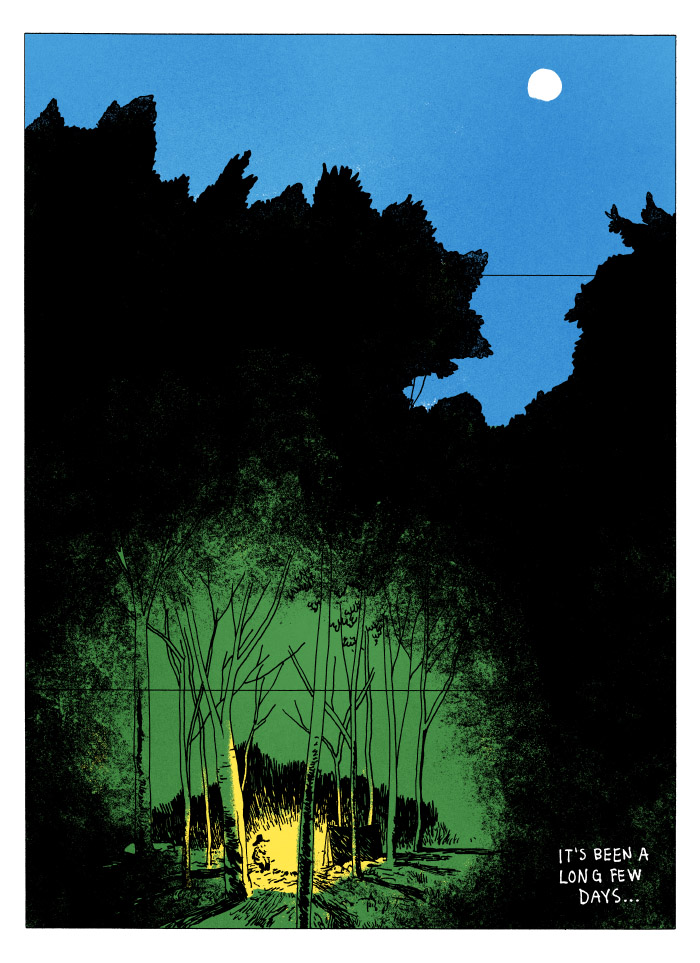
Tyler Landry is a cartoonist from Prince Edward Island. I remember fondly going to the Island with my parents as a child, camping in Cavendish, and reading comics by the phenomenally alien-looking red sand of the beaches there. It’s a wonderful place in the summertime and a arid, and difficult place to be in the winter. With the snow, roads become hard to navigate and the humidity makes it winter feels even colder. I was wondering about the influence of Canada’s smallest provinces winter may have had on the horror comics of Tyler Landry. Tyler is a regular contributor to Study Group comics and has produced a number of fantastic horror comics. His horror series Vile was published recently and made it’s way through regular comic book shop not that long ago. I’ve spoken with Tyler about his horror comics, his ongoing comics club in Charlottetown and his approach to colour.
—
Philippe Leblanc: For those readers who may not be familiar with you and your work, can you tell us a little bit about yourself?
Tyler Landry: Sure. I’m a Cartoonist, Art Director, Islander, Dad, and i run a Comics Club. Basically, I work at a game studio by day, and draw/teach/grow comics by night. I’m pretty new to comics as a serious pursuit, really only being active in creating them for 4 (or 5?) years, but I have a long history in graphic design, illustration, and game development. A lot of that stuff comes into play. I’m a storyteller at heart, and I have always expressed myself best through drawing, so it’s a natural fit.
PL: You have written many horror comics, whether it’s your ongoing series Vile or The Jaundiced Eye? How do you make an effective horror comic?
TL: I’m far from an expert on the subject, but for me, the story itself needs to have certain types of elements (and I’m sure these are as varied as the grains in a fistful of sand), that cut deep with the reader. Jabs at personal flaws, feelings that are taboo to discuss or difficult to address, or even just a simple peek into the abyss… It really comes down to knowing your story intimately enough to decide which details are the important ones. Then it’s just up to the mechanics of cartooning, being able to identify and effectively communicate those vibes – shock, horror, dread, fear, disgust, anxiety. I know that sounds obvious, but there are definitely good or better ways to compose pages, pace events, and reveal (or conceal) important story elements when you’re looking to sew some scary seeds. I suppose the surface qualities of “style” can play a pretty big role, too, but to me, it seems like giving too much importance to style, or making bad style choices – which works against the content of the story – is the thing to watch out for.
PL: You were born and raised in Prince Edward Island. Do you think the isolation of the winter months contributed to your fascination with horror?
TL: I grew up loving the winter. It was a vibrant time for the better part of my life. My dad used to make a rink in our backyard, my brother and I would build forts, go sledding with the neighborhood kids. We still get out to work and school and grocery stores during the winter months, there’s just a lot more snow. So, no feelings of isolation because of small town winters. I think the horror fascination comes from peering into the unknown, and the fear of what might be peering back. Exploring the edges of the neighborhood as a kid was always as terrifying as it was exciting. Living at the end of a dead-end street, we had access to the woods, fields, and hidden footpaths between other neighborhoods. Around every corner we would find a dead animal, or a discarded pair of underwear, liquor bottles, a single sock, a long-abandoned treehouse or fort – fuel for the pre-pubescent imagination to run totally amok. We were really imaginative kids, and with the occasional push from a ghost story, or a scary movie, or a text-based haunted house adventure game, we would lose our minds out there in the woods. This stuff became exciting for us (my brother and I at least), and it followed us into adulthood in various forms.
PL: Is there something you feel can only be told within horror comic that brings you back to the genre?
TL:. I dunno if I think there’s a specific exclusivity to it, but there are definitely things facilitated by putting them in an uncomfortable context. Again, If I’m looking to dig up something ugly about us as people and really stick it in your face, it’s going to come across more clearly (I think) if it’s presented in a more shocking or grotesque way. Dead things, gross things, ghosts, murder, deep shadows – they all emphasize certain types of feelings. I guess that’s a language unto itself, especially where horror is concerned. Lately, I’ve been playing around with some different ways of telling these kinds of stories, pairing extremely normal interactions and dialogue with horrific imagery – more as an overt, visible manifestation of how repulsive i find those totally normal and accepted things to be. Stay tuned in case any of these experiments ever make it out of the dungeon.
PL: How did you get into comics on the Island? I noticed you’ve been running a comics course in Charlottetown, is that correct?
TL: I REALLY got into comics because of the huge community on Tumblr. A friend was just showing me some cool work one day a few years back, and when I went looking for myself, I uncovered a whole scene I wasn’t even aware of. It was some kind of weird awakening, like “shit, these are my people!” Everyone was doing the kind of work I was dabbling in (mostly aimlessly) and dreaming about in really vague ways over the last 20 years or so. I tried my hand at seriously making comics for the first time (Society – on Study Group), but it wasn’t until I took Frank Santoro’s correspondence course back in 2013 that I really started to gain some momentum. So, “The Island” really has very little to do with my love for, or connection to comics – WHICH IS WHY I started the Charlottetown Comics Club. There are a handful of people working in comics here – both professionals and hobbyists – but there’s never been, to my knowledge, any kind of visible community. So I started one. It’s not a fan club, and it’s not a course, but it is very much work-based. The CCC is a place (and time) for people who want to work on comics to get together with each other and jam. Some of the members are totally fresh-faced, and there’s an opportunity for them to learn from some of the more battle-hardened members. I occasionally run some drawing/composition exercises or larger group projects, but sometimes we all just put our heads down and draw, sharing with our neighbors as we go.
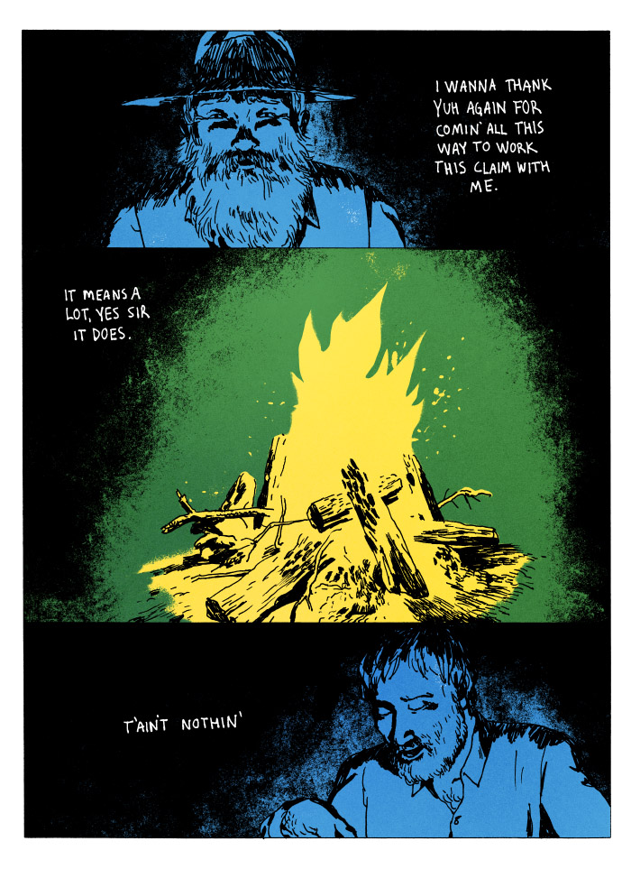
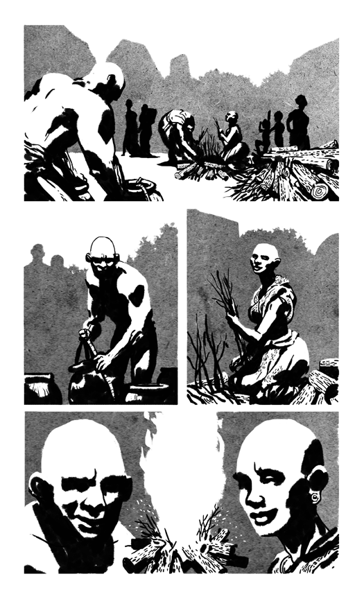
PL: I’m fascinated by the way you use colours in your work. In Coward’s Hole, the bright green and purple lends an otherworldly feel to your story. In Lonesome, you use a palette of bright blue, yellow, white and green against a black background which. Even in Society, the stark white contrasts heavily against the black ink and the grey tones looks interesting on the page. I’m curious to know how you approach working with colours.
TL: I’ve always been dissatisfied with normal, sky-is-blue, grass-is-green, trees-have-brown-trunks, every-color-is-being-used sort of coloring. I tend to approach coloring from a more mood/theme angle, and work with a limited palette to enforce the importance of the appearance of color in a given panel. I mostly think in terms of spot colors, or even more traditional printmaking – even if those don’t end up being the actual end-states of the work – using that limited palette in very specific ways for very specific results. This is a combination of a couple of influences I’ve been able to synthesize only recently. Studying graphic design back at the turn of the century, I got real close and cozy with the idea of printing in pigments, the way CMYK works/looks, spot colors vs full color, the language of transparency and linescreens, vibrating relationships between saturated things and dull things, shit, all that stuff. The other major factor was a liberating perspective on the use of color as a storytelling element, something I learned from Frank while taking his course. Really, I’m choosing flavors, or moods, things that harmonize, or fight with each other – to use as players on the page/stage. Sticking to a specific palette allows me to set an expectation with the reader. I give you the rules of the story – a grid, a size, a feel for form/line, a timing/pacing mechanism, and among them is a language of color.
Society was a special creature for me, a formative one in my quest to broaden and improve my drawing. I was trying to teach myself to draw without the crutch of containing lines. Sometimes lines get in the way of a good drawing – being used “just because”, without any real care for what they’re describing, totally betraying the intention of the work. I wanted to break free from that way of thinking/drawing, just to see if there was something else I could learn about what makes drawings work. So, in Society, I chose tone to describe form in positive/negative space. Black-on-white wasn’t enough for the level of detail i wanted, so I introduced the mid-tone, which really extends into the way I use colors now. Simple palettes, simple language, clear (I hope) cartooning.
PL: You’ve been working on Dungeon Lollers for the Comics Workbook. This is much different than what I’ve seen you do before. Do you like this type of “done in four panels” comic?
TL: Dungeon Lollers is sort of a response to a challenge set out by CW. You may have noticed a lot of members/alumni have been making smaller gag/event-based strips lately. I’m just trying to sharpen my skills in a new area. I’m more naturally inclined to do longer “stories” that have a lot of rolling dynamics – quick action and slow-creeping unease playing off each other over a longer time – and the 4-panel strip format gives me a chance to explore something more immediate and economical. Dungeon Lollers, and the few Suzy and Cecil fan-strips I’ve tried my hand at, have served as bite-sized lessons for me. I hope to do a lot more of them.
Really, if you’re looking into those, Caleb Orecchio’s daily has caught my eye pretty regularly. Dude knows how to deliver in this format.
PL: Your latest comic Shit and Piss is debuting at TCAF. What can you tell us about this comic?
TL: Shit and Piss was originally a weekend attempt at supersimplification of my approach to drawing comics. Historically, I’d been guilty of over-working, over-rendering, over-complicating just about everything I’ve ever produced, to the point where anything of value in it was completely obscured by… stuff. I wanted to reduce to a simpler execution. More graphics, more symbolism, more actual cartooning – rather than straight-up rendered scenes in every single panel. I started with a dire setup, a filthy place, an eyeless, mouthless blob of meat, and then…
What eventually spewed forth was a warped (16-page) narrative describing, in a sort of displaced kind of way, the fundamental flaws and follies of, well, people. Eventually, in four additional chapters, the violence, aggression, carelessness, fear, greed, and the horrors that occur when desperate self-preservation is on the table, all started to come out in the habitudes of the putrid denizens of the awful place. Shit and Piss is about we humans as the unglamorous, unkind, un-fucking-likable gargoyles we so often end up being.
Retrofit/Big Planet has just published Shit and Piss – all 5 chapters, at just over a hundred pages.
—
You can read Society on the Study Group website. You can buy Vile at the Study Group Comics shop and Shit and Piss over at the Retrofit Comics shop. You can also follow Tyler on Tumblr.
Tyler Landry will be attending TCAF. Come and meet him, he’s not at all … horrifying, he’s a very colourful character!
![]()


All hail Tyler. Seriously, the guy’s a class act. Can draw and cartoon soooo well, but also works to lift all the boats around him.
And ditto on the shoutout to Caleb Orecchio’s “Joanie and Jordie” strip. Watterson meet Krazy Kat.
Comments are closed.