BY JEN VAUGHN With the continuing tradition of the band poster convention, FLATSTOCK, in Austin and the gaggles* of cartoonists, designers and journalists, there is no surprise that one of the Interactive panels focused on How Print Design is the Future of Interaction. One full room of print people eagerly waiting to hear what only one man, Mike Kruzeniski, had in mind. Kruzeniski works for Microsoft and is key in the development of the Windows Phone 7.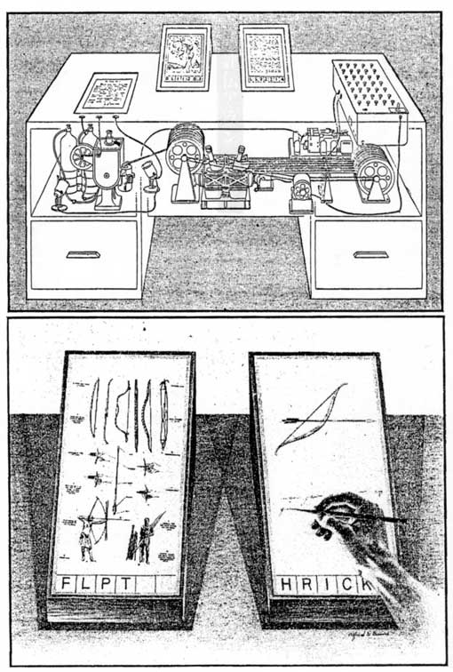
His history lesson focused how the visual language of interfaces have been shaped over time. From Vannevar Bush’s memex in 1939 (shown above) through XEROX to the iPad of today that reinforce a physicalness. We are rebuilding things around us, the functions and file system of an office serve as a metaphor for the data visualizations. Kruzeniski summed up the development as half a century of redesigning the trash can.
So why don’t our User Interfaces (UI) look as swank as contemporary ads? Kruzeniski suggested a few ways to improve UI so it would get out of the way and let the content come forward. UI could be improved through better heirachy and structure with grids (in relation to Swiss design), confident use of negative space (think the Little Miss Sunshine poster), uncompromising focus on typography (Swiss again!), objectivity through imagery (one idea translates to one singular image) and a reduction of elements.
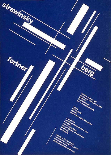
Joseph Müller Brockman 1955 poster design
We see this in the reduction of indicia in indie comics now, what was once a clustser-dump of fonts and information has now been cropped to the essentials and even in a font or pure handwriting that matches the rest of the typography in the book. Keep your eyes out for Kruzeniski in the future.
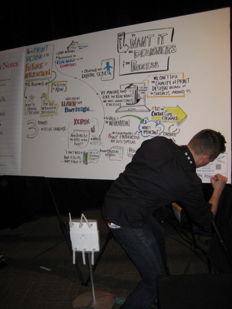
A mind map or ‘visual notes’ is made by Ogilvy Notes at almost every panel and presentation! Fantastic. Especially that marker stand.
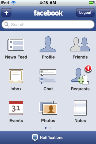
Another intrepid speaker, Anjuan Simmons, spoke on his solo panel What Comics Books can Teach Mobile Application Designers. For anyone with a smart phone, the facebook application is startlingly similar to the 3×3 comic book grid popularized by Jack Kirby: three tiers of three panels. While I very much doubt the creators of the Facebook app considered the Fourth World series when wondering how small and readable they could make the icons, the room very much enjoyed the connection.
Using accessible (read: famous and classic) cartoonist examples, Simmons compared Will Eisner’s example of the marriage of words and image to the current mobile app’s text and image partnership (or is it a common law marriage?). Borrowing heavily from Scott McCloud’s Understanding Comics, Simmons proceeded to look at the an example mobile app but removed the words to see if the icons made sense. We have so many symbols today that an green arrow inset inside a red arrow COULD be an awesome symbol for the childhood game Red light, Green Light but means abso-frickin’-lutely nothing to the casual observer. Anyway, Simmons then reversed the example by taking out the image to show the power of words and how some can merely be changed from ‘Stores’ to ‘Shops’ and carry more weight.
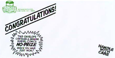
After creating iconic buttons, Simmons gave one more piece of advice to developers by adding a wee bit of achievement. Gowalla, a location-based application that wants its users to check-in and create locations is a great example as it rewards you occasionally with virtual gifts as well as real gifts (I won Knicks tickets during MoCCA last year). In the physical world, arcade games area are a great example of rewarding users with achievements because what high-scorer doesn’t feel rockin’ when they are asked for their three initials. Shown above, Marvel’s No Prize for spotting errors is another unexpected achievement. This is temporary analog and digital immortality!
Finally, in what turned out be a day full of one-man panels, Thomas Knoll held a conversation with the audience about whether their Customers Are a Crowd or a Community. Consider that you may have two to three different communities in your customer base and to allow for just as many types of engagement. Don’t forget about roadies, theater technicians, misunderstood artists, and New Yorkers when creating commercials appealing to only goth kids when your product is black shirts.
The conversation continued with a list of excellent dichotomies that Knoll only took half-seriously like crowds are driven by connection while communities are driven by collaboration. Twitter followers are crowds that are powered by inspiration (if you entertain me, I’ll continue to follow you) versus communities are powered by influence (I want to be a part of that inspiration). When you get responses from your webcomic, think about your interaction and how you are fostering your own sort of family, customers who are a mix of crowd and community and 100% yours.
SXSW Interactive continues to amaze and inspire. More from the Austin front soon!
—
*To be picky, the proper collective nouns are as follows: a doodle of cartoonists, a scribble of designers, and a scoop of journalists.
Jen Vaughn is part of a shiver of mersharks.


Hi Jen,
Thanks for mentioning my panel, “What Comic Books Can Teach Mobile Application Designers”! You perfectly captured what I was trying to communicate during my presentation.
Regards,
Anjuan Simmons
Twitter.com/Anjuan
Facebook.com/Anjuan
Very interesting article and quite inspiring, thanks!