
As a cartoon loving kid of the 90’s, chances are the Batman: The Animated Series was on your “must-watch list.” It’s hard to believe that the iconic show is hitting its 25th year anniversary. But what really made this show stand out so much in our minds, even now as adults? Aside from the writing that didn’t belittle the intelligence of its Saturday-morning audience, Arlen Schumer decided to discuss the show’s elements at this year’s San Diego Comic Fest. He spent a great deal praising the artwork of Bruce Timm, who gave us a look for the iconic Batman that still perpetuates to this day, and much more.
“Anything that can go wrong, will go wrong” is what’s known as Murphy’s Law, which Schumer invoked as he watched the convention’s technical support trying to get his laptop to display on the projector. Fortunately, a friend of his who has worked as an animator for twenty-some years and who I only caught the first name of Lance, entertained the audience with talks of the lack of quality-diversity in that of superhero cartoons. “In the early 90’s, even in the business, there was a massive revolution [in animation]. To see a cartoon that you not only wanted to work on, but you wanted to watch, didn’t exist… In my opinion Johnny Quest was the greatest, until this show… Batman, well I’m not going to step on Arlen’s toes. In his lecture he’s going to tell you how it was such a great show-“
“No I’m not!” interrupted Schumer just as his computer woes were almost solved. “Don’t put your words in my mouth,” he added cheekily.
Lance continued. “I’m just going to leave off with that when I first saw Bruce Timm’s art, I didn’t say ‘This is a great artist,’ but instead ‘This is an important artist.’ Bruce has influenced so much that has followed, but he still hasn’t been equaled.”
Now in full control of his laptop thanks to the “techie gods,” Schumer urged the audience to give his friend a round of applause (to which they did) and dove right in to “visualecture.” He began by showing the opening animation for the Batman cartoon (which still gives me goosebumps to this day). Schumer pointed out the first instance of the cartoon’s version of the Batmobile and the connection to the late 80’s movie adaption.
 “And of course we have the animated series’ Batmobile in full color, from the opening that we just saw. That was actually more-or-less based on the Anton Furst design for the 1989 Batman film, which really was because of the success was the impetus for the animated series to be given the green light.” Adam West’s 1960’s Batman television show was a large part to why it took the success of a major-motion picture to get the cartoon approved. The “caped-crusader’s” image was overshadowed by the early show, making it hard for people to take the character of Batman seriously for some time.
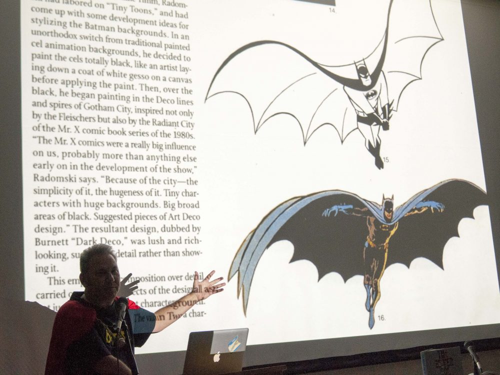
To dissociate from the 60’s television show, Schumer pointed out the similarities to past superhero cartoons and the Bruce Timm Batman. “Look how different Bruce Timm’s animated Batman was [compared to the live-action show]. But again, if you know your comics and you know your Alex Toth, and you know your animation, Space Ghost which appeared in the fall of 66… you have Batman in space,” pointed out Schumer as he compares an early sketch of the Space Ghost character compared to Bruce Timm’s Batman. “The dictum [Toth] was given by Hanna-Barbera was, ‘Give us Batman in space.’ And that’s what Space Ghost is.”
Another large reason to why the animated series is still firm in our minds and can even stand up to the likes of even today’s cartoons is the visual architecture displayed in the shows premise of Gotham City. Arlen Schumer attributed the art-style used by Bruce Timm to that of “Russian Constructivism”. “If you look at early production art by Bruce Timm or some of his other artists that are working to his style, you can see all of the influences in these early images that [he] did,” said Schumer as he pointed to sketches and artists renderings of Gotham skyline and building architecture. Another reoccurring theme in the series is Bruce Timm’s use of red sky throughout the series, which Schumer also points out, “The whole red/black motif itself comes out of Russian Constructivism.”
It would be safe to say it’s hard to imagine the cartoon without Bruce Timm’s influence. But where did the artist come from? “[Tim] was an animator in the late 80’s,” explains Schumer. “Working for Warner Bros. Animation, working on Tiny Toons. But he was a big Batman fan. Perhaps for years, maybe even a decade, before he got the Batman job, he had [Batman] sketches posted around his cubicle… From his early sketches, you can already see the influences that would make it into the show; the more exaggerated and more extreme characteristics… You can see how much of it survived in the version ten years later that made it to the screen… And here’s the show, where it’s tone down and more stylish/polished, but it’s there!”
Soon after the green light was given for the animated series, Jean MacCurdy who was president of Warner Bros. Animation from 1989 to 2001 began looking for someone to head the cartoon. “She sees those sketches by Bruce Timm, and he and his partner Eric Radomski are asked to put together a pilot.” The original pilot, once redone with the shows “polished” look, became most of what the opening sequence was.
Eric Radomski was the one largely responsible for the cityscapes in the show. “They called them “dark-deco,” instructed Schumer as he pointed to a paused section from the pilot. “Again, we see that red sky in the background.” It was more than the sky that made the look unique. Radomski was influenced a great deal by the look of the 1989 movie in which at first greenlighted the animated series. However, the movie’s long, dark, and foreboding look came from that of the 1927 black-and-white movie Metropolis.
“Now influenced who first?” asked Schumer. “It was the American architect Hugh Ferriss. With these monumental images of buildings that are just literally the blueprint of everything to come… Look how [Bruce] Timm in his early presentation production artwork took a Hugh Ferriss drawing and look at how he adds Batman directly to that Hugh Ferriss background. Look how this Hugh Ferriss typical, monolithic building is echoed in one of Eric Radomski’s background images for the animated series.”
Unfortunately, Schumer wasn’t able to go through his full presentation due to time constraints. What he was able to go through however spoke volumes about the animated series, its artists, their influences, and how it all came to be a great show that would forever mark itself among Batman and cartoon fans for perhaps as long as its comic predecessor. The show is a subject that could be analyzed and discussed in the likes of a college course.
To learn more about the lecturer, artist Arlen Schumer, visit his website at www.arlenschumer.com. Also, check out his 2003 released book “The Silver Age of Comic Book Art.”


“Lance” is of course Lance Falk.
Oh man, I think I need to a panel on the Olan Soule Filmation cartoons. But geez, 25 years? Seems like yesterday I was on the couch watching the very first episode with my. baby daughter. Tempus Fugit.
I didn’t see where Schumer denounced Stan Lee?! Kidding! Great article about a wonderful show that holds up beautifully today.
Some of the panels from the 2017 Comic Fest are up on Youtube. While they don’t have this one they do have Mark Evanier’s Jack Kirby tribute and part of another Arlan Schumer panel on his Silver Age of comics book.
I love to read such blogs that uses simple and easy word, and your post is really fantastic. I will recommend your blog to my friends so that they can increase their knowledge.
Comments are closed.