
In Black Bolt Saladin Ahmed was paired with a bold and experimental artist, Christian Ward, and given an underdeveloped character to play with. They turned it into a Hugo and Eisner nominated series beloved by many, especially those of us who appreciate the vision of a world that values love and rehabilitation over revenge.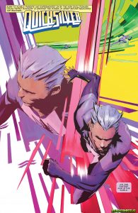
Ahmed’s Quicksilver mini-series – with art by Eric Nguyen and colorist Rico Renzi – is well on its way to proving this successful equation with a few new variables: a different experimental artist and a character who while niche, definitely has his own following, voice and legacy.
It worked before and it sure looks to be working again.
Since childhood, Pietro Maximoff aka Quicksilver has been one of the superheroes I relate to most. He has superspeed, I had ADHD and we both came from families of Holocaust survivors. I mean we’re practically twins!!! So I was an easy sell on buying this, especially since I’m an enormous fan of writer Ahmed, who I interviewed on the Graphic Policy podcast and who’s fabulous creator owned series called Abbott just concluded.
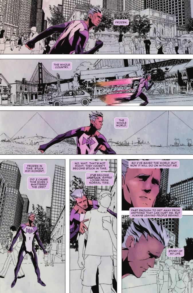
Quicksilver’s premise is intriguing: Pietro has become “unstuck in time” and must battle a dangerous force that is unstuck with him before it kills everyone he knows.
I’m predicting a parallel to a classic Adam Warlock story but Ahmed plays with this in new ways and his social analysis is a breath of fresh air. Ahmed writes his character’s inner monologue as deftly as ever because he is just so damn good at writing moody superheroes. Ahmed must be the new master of the narrative caption box. I want to spend time unstuck in time with this Pietro.
Issue #2, just released today, is a full throated rebuke of anti Romani slander. It’s clarity is beyond anything I’ve seen in a superhero comic about the Romani people. It dispels racist myths about an ethnic and cultural group that too many writers still refer to using the G word, which is actually a slur.
Pietro explains, “Because we are Romani the villagers called him a thief when he tried to feed his children….They never mention that they stole our whole people– enslaved us for 500 years. They don’t have a word for that level of theft…. The Americans are almost worse. They turn us into cartoons and costumes.”
It reads like an announcement that we are entering a new era for Romani characters and Pietro’s words address Romani stereotypes across pop culture, not just within this particular story.
I’m dying to hear what the folks at Roma Pop, an organization of Romani activists demanding better representation in media think about this series. They have called Pietro’s past characterization stereotypical. I hope they’ll find this a step in the right direction.
Another strength of Ahmed’s writing is how he wrestles with the character’s changed history in canon– the fact that Pietro is no longer actually Magneto’s son. Continuity is complex and this particular continuity change isn’t one I like but Ahmed successfully makes something that felt like an editorial mandate come across like a true artistic consideration. That my friends, is style.
Speaking of style…. artist Nguyen’s is expressionistic and the layouts are the sort that remind us of the whole point of the comics medium. The character motion is so much more than a motion blur effect, it’s a motion map blazing across page gutters and street grids. Renzi’s limited palette is an essential piece, coloring Pietro and his motion and the opposing force while keeping the rest of the world in a soft frozen grey.
There are some interesting digital effects in the mix here too with pixelated crackles of energy. As Pietro runs across the world Nguyen gets to draw detailed architectural sketches of the cities and buildings he passes from NYC to the Great Wall of China.
Pietro’s new unitard features his first real logo: a fast forward symbol, which is just the sort of iconic graphic the character has always needed. His old diagonal lightning bolt and seatbelt, while iconic, was never gonna be sold on a costume T-shirt. It was practically a color-shifted version of one of the Flash’s old costumes. His Avengers movie costume was basically just an athletic shirt with no symbol to speak of. Hardly fit for a starring character. This fast forward symbol logo seems like something the wry Pietro would come up with for himself. ![]()
I’d wear it.
Even if it only came in pink and purple. Speaking of, his costume is a very femme forward pink and purple. Pietro was never associated with those colors before but he’s not the sort of guy to shun pink. He will certainly stand out if he keeps this new uniform in a future team book.
My one aesthetic complaint is Martin Simmonds cover: Pietro’s face looks lumpy and to me — that’s just not what he looks like. But I’m not going to demand the quality of handsomeness as the be-all-end-all of art. His face is very gestural in the interiors as well.
In the past Pietro frequently voiced the frustration of dealing with a world that’s too slow for him — you can see why that would be relatable to a young person who may have felt too smart for their own classes. Now he is stuck in fast forward regardless of his own desires.
If you loved Black Bolt, as so many of us do, then you definitely need to buy Quicksilver. It’s an exciting and emotionally charged comic for anyone looking for a superhero story that wants to do right on and off the page.
RATING: Buy.


Looks great. Easy sell on this character and writer. Thanks for making me aware of Abbott as well.
Comments are closed.