This month’s release of the first volume of Fantagraphics’ Carl Barks reprints is call for rejoicing. There have been many reprint projects centered on Barks’ work, but they must have been designed by the three bears: one was too expensive, one was too cheap, one had garish color, and so on. This new effort — reprinted in handsome hardcovers with simple coloring by Rich Tommaso that recalls the original limited coloring without a lot of fanfare.
I think a lot is going to be said as more of Barks’ work becomes available in a world where the bodies of work of the great cartoonists are becoming increasingly available — it is the golden age of the comics reprint, after all. For now, this conversation between James Romberger and Gary Groth will serve as a good introduction.
Fantagraphics has a 17-page pdf preview available on their site. In the meantime, here’s a seven-page preview of that preview. And these may be the seven of the greatest comics pages ever. Enjoy.
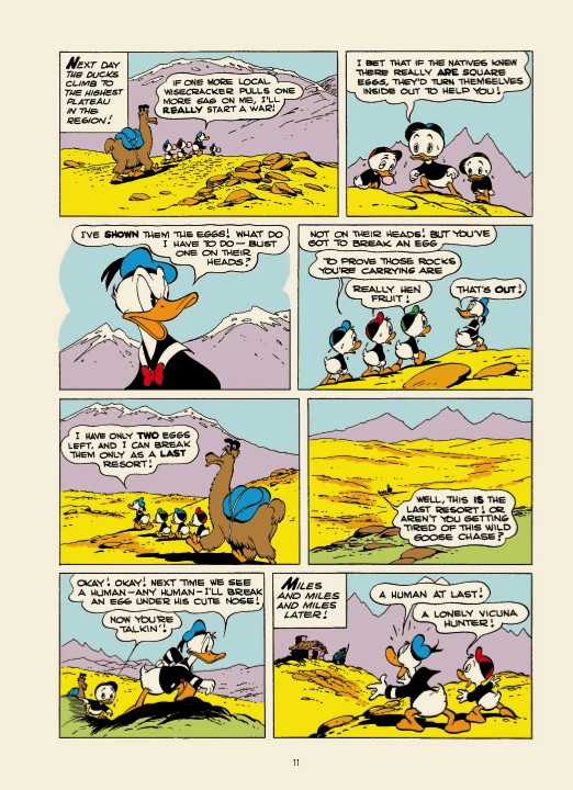
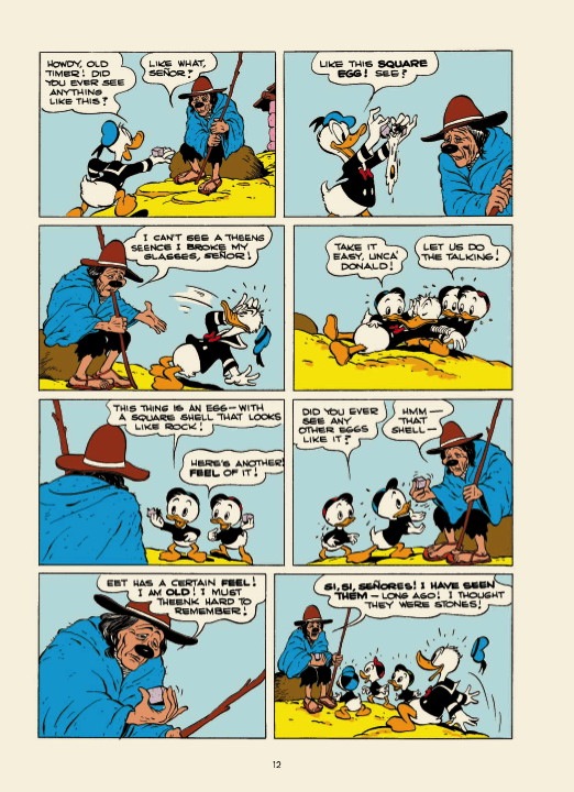
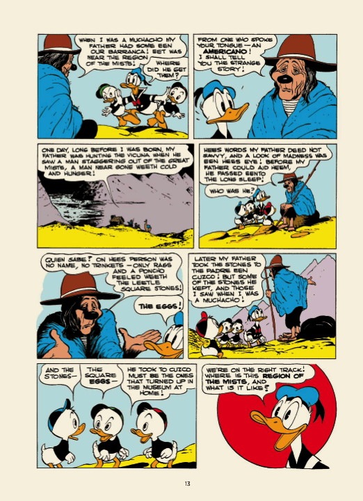
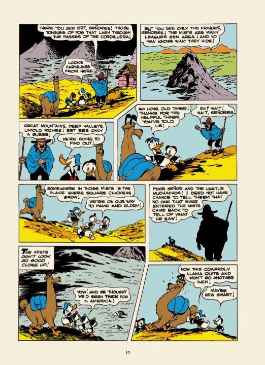
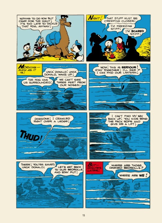
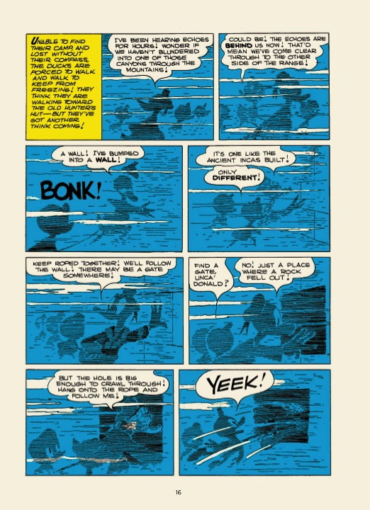
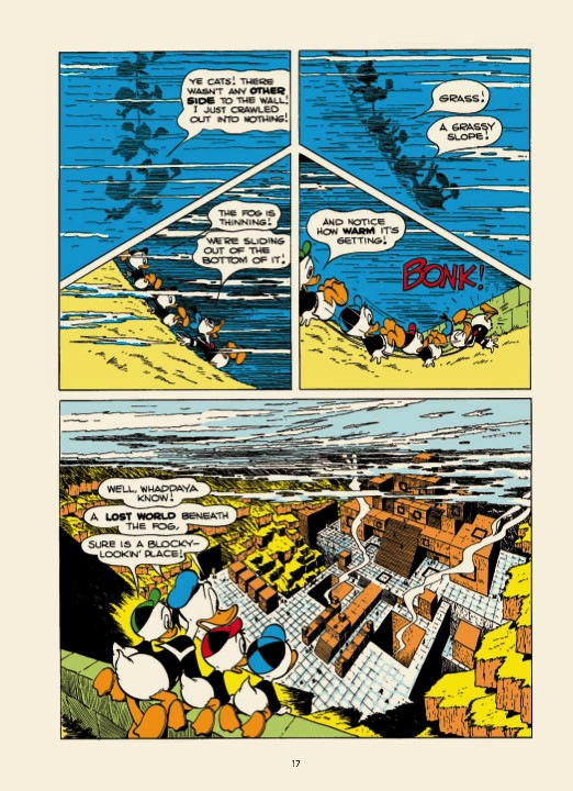
Maybe I’ve been spoiled by Gladstone’s editions, but that coloring is pretty garish, as if it were printed during the early days of Flexographic printing.
Compare and contrast here:
http://coa.inducks.org/s.php?c=W+OS++223-02#scans
Is it nitpicking if one complains that the nephews’ cap coloring was not duplicated from the original art? That is, in the original temple image, it’s Huey (Red), Louie (Green), and Dewey (Blue). In the panel shown above, it’s Louie, Huey, and Dewey.
Quoting the promo:
“For the first time, read the complete works of one of the medium’s greatest artists in affordably priced hardcover volumes perfect for parents and children alike, meticulously restored and re-colored to ensure the very best reproduction Barks’ work has ever received.”
If it’s an archival edition, then Fantagraphics seems to have blundered with the re-coloring, especially IF that coloring was done by Barks or his wife.
This story caused an uproar when it was originally published in Norway. We have three official languages in Norway. The two biggest are Bokmal and Nynorsk, however the latter is used by a much smaller percentage of the population, and the weekly Donald Duck comic has always in published in Bokmal.
When the story was first published, the people living in the blocky town spoke Nynorsk, while Donald and his nephews, as usual, spoke Bokmal. The Nynorsk people took this as an offence since they felt that the people of block town where portrayed as simpletons. Their logic was that this meant the translator were poking fun at people using Nynorsk.
All later translation of this wonderful, wonderful story have been in pure Bokmal, with no Nynorsk in sight. :)
I can’t wait to have all 30 volumes of this series on my shelf some day. I hope it gets the wide readership it deserves! Thank you Fantagraphics for getting this important work back into print, and for doing it right!
You shouldn’t judge the colors on the Barks volumes by on-line PDFs. We recolored the books matching the original color codes, and then printed the book using softer Pantone colors instead of cyan/magenta/yellow. The printed books look significantly different from this.
I don’t know if we messed up the order of the nephews (maybe there are variant versions in the Dell/Gold Key history) but yes, absent any other more serious errors, I would say this might be nitpicking.
I have to say, while I’d like to own hardcovers, I very much love my Gladstone reprints in comic form from the 80s/90s. Bright covers, on newsprint, the way comics are supposed to look.
I love the Gladstone books, but if there’s one name I trust, it’s Fantagraphics. I can’t wait to buy these!
Coloring looks great. No cut and grad, no random radial gradations, just solid color choices. The Gladstone versions are terrible.
Between this and the Pogo collection FINALLY coming out…Fanta’s my favorite pub right now.
I’m not too fond of some of the original color choices, but I highly prefer this to the gradient-filled style of recent years.
Exactly right, Mike. We have an absolute ban on gradients. The original coloring isn’t necessarily great (I don’t believe Barks or his wife had anything to do with it), but trying to re-think and tweak it opens up about twenty cans of worms. So we’ll try to discreetly correct any obvious flubs or eyesores and otherwise treat the original coloring as gospel.
Similarly in the Peelleart JODELLE book (although in that case the original coloring, by Peellaert himself, is really good): We’re matching it exactly except for fixing the original goofs and glitches, such as the iconic panel of Jodelle waking up that was used on the original US book cover and we used on our current distributor catalog cover: The original color separator forgot to color Jodelle’s armband yellow, and that mistake, which is a noticeable continuity error and throws the color balance on that panel off, has been in every version since then.
We’re printing the EC comics in black and white because we think there simply is no good way of coloring them because of the crudity of the color palette available in the industry at the time vs. the complexity and subtlety of the art. Marie Severin did great work with the tools she had, but it was like trying to butter a croissant with a shovel.
Thanks for the clarification, Kim.
If you did follow the original comics, tweaking the colors, then I’ll probably have little quibble with the final book.
Heh… How about a coloring comparison with the various reprints over the years?
Any chance you could do an American version of this?
http://www.ehapa-shop.de/product/3022-don-rosa-collection?source=233
I second the idea of a complete Don Rosa collection! He has hung up his pen, so what he created stands alone. By all means the Barks collection should come first, but then, please consider a similar Rosa collection!
Got this today. Gorgeous book, beautiful design, great production… and of course, great stories. Everyone go buy a copy!