
In the wake of our review of X-Men: Apocalypse, which writer Kyle Pinion called “easily one of the worst films of the franchise,” we the viewers are once again left to ponder what went wrong.
Well, YouTube video essayist Kaptain Kristian offers one answer to us in a recent video he produced about the usage of color in X-Men costumes.
X-Men: Apocalypse has received a bevy of promotion in the months leading up to its release. However, despite the barrage of interviews, teaser trailers, and promotional photos, positive buzz surrounding the movie has been muted. The X-Men were once the defining superhero team in cinema, and while eyeballs this year are hotly contested by Captain America: Civil War and Batman v Superman: Dawn of Justice, Fox clearly expected more talk about the film than they have been receiving. However, the truth is that this cinematic incarnation of the X-Men simply cannot attract attention because its visuals and filmmaking style are outdated and bland. Compared to the flair that other superhero films have, X-Men: Apocalypse looks like an anachronism from a time where the X-Men were the only kids on the marquis.
The 2000 Bryan Singer X-Men film arguably launched the superhero craze that dominates cinema today. At the time, the visual styling of the piece was lauded because nothing like it had ever been seen before. Singer and his production crew fundamentally changed the way audiences looked at superheroes. No longer were they primary color children’s toys. Now they were cool. They were slick in their black leather outfits. They were the precursors to the angsty emo teens we’d all become in a few years’ time. For that reason, their historical relevance cannot be understated.
However, in the sixteen years since the release of X-Men, visual styling in superhero films has evolved in a dramatic way, but the X-Men franchise still looks strikingly similar now to the way it did in 2000. As Kaptain Kristian notes in his video, we no longer have black leather suits, but instead… black “paintball gear?” In X-Men Apocalypse, a majority of the uniforms showcased in the trailers speak to an era where, yes, superhero movies were embarrassed of their source material. Films like the X-Men movies and Nolan’s Dark Knight trilogy overcompensated for the kid-friendly nature of their silver age forebears by becoming “extremely edgy,” much like the generally vapid superhero comics made in response to classics like The Dark Knight Returns and Watchmen.
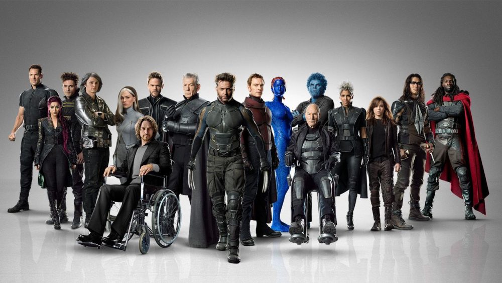
2016 is not 2000. We live in an era where X-Men is not the only superhero movie on the year’s slate, but rather one of six. The people have spoken. It’s no longer a social faux pas to love superheroes. In fact, it’s almost mandatory in order to participate in large swaths of the social discourse. People love the hot-rod red and sterling gold sheen of Iron Man’s suits. Suicide Squad‘s visuals get more and more whimsical every time a new trailer comes out, and hype for the film has built to a fevered pitch. Even films like Man of Steel and Deadpool, which are certainly more visually muted than most other Marvel movies, have a certain visual playfulness and variety to them that stays true to the imaginative nature of their source material. Characters in Fox’s X-Men universe lack that joyfulness. Internal character development has to struggle to break free out of layers of black and grey outfits. It takes a moment as dramatic as the “Time in a Bottle” scene to make the uninspiringly costumed Quicksilver a memorable character.
Note that a film does not need to be happy in order to be joyful. Nolan’s Dark Knight films certainly aren’t. However, even in his hyper-realistic representation of Gotham, there is a level of playful invention in his visual choices that is simply not present in the X-Men movies. Every Dark Knight film has a distinct color palette that breaks up the monotony of blacks (copper-blue-white). Scarecrow’s simple potato sack mask terrifies in a real way, as does Bane’s anesthetic applicator. Do we need to say anything about the staying power of Heath Ledger’s Joker costuming? His scars were both visceral and narratively symbolic. That level of thought has never entered the costuming of Fox’s current slate of X-Men characters.
Zack Synder’s DC universe movies are generally weak affairs, but the way he shoots visually dramatic moments and action scenes is singular and often very strong. Man of Steel is a painfully dour take on Superman, but characters like Faora-Ul make a memorable impact even when they get no lines. There is no way to redeem the mess that is Batman v Superman: Dawn of Justice, but there are many moments of fantastic visual invention such as young Bruce Wayne’s biblical rise from a well that make the movie incredibly gif-able despite its incoherence as an actual story. The Quicksilver scene from Days of Future Past and the Cuban Missile Crisis scene from First Class are comparable to these examples, but such moments of genius in the Fox films come so sparingly compared to Snyder’s flashes of flair that it’s barely worth the trudge to find them.
Bryan Singer and Fox have done a lot of great work with the X-Men franchise. It makes sense that they would not want to let what they have go, given that it has worked so well for them in the past. However, times have changed. We’re not asking for anyone to make a happier, brighter X-Men series. We’re just asking for one that takes the emphasis off of “badass” and puts it on “thoughtful” instead. Make costumes and visual choices that reflect characters’ internal states of mind. If everyone on screen looks apathetic and too cool to be there, how can the audience ever feel any differently?


Nicely laid-out argument. I personally find more visual playfulness in X2 than I find in all of the Snyder and Nolan films put together, but that’s what makes horses racy, or something like that.
“We live in an era where X-Men is not the only superhero movie on the year’s slate, but rather one of five.”
Dr. Strange?
Ah right, six is the number, Skottie. I remembered Dr. Strange, but for whatever reason Deadpool is burned in my mind as a 2015 film.
Comments are closed.