
The best lettering is often so subtle you don’t even notice it. Marshall Dillon certainly blends his lettering with the page to make one indistinguishable from the other, but he first caught my eye with his work on Skullkickers, a series that’s bombastic sound effects were a signature element.
Since the end of Skullkickers Marshall has kept himself busy lettering projects at a number of different publishers while still managing to fit in time for other pursuits including writing, inking, and developing a role-playing game. I had a discussion with him about juggling all those different interests as well as digging into the finer points of lettering comics.
Featured image art by Edwin Huang and Misty Coats
I notice that a lot of your lettering work is for the same few publishers like Aftershock and Dynamite, among others. How do you first connect with publishers and then build the relationships so they keep you in mind for future assignments?
EVERYTHING is word of mouth. You work with someone and they know someone who’s launching a new book and a door opens. An artist or a writer you’ve worked with in the past lands a new book and requests you. That sort of thing. With the companies, you mentioned specifically… It took a long time to get in at Dynamite. I knew Joe Rybandt from my days as associate publisher at Devil’s Due. Dynamite published Army of Darkness through us for a very brief time. Several years after I left DDP I finally landed a Christmas special at Dynamite and it slowly grew from there.
As for Aftershock, I’ve known Joe Pruett for YEARS. I was familiar with his work at Caliber in the 90s and started working with him on little projects through Desperado in the mid-late 2000s. Anthology stories, one-shots, commercial comics for the Department of Health, things like that. When Aftershock came together I contacted Joe and he put me in touch with Mike Marts because Marts runs the day to day editorial stuff. Here’s what it boils down to. Do good work, and you’ll get more work. Getting started is slow but dedication is key. Keep plugging away and you’ll make it, not just in lettering or in comics, but in life.
You both letter and design logos. How similar and different is one role from the other?
Both are graphic design in a broad sense, but they have VERY different needs and so they are approached differently. Lettering is about leading the eye through the page, giving emphasis to the action, that sort of thing. A comic cover logo (I prefer the term title treatment to distinguish it from a business logo) needs to embody the FEEL of a series (in my mind anyway). Plenty of logos DON’T do that. I see a lot of logos that are just a slightly modified font and I can tell who the designer is and I think, well… that’s not good. I know the designer but I have no sense of the subject. When I do a logo I try to make it fit the book, to give the reader a sense of what the book is about. That said, I don’t do a lot of logos and when I do it’s a long iterative process with lots of promising dead ends. [Laughs] Now, a business logo is a totally different thing. I take a similar approach, but I tend to work with more standard fonts so the company can use a particular font family for all their branding needs.
What have some of your favorite lettering assignments recently and what made them exciting?
Here are a few of them!
Incursion (Valiant)
I’m pretty unfamiliar with the Valiant Universe so working on Incursion is like discovering something new. I also get to work with Joe Illidge (editor). He’s another one of those guys I’ve known for YEARS and worked with on projects here and there. The art is also KILLER on this series (Doug Braithwaite).
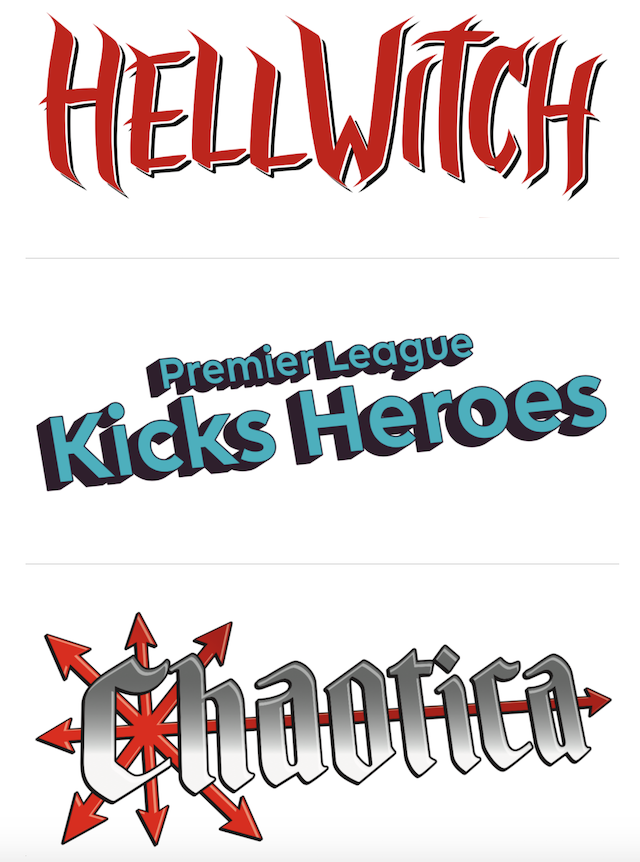
Hellwitch (Coffin Comics)
She’s a villain from the Lady Death storyline who struck me as very compelling from her first appearance. Diego Bernard is the perfect artist for her. I hope we can build her into as prominent a character as Lady Death. She’s a good counterpoint to LD. *I did the logo for this book too.
Moth & Whisper (Aftershock)
The whole team is ace on this book. It’s an interesting mix of current socially conscious characters and Cyberpunk. I did some very different lettering on this series too.
Pestilence (Aftershock)
MAN, This book. LOVE IT. Zombies in the middle ages, what’s not to love? Frank Tieri is the PERFECT writer for this and HOLY BALLS, the art. Oleg Okunev is so wonderful. This is definitely not one for the kiddies, but if you like horror and adult stuff you’ve GOTTA check it out. I made the font for this one and with the balloons, I have a varying in line to compliment Oleg’s art.
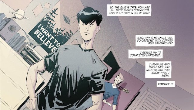
Beyonders (Aftershock)
Conspiracy theories are ALWAYS fun. It’s good to be working with Paul Jenkins again and Wes St. Claire is such a breath of fresh air. He reminds me of Keith Giffen’s in the late 80s and 90s (and yet fresh). With this lettering, I took a similar approach as I did with Moth & Whisper but somehow it’s totally different as well.
WitchHammer (Aftershock’s new OGN line)
I like longer form stories. Since you can’t usually letter all 4-6 issues of a series back to back an OGN is the next best thing. I grew up in the 80s. The “satanic panic” was in full force. WitchHammer is set in a world where the satanic panic was REAL…like there was REALLY reason for concern. So it triggers nostalgia and yet introduces new characters and situations.
And Wayward (Image) has just recently wrapped up. This book, this team. GOLD. Every issue. I’m working with Jim Zub on something new. I can’t say more right now, but I’m going to be doing some really interesting things with that book.
You know, a publisher I’ve worked with for years that few people might know of is SitComics. They do a LOT of cool books, StartUp being my favorite. Startup follows a Hispanic single mother struggling with her weight who leads a double life as a super-speedster in a very well populated superhero world. She also crosses over with other books from SitComics, primarily with The Blue Baron as they’re on a team tougher. SitComics uses a very imaginative rating system on their covers too so with a glance you know what to expect. I believe StartUp and The Blue Baron are both rates 8 PM, so they’re suitable for people who watch TV shows at 8 o’clock. By comparison, SuperSuckers is rated 9 PM as it’s about college-aged vampires and has an appropriate amount of innuendo for the subject and the time slot.
I’m looking forward to Horde (Aftershock’s new OGN line). That’s still in the early stages but it’s gonna be super cool.
Lettering is frequently the last stage of the comics-making process. How do you manage to hit those tight deadlines?
Get the job, do the job. Don’t waste time. Get up early. Get to work. It’s a job. REPEAT.
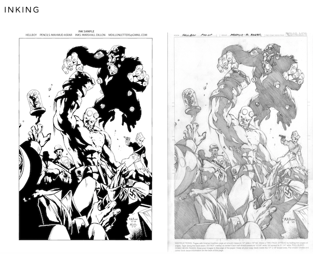
You recently took an interest in inking and have wonderful samples on your website. What inspired you to pursue the art form, especially in an age of comics when most illustrators both pencil and ink their work?
Thanks. TRULY, I appreciate it. When I started in comics, when I was 19 years old, I wanted to write and draw comics. Inking is an extension of drawing, It’s also fairly technical (as the lettering is) and the technology has improved enough that you can do it digitally with good results, so it wasn’t as big of a stretch for me to try it as you might think. As for the sample you’ve seen, I was lettering a book that was late. I was working over the pencils (less than ideal) and I thought I’d try my hand at inking to see if I could help us hit our deadline. In the end, I didn’t do any published inking work on that book but I did half a dozen sample pages from it and several from the subsequent books.
I’m not trying to be an inker as a singular profession, it’s just another aspect of what I do. If an artist can ink themselves and hit their deadlines then they don’t need an inker. If they can’t then inkers get the work. One interesting change in the business is the reduction in inkers as a whole. Facing downsizing I know several who have upped their game and become penciler – inkers. Which is good, because most of them have been honing their skills for years and just never had the opportunity or the impetus to become penciler – inkers. In a way, that may open new doors for new inkers…maybe.
I’d really like to do some more inking. Small publishers, hit me up!
Has your experience as professional letterer taught you more about the craft of writing comics and stories in general that you bring to your own work?
MUCH of writing is actually crafting story structure, so as a letterer that is rarely something I have to engage with. I have learned a LOT about writing, but it’s pretty specific about writing for the comic page. About pacing, reading order, leading the eye, etc. I truly think all writers should letter themselves for a couple of issues. Even if it’s not for print. Just get the basics of lettering under your belt and rough in your balloons and text at the appropriate size and see if it fits. If it doesn’t you might want to address your dialogue process.
You’re even working on a classic tabletop RPG! Are there resources you turned to in order to develop it or does the process feel instinctual as a consumer of games like Dungeons & Dragons?
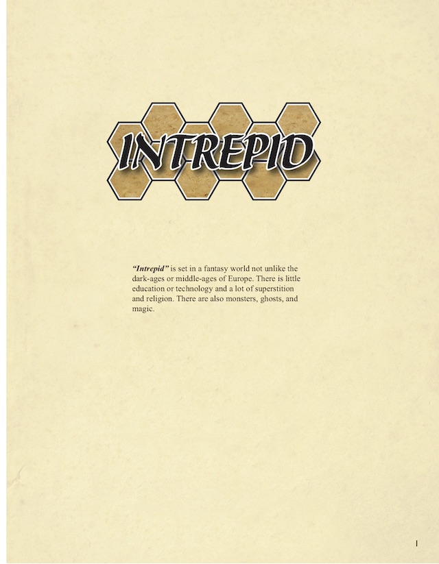
Sigh. Wow. Intrepid (my RPG) is a labor of love… but it’s been languishing.
I took a wholly new approach when I crafted this game. The setting is familiar, it’s a standard fantasy (until you peek behind the curtain anyway) but the character creation system is, I think, truly unique and builds VERY well fleshed out characters. Unfortunately, it takes quite a bit of time to do that. In today’s market, I’m not sure people want to spend an hour or two creating their character. One plus to this game is that its open source. Anyone can download and play it for free. Anyone can modify it to their liking. Anyone can publish works in the Intrepid Universe (comics, novels, RPG supplements, etc.). Because it’s a download-and-play game I built the system using 6 sided dice so people could rob dice from Yahtzee, Monopoly etc and not have to go buy D20s.
Do you worry about stretching yourself too thin between so many creative pursuits?
Yeah, that’s always a concern. Intrepid is on the back burner and has been for a while. It’s playable but I’m not fleshing out any more of the world right now because the interest isn’t there. If I get more interest I’ll work on it more. Being a free game I’m not making a single penny when I work on it. With all my side projects lettering gives me the stable base and allows me to treat everything else as a “try and see” kinda thing. If anything hits I can easily move it up to “secondary project”.
Creating is half the job, marketing is the other 50%. How do you get the word out about your writing, inking, and role-playing game?
Well, there’s the rub. I don’t really market them. I’m not a social media tycoon. I mainly use social media to stay connected with friends and family. So I’m old school, word of mouth, just like lettering. If something starts to gain a following I’ll obviously put more attention into marketing it.
You can keep up with Marshall’s many projects at FirstDraftPress.net and follow him on Twitter @MarshallDillon.
Matt Chats is an interview series featuring discussions with a creator or player in comics, diving deep into industry, process, and creative topics. Find its author, Matt O’Keefe, on Twitter and Tumblr. Email him with questions, comments, complaints, or whatever else is on your mind at [email protected].


