A lot of people celebrated Jack Kirby’s birthday on Friday by posting a lot of his art, and it is always pleasant to page through galleries of the King. One thing that I did notice on all this art was how stunning (to me anyway) the original “limited” coloring looks.
Marvel has often recolored a lot of classic work for reprints, which I understandd must be done at times, and Kirby’s Thor comics were recolored for a reprint series in the modern, “modeled” manner, and some people liked it, which I guess it does look more up to date, but for me it’s…blech.
The recolored version, to my eye, completely obliterates the detail in the art and saps its energy. Plus, poop-brown color palette…why? AND the knockout color of Thor in the new version just make that little detail in the art harder to see.
This cover was a more faithful attempt, but even the yellowed old version still has more subtlety in the color grading!
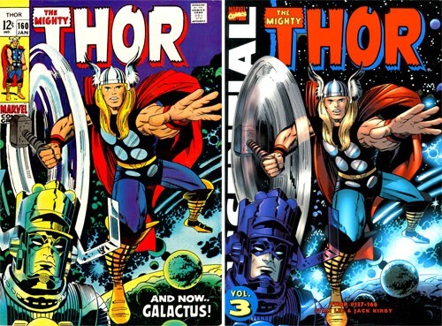
ln this one, shading Thor’s outstretched hand once again removes the impact of his pose; and I far prefer the psychedelic Galactus to the “realistic” version.
I know I’ve moaned about this before, but some art just isn’t meant for modeling. Although they had what we’d think of as incredibly primitive coloring methods—64 colors and hand separating them into the cyan, magenta and yellow plates. The colorist on Thor isn’t even known, but whoever he or she was, it was intuitive and really understood Kirby’s art.
Modeled color works, but I think there’s a reason why so many of the most popular comics use duotone, limited palettes or the more European style of flat areas of color. I’m terrible at articulating what I like about color, but I do know sometimes less is more.
Or maybe I’m the only one. Thoughts?


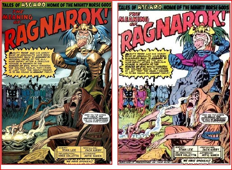
It’s not just you, Heidi. I’m not really sure I can articulate it any better, but the color palette on the modeled coloring just doesn’t pop the way the original colors do. I think that the modeled coloring also changes some of the original storytelling choices, albeit in a subtle manner. For example, as I’m looking at the side-by-side you’ve posted from “The Meaning of Ragnarok,” the original colors make it pretty clear that Thor, Baldur, and… Fandrall? At any rate, the 3 figures on the left, stand apart and in front of the rest of the crowd, while the recolored version, by coloring EVERYONE, has them all sort of jumbled together. Anyway, that’s what struck me as I was looking at this. And after spending Saturday looking at so much of Jack’s original art at the CSU-Northridge exhibit, I’m struck by just how amazing his work looks in black & white…
I completely agree! What the original colorists understood was how to make things pop — to give the most important elements of the art separation in order for them to be emphasized and seen in a two-dimensional medium. You would think modeling would make objects seem more three-dimensional, but as your above illustrations have shown, it has instead reduced everything to a muddy mess.
In some cases, it’s simply understanding the composition and how best to give it clarity. For example, In the Tales of Asgard splash page, there are so many figures and so much lettering in the original art, the colorist understood that by leaving the background white, everything is easy to read. In the modern version, muddy colors on both the characters and the sky bleed together and emphasize nothing making it hard to read. *And* it makes the biggest mistake of most modern, modeled coloring like this — there is no main light source and corresponding back light.
If a colorist *is* to model the color for a greater sense of realism, then they must follow that process all the way. A light source must be decided on. In the Asgard panel it would be the cauldron, and it would hit the figures at appropriate angles for that source. (And for even more separation, edge lighting, from the sun or moon behind them would be added.) Instead, the foreground character is completely soft lit with no source, Odin is front lit and Thor and the other background characters are not lit and all (and at the same value as the sky to boot.) Even in ‘film noir’, which most people think of as being dark and shadowy, great cinematographers like James Wong Howe followed this source light/back light principle. In black and white darkness, their characters popped.
Now the bigger argument is, even if it is done correctly, should molded coloring be done at all. I think not. In the first place, the original art was designed for flat color. Black and white line drawing are not meant to be realistic, so laying realistic color on top of them creates a bizarre mash-up of two completely different styles. Back in the 50’s and 60’s, fine artists/thieves like Warhol and Litchinstein understood the graphic power of comics with line art and flat color. It’s a little amusing to think that colorists now, in an attempt to make old comics more sophisticated and arty, do so by dolling them up with fancy modeled coloring. Except that it’s usually done wrong.
A pox on this. It seems most people hate it when old work is messed with and ‘improved’ — be it colorized movies or George Lucas not being able to keep his hands off the original Star Wars. Let’s restore old comics for us and future generations in a condition as close to their original form as possible.
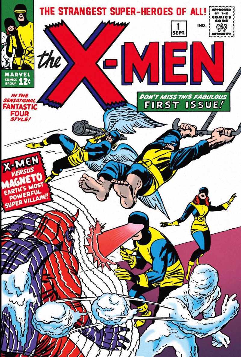
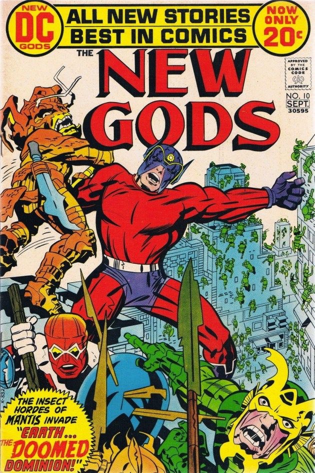
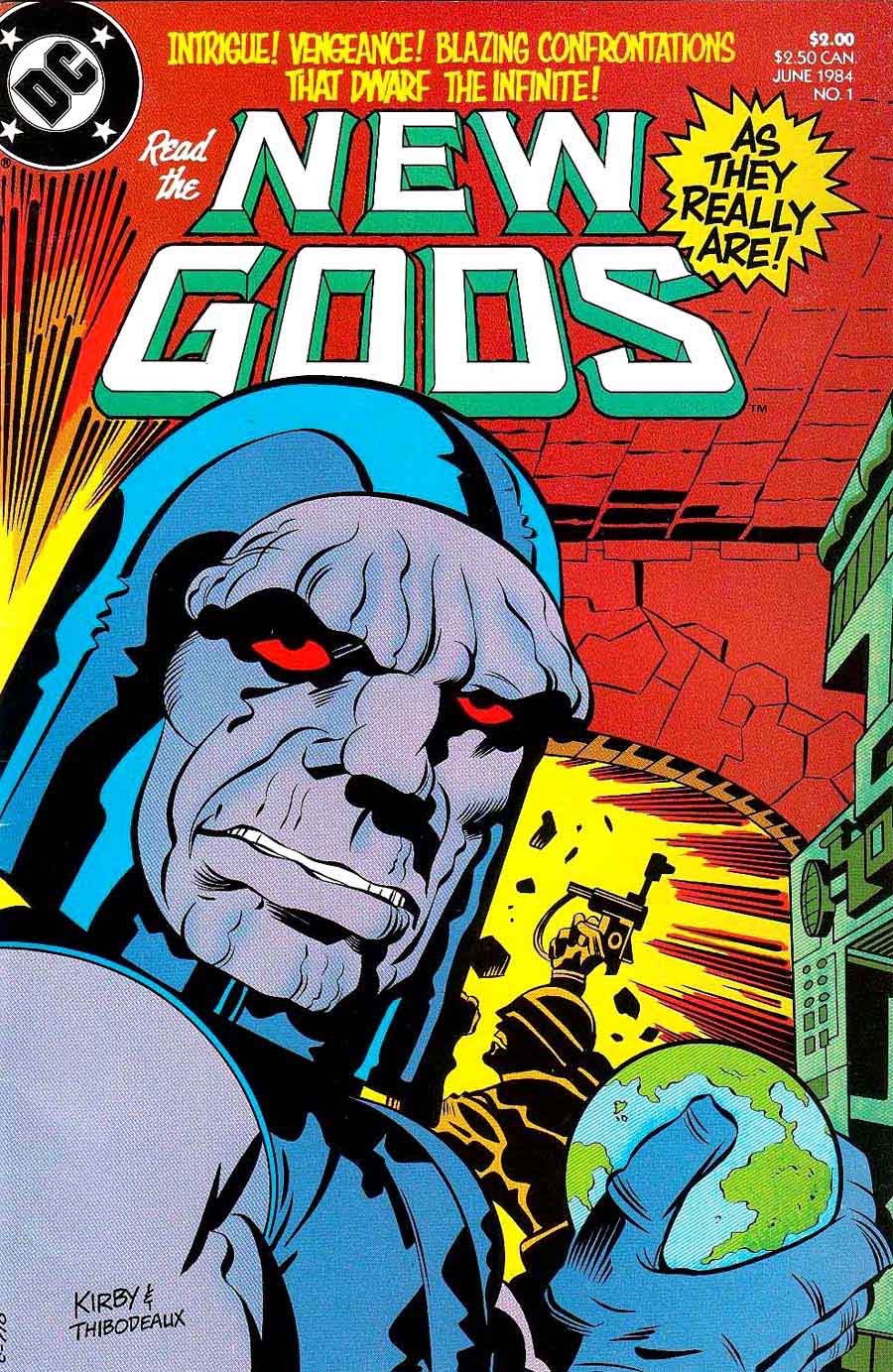
And give me the wonderful original coloring of the X-Men, New Gods and Thor covers any day of the week!
No offence to such talents as Steve Oliff et al, but the comics of Kirby’s era were never drawn with the expectation of finely-graduated colour or glossy paper.
(That said, I *did* enjoy the recoloured reprints of John Byrne’s original ‘Doomsday+1’ back in the day, if only because the pulpy printing of the Charlton series was woeful even by 70s standards.)
Recoloring old comics is not in itself a bad thing. It really depends on the original line art and how you redo the coloring. I agree that the modeled coloring above is pretty heinous. As Charlie Ryan says, part of that is lack of source light/back light, but part of it is also Kirby’s line art. It really does look best in black and white. Most comic art with a lot of weight to it does. The original Odin above looks like a child’s coloring book, and it’s part of why I have a hard time reading Golden Age books. But the modeled one destroys Kirby’s the pencil/ink work and I wouldn’t want to read that version either. I absolutely don’t mind if Marvel or anyone else wants to recolor old comics when reprinting them, but it needs to be done with care and attention. The first volume of recolored Gaiman’s Sandman was an improvement, but Kieth and Dringenberg are a far cry from Kirby. And I thought the giant hardcover of Simonson’s Thor looked mostly pretty good; there were some weird pages and bad choices, but mostly it made Simonson’s line pop more than before, instead of less.
I have so many thoughts on this, but the short version is:
1) I prefer having the original colors available for historical purposes, so we can see how they actually colored back then.
One of Marvel’s biggest art crimes was having the old comics recolored for the early Masterworks in flat limited-palette manner that made them appear to be the original colors, but that were actually wildly different (and much more restrained and *boring*) than the originals. Even worse, early on they actually tried passing these new colors off as vintage — remember those single issue reprints with the silver borders that included the original ads? And yet the colors were nowhere close to authentic.
2) Modeled color can work on artists like Kirby, but it takes someone who knows how to do it right. Many of the early Marvel covers were printed from airbrushed art, the trick is that the airbrush artists weren’t over-modeling.
Likewise, non-modeled isn’t necessarily superior — again, those early Masterworks that were recolored flat with a limited palette were just terrible (and unfortunately, some of those versions are still the ones on Marvel Unlimited. The FF colors are accurate, but the X-Men issues are so beyond terrible I’ve been tempted to do an article comparing different recolorings).
I consider re-color jobs to be disrespectful to the work of the original colorists. If publishers believe a “modern” (re: generally dull) color palette is what people who buy retro collections are looking for then they are mistaken.
It can also produce cut-rate work. I still remember that part of the Conan Dark Horse reprint where a river is colored green like the grassland around it so the art now shows a bridge just sitting in the middle of a field for no reason.
I’m a duffer at this illustration business, but I know that if I’m going to create inked art to be printed in black and white, I’m not going to do it the same as if I know it’s going to be flat-colored, and I’d do it still differently if I knew it was going to be colored-and-modeled. And I think it goes without saying that Kirby (and his cohort) understood this even better than I do. It’s like colorizing a black-and-white movie or 3D-izing a 2D movie: it might look more modern or exciting … but that means you’re changing it into something the original creator didn’t intend and didn’t envision.
Kate, I’d concur that the early Marvel Masterworks were garishly colored, but I wasn’t aware early Marvel covers were “printed from airbrushed art” (and by “early”, I’m assuming you mean the dawn of Marvel in the early 1960’s.) I always though they were colored with Doc Martin watercolors on production stats and the finished product was only used as a guide for mechanical separations.
The only experimenting with tonal work on covers that I know of was what DC’s Jack Adler did in the late 50’s and early 60’s with his tone wash covers. In those instances, the black and white artwork was shaded with ink wash (diluted indian ink) which was then combined with the standard color separations of the day. In other words, a tonal black and white base was overlaid with flat color. This achieved a much more modeled effect than the usual coloring on covers. It was also a bit muddy looking, but interesting and sometimes beautiful in its own way. Most important, the coloring was intended to be like that from the start of the process.
The problem is that the new coloring isn’t trying as hard as Kirby was to be striking and surreal, but rather to do a serviceable job, adding a grounded sense of realism that does not belong. I would enjoy seeing Kirby’s stuff colored in the manner of JH Williams III Kirby Tribute pages from Seven Soldiers number 1. That stuff was insane. Kirby’s own painted work is similar. Kirby’s art should look like it’s on acid, not like the color grade from a modern motion picture.
Well, Marvel has a pretty poor history on this since the 1970s and their lines of reprint books. Compare the depth, shading and tones in the original covers of, say, Tales to Astonish #5 and Tales of Suspense #16 versus their ’70s gaudy reprintings in Where Monsters Dwell #24 and #26. I’m not talking the total recoloring either; I’m talking about the loss of the subtle gradation from the originals that make the reprints look like finished coloring books. Or look at the shading on the Hulk and the Thing on the cover of FF #12 compared to Marvel’s Greatest Comics #29.
Granted, we’re talking about a different cover stock used in the 1960s that Stan Goldberg was working with than the glossier, thinner stock of the 1970s — but the difference in modern recoloring is to my eye about as egregious as those ’70s reprints. They feel more like “jobs” that were done than art.
I liked quite a lot of the recolored Tales of Asgard Kirby stories, although I wished the browns were toned down a little.
I think the issue lies with who is doing the re/coloring. Coloring is truly an art form in to itself and I think it needs someone with a real affinity for Jack’s artwork as well as being a great colorist themselves.
Putting aside my own instincts to stay as true to Kirby’s own color choices, recoloring his, as well as other artists such as Steve Ditko, John Buscema, Jim Steranko, John Romita, and George Tuska would give fresh commercial life to Marvel’s back catalog. As long as they don’t overcharge for the material.
The moder flat color of that Darkseid/New Gods is good, anything more and its ugly. But Kirby’s art is so amazing in black and white, color is practically unnecessary.
The original coloring is so superior that I can’t imagine anyone prefers the modern method.
I bought some of the masterworks(avengers-iron man) and started reading but the colors did not give me the feeling i needed.so I downloaded pdfs of original prints and they are great.fully regret I can not read the originals in book format .Recosntruction is ok like old films etc but recoloring looses all the greatness of the mags and sense of time.
Comments are closed.