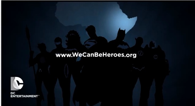
Starting with yesterday’s highly corporate We Can Be Heroes press conference, DC Comics/Entertainment has been rolling out its new logo. It’s seen briefly at the end of the WCBH video—but not in the eagerly awaited animated form, alas.
It’s also now in use on the DC website, as on the Source Blog.
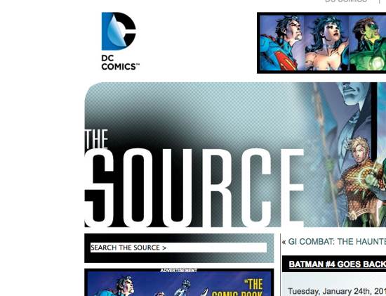
Hm. This logo really does need to jump up and dance around. Otherwise, it tends to be swallowed up by the other elements on the page.


In creating a new logo DC changed the visual shorthand for the company. The old website does not fit with the new logo. I hope they have plans to redesign that soon to keep up pace with the new aesthetic. A pity they didn’t have that ready to go when the logo launched. It feels piecemeal right now.
I’ve been sitting on the fence about DC’s new logo since I first saw it. But you know what? I now LIKE it! And it’s great seeing it in this context and it will be very interesting seeing how it can be altered and adapted for the various superhero groupings. Well done, DC!
I still don’t like the new logo. It looks like no thought went into the design.
Give the design, shouldn’t your headline read “How’s it hanging?”
I’ve been trying to give it a chance, but every time I see it, I think, “C Comics…I wonder who they are?” Then it dawns on me it’s DC. I just never see the D in the logo.
I’m sure in a year or two I’ll be unfazed by the logo, but for now, the logo makes me confused.
I expected it to move. That peel would be peeling from a D to a C. I guess not.
It starts as a D, then changes to a C, in fire, smoke or various other effects. Of course in print, it looks like a peeling poster.
Still looks like crap. So perhaps we should start taking bets on when the company throws in the towel on this one, and creates yet another logo.
Oooh! The sucky logo peels!
Lipstick on a pig.
Wait — they didn’t just go ahead and license David Bowie’s “Heroes?” What is the matter with them?
Al,
You actually talk as if it moves. In the video it was just stagnant as if it was on paper. Where did you see it peeling? I was expecting that but didn’t see it.
Regan, I only imagined how it would look when moving. So far, I haven’t actually seen it in action.
Just another example of how my imagination keeps getting me in trouble :)
You know, I’ve wavered between “it’s not so bad” and “who cares?”, but when it came up at the end of that video… It really doesn’t look like anything at all. It’s just this blot of incomprehensible shapes. I know it’s going for clever and modern, but a logo of all things needs to be like “Wha-boom!” Logo. Instantly recognizable stamp of communication. What they’ve come up with just fails.