
The world has been reborn.
Last week’s release of DC Universe: Rebirth #1 kicked off a new era of storytelling for the publisher. The house that gave us Batman and Superman is looking to make up for the mistakes of the New 52 canonical reboot, reinstating old plot points that were erased from their timeline and even bringing back old versions of classic characters that had been discarded in favor of newer, “edgier” ones.
Rebirth #1 promised us character driven stories filled with more heart than fist. Can they deliver? Each week, Kyle Pinion and Alex Lu will dig into the Rebirth titles kicking off DC Comics’ line overhaul to find out. This is week two of DC Reborn.
Note: the reviews below contain **spoilers**. You’ll find our buy/pass recommendations at the bottom of the article, so if you’re looking for a quick guide before heading out to the store, you’ll find it there!
Previous Reviews:
Week One— BATMAN, GREEN ARROW, SUPERMAN, and GREEN LANTERNS
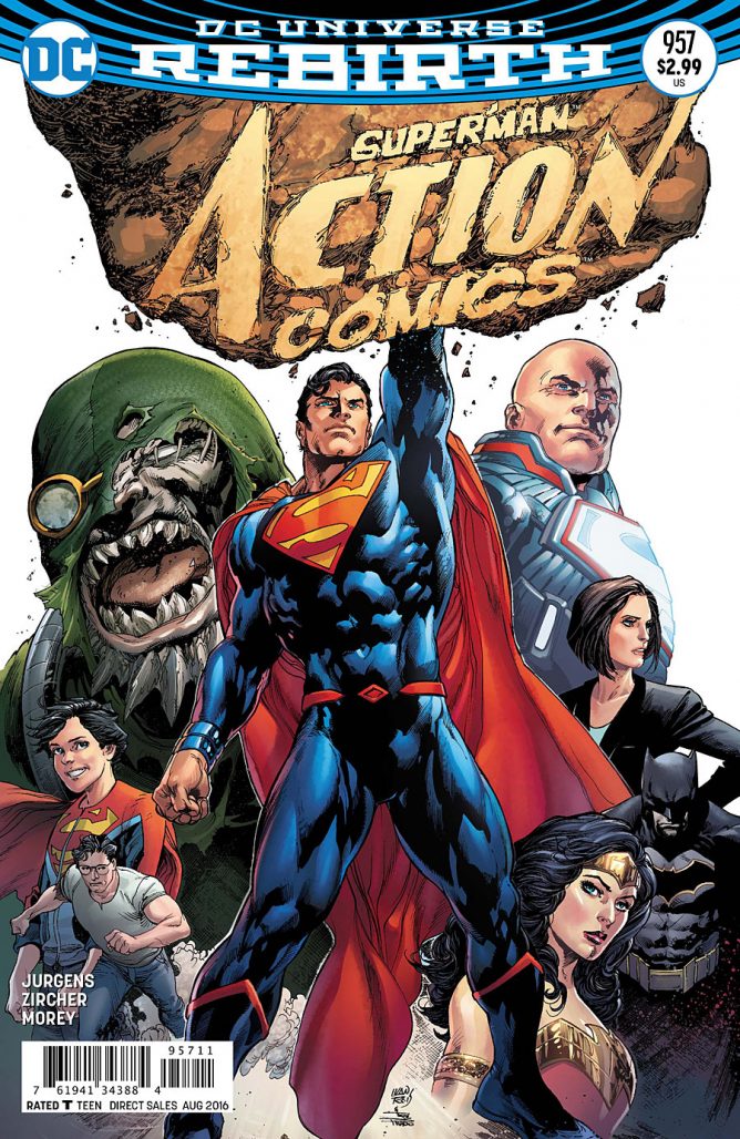
Action Comics #957
Writer: Dan Jurgens Artist: Patrick Zircher
Colorist: Tomeu Morey Letterer: Rob Leigh
Alex Lu: Action Comics #957 is an interesting book in conceit– with the New 52 version of Superman dead, who better to play the role of hero than his archnemesis, Lex Luthor? Unfortunately though, I feel like this book squanders its premise in an attempt to rush towards a new status quo. Writer Dan Jurgens and artist Patrick Zircher present us with a Clark Kent/Superman who is deeply distrustful and suspicious of Luthor because of the dealings he had with his universe’s version of the scientist– so much so that he breaks his vow to stay in hiding with his wife and son in order to stop Luthor even though he hasn’t yet done anything wrong. I don’t mind having classic Superman numbering or classic man of steel stories, but I must say that I feel like Jurgens and company have made Superman act out of character in order to expedite his return to the cape and tights. That’s disappointing considering the narrative ground DC opened by having Lex Luthor become Superman at all.
Even more disappointing though is how little we learn about who any of these characters are as people before they are forced to duke it out. In superhero comics, readers always have an implicit understanding of who classic characters are, but that does not mean storytellers get a pass to skimp out on providing humanizing moments for these larger-than-life characters. Although Jurgens and Zircher expertly show how much power Luthor brings to his newfound role as the Man of Steel, they never give Luthor the opportunity to verbally express or physically show how he feels about finally having everything he wants. To the team’s credit, characters like Superman and his son Jon get more shading, but I feel like if you’re going to put a character like Luthor, who is often reduced to mustache-twirling stereotypes, in the limelight, you should dedicate yourself to it.
Weirdly, I think Action Comics was too loud of a debut. I understand the need for action, especially in a book called Action Comics. However, I think action is only emotionally impactful to the reader when it acts as an external vehicle for internal character development. The motivations for the fights we get in this issue are flimsily laid out in order to expedite the path to the fight. The cliffhanger promises more shows of brute strength in the issues to come.
Before I conclude my thoughts, I do have to mention that Zircher does an incredible job with the artwork on this book. His character designs are lively and expertly rendered. Jon really looks like a kid, which is commendable given how often kids in comics look like adults with tiny bodies. The splash that reveals Lex Luthor is one of my favorites in recent memory. Action scenes have copious amounts of energy that make you marvel in your chair. You really have to soak it in.
Ultimately though, I’m not impressed by Action Comics #957 because I feel like it epitomizes the problem that many New 52 books had– a love for explosions that bloom outward and leave no room for internal soul searching. Perhaps you think differently though, Kyle?
Kyle Pinion: I do! I really do. This is a legitimately very fun comic from jump. I do have to admit that I have a strong fondness for the old triangle numbered Superman era, which were the comics I grew up on and the first ones I ever actively collected, and Jurgens was one of those main ringleaders, so I have a lot of positive baggage coming into this before I even crack open the cover. But given my complaints about last week’s Superman: Rebirth, which literally did nothing but recap pointlessly to no one, this felt like a breath of fresh air. Things actually happen in it, and happen real fast!
I can’t express how much I perked up with Jurgens and Zircher completely abandoning the “Superman in hiding concept” right away. It doesn’t work as engaging drama, and we knew this Superman was eventually going to step out in the limelight anyway, so why not just get on with it? I bemoan decompression in comics in general, so as ungraceful as the transition may have been, I saw it as pulling the band-aid off and making with the story I’ve been wanting to read since the WonderCon announcements.
The rest of the issue just read like Jurgens in his element, an indignant Luthor vs. a self-righteous Superman with Jimmy and Lois looking on in the background is the kind of meat and potatoes Superman I want, and it was tremendous getting to see that Jurgens still has a strong voice for Luthor even after all these years (I’m assuming he hasn’t written him since he left regular writing duties on the title, though my knowledge on any shorter returns is touch and go at best). Sure, some of the dialogue is a little corny or stiff, but this is Superman, when is he and the world he inhabits, not a little corny? I also haven’t even talked about Zircher specifically yet, but what a great compliment to Jurgens. If I can’t get his pencils, I want something that equally as clean and vivid to feast my eyes on and Zircher fits that mark perfectly. I was particularly fond of those same action beats you bemoan.
I’m enjoying the conflict between two “new” Supermen, it sets up a mystery regarding this other Clark Kent that I’m curious about the resolution to, and that silly looking Mr. Oz shows up too. I could have lived without Doomsday, given that we just came off a way too long and not that interesting Doomsday crossover two years ago, but I’m guessing his role is to be the bigger enemy that Clark and Lex have to set things aside for, and likely will give you a chance for more of the empowered Lex moments you’re looking for.
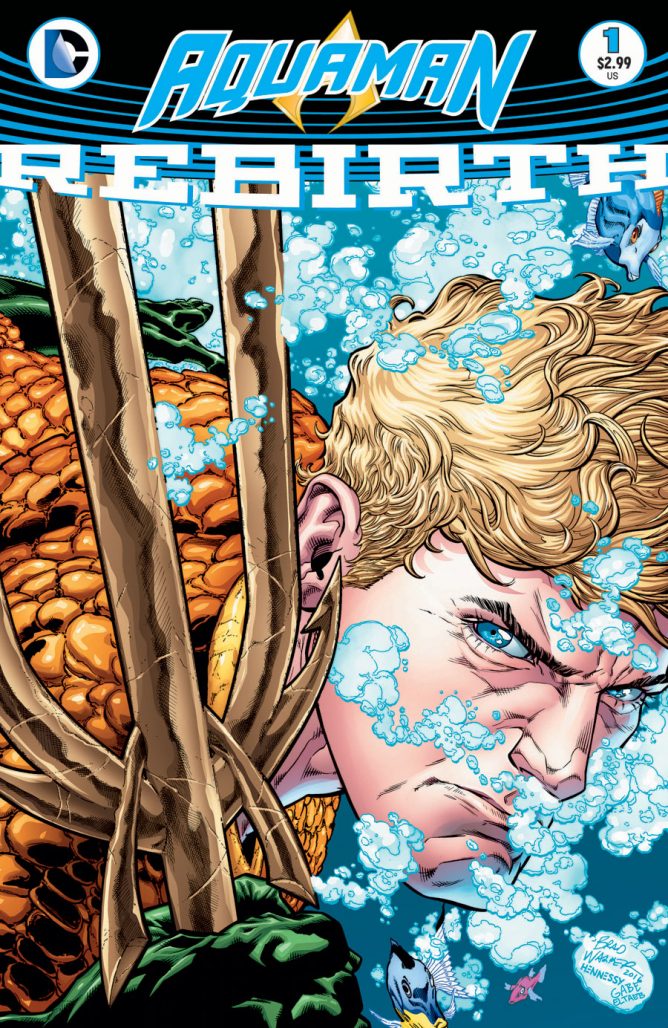
Aquaman: Rebirth #1
Writers: Dan Abnett Pencilers: Scot Eaton & Oscar Jimenez
Inkers: Mark Morales & Oscar Jimenez Colorist: Gabe Eltaeb Letterer: Pat Brosseau
Kyle Pinion: It must be unbelievably difficult to write a good Aquaman story. I think in my time reading the character, and I’ve absorbed quite a few runs, I’ve found that I’ve only ever glommed onto the character when Kurt Busiek and Butch Guice were taking him to the next logical Conan-inspired extreme, a few steps further than Peter David went in that direction. Since then, DC has tried to split the difference between “nicer version of Namor” and the meta-textual “hero that land-dwellers make fun of”. Dan Abnett continues that trend here in an issue that doesn’t really tell all that different a story than the one Geoff Johns told in his first issue: “it’s a tough job being Aquaman, and there’s unrest in Atlantis, but he likes eating in this diner”. That’s basically the gist of the issue, it’s well-written and competently drawn, though in a tremendously boring fashion, but it doesn’t necessarily do anything wrong, per se.
But when you don’t do anything new with a character that’s already going to have a tough time drawing eyes, it’s hard to see what makes this take so essential to read when you have an entire line relaunching and competing for reader dollars. Oh boy! It’s Black Manta again! And he’s mad about Aquaman killing his dad! If that didn’t grab readers months ago when Johns was writing it, I’m not sure how much will change here. Again, that’s not to say I didn’t find something to gravitate towards; the elegant narration lent itself an almost mythic vibe to the struggle that Arthur faces daily in his attempt at being a man of two worlds, and I was quite fond of the near Kirby-esque dialogue that bounced between Arthur and the The Deluge, with everything being so forcefully exclaimed.
But, I think it’s the art where the majority of this story falls short. I think in the comics community, there remains a pretty strong focus on what the writer brings to the table and an artist’s contributions too often get the short shrift. I think, much like last week’s Green Lanterns, my enjoyment of the story varied dependent upon who was bringing it to life on the page. While Jimenez doesn’t exactly get a lot to work with, penciling only the opening and conclusion, his work is vivid and I think, maybe more fitting to the material than Scott Eaton’s, who makes up the majority of the issue. Eaton’s pencils and layouts are competent, but as I read through those sequences, I had a difficult time focusing as there was little for me to draw my eye towards. And then, when Jimenez popped back up, I was instantly re-engaged. I don’t want to put the blame solely on Eaton, but I think sometimes good art can elevate okay writing, but combine bone-average takes in both, and everything will suffer. I’m still hopeful for Brad Walker’s debut on the character though, and hope that’ll make some Atlantean magic. What did you think of Abnett’s relaunch of the character?
Alex Lu: In a strangely coincident chain of events, I’ve had a lot of Aquaman stories fall into my lap recently. I’ve personally never felt deeply connected to the character, though I also feel like he takes more flack for his powerset and personality than he deserves. There are writers who can tell a good Aquaman story– Geoff Johns, for example. However, telling that emotionally impactful story is a tricky feet, and unfortunately Dan Abnett, Scot Eaton, and Oscar Jimenez fail to pull it off in Aquaman: Rebirth #1.
First off, I should say that I found certain elements of this book very impressive. Jimenez opens the book on a huge school of fish that dominate the entire first page. They’re beautifully depicted and each of them, as far as I can tell, is completely unique. In the era of copy-paste, drawing so many fish for the sake of an establishing shot is an admirable feat and worthwhile, as it draws the reader in and builds a decent amount of good will for the story to come. The members of The Deluge, a terrorist organization that Aquaman fights in this issue, have creative character designs that remind me a bit of the New Gods. Their bulky costumes and giant sea monster mounts as rendered by Eaton add a great deal of livelihood to the proceedings.
Unfortunately, despite all the positive artistic elements Eaton and Jimenez bring to Aquaman Rebirth: #1, the story fails to hold up its side of the weight. The entire issue is bogged down by narration that explains Aquaman’s character, motivations, and struggles in granular detail. Over the course of an extended fight with The Deluge that takes up most of the issue, we learn that Aquaman is a monarch who is overwhelmed by the magnitude of his dominion, even though he doesn’t always realize it. We’re told that some of his subjects, The Deluge included, hate him for his love of the land. We are carefully reminded by the narrator that Aquaman is considered by many to be a joke, but those who laugh at him misunderstand him– he does not talk to fish because fish don’t “possess enough intelligence to conduct meaningful dialogue.” Do you, dear reader, see the pattern yet? Aquaman Rebirth: #1 flagrantly breaks the number one rule of storytelling: show, don’t tell. Perhaps Abnett thought this information would be useful to fill in brand new readers. While that may be true, an informational background packet does not make for a compelling story. It falls to the conflict between Aquaman and The Deluge to drive the momentum of the book, and while their fight scenes are well-rendered, our investment in the characters is not high enough to make any of it feel meaningful. Plus, the narration that clarifies Aquaman’s powerset and makes note of his status as a “joke” in the public eye takes the reader out of the story even more, as it is a meta-critique that reads like Abnett trying to nurse the chip on his shoulder and shame the reader for ever thinking poorly of the king of the high seas. I don’t think Aquaman is a joke, but I wish writers would stop thinking I did.
The most successful story beat of the issue comes at the end when Aquaman and Mera dine at a restaurant. In a callback to a locale featured in Johns’ Aquaman run, we see Aquaman ordering up a seafood meal with his new queen Mera by his side. Their relationship is the heart of the book and leads to a very human moment that causes the reader to emphasize more with them in four pages than we did with Aquaman alone in the previous eleven. I’m not sold on Mera’s primary motivation being her love for Arthur, as it seems socially regressive. Still, it’s better than what we get for most the issue. Moreover, it’s frustrating that the moment comes so late in the story, as I feel like the fight scene would have been more impactful if the reader had had a better sense of their bond going into the battle.
Given the cliffhanger at the end of this issue, we clearly know where things are headed in Aquaman in the months to come. That said, I’m not convinced that this is a ride worth taking. Based upon the last scene of the story, I believe that Abnett is capable of crafting a more interesting character-driven narrative, but the balance is all wrong here. Too much narration, not enough dialogue. Lots of action, but little of it meaningful to character development. It’s a similar problem to the one I think Action Comics #957 has, but in an even more pronounced way given the relative obscurity of all the characters in this book. I think there is more salvageable material here than there was in Action, but it remains to be seen whether the creative team can make something of it.
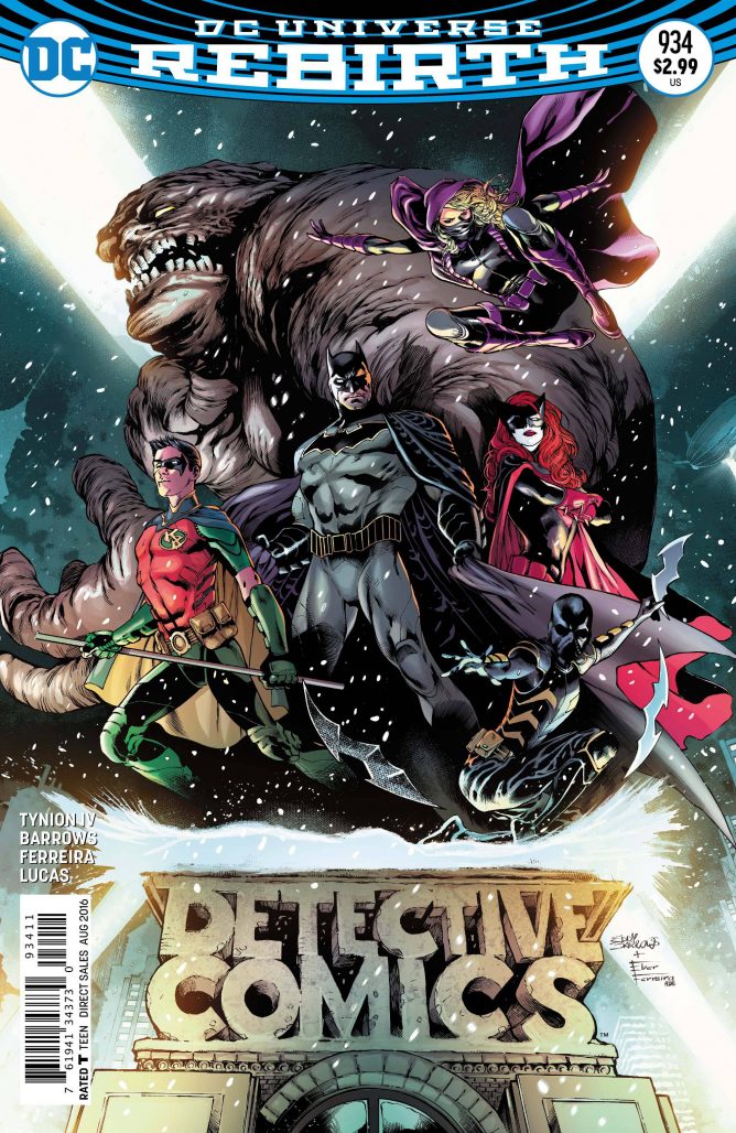
Detective Comics #934
Writer: James Tynion IV Artist: Eddy Barrows
Inks: Eber Ferreira Colors: Adriano Lucas Letters: Marilyn Patrizio
Alex Lu: What do you get when you mash together the team-up elements of Batman Incorporated, strip away the Morrisonian quirks, and replace them with the more action-driven sensibility of Batman Eternal? Why, you get James Tynion IV’s and Eddy Barrows’ take on Detective Comics, of course!
Detective Comics is a book that has always struggled to find an identity. Despite being Batman’s debut title, it has been living in the shadow the eponymously named Batman series for years. During the New 52, Detective Comics was the home of smaller stories featuring quirkier villains while Batman was reserved for major events where the Dark Knight faced off against heavy hitters. The plan didn’t work out as expected, so they’ve totally discarded it here to their eternal favor.
Detective Comics #934 is a legitimately great comic because it isn’t afraid to be huge. The story opens on Batman standing over the beaten body of Azrael. When the Dark Knight asks Azrael who hurt him, the crusader responds that Batman did it. Not only is an impostor out for blood, but Batman also discovers he and everyone in his circle are being watched by cameras of an unknown origin. He senses something big is coming so he goes to Kate Kane, aka Batwoman, for help. Together, they recruit other members of the Bat Family including Spoiler, Red Robin, and even Clayface so that they can prepare for what’s coming. There is a ton of momentum here that persists all the way through the climax, making this the perfect issue for a new reader to pick up.
The energetic pace and sense of fun present throughout the story is matched by Barrows’ artwork in the comic. His artwork is crisp and dynamic. He experiments with intricate layouts that feature irregular panel shape but isn’t afraid to narrow in and create highly structured pages when it feels necessary. I’m not totally in love with a couple of pages, particularly one splash where Batman looks like he’s squatting in the air rather than flying through a window. However, the quality of the figure work is high enough overall that a few slip ups are easy to forgive.
Barrows’ pencils are further enhanced by Adriano Lucas’ colors, which are quite a standout feature of Detective Comics #934. The style he employs here has a restrained painterly feel to it. Highlights and shadows are heavily emphasized, reflecting the dramatic and often somber tone of the book. Every page has a sense of gravitas to it that sucks the reader in and leaves them wanting more.
This is definitely one of the best books to come out of the Rebirth lineup thus far, even beating out Batman: Rebirth #1 in overall effectiveness. Not only did we get a strong sense of characters and motivations, but we also got a clear sense of where the story is heading. Grand conflict is in the new Batman Incorporated’s future, and we should all be excited for the ride.
Kyle Pinion: Calling this “great” seems like a stretch, I think it’s fine, with some promise peeking through in the case it’s making use of. To me, this reads like the exact same sort of story Tynion was writing with Batman Eternal or Batman and Robin Eternal. Some mysterious bad guy is striking out against the Bat family and now they have to band together in order to take him down and save Gotham in the process. It’s at least approaching the idea with a little more fun in the mix, rather than the grimmest/darkest slog that was the original Eternal weekly, but it still just kinda falls into the old standard recruitment dialogue trope and storytelling style. It’s also just an idea that feels so tired on its face, and frankly, if you’re gonna come knocking on Morrison’s door here, you better come with something worthwhile. Tynion doesn’t really do anything here that has me wanting to dip in for more, other than pulling on my memories of the Tim/Stephanie relationship from years before and finally setting up the cousin dynamic between Batman and Batwoman. Putting Batwoman back in the lead of a book, particularly the comic where she was at her most successful creatively, is a good move at least.
There’s also some dialogue here that I’m surprised didn’t get a second pass, for example: “he’ll be operating as your lieutenant for this operation” or just the general sense of some of it being really overwritten. Everytime I see gigantic speech balloons in a superhero comic, I’m reminded how Ed Brubaker bemoans just how wordy his earlier work was, and how you can always find a way to do more with less. Also Alex, you complain about Aquaman: Rebirth being “all tell and no show”, but I think this issue falls into a lot of the same trap, with characters relaying backgrounds in the most long-winded way possible. I found it exhausting to read, and while I appreciate the idea that Batman cares about the people closest to him, and is even willing to extend a hand out to a former nemesis, I just came away with a general “so what?” feeling about the issue. But maybe I’m just fatigued of the mysterious villain/organization premise that’s been running in the background of the franchise since Morrison took over. He pulled that trick, and then Snyder did it a number of times, and now Tynion is doing it. The fact that said villain puts me in mind of The Arkham Knight, from the most recent (not very good) Batman video game, doesn’t help much either
Barrows does solid work throughout though, I agree. I think he’s a much better fit here in Batman’s environs than he was with Martian Manhunter.
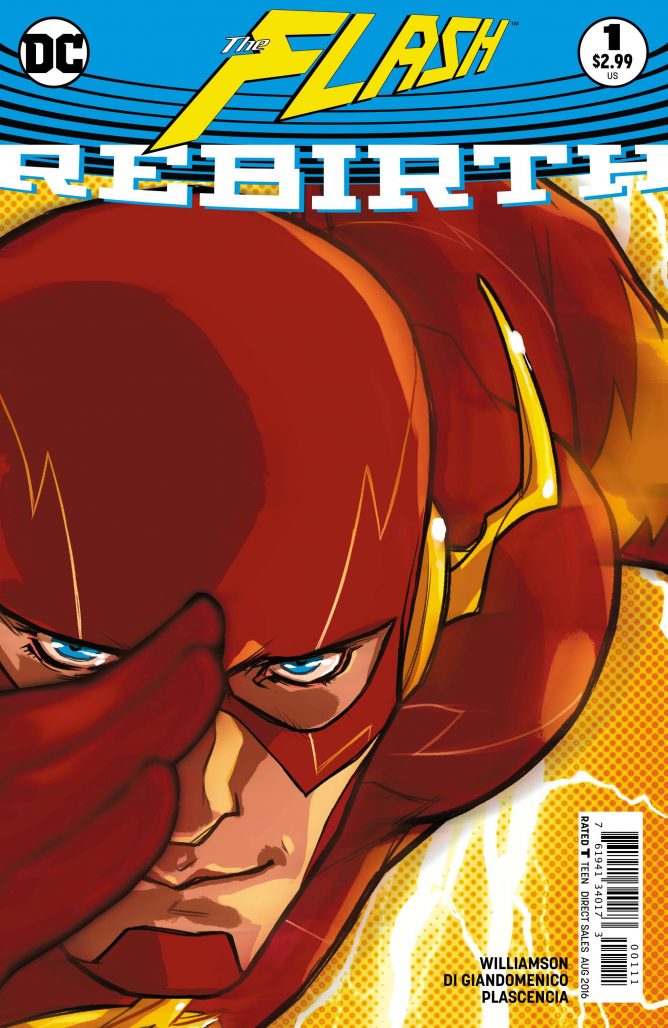
Flash: Rebirth #1
Writer: Joshua Williamson Artist: Carmine di Giandomenico
Colors: Ivan Plascencia Letters: Steve Wands
Kyle Pinion: I had many a confused feeling with Williamson’s big Flash debut. While I think it’s a good sight better than last week’s Superman: Rebirth #1, it seems equally unsure who its audience should be. There’s large parts of it that reads just like The CW television series, and aims to be about as approachable for newcomers as can be – including a recap of Barry’s origin and a constant reminder of Barry’s poor dead mom. On the other hand, it tries to be a sequel to Rebirth as well, even going so far as to literally retell the most effective moment of that comic with not enough context for that same new audience to have a real sense of the gravity of what’s happening. Basically you needed to read the Rebirth 80-pager to have any idea what was happening in the back-half of this issue.
Luckily for me I did, so I was mostly okay with that detour, but it was a weirdly “up its ass” moment for a book that assumes its audience needs catching up. Regardless, I can’t say the book didn’t interest me. I was into whatever mystery is building around Barry’s visions, I was engaged in Barry and Wally yet again, and I very much wanted to see what kind of Watchmen follow-up we were getting as well. Despite any structural qualms I might have had, it’s an enjoyable enough start for Williamson, and I’m certainly on-board for what comes next in his actual first issue. Having Carmine di Giandomenico doing some of the best linework of these Rebirth titles, right there with Otto Schmidt, was also a huge boon. When I read a Flash comic, I want an artist that can portray that sort of krackling energy right that befits the character, and I think di Giandomenico is a suitable follow-up to Francis Manapul’s career-best turn when the New 52 volume initially launched. I know you had some strong thoughts about this new addition to the line, Alex.
Alex Lu: When I go into books like Flash: Rebirth #1, I want them to succeed based on art alone. DC books’ adherence to the house style is incredibly grating, as it limits the kind of stories they can tell. A book like this one, which features stunningly different art from Carmine di Giandomenico, is something I wish DC Comics had more of. From what we’ve seen of the DC Rebirth initiative, things are improving, but we aren’t even close to having as diverse of a visual look at DC as we do at Image or even Marvel. Thus, I feel the need to cling to Flash: Rebirth #1, even though I don’t think it is a very good book.
This isn’t Giandomenico’s fault. The Italian illustrator’s artistic style is unlike almost anything in the American comics market today, but feels right at home in the DC Universe. His work in this issue reminds me a bit of Mike Allred’s thanks to the heavy black outlines he employs. His layouts never approach the experimental playfulness of those featured in Francis Manapul’s Flash run, but they are serviceable and allow the reader to focus on the dynamic figure work featured in every scene. If his art has any faults, its that the heavy structure and linework Giandomenico places into faces makes them more difficult to effectively convey emotions– something that hurts the issue at points. Ultimately though, I found a lot to love in the art of Flash: Rebirth #1.
Where this book fails for me is in its story. This book is basically DC Universe Rebirth #2, which is not exactly what I signed up for when I decided to read a Flash book. Indeed, Barry plays a focal role in Rebirth, but in this book his role in those events is not advanced as much as it is rehashed. Three pages of the book are dedicated to recapping the big return we see in Rebirth #1, not to mention the pages we spend summarizing the events of Flashpoint that led to the New 52 and eventually to this moment. We get to see some nice moments where Barry interacts with his fellow police officers, his father, and shows up a day early to a night out with Iris, but we spend a disproportionate amount of time building back up to the end of a story we’ve already read. These narrated rehashes kill the momentum of the book up until the end, where we get some marginal advancement on the Watchmen cliffhanger from Rebirth #1.
I’m not sure how heavily Flash plans to explore the Watchmen storyline as it moves forward. The Flash is often used as the catalyst for major DCU events, so I wouldn’t be surprised if his book were the one to carry this plot forward to its inevitable event-based conclusion, but I can’t help but wish this book had more of its own identity. The Flash is one of the most visually innovative and most humanizing characters DC has in its arsenal. Giandomenico certainly takes advantage of the visual playfulness The Flash allows for and Williamson’s script provides some solid emotional beats for the character and his loved ones. I just hope they’re allowed to keep exploring this on a smaller scale that doesn’t get overwhelmed by the multiversal war that appears to be on the horizon.
As for this prologue? I’d say it’s a decent jumping on point for new readers, especially for those who have not read Rebirth #1 but want a quick recap of its events. That said, if you’re looking for more than just the opening scene to a story, you’re pretty much out of luck here.
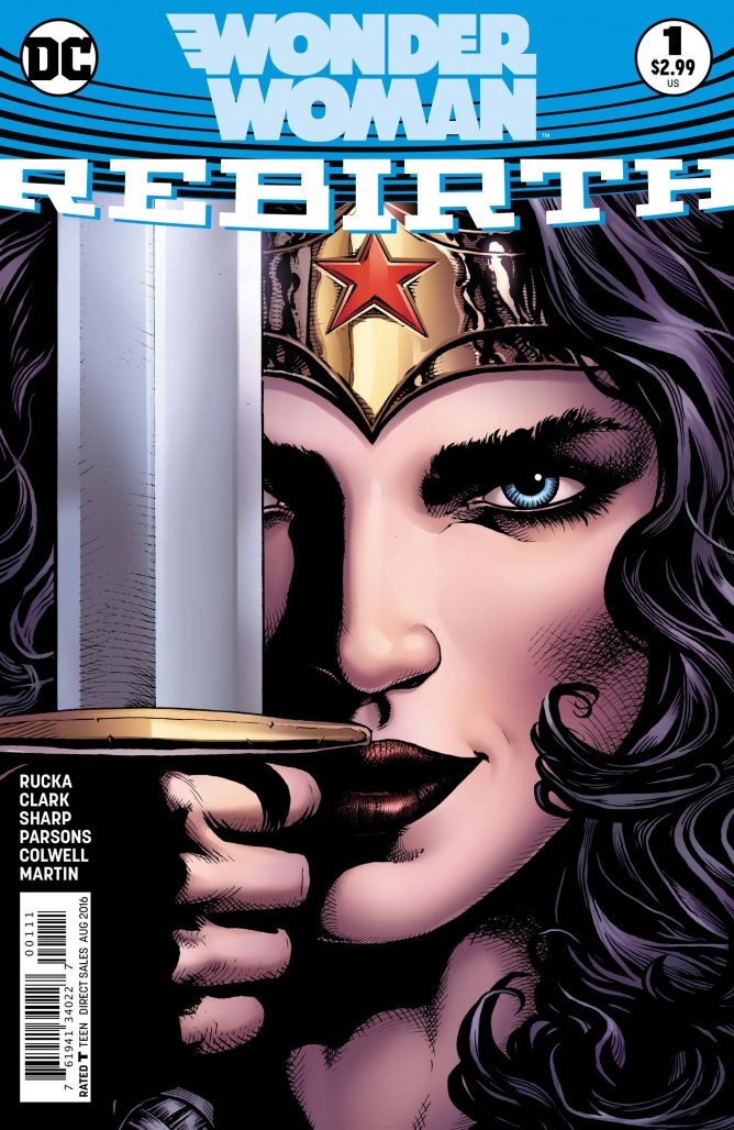
Wonder Woman: Rebirth #1
Writers: Greg Rucka Artists: Matthew Clark & Liam Sharp
Colorists: Jeremy Colwell & Laura Martin Letters: Jodi Wynne
Alex Lu: One of the more puzzling elements of the DC Rebirth initiative is the inconsistent weight it places on the broken continuity of the New 52 DC Universe. While Rebirth has clearly been built to attract lapsed readers who fell out of love with DC rather than new readers totally unfamiliar with the universe’s heroes beyond vague tropes and platitudes, the fact remains that in their heart of hearts, DC hopes brand new comics readers will fall in love with their books. The New 52 is seen by many as a failure on both fronts that DC would like to forget, but rather than moving the strange sidewinding timeline into the background and telling simpler and more accessible stories, many of these new books have made the fragmented history into a central conceit. Wonder Woman: Rebirth #1, written by Greg Rucka and illustrated by Matthew Clark and Liam Sharp, is one of these books.
Rucka is no stranger to the character of Wonder Woman, aka Diana Prince. From 2003-2006, he wrote a well-regarded run on the character and it’s clear that in the decade since, his familiarity with the princess of the Amazons has not faded. The central conflict of the story focuses on Diana discovering her history has been damaged. Was she fashioned out of clay or from a tryst between her mother and Zeus? Does she have a brother? Was she loved or scorned by her Amazonian sisters? All these things are or were true at some point in Diana’s history, but as Diana narrates in this issue, “the first casualty of war is truth.” The labyrinth of DC’s continuity is Diana’s foe, and she aims to shatter it. It’s a powerful conceit that lands well emotionally and is surprisingly clear, especially when compared to the strange mess produced by having two supermen in the Rebirth.
Both Matthew Clark and Liam Sharp produce fascinating art for Wonder Woman Rebirth: #1. Clark’s style is very much akin to David Finch’s take on Wonder Woman, for better or worse, but Clark’s take on Wonder Woman’s build is far more true to the spirit of the character. Unlike Finch’s Wonder Woman, who was presented as strong but lithe, body has a great deal of musculature that better reflects her training and makes her actions more believable. Sharp’s take on the character reminds me a bit more of Yanick Paquette’s. Sharp keeps the musculature Clark provides Diana but uses heavier shadows and blacks to add more gravitas to the page. This contrast is further enhanced by the colorists Jeremy Colwell and Laura Martin. Colwell takes a pop art approach to the pages, filling them with bright neon lights and limited values of shading. Martin, on the other hand, douses the pages in shades of color, evoking the drama and power of renaissance paintings. It’s a stark and effective transition that reflects Diana’s transformed state of mind.
While I would love to see Clark produce more work for this series, he is only solicited for this special. In an interesting twist, Rucka will be writing two series under the Wonder Woman banner at once. Wonder Woman: The Lies will be drawn by Sharp and looks to be the direct continuation of what we’re presented with in Wonder Woman: Rebirth #1. Wonder Woman: Year One will be drawn by Birds of Prey artist Nicola Scott. It’s a bold move to run these series concurrently, but based upon what we’ve seen here it looks like the creative team is up to it. While I’m not convinced that Wonder Woman: Rebirth #1 is the most accessible Rebirth book we’ve seen, I do think it has the most offer overall. What do you say, Kyle?
Kyle Pinion: For my part, I’m intrigued, but there’s not a lot of actual meat on this bone for me to really have a solid read about what Rucka’s run is going to be all about. It reminds me a bit of Batman: Rebirth, in that just as the action really gets going, the comic ends. It’s funny to me that the two most promising runs of this relaunched line were handled that way in these introductory issues, but perhaps DC figures these two will sell themselves easily enough and the hook doesn’t have to set in right away.
This perhaps may sound odd, but while I’m confident that Rucka, talented writer that he is, will have a satisfying answer regarding Diana’s background mysteries and the lies that’s she come to believe about her past, one can’t help but feel a little put off by the potential of walking back some of what Brian Azzarello and Cliff Chiang established when the title was relaunched in 2011. Much like Grant Morrison and Rags Morales’ new take on Superman, the Azzarello and Chiang run was the other part of the New 52 relaunch that actively felt “new”, not always perfect, but different and for a genre of comics that often remains static and is so careful to put the toys back where they found them, I appreciated the willingness to toss aside a traditional take on the character (up until the Superman kissing started, but neither of those creative teams were to blame for that). I recognize some of those changes rubbed some readers the wrong way, and I fully respect their reasoning, but I’m hoping Rucka’s aim isn’t to throw everything out that was established before just to restore the status quo. Some kind of happy medium that pleases both readerships would be the ideal if possible…but I’m projecting too far before he can even tell his story, and I think I should allow him to do that before I judge anymore about what he may or may not do.
Getting back to the issue, it’s well narrated, and I was big fan of the internal approach with no actual dialogue beyond Diana’s self-reflection, up until she ventures into Olympus. The “maybe this is true… or this… or this” was a fun device to implement. The hand-off between Clark and Sharp was also done in a very clever place, with Sharp taking over just as Diana switches out of her New 52 costume and into her Rebirth/movie inspired garb, denoting the new era and new look appropriately. Also, props to Laura Martin’s coloring, as Alex noted, as that otherworldly pinkish-orange makes for a very striking approach to Olympus.
It’s all preamble really, so there’s not much else I can add that you haven’t already contributed Alex. I liked it, I’m hopeful that this will be an enjoyable epic, and I’m glad a writer of Rucka’s caliber is on the title.
Final Thoughts
Kyle: I think this was largely a more exciting week than last, maybe because I finally had a Superman comic I could get excited about again, and combined with solid starts for Flash and Wonder Woman, that gives Week 2 an edge over last week, as much as I enjoyed Green Arrow and Batman. By and large, I think most of these Rebirth issues proper have been a tad too prologue-esque, but the fact that I’m still interested in hoping on board the first issue of just about everything means they did their job well enough. With next week’s set of #1’s, we’ll see if some of the actual arcs kick into higher gear or not. Here’s hoping!
Alex: I agree that this was definitely a more interesting week of releases than the last! Our opinions on certain titles have started to diverge, but I think that’s a good thing because it means that certain books are appealing to different axes of readers. There are still some obvious clunkers, but books like Detective Comics and Action Comics have merits that please some readers more than others, and the ultimate result of this is that we have a greater sum total of happy DC Comics fans.
Indeed, most of these books are more prologue than plot. That’s a little frustrating to longer-term fans like me, but is more friendly to people buying stories featuring these classic characters for the first time. Plus, since many of these series will be bi-weekly, we won’t have to wait long to get to the meat of DC Rebirth. In fact, as you mentioned, Kyle, several proper #1s are coming out next week! ALL ABOARD THE TOM KING BATMAN HYPE TRAIN!
Buy/Pass
Kyle:
Buy: Action Comics, Flash: Rebirth, Wonder Woman: Rebirth
Pass: Aquaman: Rebirth, Detective Comics
Alex:
Buy: Detective Comics, Wonder Woman: Rebirth
Browse: Flash: Rebirth
Pass: Action Comics, Aquaman: Rebirth


Imagine that, corporate-owned superhero garbage is largely the same as it ever was. Will fanboys ever learn?
Well, given the plummeting sales, maybe they finally have.
Alex,
Not being snarky at all but can you explain what you mean by “house style”? Personally, I believe that comics from the Big 2 should have a somewhat consistent look ( if we’re on the same page with the term). Not a cookie cutter approach where everyone is drawing like Jim Lee but I grew up with Byrne on the X-Men while Perez was on the Avengers, Starlin, the Buscemas, etc… Using current artists, I prefer a Fabok or a Pelletier to be on DC books rather than the sketchier, cartoonier artists that I prefer on indie books or a book like Gotham Academy.
based on feedback from our customers, they are off to a very good start, each title had over 100 people adding the comics (all 5) to their reserve/hold. same performance as last week, DC is on to something here. these comics are getting a much stronger “word on the street” then the last batch of Marvel Now titles
“I prefer a Fabok or a Pelletier to be on DC books rather than the sketchier, cartoonier artists that I prefer on indie books or a book like Gotham Academy.”
Not every title has to appeal to your very limited, shallow tastes. But looking at DC’s poor output, that’s what they’re going for now.
Easy there, Brave Keyboard Warrior….
Hi Shawn,
I think we have the same understanding of the term “house style”– a look that, while not necessarily 100% homogeneous, has a large number of consistent features across all titles. May I ask why you prefer this look?
Personally, I dislike the idea that a large publishing company could ever have a house style because it leads to creative stagnancy across a large line. You can have stores that only sell bone broth or one kind of artisanal bagel because they’re small boutique outlets that target a small corner of the market. A company like DC or Marvel, who wants to and does capture the largest market share among comics publishers, is not a boutique brand. Paradoxically though, in DC’s case, they target the audience for house style books as though it’s the totality of the market rather than just one niche in a greater whole. Their strategy is what MacMillan’s would be like if they only published horror novels or Simon and Schuster acted like they were Harlequin.
I believe that the art style of a comic dictates its tone. I also believe that superheroes are not just a vehicle for action stories, but can be used to tell a variety of tales. Having a house style limits that possibility because personally, I don’t think a romance book with Jim Lee on art would fare as well as something drawn by Joelle Jones. Large publishers like DC and Marvel should and finally are diversifying their visual lineups to accommodate the fact that they are, in fact, large publishers with a wide variety of audience members who want to read different things.
We’re probably not too far apart in thinking, we may just be viewing it from opposite preferences. I like a house look probably because that is the way my brain is wired for superhero comics. Like I previously wrote, I was raised on John Byrne, George Perez, Frank Miller, John Buscema, Sal Buscema, John Romita Jr., and others who were popular (and doing regular work) from the late 70’s through the 80’s. Just using Marvel as an example, Peter Parker looked like Peter Parker in not only the Spider-Man titles, but also when he guest starred in other books. Depending on the artist, he can look different in his own book these days. For a while, Captain America’s costume looked different from book to book. Of course these are just personal preferences (which I’ve heard are “shallow and limited” lol) but they take me out of the story. I agree that the tone of a book is dictated by the art, I think that Neal Adams would me a bad fit on Invincible just as I agree Jim Lee wouldn’t be a good choice for a romance comic. And preferences change, as a kid I HATED Bill Sienkiewicz on the New Mutants but now I look at those issues and love them.
I appreciate your opinion and your willingness to have these conversations in the comments section helps make this sites one of the great ones.
I’m just glad to see The Flash drawn by someone named Carmine again!
Comments are closed.