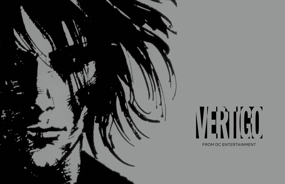
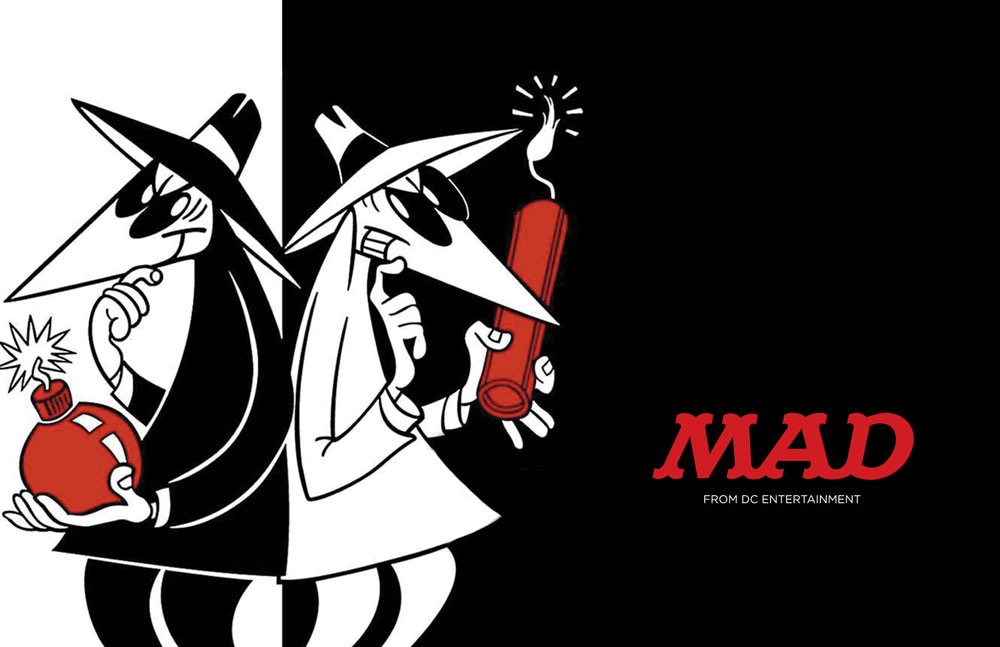
And here’s the official word and examples of treatment. Looks like the Vertigo and MAD logos have been adjusted to include the Gotham-lettered branding for now.
Now that we can see the actual treatment, it’s clearer how “the Peel” works as a symbol as opposed to a readable name—so even with the peel, the lettered DC Comics part is included. On that basis alone the peel works a lot better.
Ultimately what all this says is how design has expanded to include so many other elements of branding. A logo has to open a movie, represent an app, start a video game and not just sit there and look amazing on the page. You don’t get any better than Milton Glaser, the designer of the Bullet logo and a legend of design…but his approach doesn’t work for current media, either.
So…moving on! How about that WATCHMEN 2 logo?
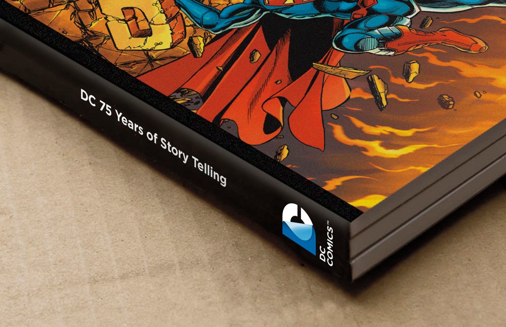
All that said, this spine treatment does have an incredibly 80s physics textbook feel to us.
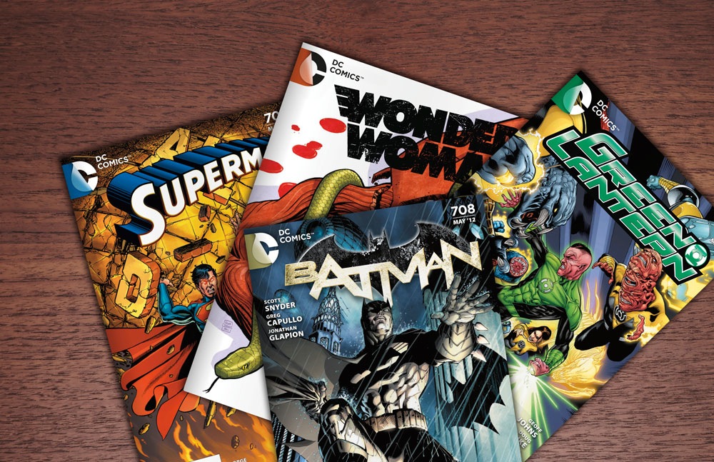
DC Entertainment, a Warner Bros. Entertainment company and home to iconic brands DC Comics, Vertigo and MAD, revealed today a new brand identity. The new identity is reflective of the company’s mission to fully realize the value of a rich portfolio of brands, stories and characters, distinguished by incredible breadth and depth across publishing, media and merchandise. A new logo for DC Comics was also introduced, closely aligning with DC Entertainment’s new mark.
“It’s a new era at DC Entertainment and the new look reflects a dynamic, bold approach while at the same time celebrates the company’s rich heritage and robust portfolio of characters,” stated John Rood, EVP of Sales, Marketing and Business Development for DC Entertainment. “It was just a few months ago that Superman, Batman and many of our other Super Heroes were updated when we launched DC Comics – The New 52 and now it’s time to do the same for the company’s identity while remaining true to the power of storytelling which is still at the heart of DC Entertainment.”
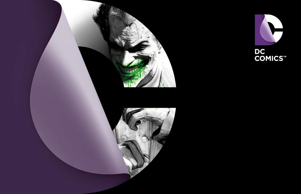
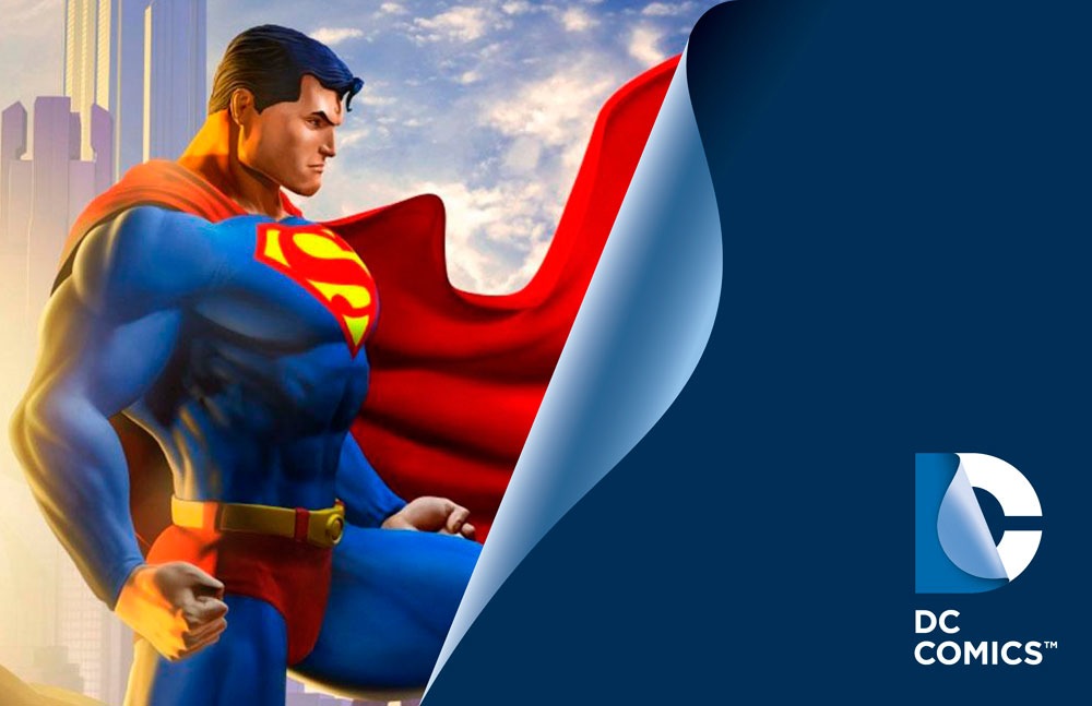
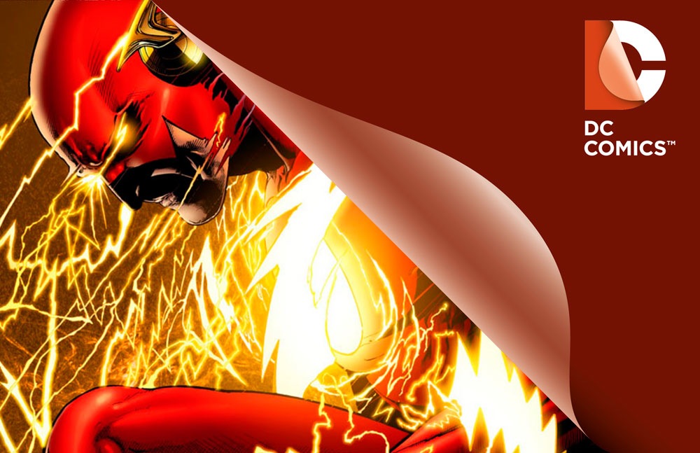
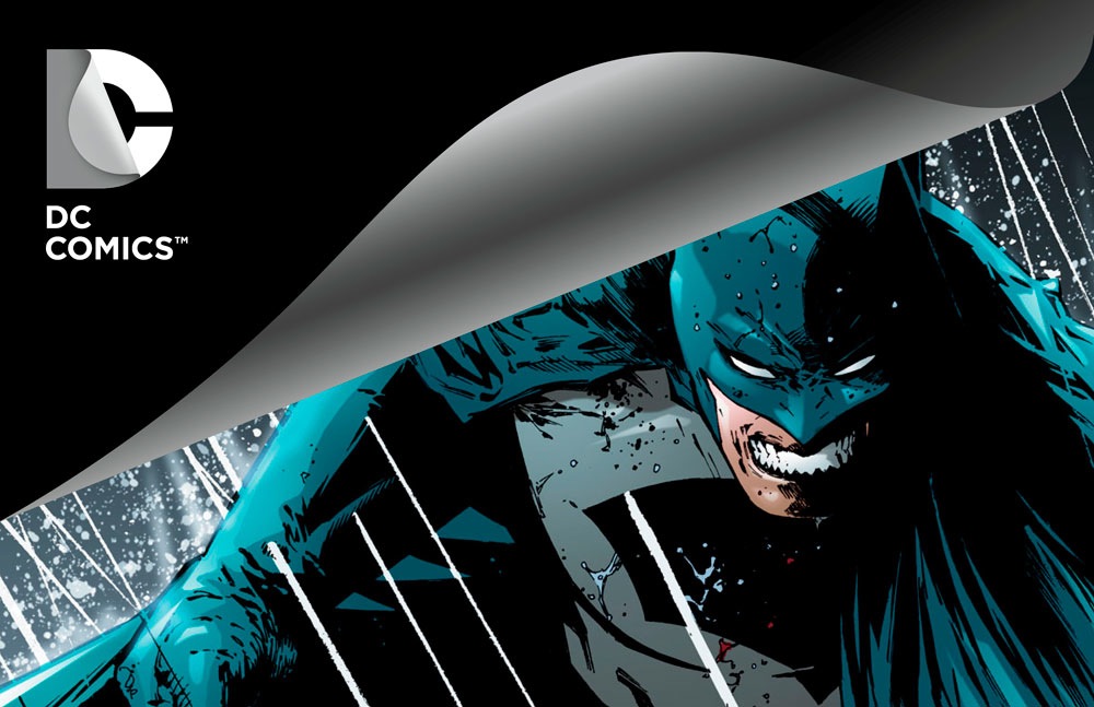
DC Entertainment worked with Landor Associates, one of the world’s leading brand consulting and design firms, to develop an identity that creates a visual connection among the company, its three brands DC Comics, Vertigo and MAD and its vast array of properties as well as celebrates the power of the company’s stories and characters. The design of the new DC Entertainment identity uses a “peel” effect – the D is strategically placed over the C with the upper right-hand portion of the D peeling back to unveil the hidden C – symbolizing the duality of the iconic characters that are present within DC Entertainment’s portfolio.
“It was our goal to capture DC Entertainment in a dynamic and provocative identity. Our solution is a living expression which changes and adapts to the characters, story lines and the ways fans are consuming content,” explains Nicolas Aparicio, Executive Creative Director at Landor’s San Francisco office. “The new identity is built for the digital age, and can easily be animated and customized to take full advantage of the interactivity offered across all media platforms.”
The new brand identity will come to life across all consumer touch points in order to create a clear and consistent message in support of DC Entertainment. The new identity will begin to appear on comic books and graphic novels as well as new websites in March. Consumers will also see the new identity rolled out over time on other DC Entertainment products from Warner Bros. including film, television, interactive games and merchandise.
“We believe our new brand identity will strongly resonate with our loyal fans who will want to proudly express their affinity for DC Entertainment and their passion for their favorite stories and characters, this new look allows them to easily do this. In addition we were excited to update our identity, it’s not often a company gets to revisit something as important as its brand and we took the opportunity to make sure it represented the multi-media business we set out to build with the formation of DC Entertainment,” said Amit Desai, SVP of Franchise Management for DC Entertainment.


The look of the logo on those comics makes me think of the old Continuity Comics logo: http://en.wikipedia.org/wiki/File:ContinuityComics.jpg
The logo has a decent concept, it fails in execution because it looks tacky. The gradient peeling back effect of the sticker is visually unrefined, and reproducing it at very small or very large sizes worsens that.
A company like DC needs a very good logo. The old logo wasn’t perfect, and it was certainly due for a change, but the new solution is a bit tired. It’s not the worst logo in the entire world, it’s just not a very good one.
It’s funny how they aren’t using the new redesigns of their characters with the new logo… Marketing Blunder!
Not Marketing Blunder – Marketing Win. Somebody in Marketing recognizes that pantsless Superman is not the iconic image of Superman that people are expecting to see, and they’re favoring the icon over the current non-iconic representation. That’s smart – unless that image is specifically supposed to be selling comics (which I doubt – that image is supposed to be selling the new logo, and possibly selling Superman, but it has little to do with selling comics).
And as I suspected – the logo looks somewhat better in color than it did in grey. Though personally I think it looks better on the logo slides with the characters and on the book spine than it does in the corner of the comic books (another data point for “they’re not doing this stuff for the comic book market crowd” I suppose).
??? Landor Associates ???
LMAO
That explains a whole lot to me. After failing miserably with recent re-branding for Disney…well, you have to follow that up with this incredibly 1990’s digital “Peel” look.
This is a colossal FAIL.
Even animated I think this just does NOT work.
Does anyone else think this logo looks like a half-opened condom wrapper?
If you’re going to mock Landor, at least call them Blandor. It’s required.
Marketing blunder, marketing win, neither. These materials were prepped before the New 52 was fully rolled out. They haven’t updated their examples. The world will still keep turning, guys.
Yuck.
~
Coat
Landor Associates. Okay, I stand corrected, as it is now obvious that DC went to pros for this logo mark.
Landor has done very good work for their other clients.
My only real issue is that the new look that DC has implemented does not decode to clearly consist of a ‘D and a C’.
And now, time for me to think about other matters, this logo thing is a done deal.
It looks like they’re opening a can of sardines.
Still looks like crap, no matter how DCE want to spin this latest fail.
What really ticks me off is that some design firm was paid thousands and thousands of dollar$ to come up with this ‘masterpiece’. I hardly think this was done in house.
Yeah, it fails.
Thumbs down (again).
I’m still at a loss as to why DCE felt they needed to change logos again so soon. The ‘DC Bullet’ endured for decades, and the current one’s only been around since 2005.
Personally, I don’t think the ‘DC Peel’ is horribly ugly — but I do think it’s indistinct and unclear, which IMHO, are even worse crimes for a media conglomerate’s logo.
I think the “DC” in the new DC logo stands for “design challenged.”
bleh…
The more I look at that thing… there is not any part of that image that looks like a “D”. I don’t think any rational person that did not already know it was for “DC” would assume that it read as “DC”. I just reads as a “C” with a old sticker peeling off of it.
Like a product that has been sitting on a shelf unsold for 70 or so years and not one had the heart to burn it.
I guess the logo doesn’t clearly indicate a D for DC comics……so they have to have the text “DC COMICS” underneath it.
Nope, sorry. Still an epic failure. And as Samir D points out, the fact it has to spell out the name for you to have ANY idea that’s supposed to be a “D” shows clearly it’s not just butt ass ugly but also just does not do its job.
I think it’s cool in the sense that it makes you think, so it reflects the complexity of their product. But it’s definitly not simple. Which is what all the graphics art instructors would say, “a logo should be bold and simple” So it’s bold. But not simple.
But what in life is anymore?
Plus they’re the ones at the multi-million dollar publisher,not the graphics art instructors, right? (nothing against graphics art intructors)
See even my comment is not simple.
BTW, since I’m yappin so much, while we’re on the subject,wasn’t Sol Brodsky a kick ass designer who doesn’t get his due?
(I know, this is about DC Comics, but logos indirectly,so I wanted to say it, thank you for your indulgence.
See, yet more complexity)
I couldn’t coincive an uglier logo.
Tony Daniel or Rob Liefeld prolly designed it.
I hate it. The previous design was far superior.