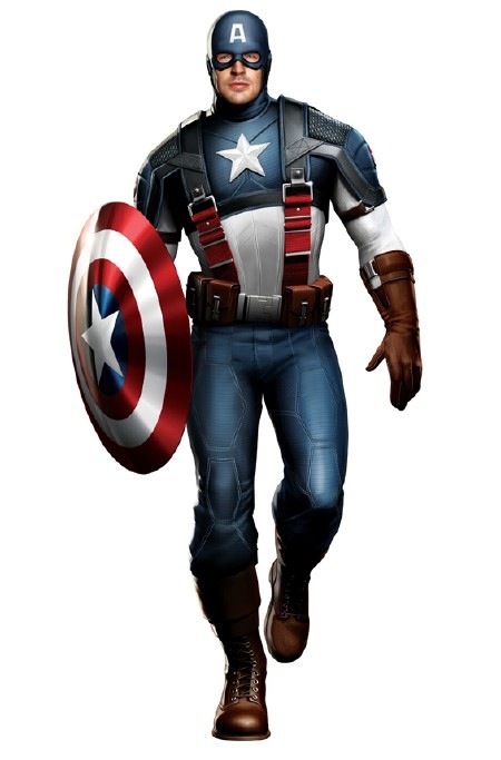
As we alluded to the other day, concept art for Chris Hemsworth as Thor and Chris Evans as Captain America have been leaked….or “leaked,” as they often say. Collider points out:
Collider reader “Dan” has sent us some concept art of Chris Hemsworth as Thor. Earlier today, we ran a story about AICN landing concept art of Chris Evans in his Captain America outfit. While we were very circumspect about saying these images were official, it is telling that both of these images have leaked today and they have the same artistic style. You can also see how they compare to the official shot Marvel released in April.
The timing is indeed…interesting. Other times when we’ve posted “leaks,” we’ve been asked to take ’em down, so let’s see how this goes.
We can totally see why there was fan fretting over Captain America’s new duds — it’s very New Cap/Alex Ross, and the loss of the wings is a shocker. Cap is a hard character to get right — his origin is impossible to properly update, and he can’t seem jingoistic for foriegn territories. So it’s a real fine line here.
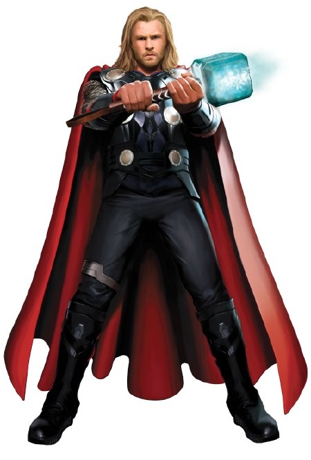
On the other hand, all you need is a big blond guy and a hammer and it spells T-H-O-R.


Nice bit with the straps making the red stripes.
If this is WW2 Cap, what material is the suit?
No wings? Big deal. I think the movie will work better without them. Personally, I think the “A” looks a bit dorky, and makes a nice target (it will glow in the dark).
They’ve come a long way since the original X-Men when it comes to costume design for superheroes, kudos.
I don’t like Cap’s costume here. Call me a purist. I grew up on Kirby and Byrne.
Nice point, Kevin. I hated that the X-Men movies went too far away from the source material (ESPECIALLY the original Green Goblin in the Spidey movies). If you see this Cap from a distance, he still looks like Cap. I would have been more against this if Bryan Hitch hadn’t kicked ass on Cap’s redesign in the Ultimates. It’s clearly somewhere between classic Cap and Ultimates Cap, and really, I don’t mind. I just hope the story is good. Anyone know if it’s set during WWII??
Anyone know if it’s set during WWII??
Yes, it is.
Sorry, Thor just looks like a model in a business suit to me.
Thor’s cape looks a bit too garish next to the new dark-and-subdued armor…the red worked better next to the equally bright blue in the comics! If they’re keeping the cape they should darken it a bit.
Wonder if Cap will get another costume change since The Avengers movie takes place in the present and I’m assuming that’s 1940’s Cap.
You know, there’s nothing stopping them from adding Cap’s temple wings as CGI.
Bitch, people, bitch!!!
Is there really an uproar about the wings? I guess they’re also peeved that Thor lacks a helmet?
Does it really matter? :) As I said before it could be all tight fitting black leather with little to no personality.
<>
It looks more like a contemporary costume to me. Maybe we’ll see a more traditional costume when Cap is in the 40’s?
<>
No kidding. I’m pleased with these. We’ve seen much. much worse.
Kevin Hynes: “Wonder if Cap will get another costume change since The Avengers movie takes place in the present and I’m assuming that’s 1940’s Cap.”
It looks more like a contemporary costume to me. Maybe we’ll see a more traditional costume when Cap is in the 40’s?
Kevin Hynes: “…it could be all tight fitting black leather with little to no personality.”
Agreed. I’m pleased with these. We’ve seen much, much worse.
thor doesn’t look too bad. from this photo you can’t really see the chain mail on his arms and if he does have a helmet (sure hope so, cause really, what kind of viking warrior goes into battle “WITHOUT” a helmet on his head) it should bring the whole look together. maybe they should also put chain mail on his legs, same as he looks in the books these days , with a piece of cloth covering the nether regions and he would look pretty damn close to the source material. but as far as captain america is concerned,holy crap, where do i begin? cap looks AWFUL. without the wings his head looks like a peanut, those are straps? they look like suspenders. is he going for the urkel look or mork from ork? and the belt is too big and bulky. glad to see the “a” survived, he is after all captain “AMERICA”. the shoulder pads with the straps around his arms and the weird design on his pants(?) looks more like something a sports figure would wear. he looks more like a WWE wrestler than a superhero. everytime they muck with a superhero costume and go ahead and try to make it appear more “realistic” what they are saying to all of us the “superhero comic book fans” is: the characters that you people read about look ridiculous and silly and in no way can we present them to the public at large with the way they look in the books”. here’s the problem: the source material has nothing to do with reality, it’s all fantasy, and the real kick in the head is that the non-comic book reading movie going public gets that. if they made this cap flick with cap dressed the same as he looked in classic kirby style, the non-comic public gets that this flick is a fantasy, would move beyond it, and enjoy or hate the flick on it’s merits. i gotta give the folks that put out hellboy credit. they didn’t muck with the character’s appearence, he is what he is. the hellboy movies made no apologies for the source material, which is what made those flicks so much fun. i know folks that could care less about comics, but love the hellboy flicks. maybe this is what the superhero movie genre needs, folks with more balls that are not afraid to stick to the source material, show these caracters as they look in the books, and make no apologies about it. thanks for letting me rant!
I can live with the Cap costume as is, but you gotta add the wings. It’s one of the most destinctive parts of the uniform.
The “A” is also too narrow.
Thor continues the apparent aversion to “head-wings.” What, no winged helmet? For those filmmakers who think plumed/winged headgear won’t work, keep in mind it worked fine in films like “Gladiator” and “Spartacus.”
For the record, I liked the Kirby Thor better than I did the Simonson Thor.
ABC,
Good point about Hellboy.