[No one has guessed my challenge from the other week, so I’ll hold off a few more weeks before revealing the answer.]
A few people have asked if I take requests. I think I’m up for the challenge. Let me know if there are any older covers you’d really like to see analyzed/discussed, or any recent covers you felt I overlooked.
Today’s reader request comes from Heidi MacDonald, who wanted to know what I thought of the recent JLA: Earth 2 redesign. It generated a little bit of discussion on Twitter recently when Andy Kouri tweeted about it:
One thing I love about DC Comics is it always keeps the good shit in print. What I don’t love are the bad redesigns pic.twitter.com/cYaXKfWDnP
— Andy Khouri (@andykhouri) May 20, 2014
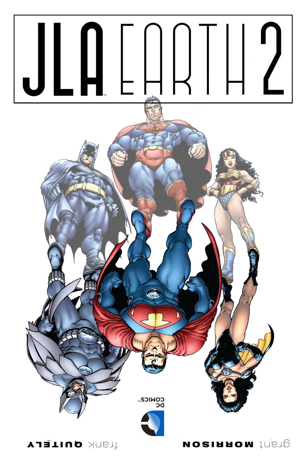
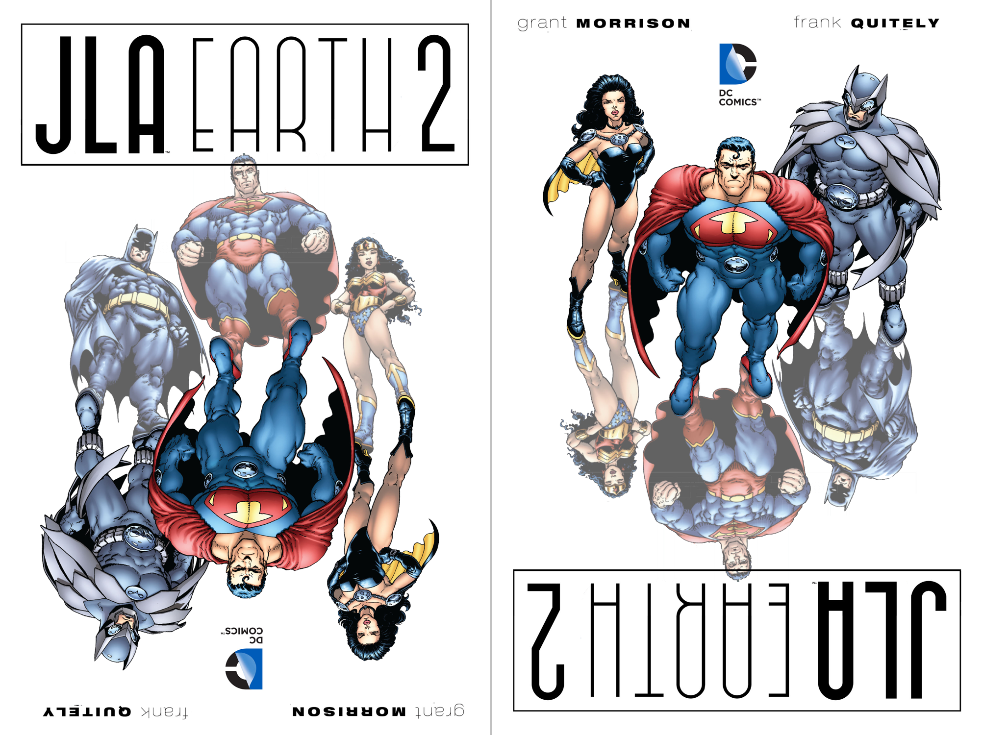
Unfortunately, Twitter’s character limit doesn’t leave a lot of room for specific critique. A few people seemed unsure if Khouri was complaining about the redesigned title or the different art. After doing a little digging, I figured out that this are is from the original Hardcover release (bottom right), while the Softcover (bottom left) had new art that flipped the positions of the two sets of characters.
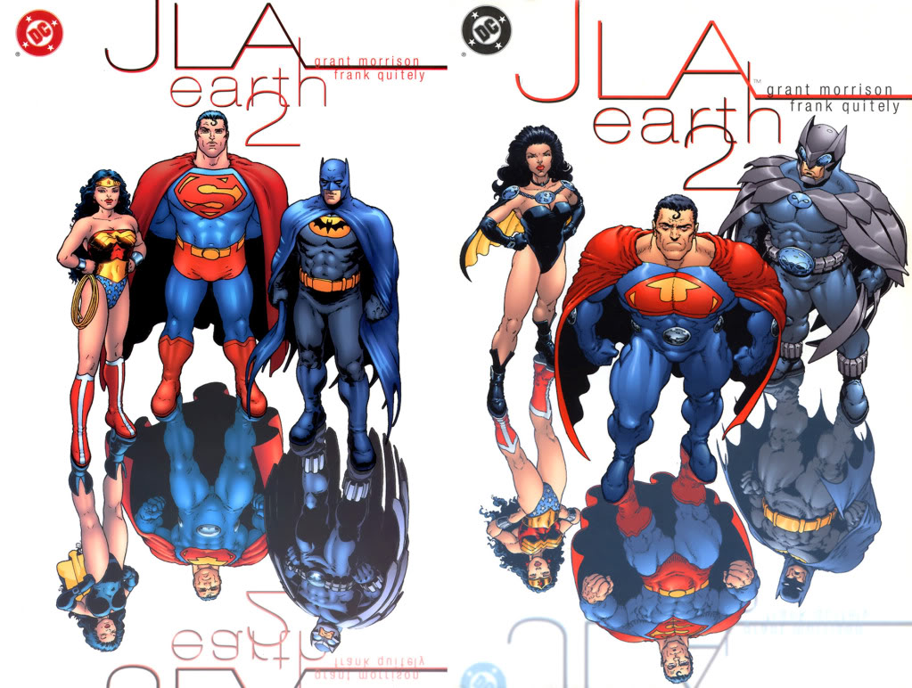
I’m pretty sure Khouri was reacting to the new text design, and I agree that it has some problems. However, to be completely honest with you, I was never a big fan of the original text treatment either. The way the words just ever so slightly overlapped seemed kind of random and arbitrary to me, not to mention that it created odd tangents and almost-tangents.
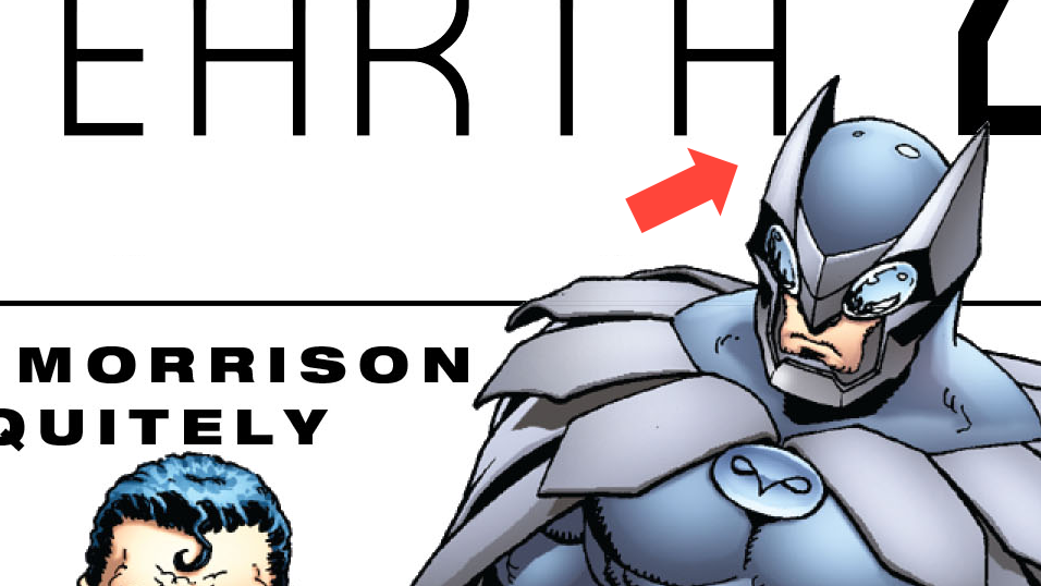
A tangent is when two elements just barely touch, like Owlman’s head and the letter “H” above. This is considered a design faux pas because of the way it creates unintended visual tension. Visual tension can also be created with almost-tangents such as when two elements are just a little too close to one another (such as Ultraman’s head in proximity to the word “Quitely,”), or when two elements don’t quite go far enough in overlapping each other (like the number “2” and the bottom of the “r” and “h” in the original cover design).
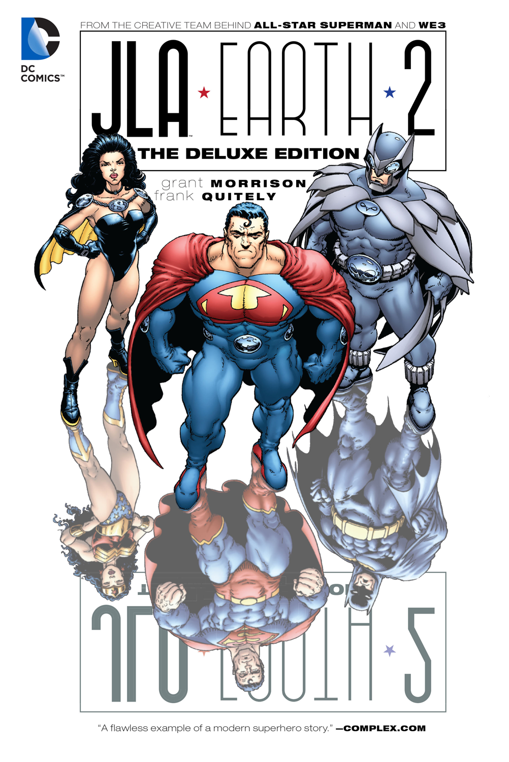
But what stands out to me most in the new design is that strange empty space under the title. It looked to me almost like the creator’s names had been placed in there at one point, and the box wasn’t resized when the names were removed. It turns out I was half-right – the new design was originally created for the Deluxe Edition:
The only other issue I have with the cover is a problem I also had with both of the originals: the first time I ever saw Quitely’s image (I can no longer remember which one I saw first), I didn’t immediately notice that the reflections were different. I’m just so used to reflections being background information that I didn’t bother looking closely on first scan.
You might argue that this isn’t a problem at all, that it’s one of those minor details for you to discover on closer inspection. But what if it could be used as a way to get people’s attention and create interest?
Above I’ve mocked up an idea for how I might’ve approached the cover. The familiar heroes would be at the top of the image as the primary focus…but something’s clearly wrong. They appear to be reflections of something else, and why is there upside-down text?
You’d flip the cover automatically, almost without thinking, and discover these warped versions of the characters. Getting you to flip the cover also ties into the theme of the story turning everything upside-down.
A missed opportunity, or am I just off my rocker? (Or both?)
And now last week’s covers:
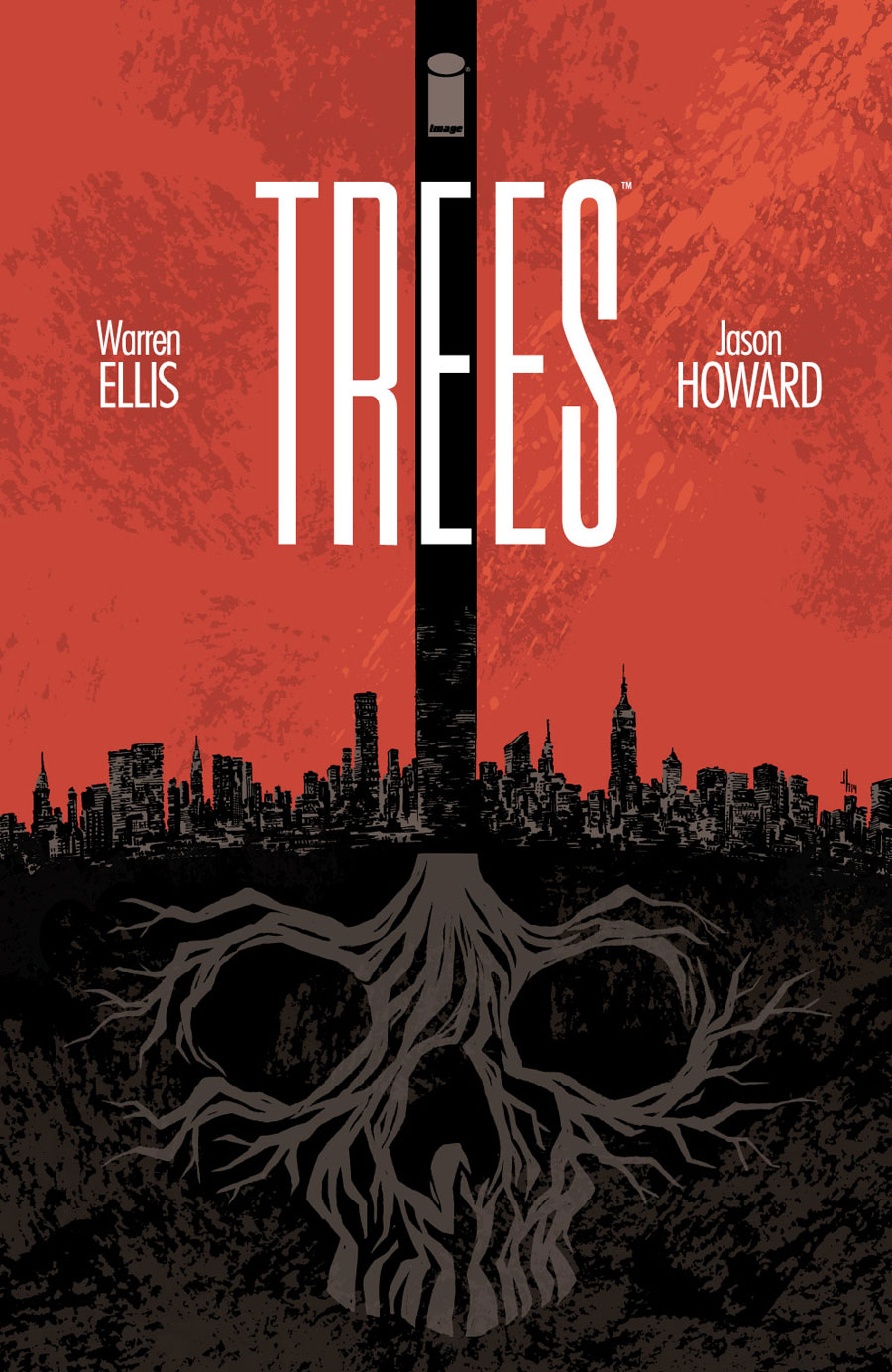
TREES
Evil and/or death is literally lurking beneath the surface in this cover by Jason Howard. I’m not sure it could have been conveyed any more clearly than this. I also kinda like how the middle letter in the title fits nicely within that vertical bar.
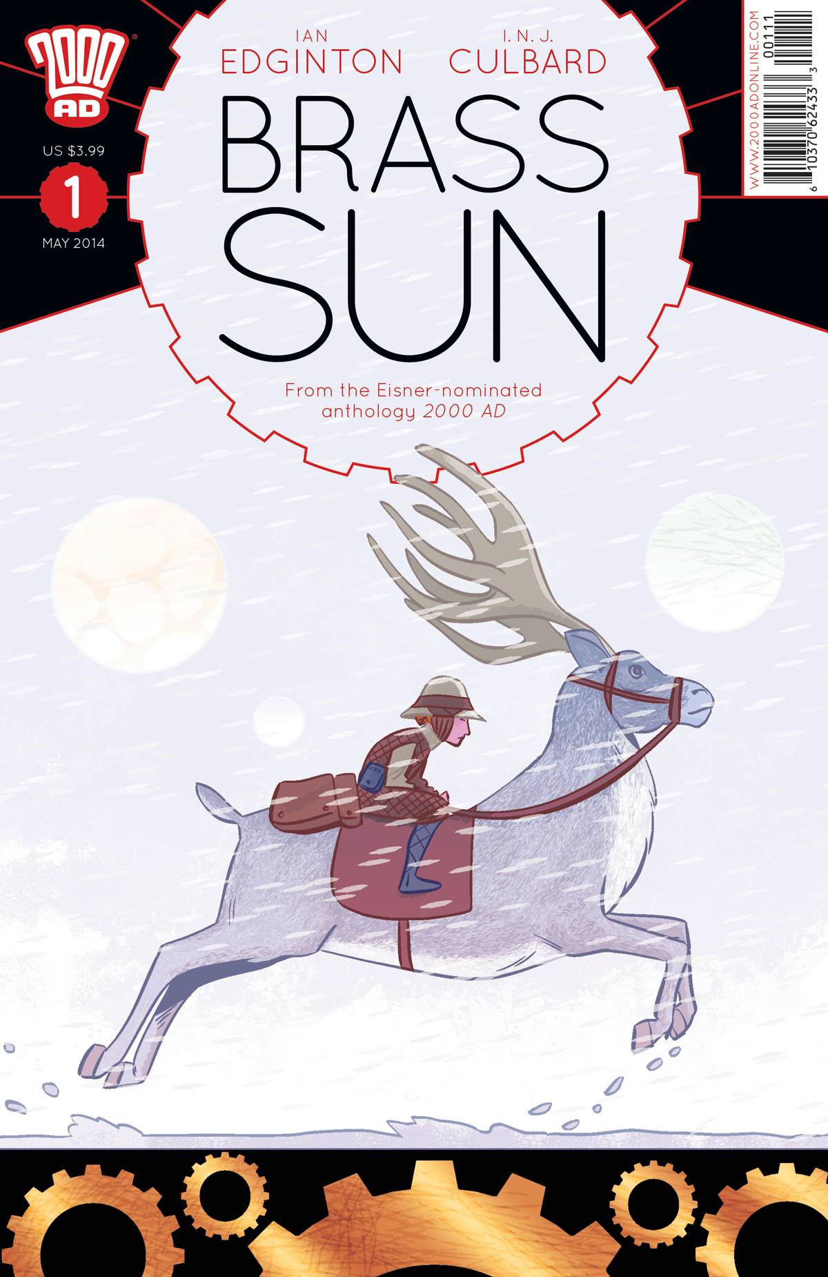
BRASS SUN #1
Am I the only one who gets a little bit of a Ghibli vibe from INJ Culbard’s illustration? It looks lovely. Also, notice how they’ve expertly balanced their trade dress and centered the title while still passing the Hibbs Test.
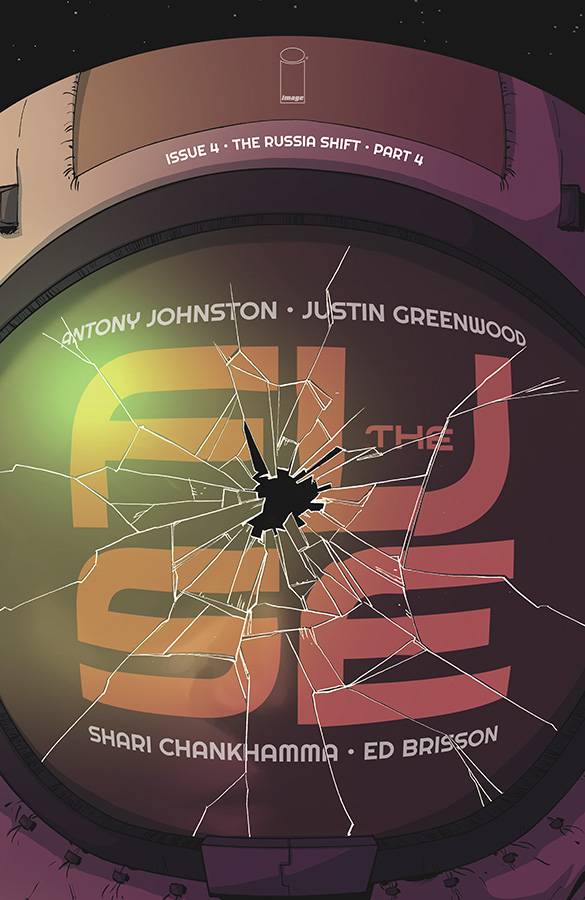
THE FUSE #4
I’m a big fan of Kubrick-esque symmetrical compositions, like this cover by Justin Greenwood. The only thing that kind of bugs me is that I wish the window was centered vertically as well as horizontally. Also, it might’ve been cool if the words looked like they were being reflected in the glass rather than printed on it. But it’s cool.
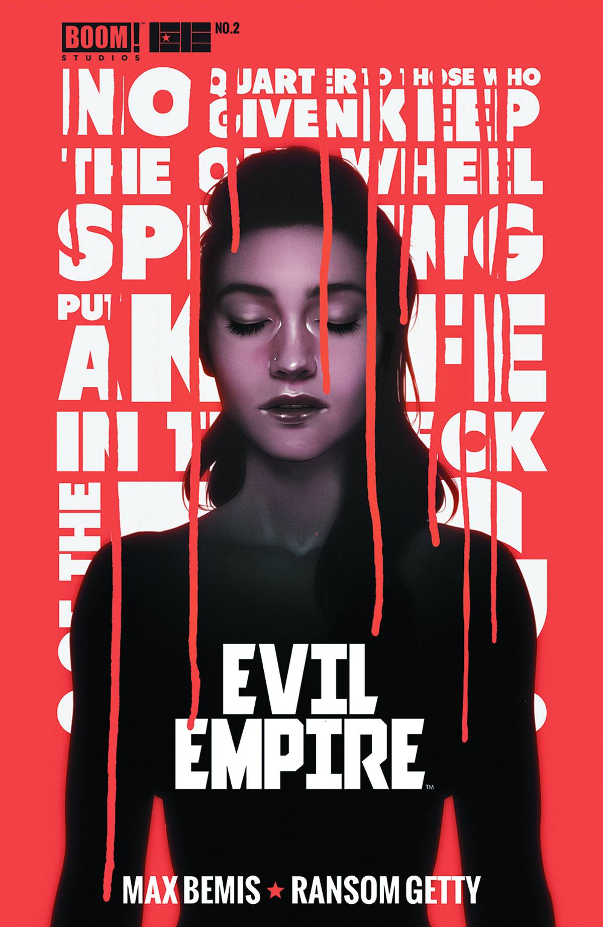
EVIL EMPIRE #2
I kind of wish the text in the background was slightly more readable, though the argument could be made that it’s creepier to leave it to the reader’s imagination. My favorite part of Andre De Freitas’ composition is the red dripping down from the background over the character, cutting into her. Nice for a creepy horror vibe.
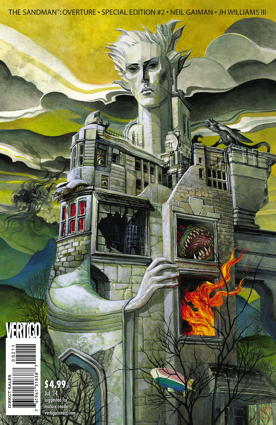
THE SANDMAN: OVERTURE – SPECIAL EDITION #2
I keep trying to figure out something to say about this cover, and I just don’t know. J.H. Williams III definitely succeeded dark and dreamlike. I like the way the title on this Special Edition is just a line of text along the top, letting the image carry the cover.
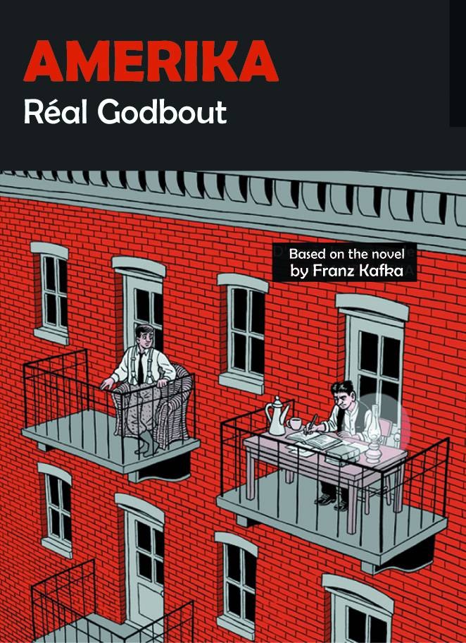
AMERIKA
Such a clean illustration, and an amusing concept. I just wish the rooftop wasn’t cut off. The black box is kind of awkward in that it at first looks like a dark sky behind the building, but then the left side of the roof just disappears. It would’ve been more elegant to use the edge of the rooftop to create the box to place the title in, the title floating in the sky.
Kate Willaert is a graphic designer for Shirts.com. You can find her her art on Tumblr and her thoughts @KateWillaert. Notice any spelling errors? Leave a comment below.


Kate, I think your version of the *flipped* Earth 2 cover is by far the best. It plays directly into the theme and even the composition. Well done.
Likewise, this is another good installment in your series. As for Tangents, I’ve always been of the mind that it never bothered me. I know it’s a design no-no, but I’ve often played with tangents in my work because I like breaking the rules. As for the coves above, I don’t mind the near misses because all three characters are nearly missing, which in my mind, looks purposely done.
However, what I don’t care for are the font size and kerning of the credits for the writer / artist below the title on the Earth 2 Deluxe edition. By using a *box* to define space for the title they should likewise center the credits below it. Smaller font, too. But that’s my two cents.
Am I the only person on Earth (…one,…) who misses hand lettering on comic book covers? All of these covers seem so dull to me.
@Jimmie: Tangents don’t always bother me either, though there are times when I find it a little distracting. And I agree that the creator credit placement was kind of awkward.
@Steven: I don’t miss the hand lettering, but then I’m a fan of contrast. I kind of like mechanical lettering over hand drawn art, or hand drawn lettering over photographs for that matter.
Though I do enjoy when artists draw the title into the artwork as an object that appears to take up physical space for the characters to interact with.
I really like your flipped Earth 2 cover as well. I agree that the original mirror image is too subtle, but I never gave it much thought. OTOH that Evil Empire cover doesn’t appeal to me as much. The nearly illegible background text distracts me too much.
That Earth 2 design of yours is the best of any. You really convey that through the looking glass feel. It feels like two sets of people, apart, rather than a one-set and a reflection.
Comments are closed.