For anyone who was still curious, here’s the answer to which covers were used in the By Its Cover title. I tried to include several different genres and eras.
My focus on design each week has led to my skipping over illustrations that were unfortunate enough to be ruined by the text laid on top of them. This week I thought I’d look at a few otherwise well-composed images before and after the other elements were added.
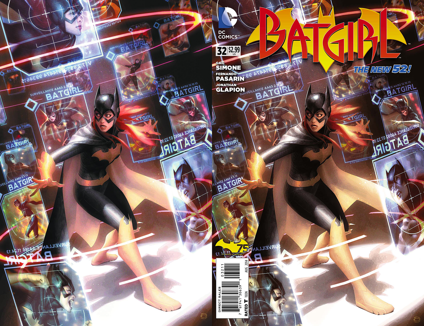
BATGIRL #32 by Alex Garner
This nicely rendered cover does a good job of telling a one-panel story. Batgirl’s face and body language clearly express that she’s surprised by numerous floating images of her, which suggests she’s wandered into the control room of someone who’s been tracking her. It’s disappointing then that such a nice cover has been marred by a trade dress applied in ugly, bright primary colors that don’t even attempt to compliment the illustration’s color scheme.
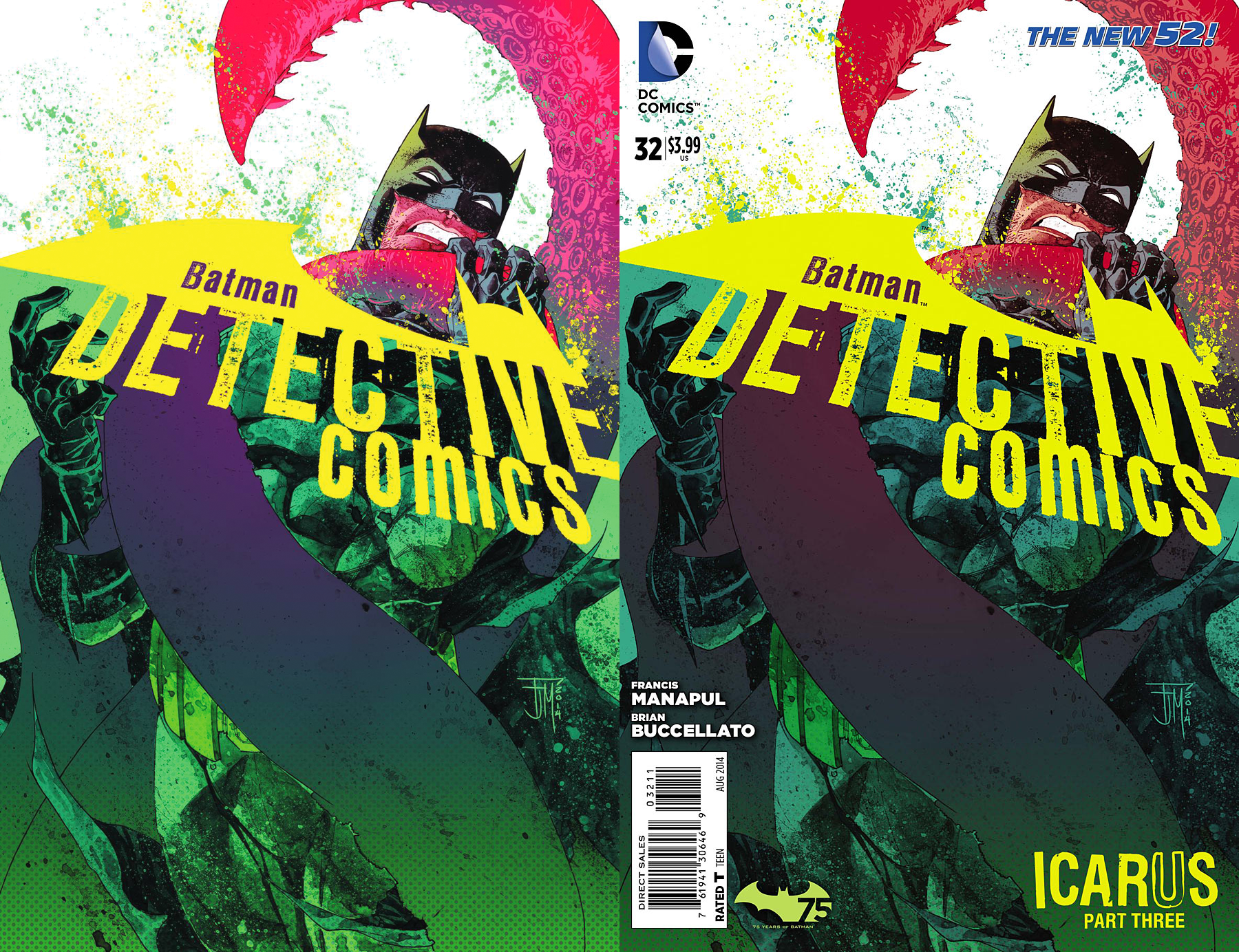
BATMAN: DETECTIVE COMICS #32 by Francis Manapul
Here’s a nice example of someone making the logo a part of the composition, in this instance using one edge of the logo to represent the water line. I’m not sure why the color always seems to shift dramatically between DC’s solicitations and final covers, does anyone know? I get the feeling it has to do with the way its being saved by whoever does these at DC, a bad color profile or something maybe?
Anyways, someone further down the production line decided to clutter it all up by adding junk to all four corners of the image. Was “Icarus: Part Three” necessary to include? If so, maybe it would’ve worked better to make it a single line of text under the word “Comics” in the logo, making it an actual part of the design rather than just plopping it in whatever corner was still open?
Making that text yellow directly associates it with the logo – the primary focus of the image – which sort of makes it the second most prominent element in terms of visual hierarchy.By placing it in the lower right corner, it drags my eye down to the bottom, whereas the more successful non-text version led me up from the logo to Batman’s face and the tentacle.
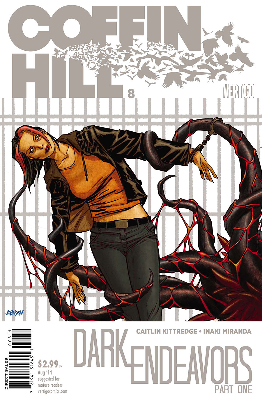
COFFIN HILL #8 by Dave Johnson
Are tentacles a theme this week? I do like how the tentacle touching her head directs our attention to the change of color in her one eye, which hints at some sort of possession. The pair of handcuffs also suggests that this monster may’ve been in human form just moments ago. But what I really like is how the fence in the background matches the text around it. I particularly love that logo, with the super heavy Avant Garde lettering that looks like it’s transforming into a flock of birds.
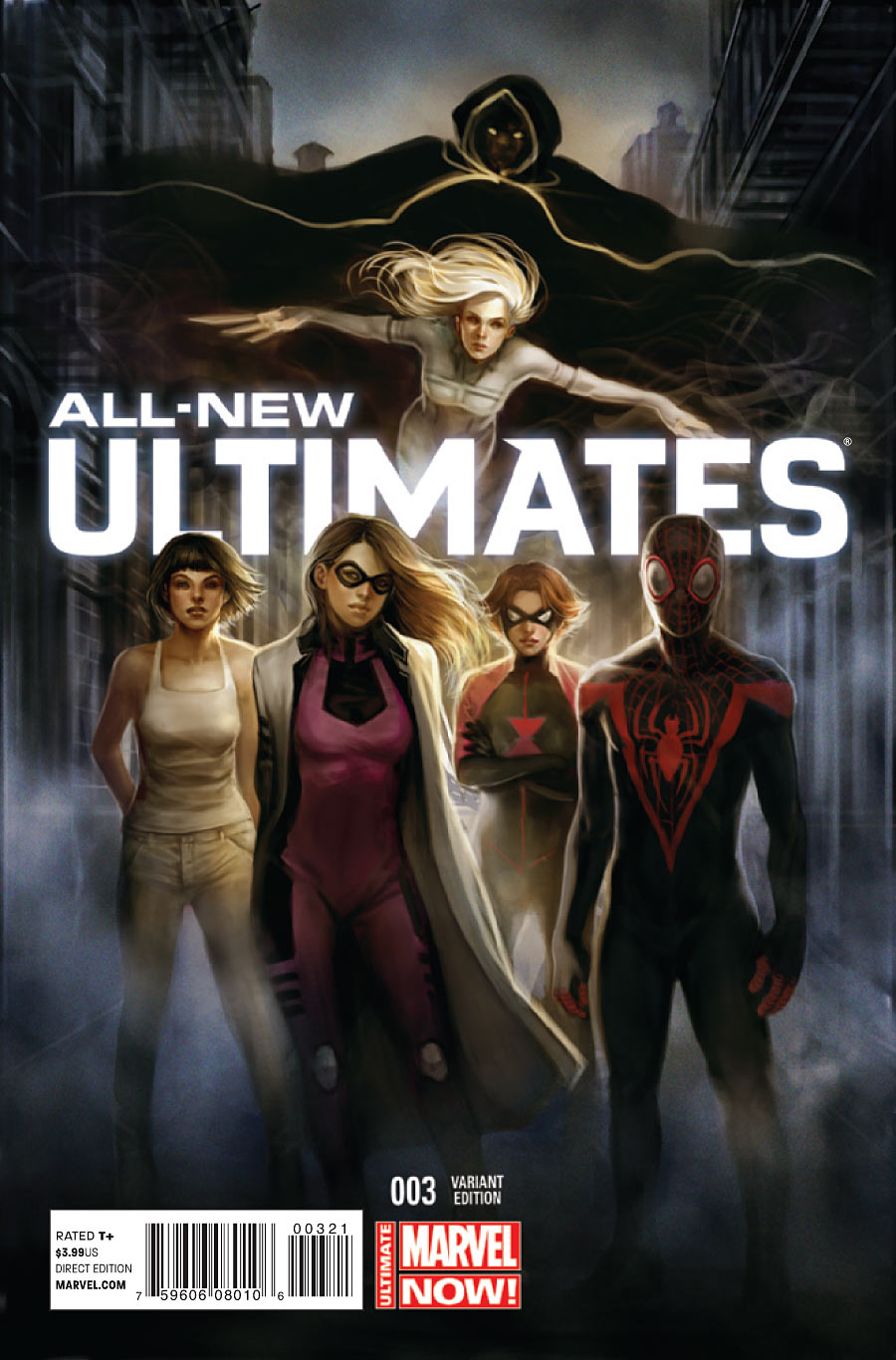
ALL-NEW ULTIMATES #3 by Siya Oum
Stylish and moody, like a movie poster for the series. I like the way the logo splits the image in two, and the way it creates depth by being places behind the foreground characters (with the background characters hovering behind it).
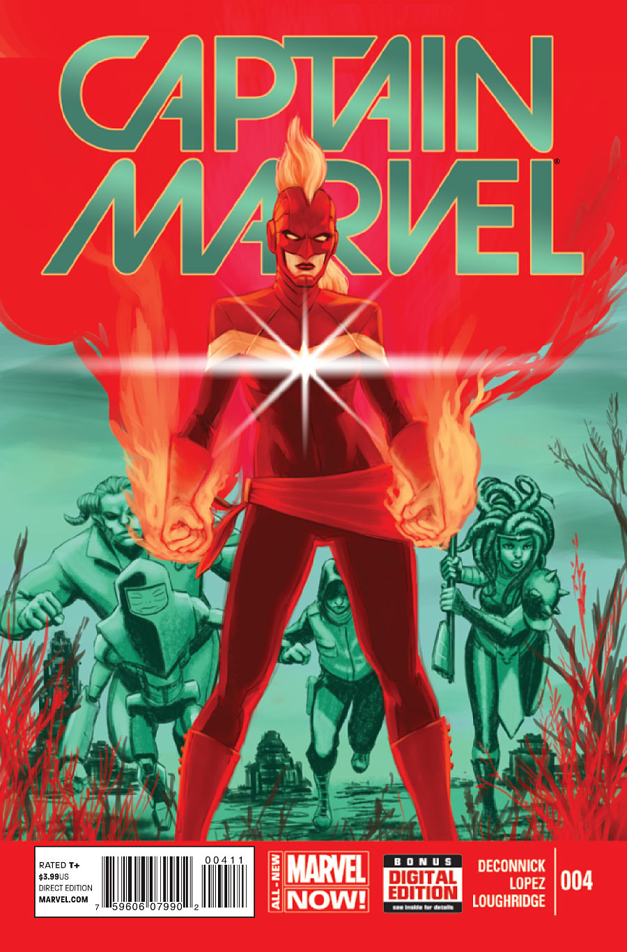
CAPTAIN MARVEL #4 by David Lopez
This is a fantastic composition, with the flames rising up behind Captain Marvel to create a container for the logo (and creating depth by placing the logo behind her). What I don’t like is the colors. It’s typically recommended that you don’t place green text on a red plane (or vice versa) of equal value/brightness, because the colors vibrate against each other in a way that makes it difficult to read.
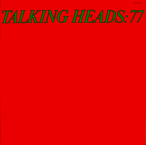
Some people do this on purpose, such as the cover to Talking Heads: 77, which used this abrasive vibration to get people’s attention. But I’m not sure it was intentional on this Captain Marvel cover because of the gradient (only some of the values in the gradient are vibrating annoyingly against the red).
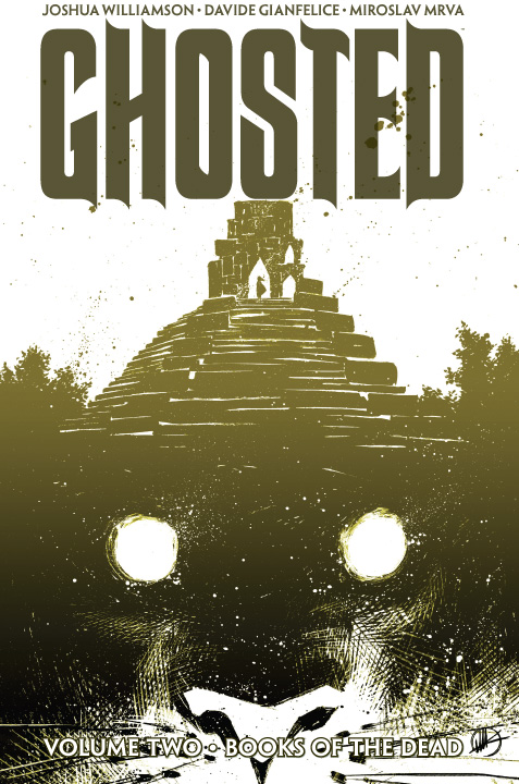
GHOSTED (VOL. 2): BOOKS OF THE DEAD by Matteo Scalera
Love that cross-hatching. Sometimes color gradients can look cheesy, but here it makes the creature lurking underneath seem that much darker. The way that the logo almost sits on the tower could be considered a weird tangent, but I’m more bothered with the white text at the bottom getting lost in the whiter areas of the image. It has a black outline to make it readable, but it still looks kind of awkward.
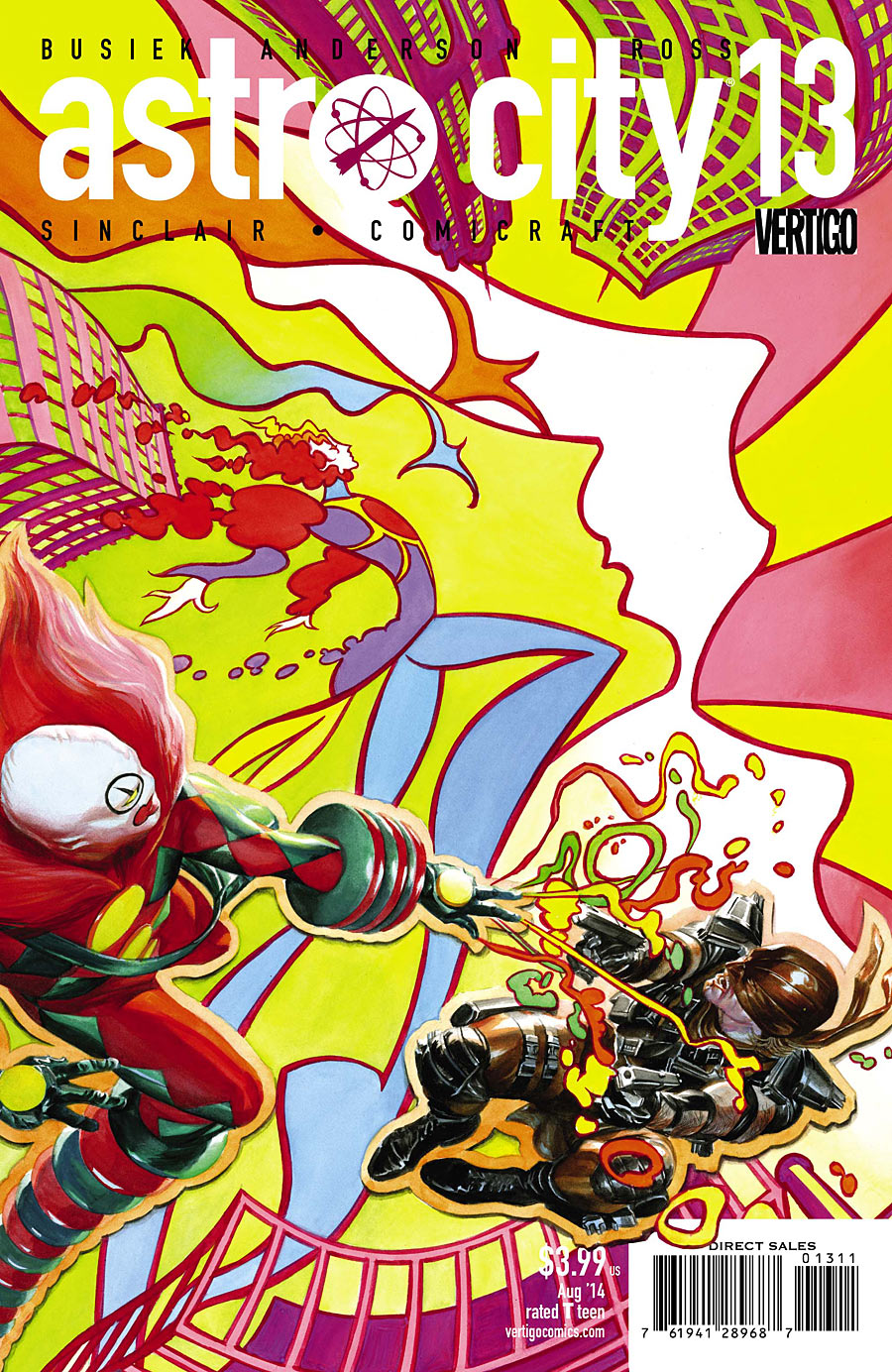
ASTRO CITY #13 by Alex Ross
If Alex Ross was trying to make me feel like I’m on drugs, he succeeded.
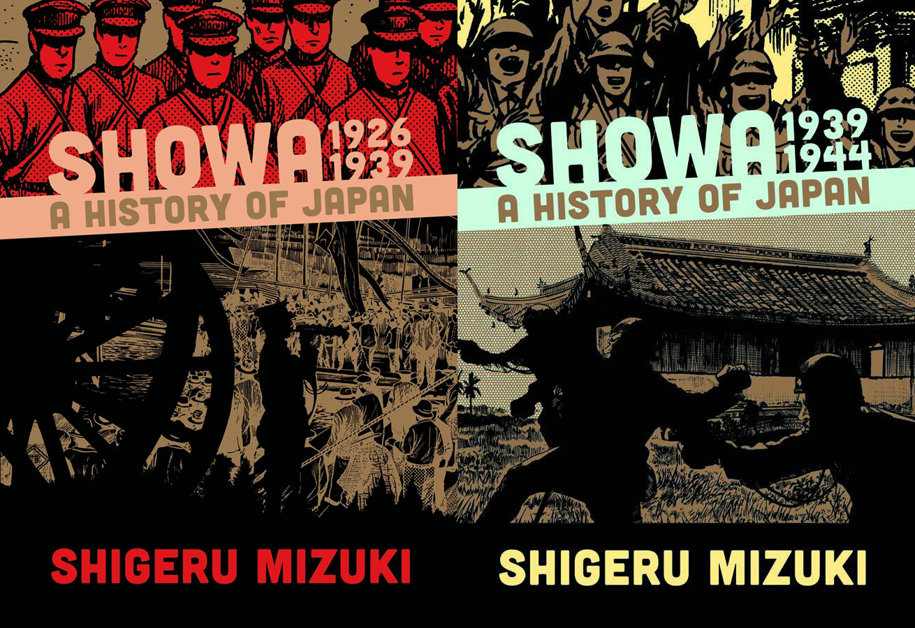
SHOWA: A HISTORY OF JAPAN (VOL. 2) – 1939-1944 by Shigeru Mizuki
The cover of the new volume (right) makes more sense when viewed in context with the first volume (left). The first cover is very quiet and solemn, and the soldiers at the top look like they could be in the crowd somewhere watching the bottom image. The second cover portrays an image of violence, with soldiers cheering above. It’s quite a contrast.
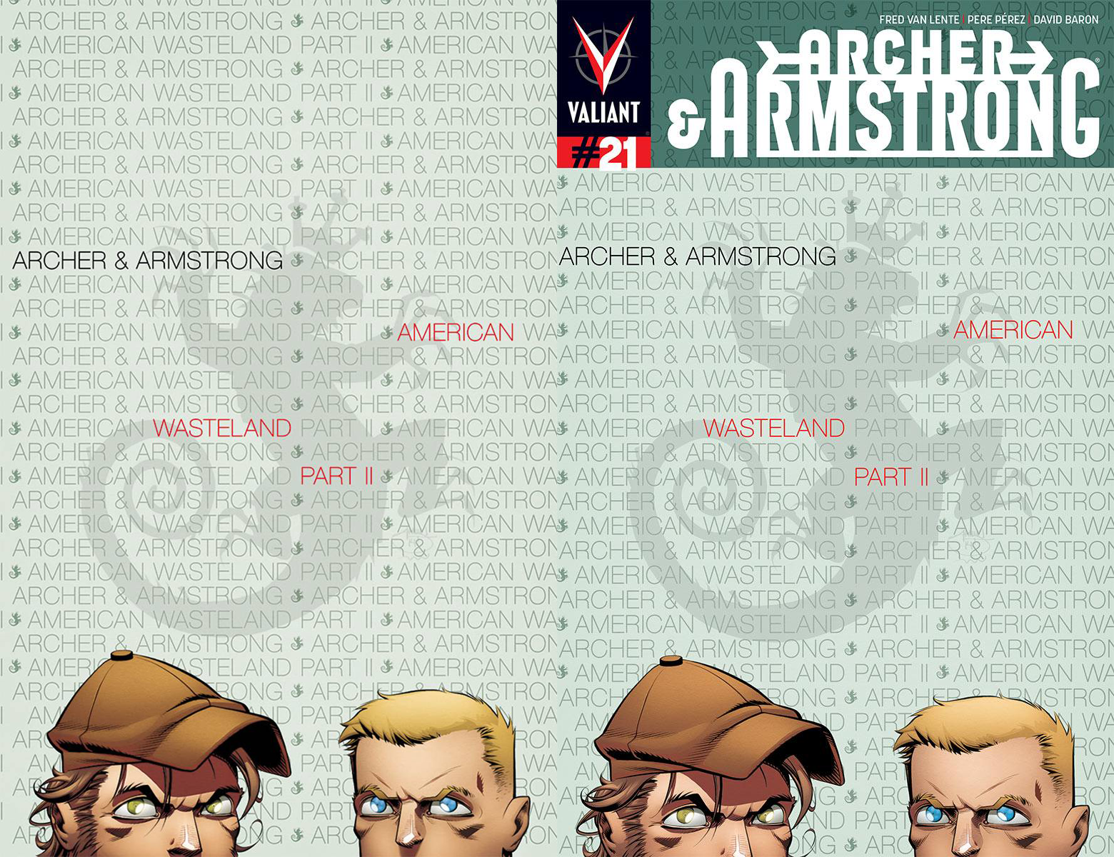
ARCHER & ARMSTRONG #21 by Shawn Crystal
I love the use of elegant thin-weight Helvetica in the background, but I would’ve liked it more if they’d been brave enough to drop the trade dress entirely for this one (incorporating “#21” into the background).
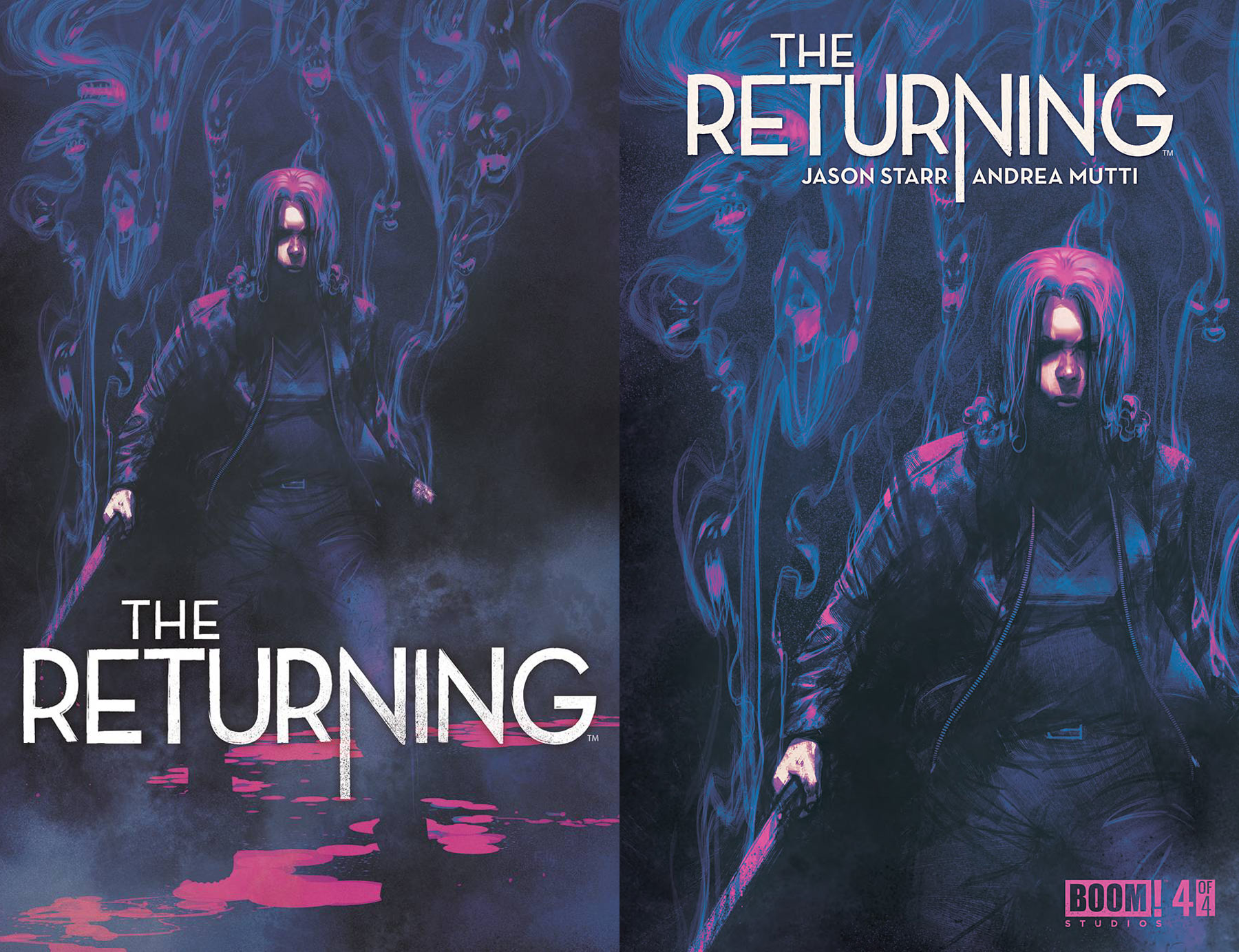
THE RETURNING #4 by Frazer Irving
The image on left is what appeared in solicitations, and the image on right is the final cover. I saw the final cover first, and thought it was a big wall of spirits behind a woman darkly brooding with a knife. I assumed the knife was maybe being used to protect herself from the spirits. In the full image, I can see that the spirits are actually emanating from her, which completely changes the context.
Also, I liked the subtlety of the stream of blood (?) at the bottom indicating the shape of the portions of her leg that are in shadow. I’m not so sure the logo was working at the bottom, though. I kind of wish they’d gone with the first version, but put the logo at top (with the lower part of the “N” going behind her head, maybe?), though the creator names probably would’ve had to be moved elsewhere.
Kate Willaert is a graphic designer for Fun.com. You can find her her art on Tumblr and her thoughts @KateWillaert. Notice any spelling errors? Leave a comment below.


RE: That Archer and Armstrong cover: http://en.wikipedia.org/wiki/King_of_Rock
Ah, thanks. I’d recognized their other album cover tributes, but wasn’t sure on that one. I kind of wish comic covers in general varied as much in terms of design as album covers do.
The Astro City cover, sans logo:
https://d1466nnw0ex81e.cloudfront.net/n_pi/300/1865720.jpg
Print it as a blacklight velvet poster, and I’ll be first in line!
(And if they make it so the two figures are puffy vinyl decals, even better!)
—
Here’s a radical idea:
What if the title etc. was printed via a spot varnish, with no specific color underneath? Or embossed?
@Torsten: I’d LOVE to see subtle almost-invisible logo treatments like that, especially because it’d be one step closer to textless covers in the style of ’70s album covers.
How about putting the title and all those whatnots in a clear plastic cover so when you flip it, it reveals the cover art untouched?
“RE: That Archer and Armstrong cover: http://en.wikipedia.org/wiki/King_of_Rock”
Reminds me of the opening titles to the old television series “The Name of the Game” — stars Robert Stack, Gene Barry, and Tony Franciosa were introduced by their names, which formed into pictures of the stars. Don’t know what that technique is called though.
@dib:
Marvel used the vinyl covers in the mid-90s. Marvels is the most common example, but they also used it on a few other titles that they wanted to replicate the “Marvels” mystique with. I recall one with Wonder Man, about a member of his fan club?
Those covers are expensive. I haven’t seen anyone use it as part of the cover storytelling, like you’re peeling away a costume to reveal the secret identity beneath. (Or dissecting a frog, like those cool acetate schematics found in World Book encyclopedias.)
Comments are closed.