
This is the third season in a column that judges a book by its cover. Catch up on the current season, or view the complete archive. Spelling corrections are welcome.
When I wrote about the Spawn colorist variants last time, I did so under the assumption that they were textless covers. Image’s “We Believe” covers have traditionally been textless, and all the preview images were textless, so imagine my surprise when I saw what shipped.
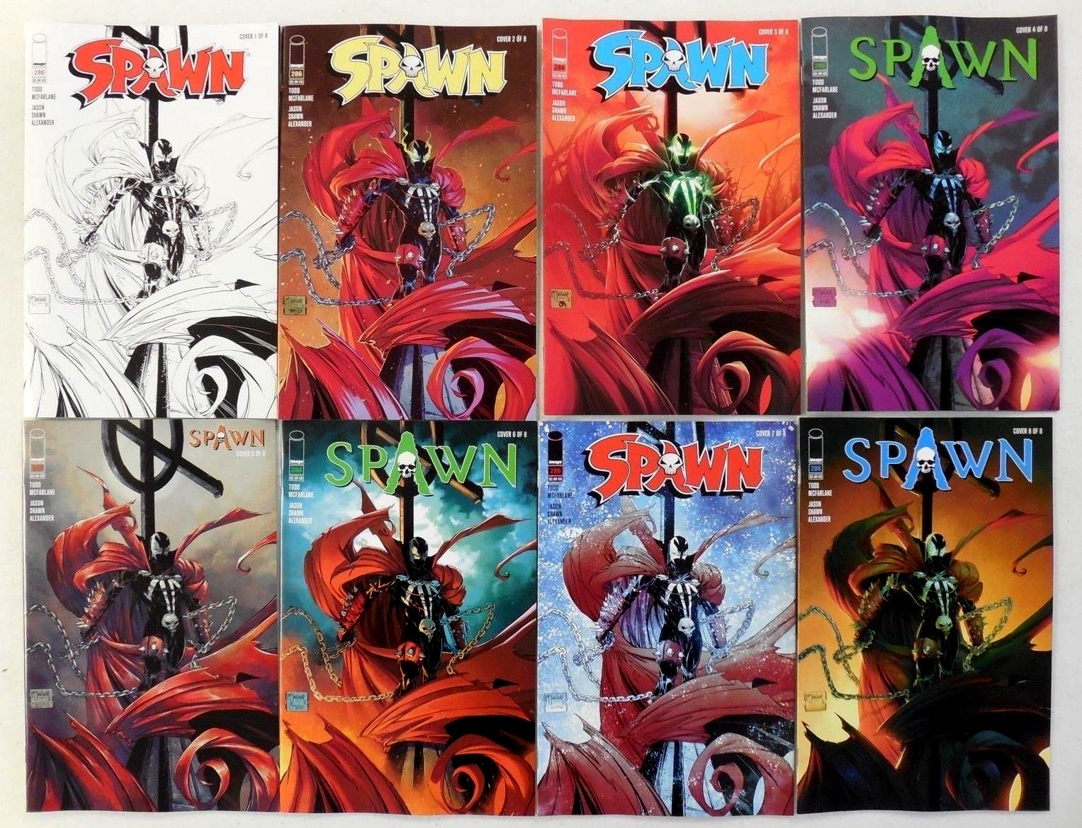
As of this writing, you still can’t find digital uploads of these final covers, only photographs of them via eBay. Not only do the covers have a full trade dress, but each one has a slightly different trade dress.
It’s a huge missed opportunity, in my opinion. If you want someone to compare and contrast a specific difference, you put attention on that difference by making everything else the same. It’s why my superhero costume infographics always have the character in the same pose throughout.
Not to mention that the colors chosen for the logos are sometimes completely outside the palette chosen by the colorist. It’s really unfortunate.
Anyways, not knowing how the final printed edition is going to look is a common hazard of using preview images so this column can go up Wednesday morning. Just be aware these might change, and let me know if you spot any differences. Sometimes it’s obvious even without seeing the finals, like in the case of the DC variants, which are always uploaded to Previews World without barcodes.
When the first week’s worth of DC variants shipped, I was hyped. It was a new look, and I love minimalist text treatments. But the problem with putting out so many of them is that apathy starts to set in. It’s a common DC problem that I wrote about in my very first column years ago. Where before I would’ve called out a cover just for being textless, now the artist has to do something special to stand out from the crowd.
Here were my favorites from the last month.
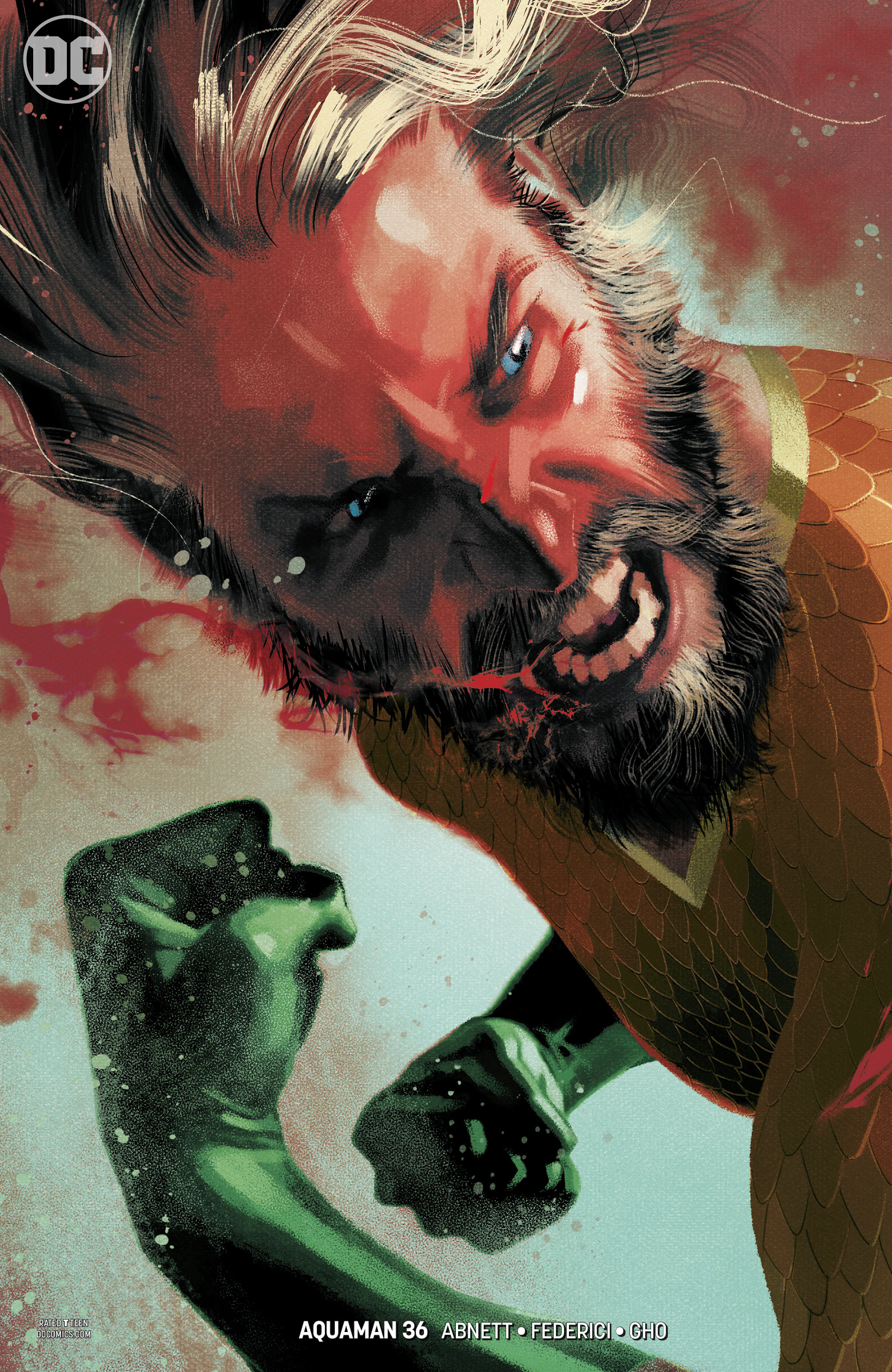 AQUAMAN #36 by Joshua Middleton
This has that “trading card” vibe I attempted to describe when writing about Marvel’s Young Gun covers. But I can’t deny it’s energy gets my attention. The little stream of blood coming from his mouth is a nice touch, the primary indication that he’s underwater. In terms of composition, this definitely doesn’t feel like there’s an empty spot where the logo was supposed to go.
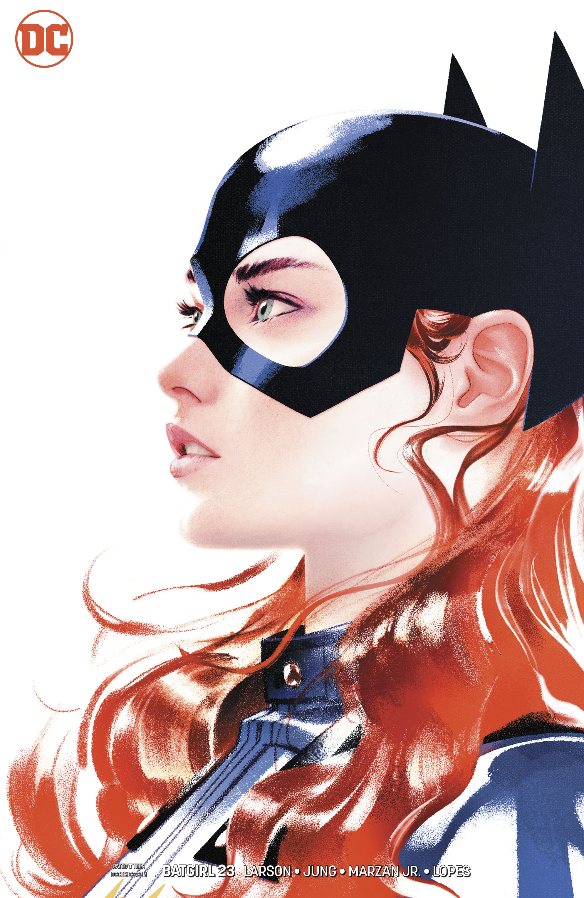 BATGIRL #23 by Joshua Middelton
Middleton is just hitting it out of the park. This quieter portrait reminds a lot of a solo album cover, which I prefer to trading cards. You’d think her glance would be pointing us to the next cover over, but the large amount of white space seems like it keeps me inside the composition.
 BATMAN #47 by Amanda Conner
This is a cute idea: Batman and Catwoman go to the movies, and no one notices because everyone else in the theater is cosplaying. Admittedly, I didn’t realize that was the premise immediately. At first I thought it was all the Gotham heroes watching a movie together. It wasn’t until I spotted the gender-swapped Harley Quinn and Joker that it clicked, despite the ’60s Batman costumes in the row behind them. Would a theater full of Batman and Catwoman lookalikes have been more effective, or less?
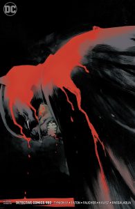
DETECTIVE COMICS #980 by Rafael Albuquerque
So much drama and energy in such a simple portrait. I kind of wish the illustration was pushed up higher, so his head was maybe in the top third instead of centered, but it’s a great image regardless.
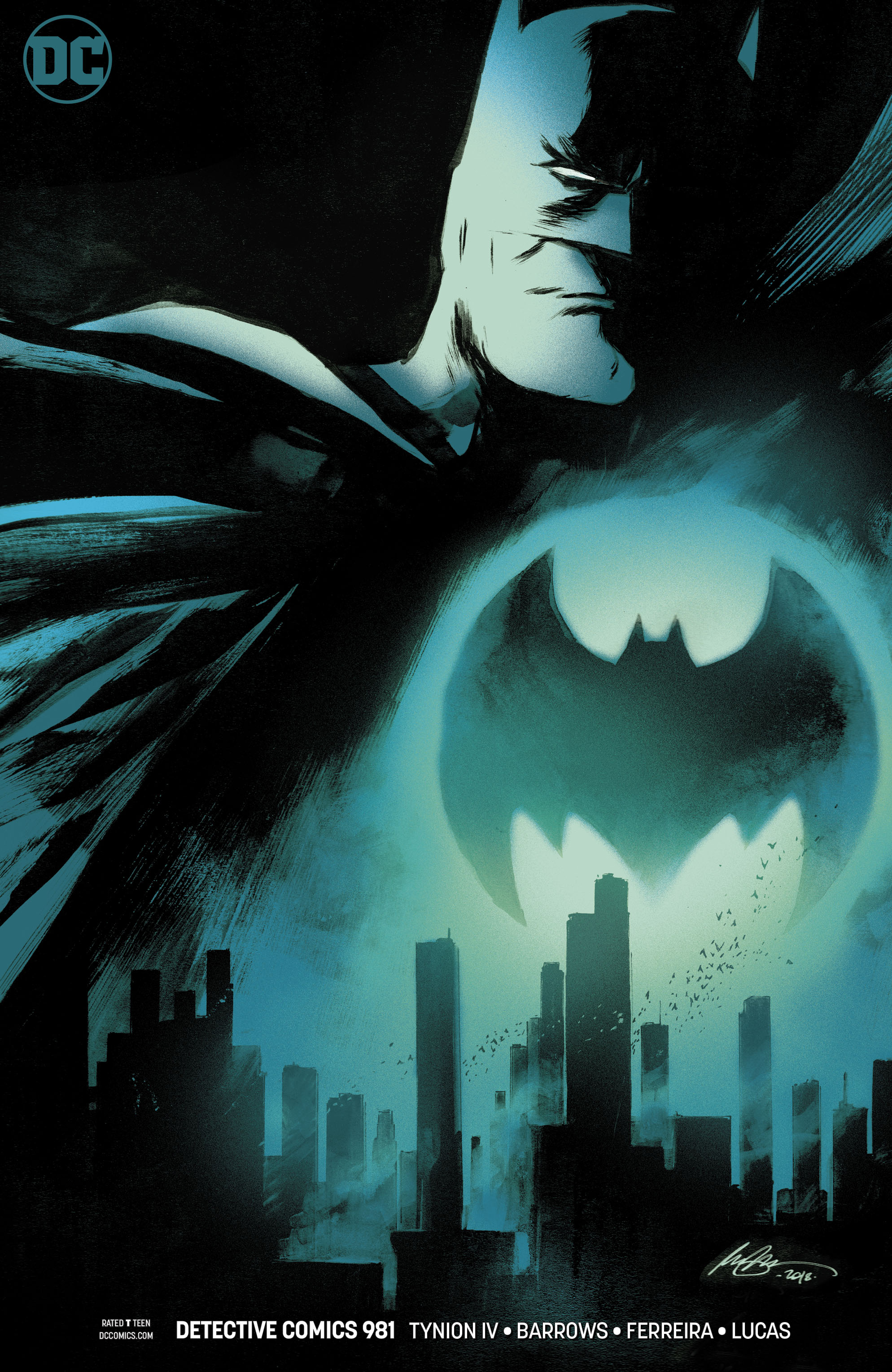 DETECTIVE COMICS #981 by Rafael Albuqeurque
Like Middletone, Albuqeurque is tearing it up. I feel like the concept of Batman towering over Gotham with a Batsignal doubling as his chest insignia is maybe a little overplayed now, but I do really like this variation on it. I suppose it only takes a few more people doing an overplayed concept for it to become a classic go-to.
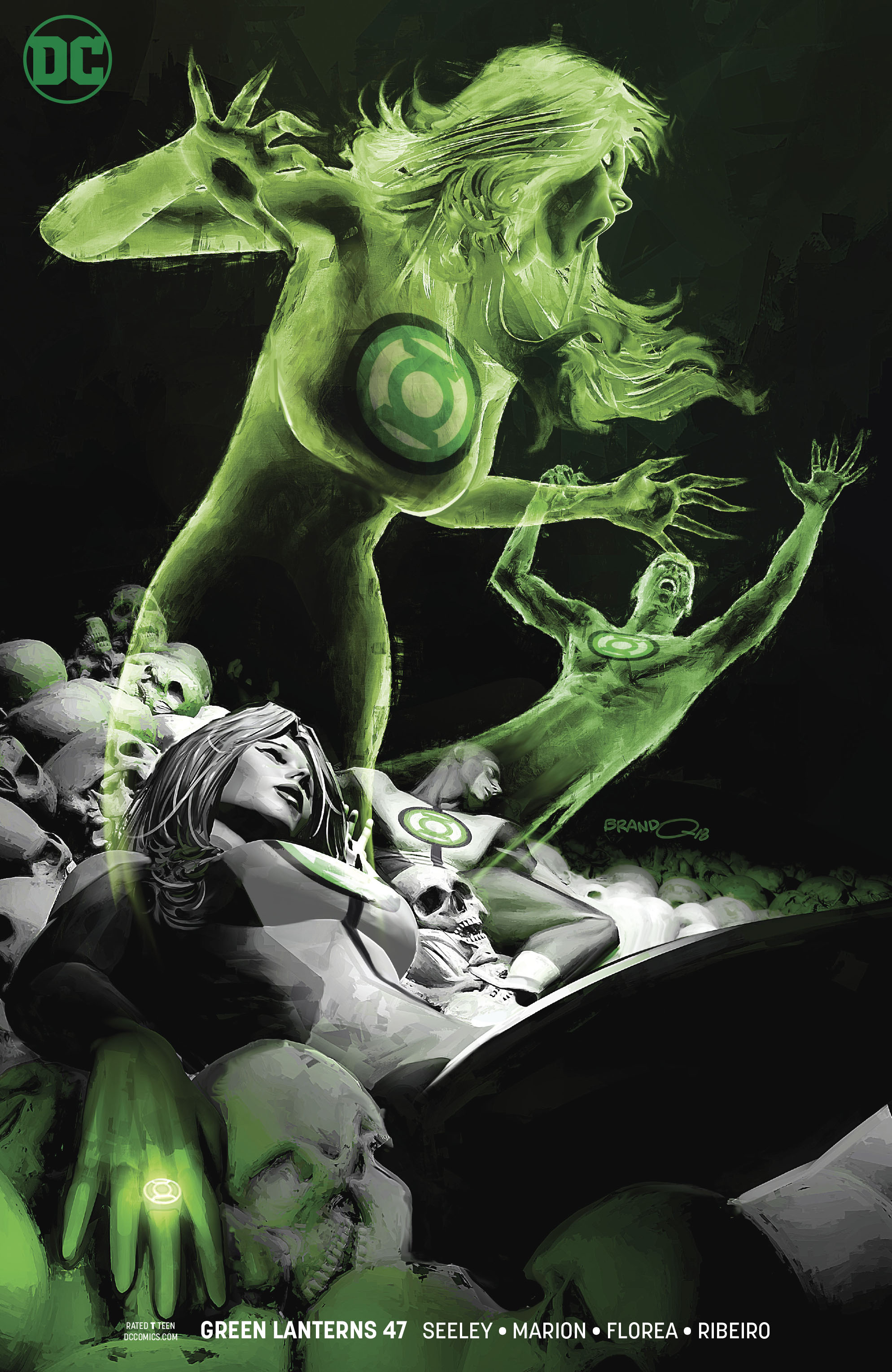 GREEN LANTERNS #47 by Brandon Peterson
Peterson had a great cover the first week, and this one is excellent too. He knows how to fill the space properly there’s no logo, and I can really feel the horror of the foreground character.
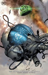
HAL JORDAN AND THE GREEN LANTERN CORPS #44 by Tyler Kirkham
This one is interesting because the ring is essentially acting as the logo. I like how this image tells a story, the helmet and smoke indicating a crash, and the person in the reflection reaching for the ring. Pretty effective.
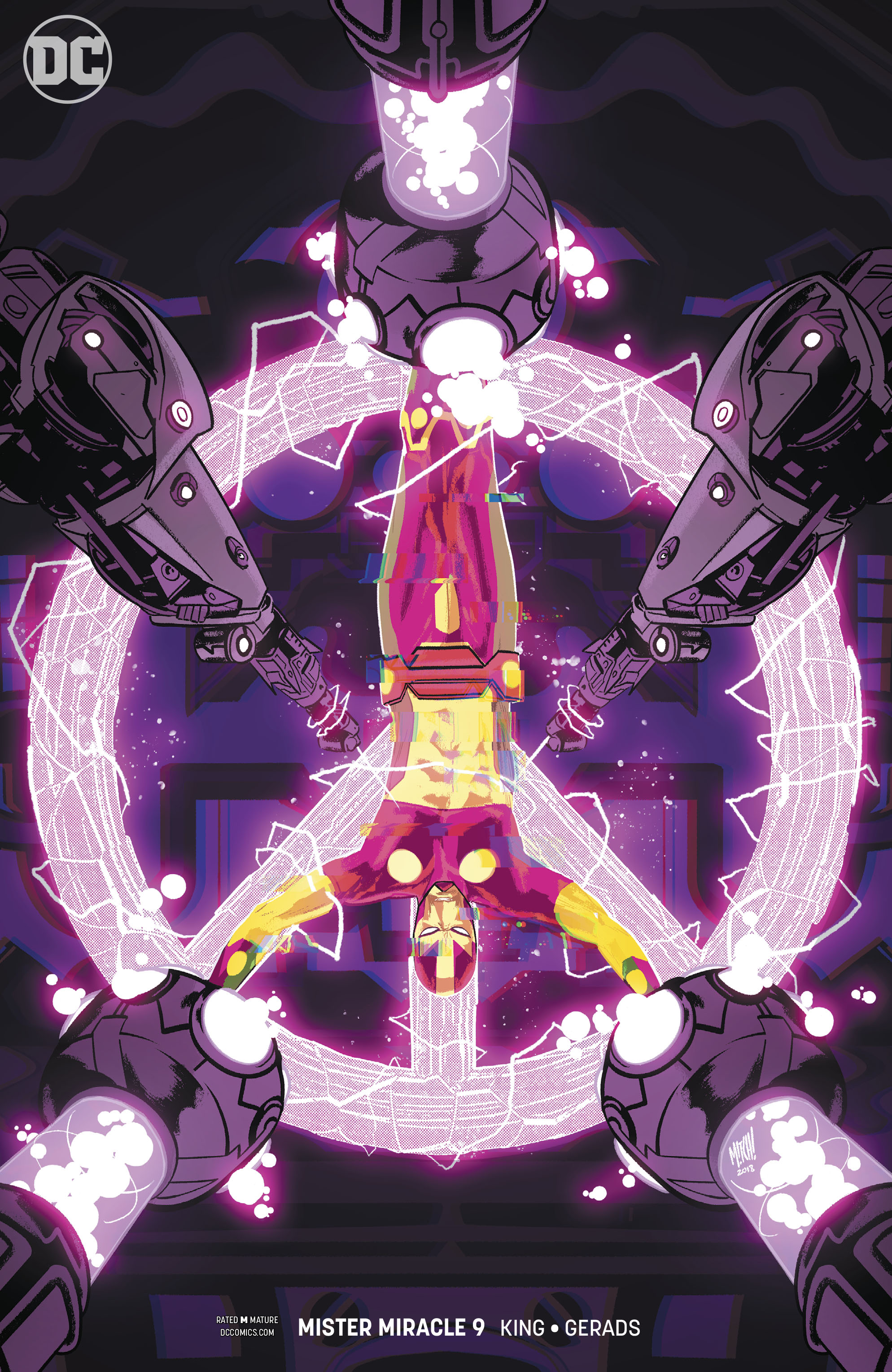 MISTER MIRACLE #9 by Mitch Gerads
I have an automatic bias for symmetrical covers because they remind me of textless album covers and movie posters. But it’s also got the contrast of a scary looking setting mixed with a peace sign, which is very intriguing.
SUPER SONS #16 Dustin Nguyen
This is a really nice shape, but the capes along the bottom make it looks so much like a bat that I found myself staring at it for awhile just to try and make out the rest of the bat. Sadly, it’s just an abstract shape (I think?), which feels like a missed opportunity. It’s also difficult to look at the individual character in the shape because there’s zero flow. But the coloring is really nice, and the idea has potential.
This Week’s Covers
Every week I pick a handful of covers that I consider particularly well-designed, not just well-illustrated. My personal criteria for a well-designed cover is that the illustration and design elements complement each other rather than fight each other, and that the resulting image stands out from the crowd.
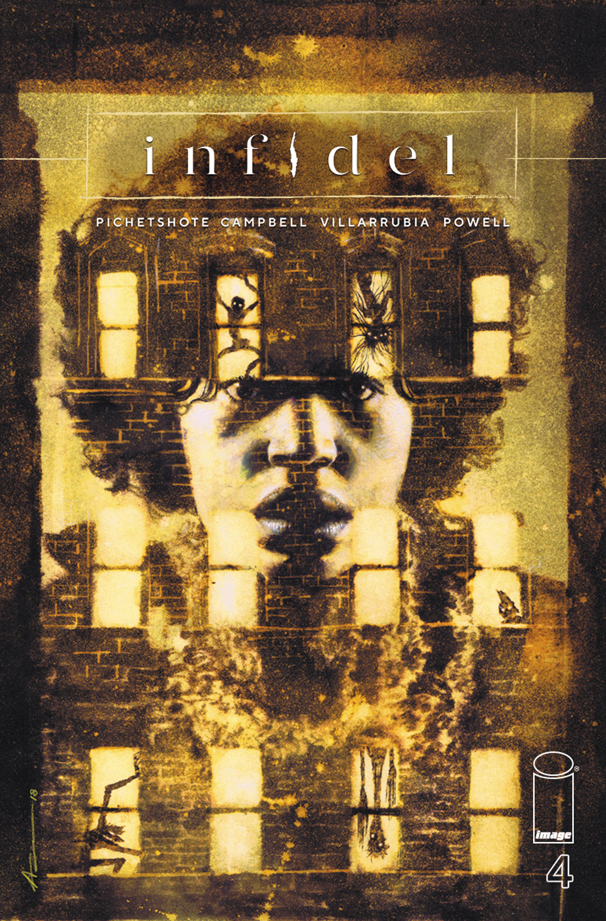 INFIDEL #4 by Aaron Campbell
Anytime I see a building cropped like this, I think of Led Zeppelin’s Physical Grafitti. But this cover goes one step further, combining two images in one. If done wrong, it might’ve looked like the character was being projected on the side of the building, but instead it feels to me like we’re seeing her while also looking through her eyes at a terrifying sight. And the trade dress fits the tone really well.
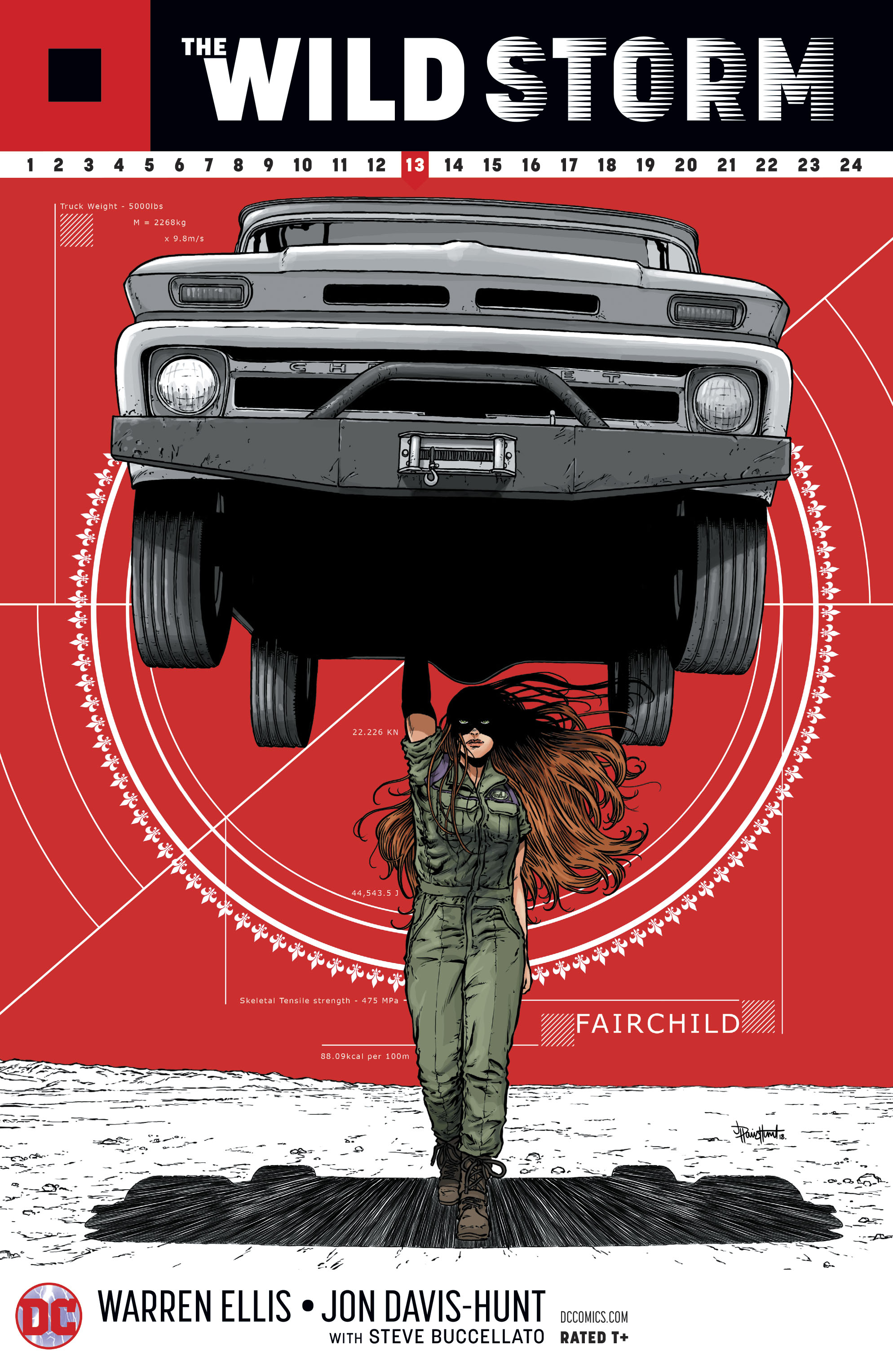 WILD STORM #14 by Jon Davis-Hunt
I mentioned classic go-to concepts earlier, and here we go. A fun variation on the iconic car-over-the-head cover, from an angle I don’t think I’ve seen before. Plus, she’s able to hold it with only one hand!
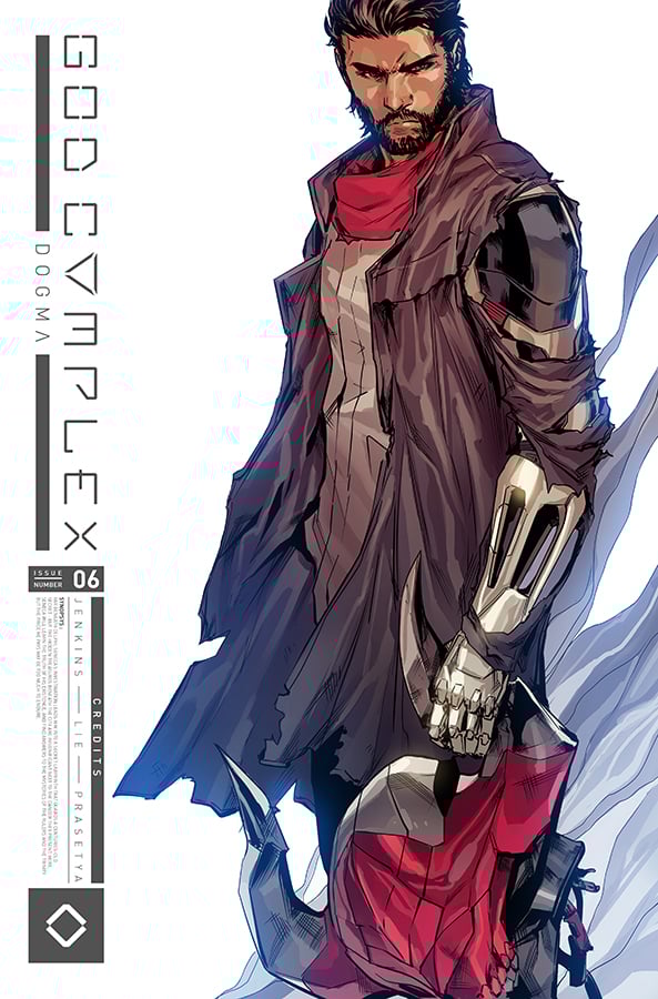 GOD COMPLEX #6 by Hendry Prasetya
The ultra-busy-but-techy trade dress is what makes this cover for me. Maybe it’s not to everyone’s taste, but I’ve spent more time looking at that bar of text than the illustration.
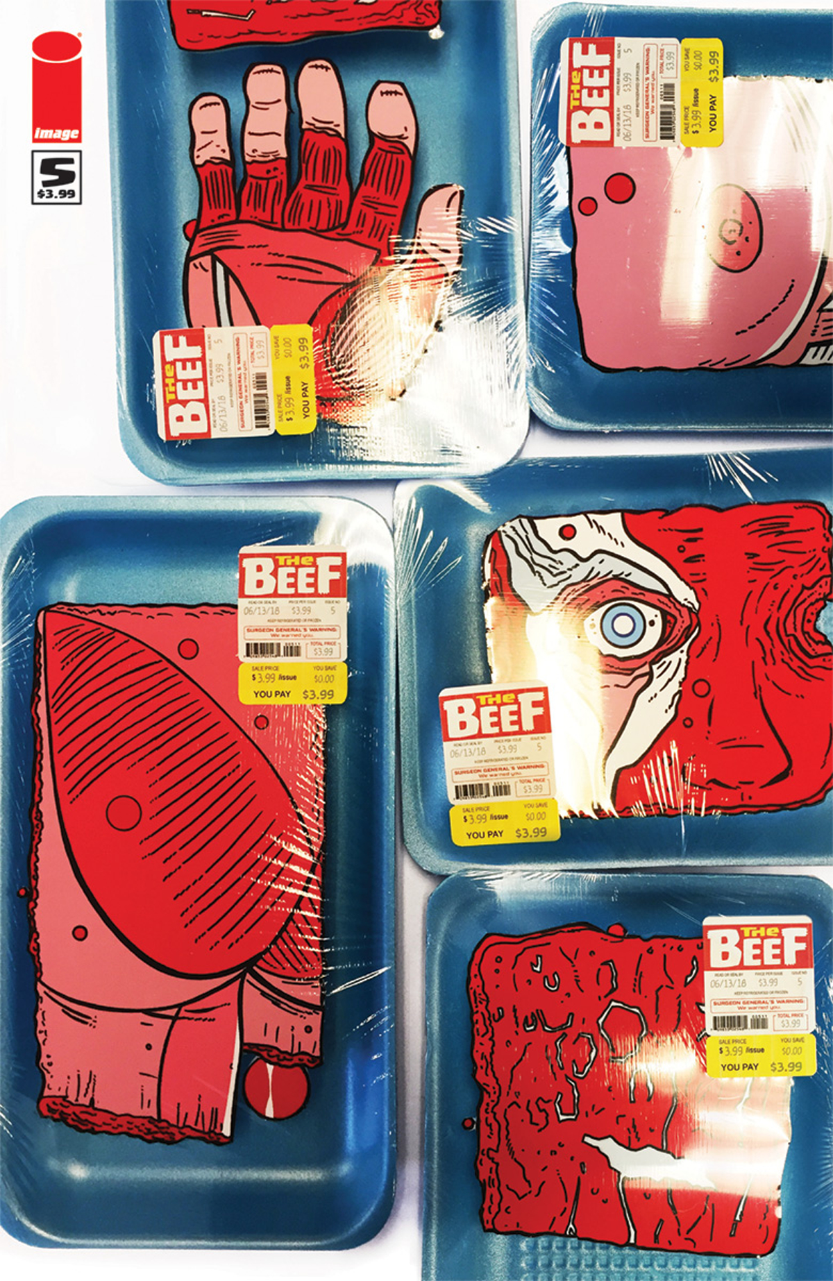 BEEF #5 by Shaky Kane
This composition isn’t quite grabbing me, but I have to call this out for such a clever placement of the logo, repeated as a packaging label. The concept is eye-catchingly disturbing, but the way it mixes illustration with photo elements tones down the horror by making it look like it’s just pieces of printed cardboard that have been shrink wrapped.
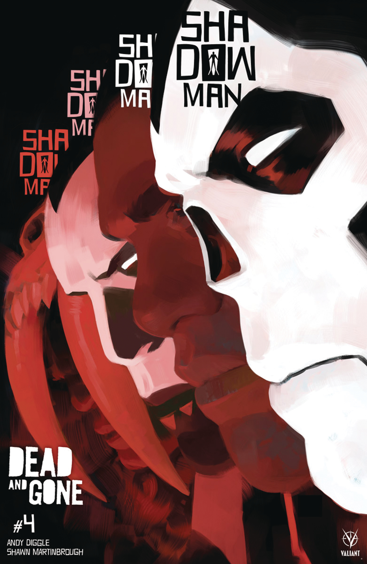 SHADOWMAN #4 by Tonci Zonjic
This text placement isn’t really working for me, but I really appreciate that they’re experimenting. I think this concept has a lot of potential, but needed to cook a little longer.


Great reed and good eye.
READ….lol…this is what happens when you work all night and there is no edit button.
Jimmy: Don’t sweat it. Like I say in my boilerplate first paragraph, “spelling corrections are welcome.” :-)
Comments are closed.