
![]()
This is the third season in a column that judges a book by its cover. Catch up on the current season, or view the complete archive.
Before I get started, I just want to let you know that if you’re a fan of textless album covers (discussed previously here and here), I’ve now started a Tumblr dedicated to the topic.
This month’s big variant event is Amazing Spider-Man #800, which shipped with 53 covers, included textless variations and store-exclusives. I use PREVIEWSworld to assemble my picks each week, but they don’t even list most of the variants. Anyone have recommendations on where to find store exclusives all in one place?
I wouldn’t have known there were so many if I hadn’t been checking eBay for final with-barcode versions of the covers, and was only able to figure out how many covers there were thanks to ComicBurst collecting them all on one page. Big thanks to them!
Unfortunately I don’t have time to discuss 53 covers. There’s just too damn many. So I’m going to pick a handful that I thought worked best.
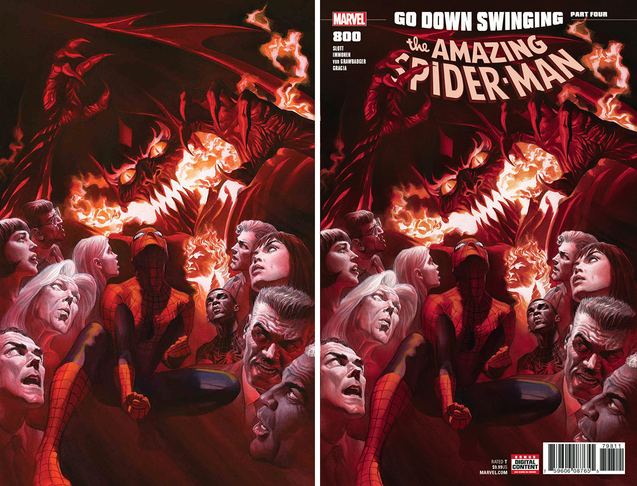
AMAZING SPIDER-MAN #800 by Alex Ross
This one is available in both textless and with-text variations, and works much better as the former, I think. The painting’s composition is very busy, but balances this out with quiet areas where the eye can rest. The latter cover fills those quiet areas with text, making it a noisy image I just don’t want to look at.
AMAZING SPIDER-MAN #800 by Gabriele Dell’otto
The only wraparound of the bunch, I like how energetic this feels for a portrait. This is a rare case where I actually prefer the version of the front cover with text, mainly because the text stacks awkwardly when it’s all on back.
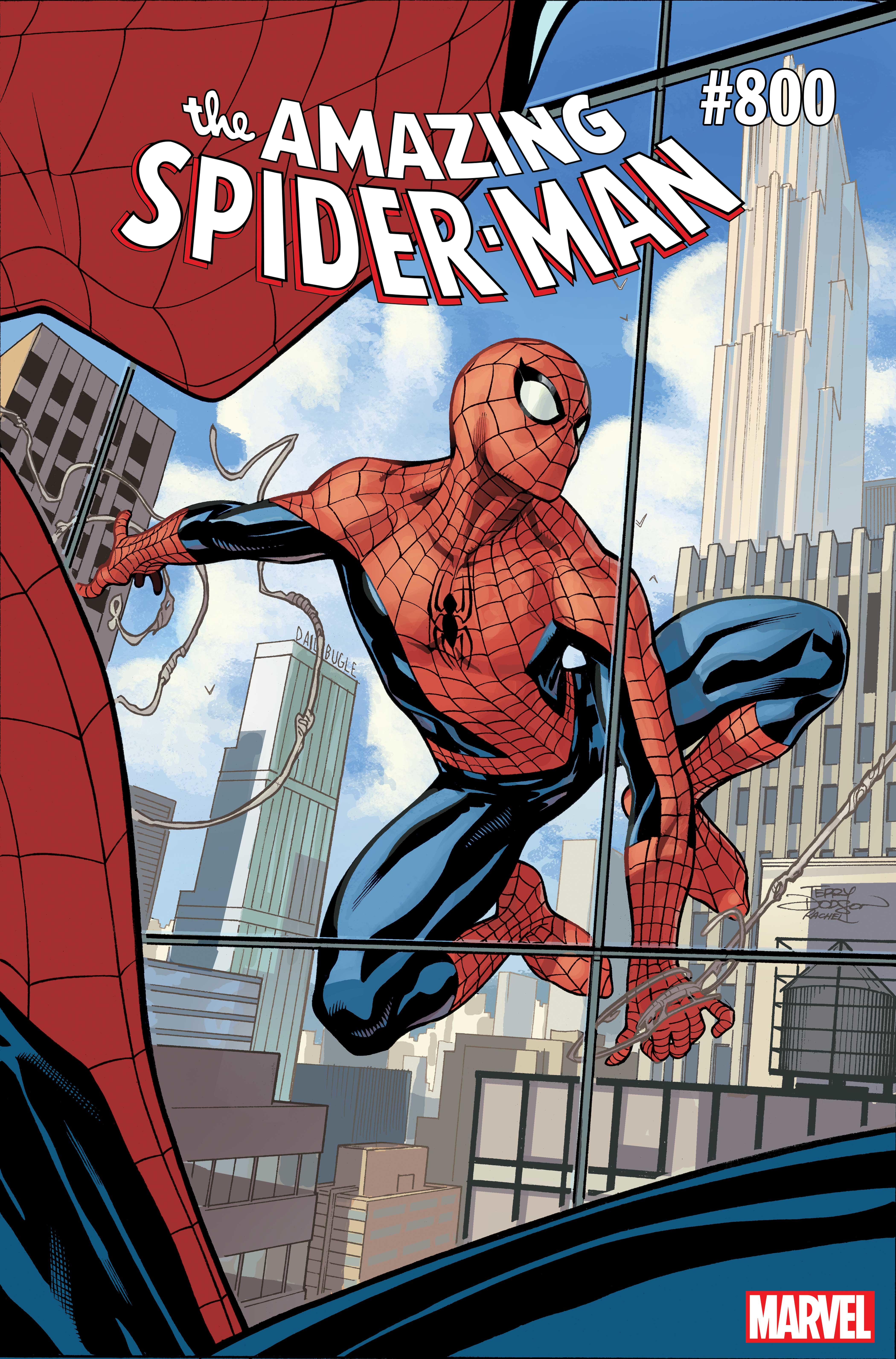
AMAZING SPIDER-MAN #800 by Terry Dodson
Of all the variants that were given textless variations, this one was the most deserving, yet it’s one of the few not given one. The way the foreground Spidey frames the background Spidey is so perfect for a textless cover, and so completely ruined by that logo plastered on his face.
I should also note, this isn’t the final with-barcode version. I couldn’t find a good quality scan of that (which is very frustrating when trying to put together this column), but the with-barcode version actually looks worse. The foreground Spidey is even more covered up, making it harder to realize he’s there at all.
A textless version of this cover would’ve been my favorite variant of the bunch.
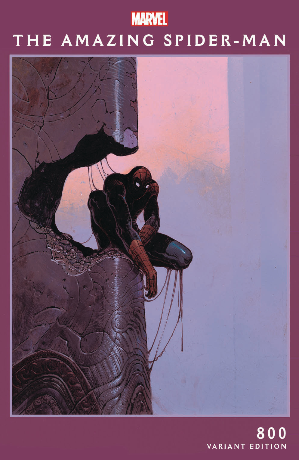
AMAZING SPIDER-MAN #800 by Moebius
Can’t go wrong with Moebius. Like the Dell’otto variant, it looks like someone realized the default logo might not be the best fit for the tone. Personally, I would’ve placed the text to Spidey’s right instead of creating a border, not that there’s anything wrong with that. It works.
Oddly, the textless version of this only removes the text and not the border.
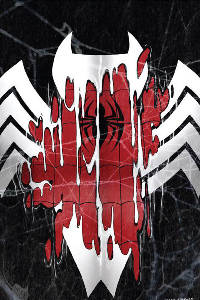
AMAZING SPIDER-MAN #800 by Tyler Kirkham
Covers that are just symbols without text (a la the Batman VHS cover) aren’t common enough in my opinion, and I really like the battling logos here. But I’d like it even more without the busy webbing laid over it.
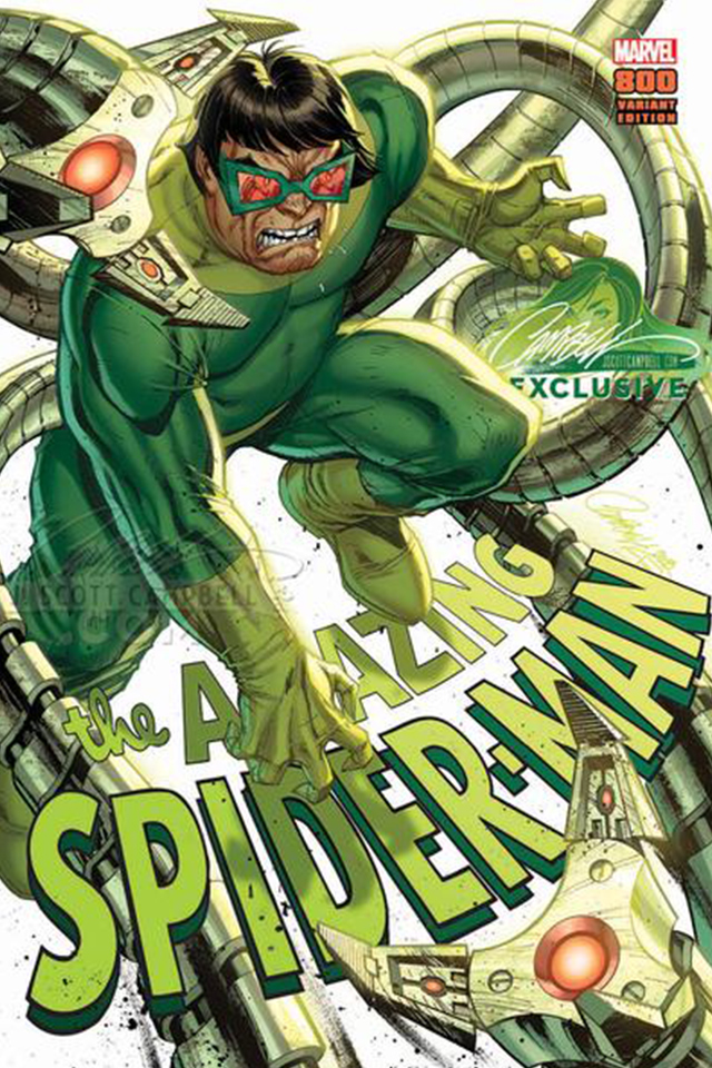
AMAZING SPIDER-MAN #800 by J. Scott Campbell
This is part of a set of eight covers, each featuring a different character and a different logo placement. This one is my favorite because it looks like Doc Ock is using the logo as a step to gain leverage. I kind of love covers where a character is disrespecting the logo, haha.
The other logo applications feel like afterthoughts, sometimes with the logo being too obscured to read. My least favorite is Venom’s, which looks like he’s in a tickle fight with the logo. But maybe that’ll suddenly make it your favorite.
![]()
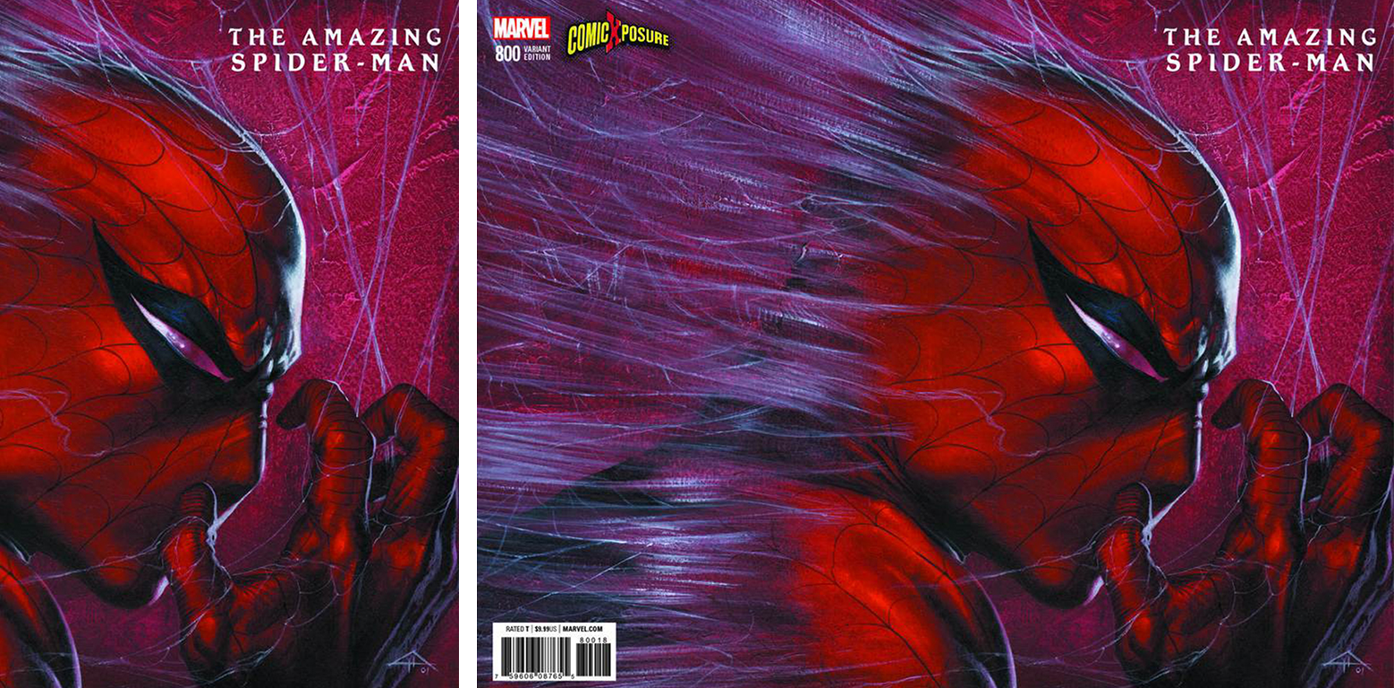
AMAZING SPIDER-MAN #800 by Blank
The artist known as Blank is one of the most prolific variant cover artists, seemingly showing up anywhere. I think his approach is kind of one-note and gimmicky, but it hasn’t stopped his work from being immensely popular. If I’m honest, I’m just jealous I didn’t think of it first.
This Week’s Covers
Every week I pick a handful of covers that I consider particularly well-designed, not just well-illustrated. My personal criteria for a well-designed cover is that the illustration and design elements compliment each other rather than fight each other, and that the resulting image stands out from the crowd.
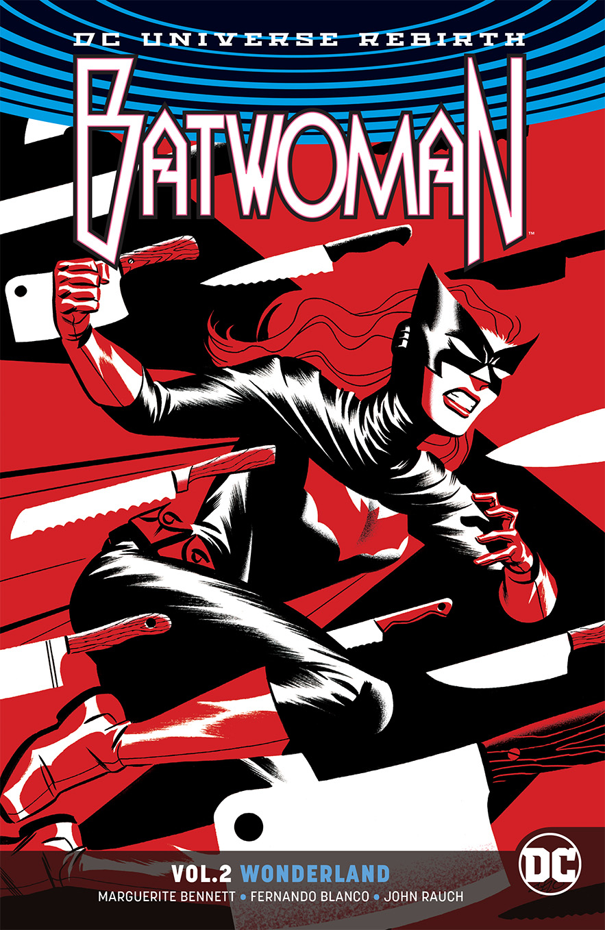
BATWOMAN Vol. 2 by Michael Cho
This image was previously used as the cover to a single issue, but the column wasn’t running then and now I get an excuse to talk about it. Michael Cho has been killing it with these three-color compositions. This is one of my favorites in particular because it’s so complex yet feels really simple, and the three colors are balanced so nicely.
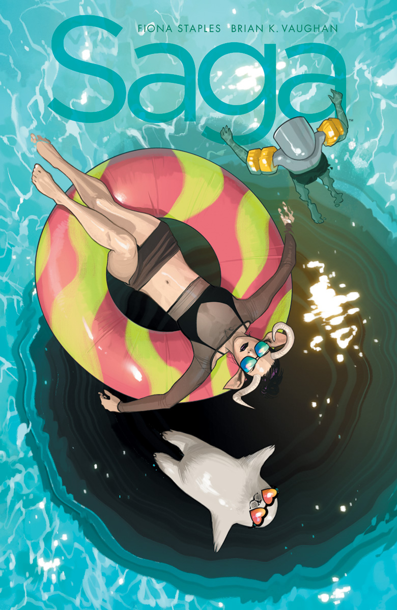
SAGA #52 by Fiona Staples
I love the concept of this: relaxed character unaware of looming danger. The one thing I’d change is repositioning the main character so her legs pointed at the logo instead of to the next cover on the stand.
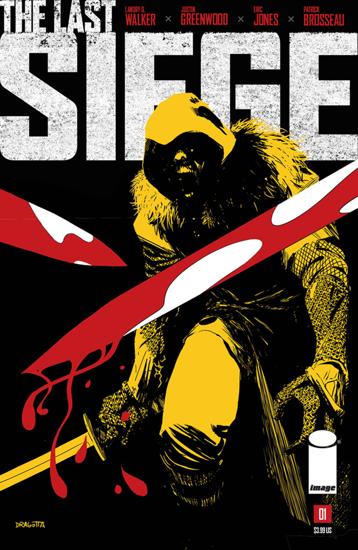
THE LAST SIEGE #1 by Nick Dragotta
Similar to what Michael Cho is doing, but with four colors. The amount of black really helps the swords pop into the foreground, and the fourth color used only on the one character helps separate him from the other elements.
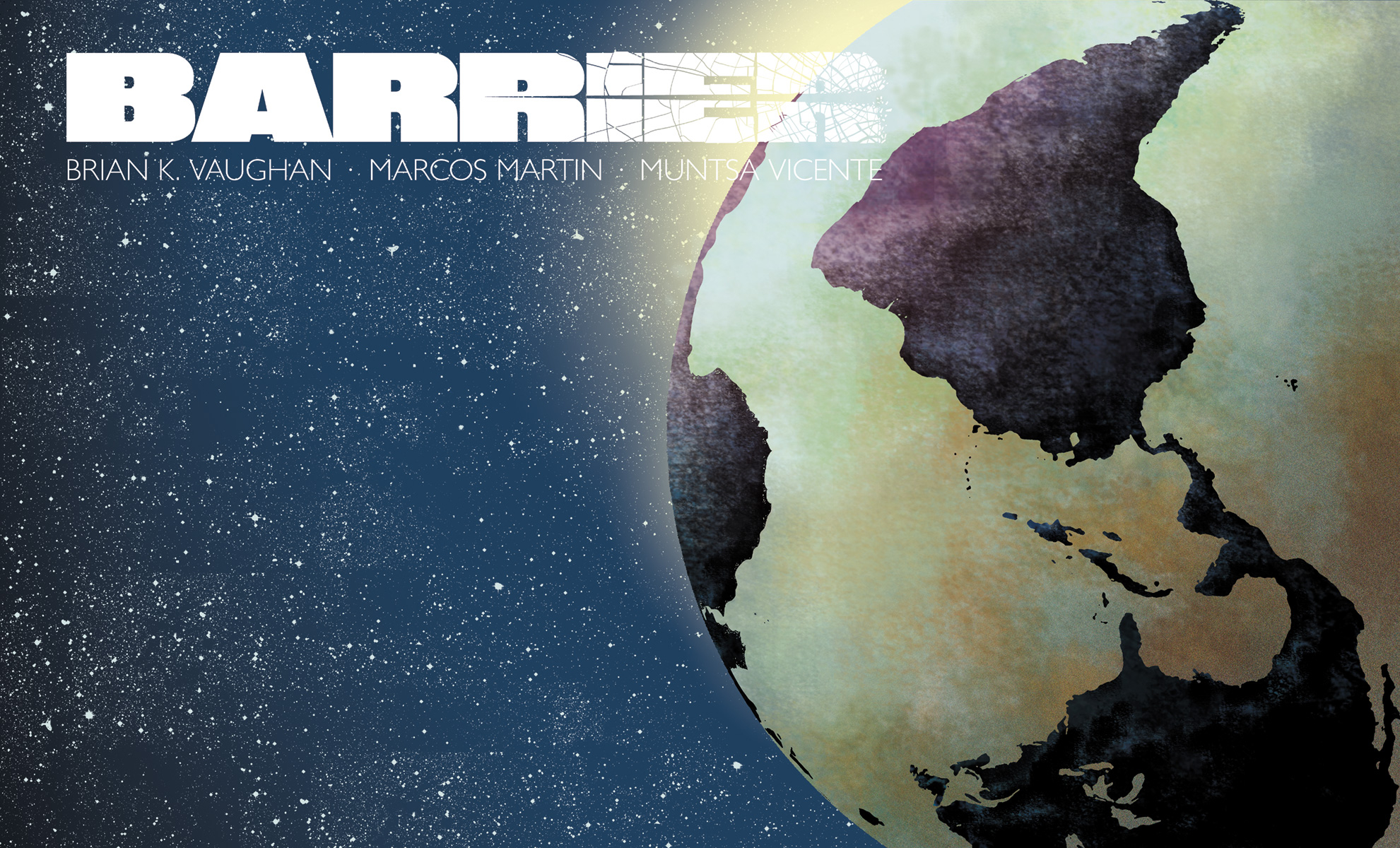
BARRIER #5 by Marcos Martin
Another Barrier cover. Landscape oriented covers are such an easy way to stick out, though I’m not sure how effective it’s been on the stands. I wish the logo here was smaller, so it wasn’t overlapping and disappearing into the planet.


I think the original Moebius art might have had a standard portrait print proportion, so that’s probably why it was left in a “frame”. I’m actually not sure why they made a textless version, since that framing works very well with the title.
Wanted: More art by Blank! Would be an improvement over most Marvel cover art!
Comments are closed.