
![]()
This is the third season in a column that judges a book by its cover. Catch up on the current season, or view the complete archive.
So, what was the first textless comic cover? I speculated two weeks ago that it might be Darkstar #1, and asked readers to let me know of any earlier ones. Lo and behold, I found a few possible contenders while doing some more searching on my own.
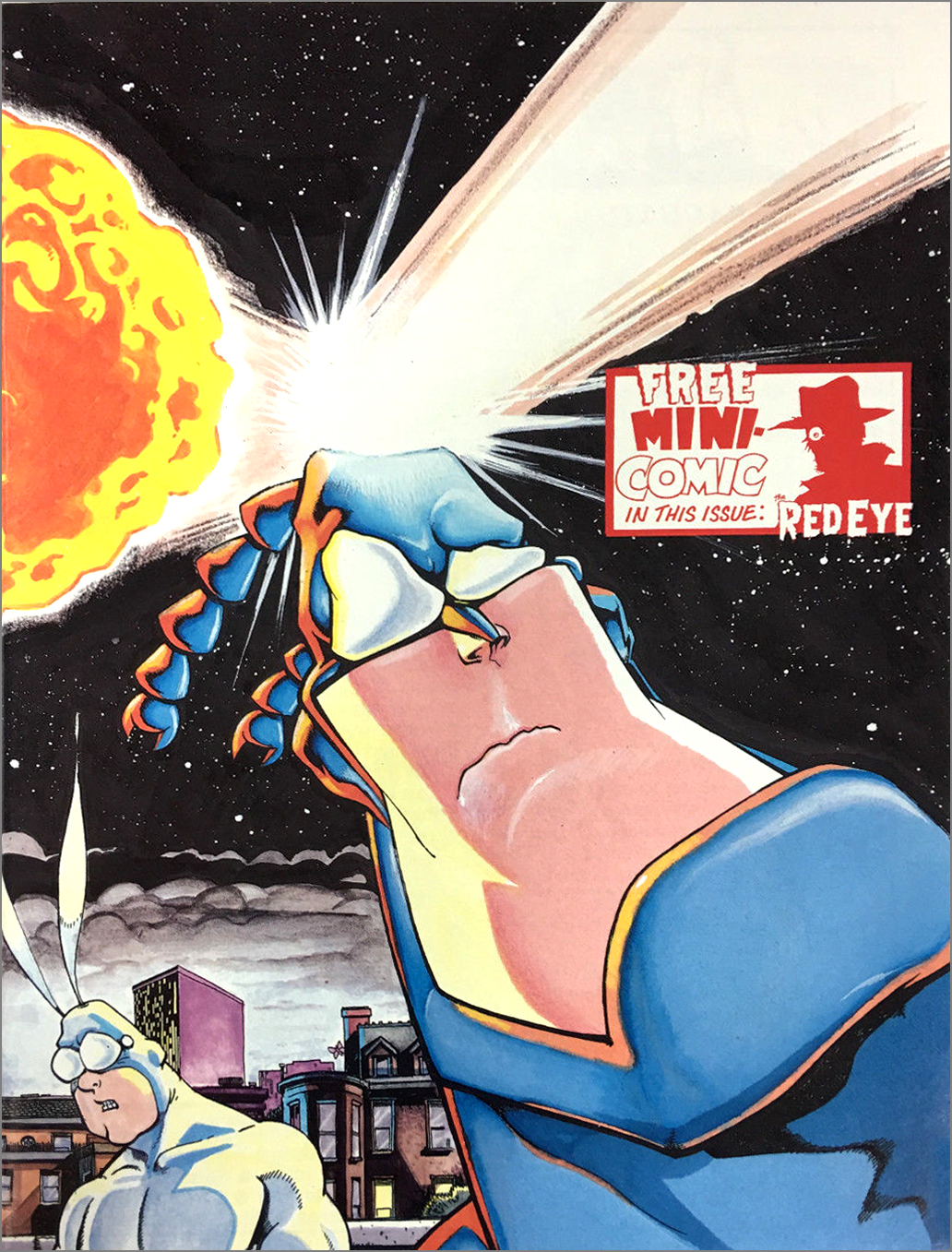
In 1990, The Tick #8 shipped with a “no logo” variant. It’s commonly referred to as “no logo” rather than “no text” because, unfortunately, it still had the blurb for the back-up strip keeping it from being entirely textless.
According to Grand Comics Database, Destiny Distributors informed retailers this was a misprint. Not the back-up blurb, mind you, but the lack of logo. Normally I might question if this was a misprint, but variant gimmicks weren’t quite in full swing yet.
The distributor also mentioned in their note that this rare variant made up only 5-8% of the print run. Perhaps they were trying to make lemons into lemonade, touting the misprint as a valuable collectable instead of throwing the run away.
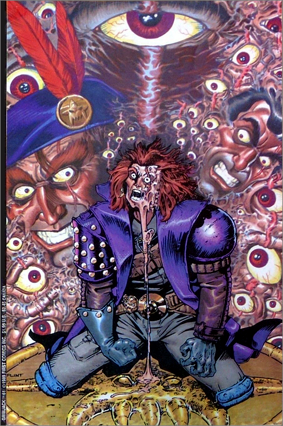
A year earlier, Grimjack #61 also shipped without a logo, and this one wasn’t a variant. Curious if it might also be a misprint, I asked Grimjack creator John Ostrander, who has a column at ComicMix.
“It was deliberate. If it’s the issue that I think it, Flint Henry sent in a cover that was so amazing, it was decided to leave the logo off as it would have had to cover up too much of the cover.”
Now it’s obvious. Upon closer inspection, there’s a black bar along the left edge acting as a fake spine, like the one I suggested DC should do but even smaller. Which means this is technically another “no logo” cover rather than “no text.”
But I still had a nagging feeling there might be an earlier textless cover than Darkstar. So I asked a group of comics scholars on a mailing list I subscribe towhether they could think of any.
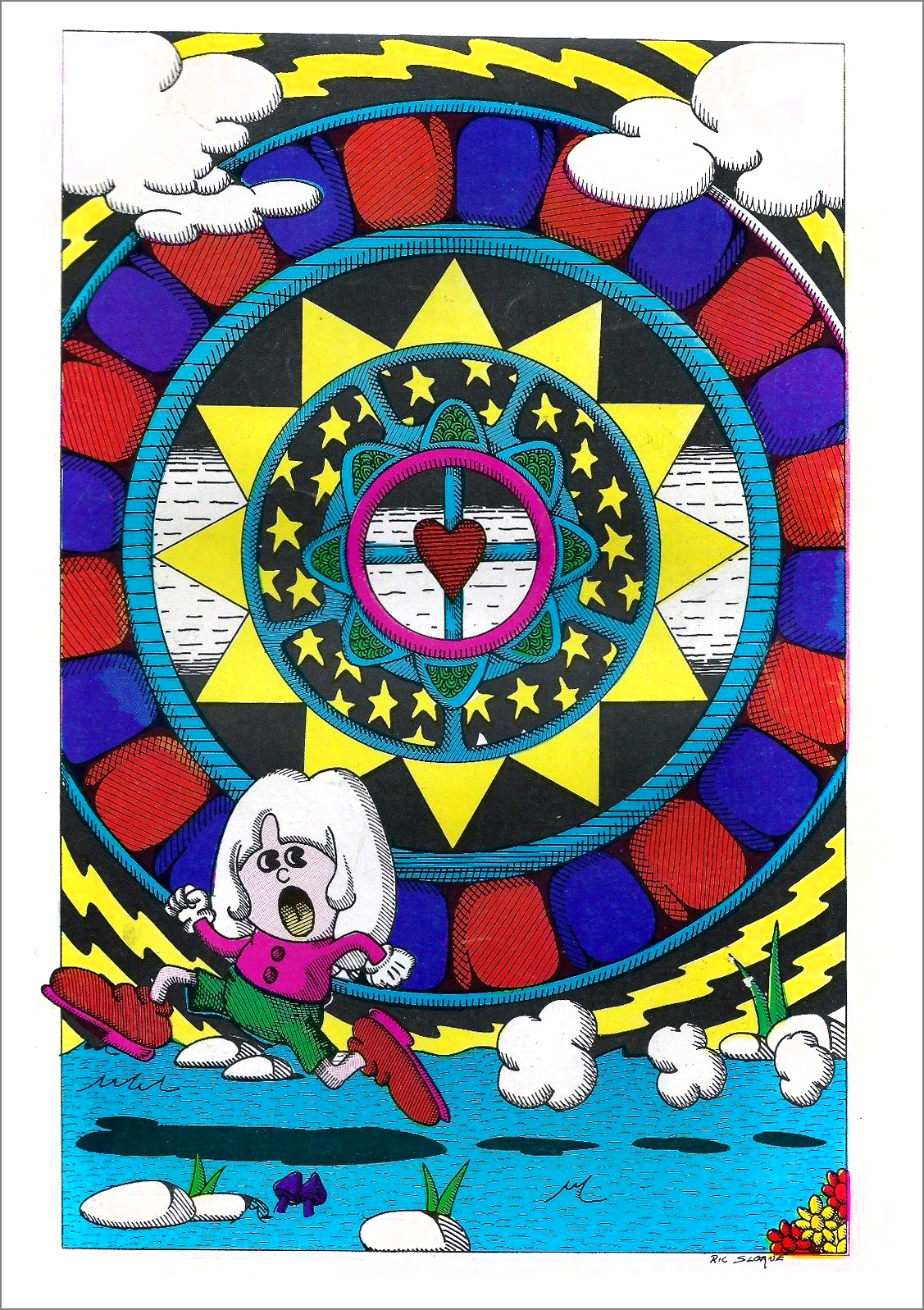
Ivan Kocmarek of ComicBookDaily.com suggested looking at underground comix, and I could kick myself. He found several great textless examples, and the earliest by far is Ric Sloane Comics from 1969.
Ric Sloane is better known as R.K. Sloane, illustrator of several iconic Guns N’ Roses images.
But then I felt the same nagging feeling about the album covers I’d mentioned. I was so excited to find an earlier textless cover than the one mentioned in Album Cover Album, I thought my find must be the first. But then doubt set in. I knew I hadn’t been thorough enough. I found a database of old vinyl and decided to dig around further.
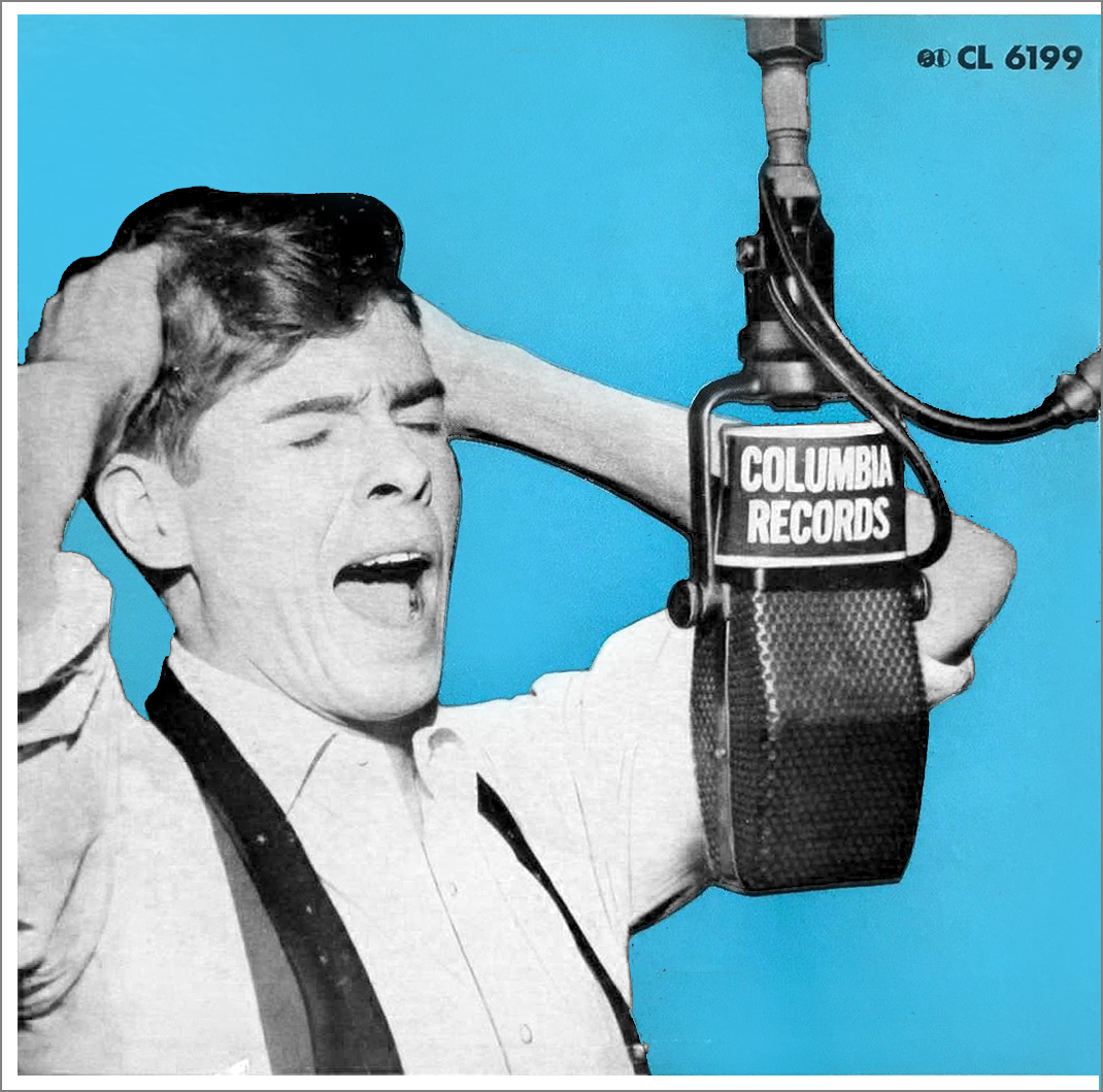 Now I feel very confident in declaring the actual first textless LP to be Johnnie Ray’s self-titled (or title-less?) album from 1952.
He was a big star at the time, appearing on numerous magazine covers. TV Guide called him “the hottest vocalist since Frank Sinatra.” Columbia Records must’ve felt like they could bank on his image at that point, and did something unusual and eye-catching. I like how they snuck in their label name on the microphone instead. Unfortunately, they also put the catalog number on there.
Surprisingly, it was never referred to as “the blue album.” That would’ve made it so much easier to search for.
The LP had only been introduced four years earlier, so this was also available as an album of 78s. But there was one album of 78s that beat it to the textless punch. Or at least only one that I can find. From The American Songbag by Carl Sandburg was released in 1937. It was an audio recording of songs from Sandburg’s popular songbook The American Songbag, which was first published in 1927 and remained in print for seven decades. But like I said, it was the only textless example I could find that predates the LP.
The first truly textless LP cover — devoid of even a record label logo on the front — was Leadbelly’s Last Sessions Volume One, released posthumously in 1953.
Then, in 1954 and 1955, there was suddenly a boom in textless album covers, mostly among jazz quartets and R&B singers. But it sputtered out just as quickly as it started, and there wasn’t another boom until rock acts adopted it in the late ’60s.
This Week’s Covers
Every week I pick a handful of covers that I consider particularly well-designed, not just well-illustrated. My personal criteria for a well-designed cover is that the illustration and design elements compliment each other rather than fight each other, and that the resulting image stands out from the crowd.
There are some interesting DC variants, but I think I’ll hold off and cover them as a group later. A lot of the preview images floating around are missing the barcodes.
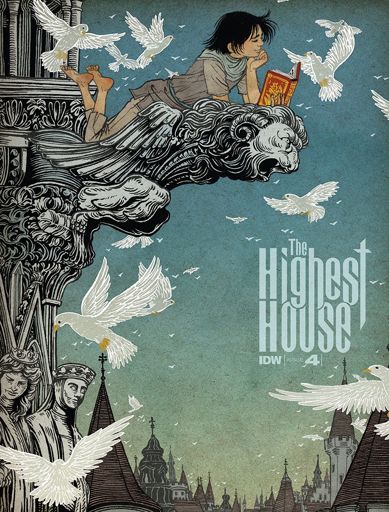
The Highest House #4 by Yuko Shimizu
Firstly, I enjoy this logo and the interesting way the letters combine or overlap or cut into each other.
The illustration does a great job of leading me around inside and not letting me leave. The architecture creates a subtle circular shape, the statue at the top points me to the logo, and the birds around the logo point me back to the architecture. There are also plenty of dark shapes or dark hues around the edges.
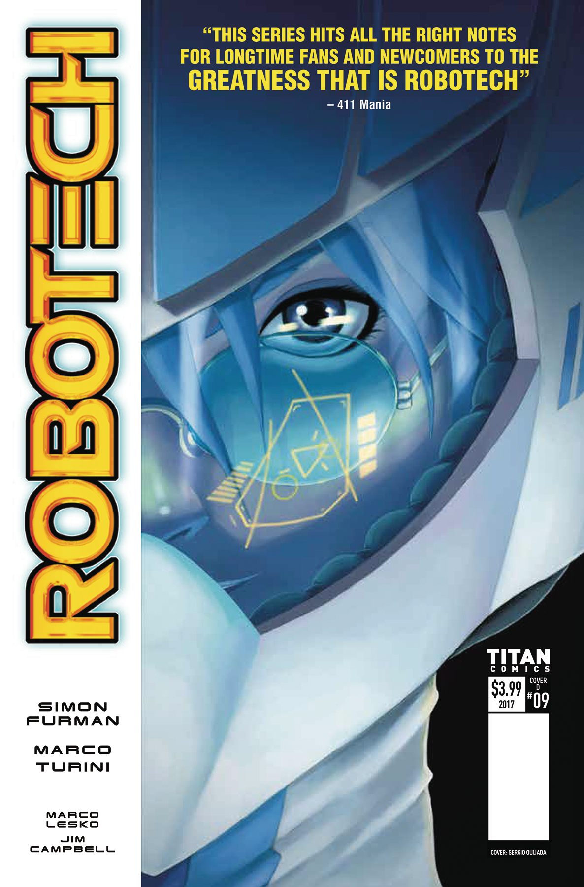 Robotech #9 by Sergio Quijada
It’d be easy to criticize this for “ripping off” the Watchmen cover layout, but the only difference between an imitation and an institution is how many times it’s been done. I’d rather see this as the default layout than what’s currently the default.
I kind of wish there was something more significant in the reflection, like something telling a story, but this is fine. It’s moody and gets my attention. There’s a nice little nook for the barcode and publisher info.
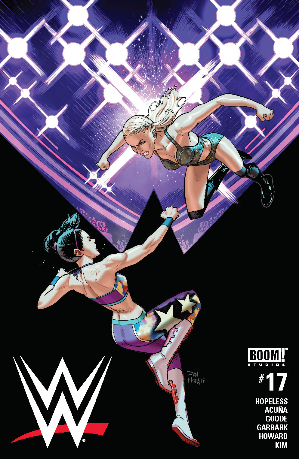 WWE #17 by Dan Mora
This cover grabs me because there’s a dynamic diagonal, but also high contrast between an area of colorful lights and an area of stark black. The text and logo placement kind of fails the Hibbs Test, but it works well for digital.
It took me a moment to realize the the black shape was mimicking the top of the W in their logo. I wonder if that could’ve been pushed further somehow.
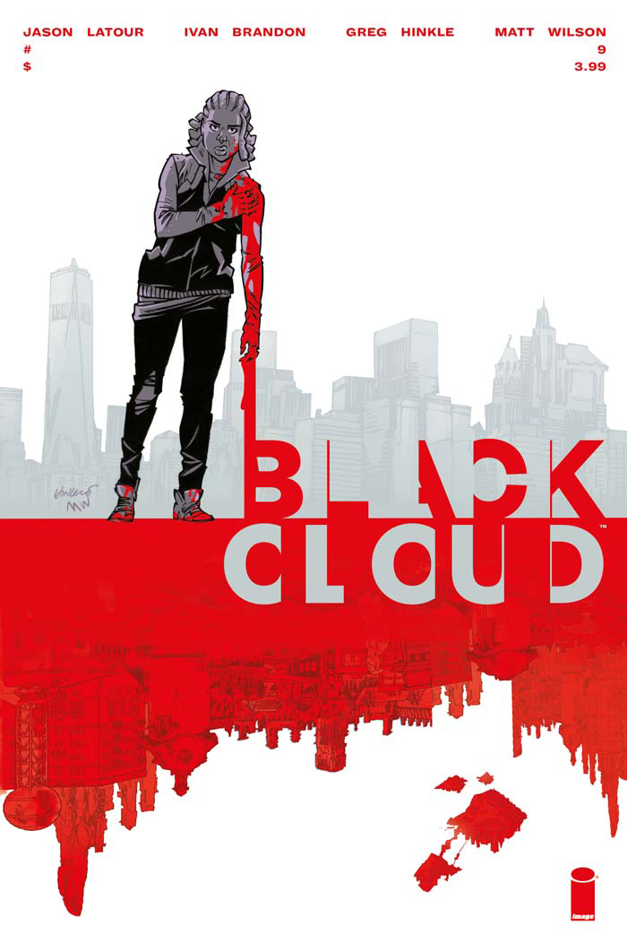 Black Cloud #9 by Greg Hinkle
I like the way the letters in this logo feel like they’re being stolen away into some other dimension. I enjoy the concept of an upside-down city skyline looking like dripping blood, but almost wish there was more focus on it. Like what if the horizon line was only 1/3 down the page, and the figure was a bit smaller? If she was understated like that, it’d feel a little like an Akira image in a cool way I think.
Barrier #1 by Marcos Martin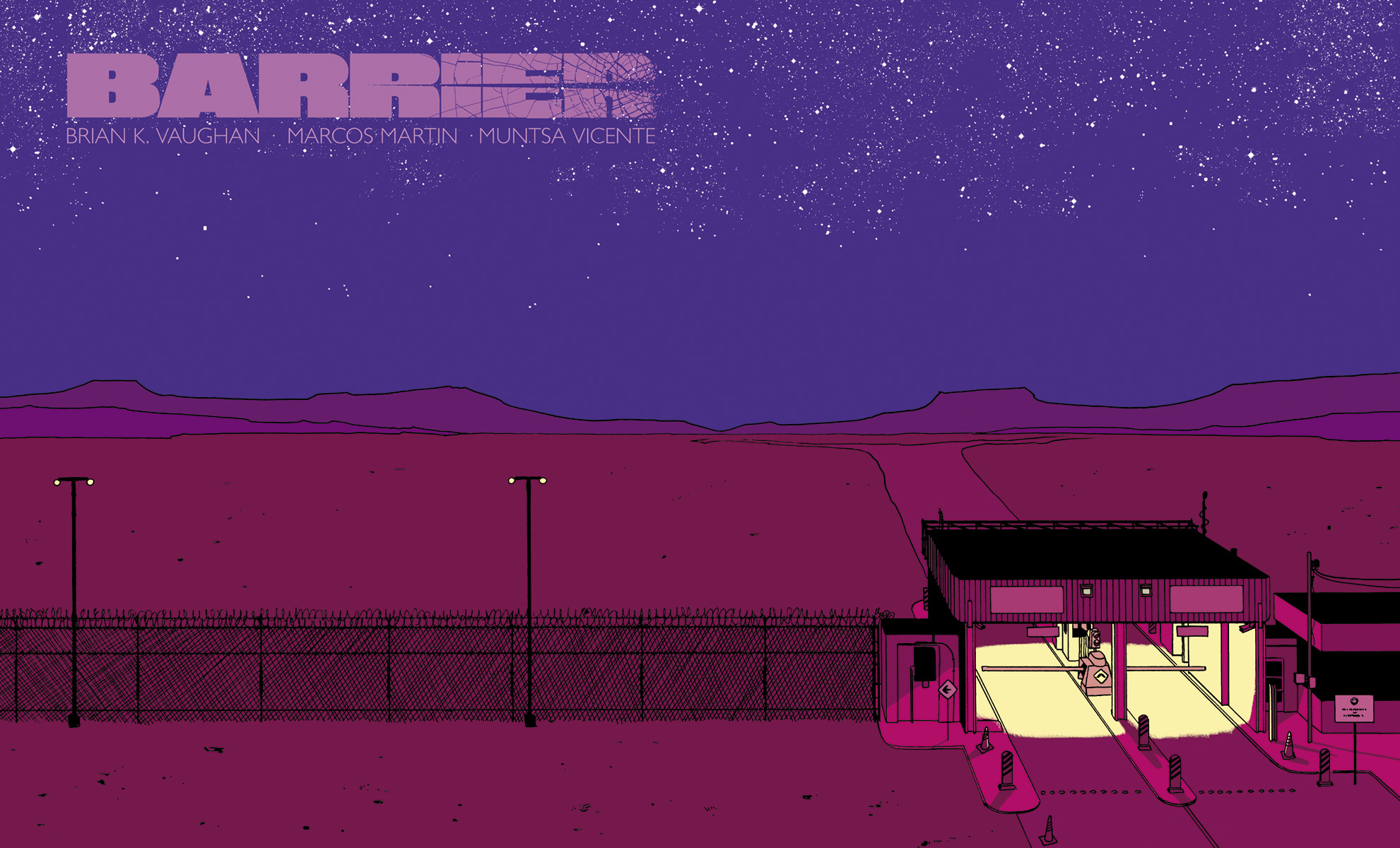
The flat style is great and reminds me of modern spooky adventure games, but what really sticks out is of course the landscape orientation of the image. Do retailers rack it landscape, or do they rack it sideways? Let me know how your local shop racked it if they had it.


